Blog

  • App Branding Examples That Boost Installs and Engagement

    App Branding Examples That Boost Installs and Engagement


    TL;DR:

    • Effective app branding quickly communicates purpose and builds trust through consistency and clarity.
    • Iterative testing and user feedback significantly improve visual elements and boost installs.
    • Authentic storytelling and timely visuals help indie apps stand out and grow without large budgets.

    Your app could be genuinely great and still get ignored. In a marketplace with millions of listings, your icon, screenshots, and color palette often decide whether someone taps “Download” or scrolls past. Branding is not decoration. It is the first conversation you have with a potential user, and that conversation happens in about three seconds. Reflection.app’s A/B icon test produced a 1.3x lift in first-time installs, which is a significant jump from a single visual change. This article breaks down real indie branding examples, explains what made them work, and gives you a repeatable framework to apply the same thinking to your own app listing.

    Table of Contents

    Key Takeaways

    Point Details
    Branding affects installs Small visual changes, like a new logo, can significantly boost install rates for indie apps.
    Customization drives virality Adapting to platform trends with fresh visuals made Widgetsmith a standout success.
    Test and measure A/B testing improvements and tracking conversions make branding updates meaningful.
    Story builds trust The best app branding communicates purpose and reliability, earning user trust alongside attention.

    What makes app branding effective?

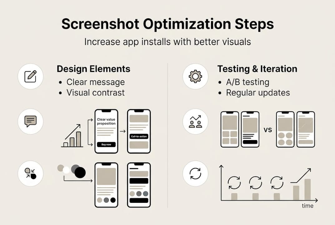
    Effective app branding is not about having the most polished visuals. It is about being instantly recognizable and clearly communicating what your app does. Users scan app store listings fast, so every visual element needs to earn its place.

    Here are the core attributes that separate strong app branding from forgettable ones:

    • Consistency: Your icon, screenshots, and color palette should feel like they belong to the same family. Inconsistency signals a lack of polish and erodes trust.
    • Clarity: A user should understand your app’s purpose within seconds of seeing your listing. Cluttered screenshots or a confusing icon slow that recognition down.
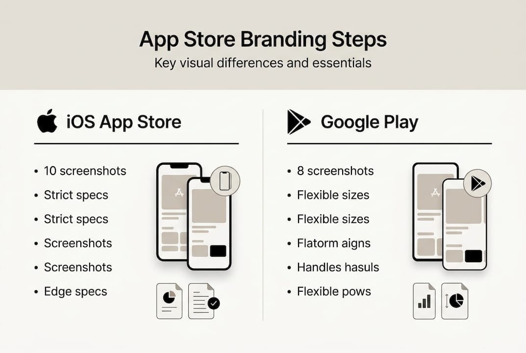
    • Platform awareness: App Store and Google Play have different screenshot dimensions, feature graphic requirements, and browsing behaviors. Branding that works on one platform may need adjustments for the other.
    • Messaging alignment: The text overlays on your screenshots should reinforce your core value proposition, not repeat generic phrases like “Easy to use” or “Fast and reliable.”
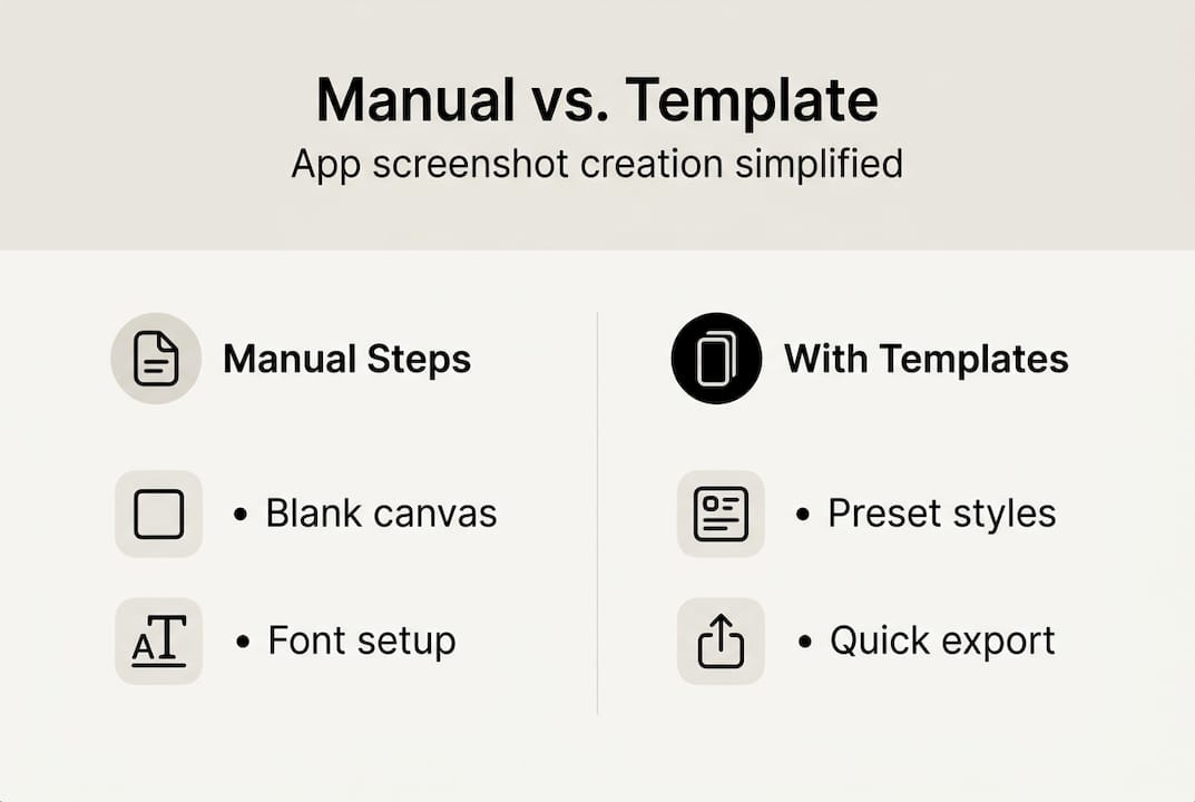
    • Iteration: Branding is not a one-time task. The best indie teams treat their store visuals the way they treat code, shipping, testing, and refining.

    One underrated factor is how branding compounds with App Store Optimization. Iterative updates combined with launch traffic can stack ranking improvements and download velocity in ways that neither strategy achieves alone. When your visuals convert better, your store ranking improves. Better ranking brings more traffic, and better branding converts that traffic more efficiently.

    Pro Tip: Start with branding steps for higher conversions before you touch your screenshots. Locking in your visual identity first makes every downstream design decision faster and more consistent.

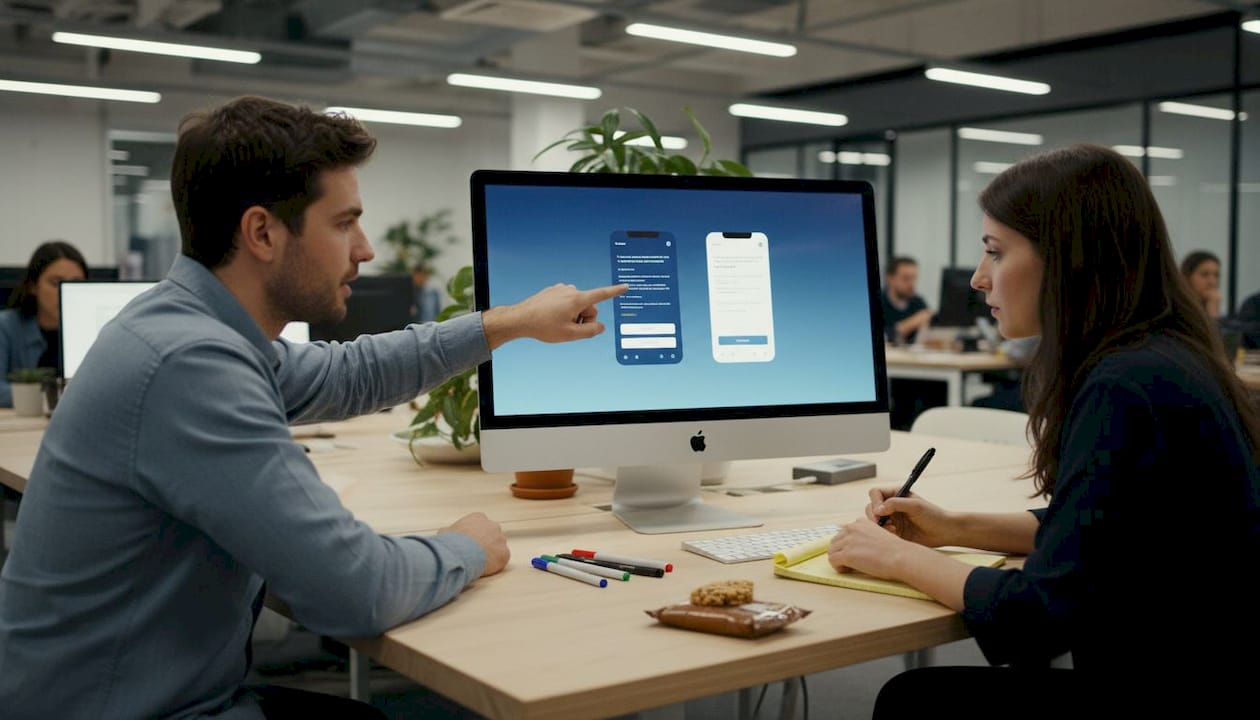
    User feedback is another lever that most indie developers underuse. Posting your icon or screenshot variations in developer communities or running a quick poll with your existing users can surface blind spots that no amount of solo iteration will catch.

    Reflection.app: A logo reboot that drove more installs

    Reflection.app is a journaling and self-reflection tool built by a small team. When they decided to refresh their brand identity, they did not just pick a new color and call it done. They ran a structured A/B test on their app icon and measured the outcome in installs.

    The result was clear: a 1.3x increase in first-time installs after switching to the updated icon. That is not a marginal improvement. For an indie app without a massive marketing budget, a 30 percent lift in installs from a visual change alone is a meaningful win.

    What drove the improvement? A few specific design decisions stand out:

    • Simplicity over complexity: The new icon used fewer elements and cleaner shapes, making it easier to recognize at small sizes.
    • Emotional resonance: The updated design felt more aligned with the app’s purpose, reflection and self-awareness, rather than being a generic journaling symbol.
    • Contrast and legibility: The new icon held up well against both light and dark home screen backgrounds, which is a practical concern many developers overlook.
    • User input: The team gathered feedback before finalizing the direction, which reduced guesswork and increased confidence in the final choice.
    Branding element Before After
    Icon complexity Multi-element Simplified, single focal point
    Install lift Baseline 1.3x first-time installs
    Design process Internal only User feedback integrated
    Visual alignment Generic Purpose-driven

    The Reflection.app example is a strong reminder that your icon is not just a logo. It is a conversion asset. If you want to apply this kind of thinking to your screenshots, a branding tutorial for screenshots can walk you through the same iterative approach. And if you publish on Android, the same principles apply when you design Google Play visuals with conversion in mind.

    Pro Tip: Run your icon candidates through a mockup tool to see how they look on an actual device home screen before committing. Small icons read very differently than large design files.

    Widgetsmith: Customization and timing lead to a branding breakout

    Widgetsmith is one of the most striking indie success stories in recent app store history. Built by solo developer David Smith, the app lets users create custom home screen widgets with personalized styles, fonts, and colors. When Apple introduced iOS 14 and its redesigned home screen widget support, Widgetsmith was ready.

    The app reached 131 million downloads, a number that most funded startups never approach. The branding strategy behind that growth was not accidental.

    What Widgetsmith did differently:

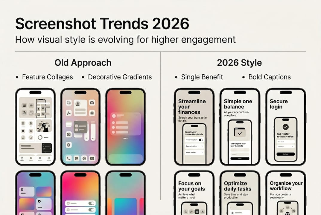
    • Screenshots showed the actual output users could create, not abstract feature lists. Seeing a beautiful, personalized home screen was the pitch.
    • The visual identity leaned into variety. Because the app supported countless aesthetic styles, the marketing visuals could stay fresh and appeal to different tastes.
    • Timing was treated as a branding asset. Launching with strong visuals at the moment iOS 14 dropped meant the app captured organic attention when user curiosity was at its peak.
    • Shareable output created organic branding. Users posting their custom home screens on social media became unpaid brand ambassadors.
    Branding approach Static visuals Customizable visuals
    User appeal Fixed audience Broad, diverse audience
    Social sharing potential Low High
    Visual freshness over time Fades Stays current
    Conversion signal “Here is the app” “Here is what you can create”

    The lesson here is that mockup customization strategies matter more than most developers realize. When your screenshots show what users will experience rather than what your interface looks like, you shift from feature marketing to outcome marketing. That shift converts better. Pairing this with smart visual marketing strategies can amplify the effect significantly.

    User testing app screenshots at kitchen table

    Stat to note: 131 million downloads from a solo developer with no traditional advertising budget. Branding and timing did the heavy lifting.

    Lessons from top indie apps: Iteration, feedback, and conversion focus

    Looking across these stories, a clear set of repeatable patterns emerges. These are not theoretical best practices. They are behaviors that produced measurable results for real indie teams.

    1. Run A/B tests on visual elements. Do not guess which icon or screenshot layout performs better. Test it. Even simple tools or community polls give you directional data. Reflection.app measured conversion uplift, not just aesthetics, which kept the team focused on what actually mattered.
    2. Collect user feedback before and after changes. Internal opinions are biased. Real users will tell you things your team cannot see. Build feedback loops into your branding process.
    3. Adapt to platform trends quickly. Widgetsmith’s timing was not luck. It was preparation meeting opportunity. Watch for platform updates that create new visual contexts for your app.
    4. Use numbers to evaluate branding decisions. Install rate, conversion rate, and page visit-to-download ratio are your scorecards. Gut feelings are a starting point, not a finish line.
    5. Prioritize visuals that communicate core value. Every screenshot should answer one question: “What will my life look like if I use this app?”

    “Ongoing review, iteration, and user feedback amplify the impact of branding updates.” This is not a one-time effort. The apps that sustain growth treat their store listings as living products.

    Iterative ASO improvements stack over time. A 5 percent conversion improvement this month, combined with a better icon next quarter and sharper screenshots after that, compounds into a fundamentally different trajectory for your app. Staying current with visual trends for engagement and optimizing your preview images for conversions are two practical places to start that compounding process.

    Beyond visuals: Why indie app branding is about trust and story

    Here is what most technical branding articles miss: users are not just evaluating your colors or icon shape. They are asking a deeper question. “Can I trust this app with my time and attention?”

    For indie developers, that question is harder to answer than it is for a company with a recognizable name. You do not have brand equity built up over years. Your screenshots and icon are doing the work that a reputation would otherwise do.

    This means your visuals need to tell a story, not just display features. The story is: “A real person built this with care, it solves a real problem, and it will keep getting better.” Authenticity in visual presentation matters more for indie apps than for enterprise software.

    The temptation is to chase every trend. Dark mode aesthetics, glassmorphism, whatever is popular this season. But trends that do not connect to your app’s actual identity create a gap between expectation and experience. Users notice that gap after they install. That is when reviews turn negative.

    Strong indie branding evolves with your users, not with design Twitter. Use marketing tips for conversions to stay grounded in what your actual audience responds to, not what looks impressive in a design portfolio.

    Elevate your app branding today

    The examples in this article prove that thoughtful branding is one of the highest-return investments an indie developer can make. You do not need a design agency or a six-figure budget to compete visually.

    https://appscreenkit.com

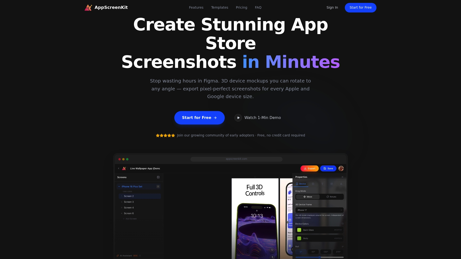
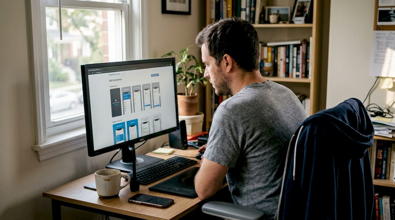
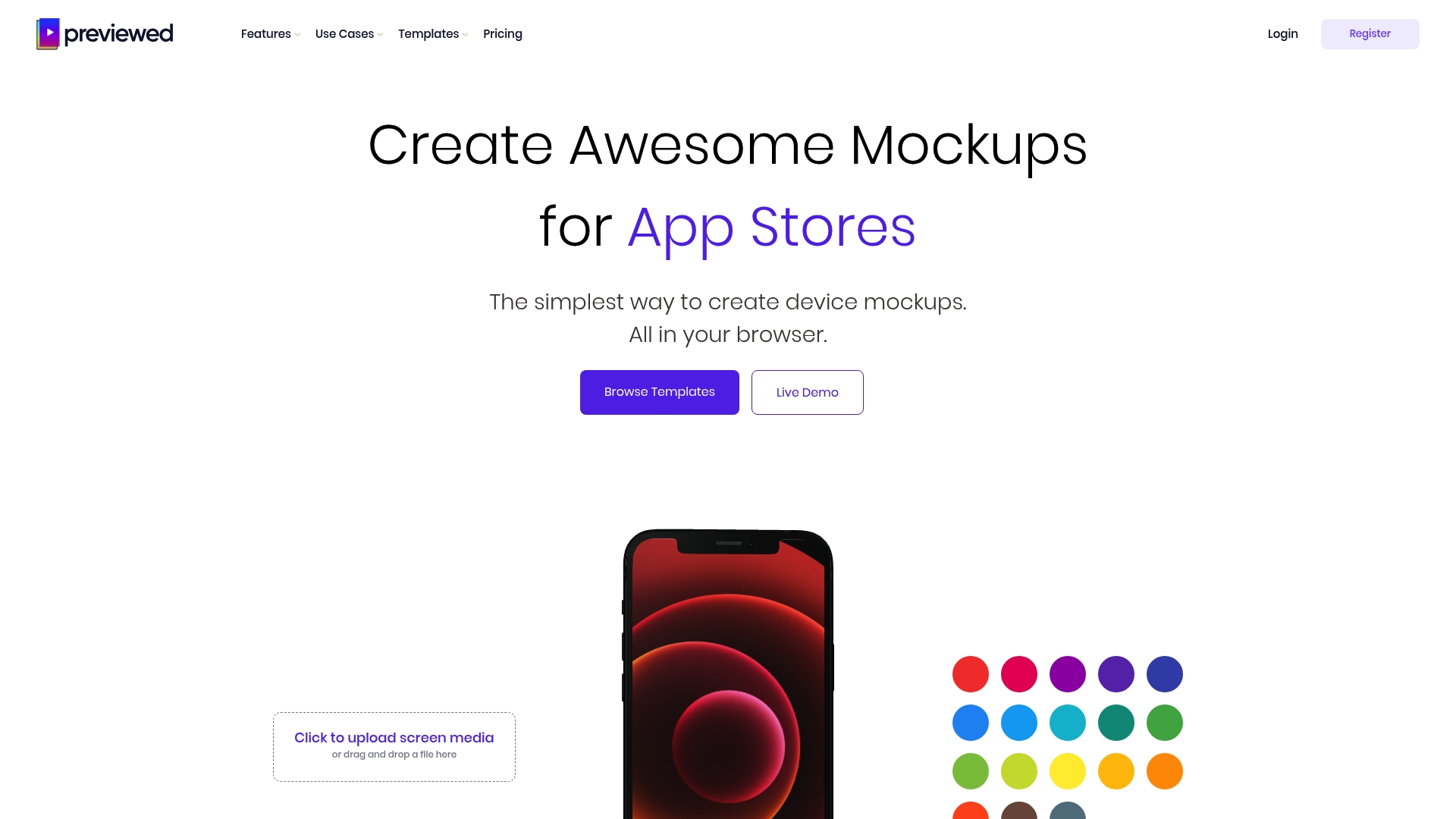
    AppScreenKit gives you the tools to act on everything covered here. Generate polished, store-ready screenshots in minutes using pre-built templates and 3D device mockups. No Figma skills required. Start with a fast screenshot generation workflow to see how quickly you can level up your listing, then use the screenshot branding tutorial to apply a consistent visual identity. When you are ready to build, the App Store Screenshot Generator handles all device sizes with one click.

    Frequently asked questions

    How do I choose the right visual style for my indie app?

    Focus on simplicity and coherence with your app’s purpose, then let data guide the final call. Reflection.app chose their icon based on actual install data from a structured test, not internal preference.

    Does changing my app icon really impact downloads?

    Yes, and the impact can be significant. A single A/B tested icon change gave Reflection.app a 1.3x increase in first-time installs, which is a measurable, repeatable outcome.

    How does customization boost app branding success?

    Customizable visuals stay fresh and shareable over time. Widgetsmith’s approach to timely, varied themes contributed directly to 131 million downloads without traditional advertising.

    What is the best way to measure the impact of branding changes?

    Track conversion rate before and after each change using A/B tests. Measuring conversion uplift gives you a direct, honest signal that aesthetics alone cannot provide.

    Can indie teams succeed with branding against big companies?

    Absolutely. Widgetsmith’s 131 million downloads and Reflection.app’s install lift both came from strategic iteration, not big budgets. Authenticity and speed of iteration are advantages that small teams actually have over large ones.

  • App screenshot branding tutorial: boost downloads and stand out

    App screenshot branding tutorial: boost downloads and stand out


    TL;DR:

    • Visual branding of screenshots significantly increases app downloads and user trust.
    • Consistent colors, fonts, and device mockups create professional, recognizable listings that convert.
    • Indie developers have a competitive edge by iterating quickly and optimizing visual assets effectively.

    Most users spend about five seconds scanning your app store listing before they decide to download or keep scrolling. Those seconds are almost entirely visual. Your screenshots are not just product images — they are your pitch, your brand, and your first handshake with a potential user. 60-70% of users make that call based on the first three screenshots alone, without ever scrolling further. This tutorial walks you through exactly how to brand your app screenshots for maximum impact, from setup to export, with actionable steps built for indie developers and small teams.

    Table of Contents

    Key Takeaways

    Point Details
    First impressions matter Over half of users decide on your app within the first few screenshots.
    Tool selection is crucial Using templates and the right branding tools speeds up your workflow and boosts quality.
    Consistent branding drives trust Alignment with your app’s colors and voice increases user confidence and download rates.
    Test for real impact Verifying your screenshots with users or A/B tests ensures your branding actually works.

    Understand the impact: why screenshot branding matters

    Your app could be brilliant. The onboarding could be flawless. But if your screenshots look generic, rushed, or inconsistent, users will never find out. Screenshot branding is the process of making your app’s visuals feel intentional, recognizable, and trustworthy at a glance.

    The numbers back this up hard. Kiwi.com gained +31% downloads after optimizing their screenshots, and AppQuantum saw a +21.5% lift under similar conditions. These are not outliers — they are what happens when visual presentation is treated as a core growth lever, not an afterthought.

    Infographic on screenshot branding download results

    Here is a quick overview of what screenshot optimization can realistically deliver:

    App / Team Change Made Download Uplift
    Kiwi.com Screenshot redesign with branding +31%
    AppQuantum Visual hierarchy improvements +21.5%
    Typical indie app Consistent color and messaging +10-20%

    The indirect benefits matter just as much as the direct ones. Strong screenshot branding builds recognition across search results, increases trust before a user even taps your listing, and signals professionalism that carries over into review sentiment. Users who feel confident before downloading are more likely to engage and less likely to churn early.

    Understanding screenshot optimization basics is the foundation. Once you see how small visual decisions compound into real conversion differences, the process stops feeling like design work and starts feeling like growth work. Pairing that with smart visual marketing strategies gives you a repeatable framework rather than a one-time fix.

    Key indirect benefits of strong screenshot branding include:

    • Stronger brand recall across multiple app store placements
    • Higher trust signals before a user reads a single review
    • Better ASO performance because visuals influence click-through rates
    • Reduced refund and churn risk from users who know what they are getting

    The first 3 screenshots carry the most weight. Everything else in your listing is secondary to what users see in that initial frame.

    Woman reviews app screenshots at kitchen table

    Get ready: essential tools and requirements

    Before you open any tool, you need the right assets and a clear picture of what each store actually requires. Skipping this step is the fastest way to waste hours on screenshots that get rejected or underperform.

    Here is how the main tool categories compare:

    Tool type Skill required Speed Cost Best for
    Figma / Sketch (DIY) High Slow Low to mid Teams with designers
    Template-based platforms Low Fast Low Indie devs, small teams
    Hiring a designer None Varies High One-time launches

    Template-based platforms like AppScreenKit are built specifically for speed without sacrificing quality. You do not need to know Figma. You do not need to hire anyone. You pick a layout, drop in your UI, and customize.

    Before you start any branding work, gather these essentials:

    • Your app UI screenshots exported at the highest resolution your device supports
    • Brand color codes in HEX or RGB format
    • Your app icon and any logo variations
    • Approved font files or confirmed web-safe alternatives
    • App Store and Google Play size specs for every device you support
    • Competitor screenshots for benchmarking visual tone

    Using pre-built screenshot templates cuts your setup time dramatically. A good template already handles layout balance, safe zones, and text hierarchy — you just bring your content.

    For background color, dark backgrounds often outperform light ones in terms of visual drama, and color psychology plays a real role. Blue signals trust, orange signals energy, and green signals growth. These are not opinions — they are patterns that show up consistently in high-converting app listings.

    Pro Tip: Prepare two versions of your background — one light, one dark — before you finalize anything. Run both through a quick gut-check with a few teammates or beta users. The winner is almost always obvious within seconds, and that feedback costs you nothing.

    Step-by-step guide: create branded app screenshots

    With your assets ready, here is the actual workflow to produce screenshots that convert.

    1. Choose your layout template. Start with a proven structure. A strong first screenshot typically leads with a bold headline, a device mockup showing your best UI feature, and a clean background. Do not reinvent the wheel on layout.

    2. Set your brand colors and fonts. Apply your HEX codes to backgrounds, text, and accent elements. Consistency here is non-negotiable. If your app uses Inter Bold at 24px for headlines, your screenshots should too.

    3. Place your UI screenshots into device mockups. Use 3D device mockups where possible — they add depth and professionalism that flat screenshots cannot match. Rotate the mockup slightly to create visual interest without obscuring the UI.

    4. Write tight, benefit-driven captions. Each screenshot gets one job. Screenshot one: hook. Screenshot two: core feature. Screenshot three: social proof or key differentiator. Keep captions under 8 words where possible.

    5. Apply branding steps for higher conversions by checking that every image shares the same visual language: same font, same color palette, same tone. Inconsistency kills trust fast.

    6. Review against 2026 visual trends. Gradient backgrounds, bold typography, and minimal UI clutter are dominating high-converting listings right now.

    7. Export at full resolution for every required device size. Do not manually resize — use a tool that generates all sizes in one click.

    “Users decide in 5-7 seconds — make each image count.”

    The first 3 screenshots carry the entire first impression. Spend 60% of your effort there.

    Pro Tip: Before finalizing captions, read them out loud. If you stumble or need to re-read, the copy is too complex. Your screenshot text should land instantly, like a billboard at highway speed.

    Check your work: common mistakes and how to verify results

    Producing screenshots is only half the job. Verifying that they actually work is where most indie developers stop short, and where real gains get left behind.

    The most common branding mistakes to watch for:

    • Cluttered layouts with too many UI elements competing for attention
    • Inconsistent color usage across the screenshot set
    • Text that is too small to read at thumbnail size in search results
    • Generic device mockups that do not match your app’s visual identity
    • Captions that describe features instead of communicating benefits
    • Ignoring the first three and spending too much energy on screenshots four through ten

    Once your screenshots are ready, run them through these quick checks:

    The squint test. Squint your eyes until the screenshot blurs. Can you still read the headline? Can you still identify the device and the core visual? If not, your contrast or text size needs work.

    The branding consistency check. Line up all your screenshots side by side. Do they look like they belong to the same app? Same font, same colors, same tone. If one looks different, fix it before publishing.

    The first-three impact review. Show only your first three screenshots to someone unfamiliar with your app. Ask them: what does this app do, and would you try it? Their answer tells you everything.

    For ongoing optimization, A/B testing is your best tool. Use a soft launch in a secondary market to test two screenshot sets before your main release. App preview image tips can help you understand which visual formats perform best in testing environments.

    Remember: 60-70% of users never scroll past the first three screenshots. Your audit should weight those images accordingly.

    Why strong screenshot branding is your indie edge

    Here is the assumption that needs to be challenged: that polished, trustworthy app visuals are only achievable by large studios with dedicated design teams. That is simply not true anymore, and clinging to that belief is costing indie developers real downloads.

    The truth is that small teams have a structural advantage in screenshot branding. You can iterate in hours, not weeks. You can test a new visual direction without a committee sign-off. You can respond to what is working in your category faster than any large organization can.

    Big studios often have more visual consistency problems, not fewer, because more people touch the assets. An indie developer who owns the brand vision end-to-end can produce more coherent, compelling screenshots than a team of ten with conflicting opinions.

    Brand is trust at a glance — especially when you have just seconds.

    The developers who win on practical visual marketing are not the ones with the biggest budgets. They are the ones who treat every screenshot as a deliberate decision and iterate quickly when something is not converting. That is a mindset advantage, and it is available to every indie developer reading this right now.

    Level up your screenshots with AppScreenKit

    Everything covered in this tutorial — brand consistency, device mockups, fast iteration, multi-size exports — is exactly what AppScreenKit is built to handle. You do not need a designer or a complex workflow to produce screenshots that look like they came from a top-tier studio.

    https://appscreenkit.com

    AppScreenKit gives you professional 3D device mockups, gradient backgrounds, pre-built templates, and single-click exports for every required device size. It is the fastest way to go from raw UI screenshots to a fully branded, store-ready set. Start with screenshot optimization fundamentals, then put them into practice immediately with the Screenshot Generator. Your next iteration is one session away.

    Frequently asked questions

    What size and resolution are required for app store screenshots in 2026?

    Both the App Store and Google Play require multiple device sizes and high-resolution exports. Always check the current platform guidelines directly, as specs update regularly with new device releases.

    How many screenshots should I include for best conversion?

    You can submit up to ten, but your real focus should be the first three. 60-70% of users decide based on those alone, so make them your strongest work.

    Should I use light or dark backgrounds for screenshots?

    Test both, but dark backgrounds often outperform light ones for visual drama and contrast. Color psychology also matters — blue builds trust, which works well for productivity and finance apps.

    How quickly can screenshot changes impact download rates?

    Results can show up fast. Case studies report +31% downloads for some apps within the first few weeks of updating their screenshot branding.

  • What is screenshot optimization? Boost app store results fast

    What is screenshot optimization? Boost app store results fast


    TL;DR:

    • Effective screenshot optimization involves deliberate design, sequencing, and testing to boost app conversions.
    • Both Apple and Google algorithms favor high-quality, localized, and strategically ordered visuals that communicate value quickly.
    • Regularly updating and testing screenshots can significantly increase install rates and overall app store success.

    Over 60% of users decide to install an app based on the first few screenshots they see, yet most developers treat those screenshots as an afterthought. They upload raw UI captures, slap on a device frame, and move on. Screenshot optimization changes that entirely. It is the strategic process of designing, sequencing, and testing your app store visuals to maximize installs and engagement. This guide breaks down exactly how it works, what the algorithms reward, and what practical steps you can take today to turn passive browsers into active downloaders.

    Table of Contents

    Key Takeaways

    Point Details
    Screenshots drive installs Optimized app store screenshots greatly improve user engagement and conversion rates.
    Platform algorithms matter Apple and Google treat screenshots differently—tailor your approach to each app store.
    Localization = higher CVR Localized screenshots can boost conversion rates by 15-40% in most test cases.
    Test smarter, not just more Prioritize your first screenshot and use testing tools for sustainable growth.

    Defining screenshot optimization for app store success

    Let’s be direct: uploading screenshots and optimizing screenshots are two very different things. Basic screenshot uploading means you grab a few UI frames, export them, and call it done. Screenshot optimization, on the other hand, is a deliberate, user-focused process. As AppScreenKit explains, screenshot optimization involves much more than uploading images—it is about tailoring visuals to maximize conversions.

    “Screenshots are your first handshake with new users.”

    The core goals of optimization are simple but powerful: grab attention within the first two seconds, communicate your app’s key value clearly, and lift your CVR (conversion rate, meaning the percentage of store visitors who actually install). Every design decision, from background color to caption placement, feeds into those three goals.

    Here is a quick comparison of what separates standard screenshots from optimized ones:

    Feature Standard screenshots Optimized screenshots
    Design intent UI documentation Conversion-focused storytelling
    Testing None A/B tested variants
    Localization One version for all Region-specific adaptations
    Sequence Random or default Strategically ordered
    Text Minimal or absent Benefit-driven captions
    Device frames Generic or missing Branded, contextual mockups

    Why does this matter so much? Here are the core reasons optimized screenshots move the needle:

    • Visibility: App stores reward listings with higher engagement, so better screenshots create a positive feedback loop.
    • Credibility: Polished visuals signal a quality product before users even read a single review.
    • Installs: More compelling first impressions directly translate to more taps on the “Get” or “Install” button.
    • Monetization: More installs mean more users in your funnel, which amplifies every revenue stream you have.

    For teams looking to move fast without sacrificing quality, fast screenshot generation workflows make the whole process scalable. Pairing that with a solid app store listing checklist ensures nothing gets missed. And if you want to go beyond static images, app preview images tips can push your listing even further.

    Apple’s own Product Page Optimization (PPO) tool exists precisely because screenshots are that important. The platform would not invest in a dedicated testing feature if screenshots were just decoration.

    How App Store and Play Store algorithms use screenshots

    Apple and Google both care deeply about screenshots, but they use them in different ways. Understanding those differences gives you a real competitive edge.

    Apple’s App Store uses OCR (optical character recognition, which means it reads text inside your images) to index the words in your screenshots. That means the captions you write are not just for users—they are partially readable by the algorithm. Google Play focuses more on visual impression and uses its built-in A/B testing data to surface listings that demonstrate strong engagement signals.

    Factor Apple App Store Google Play
    Text indexing OCR-based keyword reading Not confirmed
    A/B testing Product Page Optimization (PPO) Store Listing Experiments
    Localization impact

    15-40% CVR uplift

    Similar uplift reported
    Image limit Up to 10 screenshots Up to 8 screenshots
    Display on search First 1-3 shown in results First 2-3 shown in results

    Here is how the journey from upload to install actually plays out on both platforms:

    1. User searches for a relevant keyword in the store.
    2. Your listing appears in results, showing your first one to three screenshots.
    3. User scans visually in under two seconds, deciding whether to tap.
    4. User taps your listing and sees the full screenshot gallery.
    5. User reads captions and evaluates the app’s value proposition.
    6. User installs or bounces based on what the screenshots communicated.

    Every step in that sequence is a chance to win or lose the install. The 2026 visual trends show that gradient backgrounds, bold typography, and 3D device mockups are outperforming flat, minimal designs in most categories this year.

    Pro Tip: Use high-contrast text in your screenshot captions and localize them for your top markets. Avoid stuffing keywords unnaturally into captions—Apple’s OCR reads context, not just density. A clean, readable caption with one strong keyword beats a cluttered one every time. Pair this with a well-planned app image launch workflow to stay consistent across updates.

    The anatomy of a high-converting app screenshot

    Not all screenshots are created equal. The difference between a screenshot that converts and one that just fills a slot usually comes down to five specific elements.

    Here are the top five ingredients of a high-converting screenshot:

    • A benefit-driven caption: Lead with what the user gets, not what the feature is. “Track every habit in seconds” beats “Habit tracking dashboard.”
    • A strong background: Gradient or solid color backgrounds that complement your brand make the device pop and guide the eye.
    • A contextual device mockup: Showing your UI inside a recognizable, well-rendered device frame adds instant credibility.
    • A clear visual hierarchy: The user’s eye should move from caption to device to supporting detail in one smooth flow.
    • Strategic sequencing: Your first screenshot is your hook. The second builds interest. The third closes the case.

    What should you actively avoid? Raw UI dumps, empty states, and login screens are the fastest way to lose a potential user. Low-contrast text on busy backgrounds is equally damaging. And irrelevant UI screens—showing a settings page when your core value is a dashboard—confuse users instead of converting them.

    A real-world example: one productivity app team changed their first screenshot’s background from white to a deep navy gradient and rewrote the caption from “Dashboard view” to “See everything at a glance.” Installs from search increased by 22% in three weeks. The app itself did not change at all.

    Team testing app screenshot backgrounds

    Pro Tip: Test your screenshot designs in grayscale before publishing. If the layout still reads clearly without color, your visual hierarchy is solid. If it looks confusing in grayscale, color is doing too much heavy lifting and users on certain displays may miss your message entirely.

    Using pre-built templates removes the guesswork from layout and hierarchy. Combined with smart visual marketing strategies, you can build a screenshot set that looks intentional and professional without starting from scratch.

    Infographic showing screenshot optimization steps

    Effective testing and iteration: From theory to practice

    Building great screenshots is only half the job. Testing them is where the real gains happen.

    Both Apple and Google give you native tools to run tests. Apple PPO allows testing up to 3 variants, and you should always prioritize the first screenshot, background choices, and device frames in those tests. Google’s Store Listing Experiments work similarly, letting you measure which variant drives more installs over a set traffic split.

    Here is a structured approach to running a screenshot test that actually produces useful data:

    1. Isolate one variable. Change only the first screenshot caption, or only the background color. Never change multiple elements at once or you will not know what caused the result.
    2. Set a minimum traffic threshold. Run the test until each variant has received at least 1,000 impressions for statistical confidence.
    3. Measure CVR, not just installs. A spike in installs from a paid campaign can distort raw numbers. Conversion rate tells the real story.
    4. Document everything. Keep a log of what you tested, when, and what the result was. Patterns emerge over time.
    5. Implement the winner and start the next test. Optimization is a cycle, not a one-time event.

    “Test the sequence, not just the visuals.”

    A common real-world result: Variant A used a white background with the device centered. Variant B used a dark gradient with the device slightly offset and a bold caption. Variant B drove 18% more installs over a two-week test window. The only difference was background and caption placement.

    Avoid keyword stuffing, changing multiple variables at once, and over-testing low-traffic screens. These are the three mistakes that waste the most time and produce the least insight.

    Pro Tip: Update your screenshots 2-4 times per year, especially after major app updates or when a competitor refreshes their listing. Static screenshots age quickly, and the store algorithms reward active, well-maintained listings. Use an image launch workflow to make updates fast and repeatable.

    A real-world perspective: Why screenshot optimization is a game changer (and what most miss)

    Here is the uncomfortable truth most developers do not want to hear: your app’s quality does not matter if your screenshots do not communicate it. Users cannot try your app before installing it. Screenshots are the entire product experience at that moment.

    Most teams focus their energy on features, performance, and ratings. Screenshots get whatever time is left. That is exactly backwards. A minor tweak to caption wording or background contrast can move installs more than a full feature release. We have seen it happen repeatedly.

    The apps that consistently top their categories are not always the best-built ones. They are the ones that never stop optimizing their store presence. They treat screenshots as a living asset, not a static deliverable.

    ‘The only screenshots that don’t convert are the ones you never optimized.’

    If you are serious about growth, start with a structured checklist for visuals and build from there. Small, consistent improvements compound into significant install lifts over time.

    Apply screenshot optimization: Save time, boost results with AppScreenKit

    Putting these principles into practice does not have to mean hours in Figma or a design background you do not have.

    https://appscreenkit.com

    AppScreenKit is built specifically for developers and small teams who need professional, conversion-ready screenshots without the complexity. You can upload your app images, apply 3D device mockups, add branded captions and gradient backgrounds, and export pixel-perfect files for every required device size in minutes. The platform’s pre-built templates handle layout and hierarchy automatically, so you can focus on the message rather than the mechanics. Use the visuals checklist to audit your current listing, then apply preview image tips to level up every asset before your next update.

    Frequently asked questions

    What is the first step in optimizing app screenshots?

    Identify your app’s single most compelling value and feature it in the first screenshot with a benefit-driven caption and high-contrast text. Everything else in your gallery supports that opening statement.

    How often should I update my app store screenshots?

    Update your screenshots 2-4 times per year, particularly after major app releases or when competitors refresh their listings. Stale screenshots signal an inactive product to both users and the algorithm.

    Can optimizing screenshots increase my app’s conversion rate?

    Absolutely. Localized, high-contrast images can increase conversion rates by 15-40%, making screenshot optimization one of the highest-ROI activities in app marketing.

    Is it better to test multiple screenshots or focus on just one?

    Focus your tests on the first screenshot first, since it appears in search results and drives the majority of install decisions before a user even taps your listing.

  • Fast screenshot generation: save 10+ hours per app release

    Fast screenshot generation: save 10+ hours per app release


    TL;DR:

    • Fast screenshot tools save small teams over 10 hours per project by automating tedious exports.
    • Methods include templates for non-designers, automation via Fastlane for large-scale, and native Mac apps.
    • Proper review and understanding device-specific issues are essential to avoid submission rejections.

    Shipping a new app update should feel exciting. Instead, for many indie developers and small teams, it means another round of tedious screenshot exports across six device sizes, three locales, and two stores. Tools like AppScreens and FrameHero can generate screenshots in minutes across devices and locales, yet most teams still spend entire afternoons in Figma doing it manually. This guide breaks down what fast screenshot generation actually means, which methods work best for different team sizes, how much time you can realistically save, and the pitfalls that catch even experienced developers off guard.

    Table of Contents

    Key Takeaways

    Point Details
    Automate app screenshots Use modern tools to create store-ready screenshots in minutes instead of hours.
    Choose the right method Template tools suit small teams; automation works best for large-scale multi-locale projects.
    Check for device-specific issues Always review your generated images for text cutoffs, scaling, and compliance with store guidelines.
    Boost downloads fast Optimizing screenshots through these tools can drive 20–40% more conversions in app stores.

    Defining fast screenshot generation

    Fast screenshot generation refers to tools and automated processes that enable mobile app developers to quickly create professional, store-compliant screenshots without manually exporting and resizing every asset by hand. It is not just about speed for its own sake. It is about removing the repetitive, low-value work that blocks your release pipeline.

    Why does this matter so much right now? App stores have become brutally competitive. Your screenshots are often the first thing a potential user sees before reading a single word of your description. Staying on top of app visual trends is no longer optional if you want your listing to convert.

    Here is what makes the problem so persistent for small teams:

    • Multi-device complexity: Apple alone requires screenshots for iPhone 6.9", 6.5", 5.5", and iPad Pro sizes. That is four exports minimum, per language.
    • Localization pressure: Supporting five languages means 20 or more unique screenshot sets.
    • Frequent update cycles: Shipping weekly or biweekly means this pain repeats constantly.
    • Store compliance rules: Wrong dimensions or missing required sizes trigger rejection, costing you days.

    According to generator time benchmarks, teams using modern screenshot tools save 10 or more hours per project compared to manual Figma workflows. That is not a small efficiency gain. Over a year of monthly releases, it adds up to weeks of developer time recovered.

    “Optimized screenshots can boost app store conversion rates by 20 to 40 percent, making screenshot quality one of the highest-leverage improvements a small team can make.”

    Fast screenshot generation closes the gap between the quality of your app and the quality of your store listing. It lets you iterate on visuals as quickly as you iterate on features, which is exactly the pace modern app distribution demands.

    Core methods: Templates, automation, and direct store integration

    Now that you understand the definition and value, let’s explore the specific methods that drive fast screenshot generation. The three primary methodologies are template editors, simulator and UI test automation, and native Mac apps with direct store integration. Each has a distinct sweet spot.

    Method Speed Best for Limitations
    Template editors Very fast (minutes) Non-designers, small teams Less flexible for dynamic content
    Automation (Fastlane) Fast at scale Large teams, CI/CD pipelines Requires scripting knowledge
    Native Mac apps Fast with direct upload Mac-only developers Platform-dependent

    Here is how each method works in practice:

    1. Template editors: You pick a pre-made layout from a library of screenshot template tools, upload your app images, swap in your text, and export all device sizes in one click. No design skills required. Tools like AppScreenKit fall into this category and are ideal for teams that need professional results without a dedicated designer.
    2. Fastlane automation: Fastlane for iOS uses UI tests to drive your simulator through key app screens and capture them automatically. It integrates with CI/CD pipelines, handles localization at scale, and can generate hundreds of screenshots in a single command. The trade-off is setup time and scripting knowledge.
    3. Native Mac apps: These tools connect directly to App Store Connect, handle uploads automatically, and some include AI-powered localization. They are streamlined for solo Mac developers who want the fastest possible path from screenshot to live listing.

    If you are evaluating drag-and-drop alternatives to complex design tools, template editors are almost always the right starting point for teams of one to five people.

    Pro Tip: Match your method to your release frequency. If you ship once a quarter, a template editor is plenty. If you ship weekly across ten locales, invest the setup time in Fastlane or a hybrid approach.

    Time savings and productivity benchmarks

    Understanding the methods is helpful, but seeing the real productivity gains can show why these tools are game changers.

    Team reviewing app release workflow

    Workflow Time to complete Steps involved Output quality
    Manual Figma 6 to 10 hours Design, export, resize, repeat per locale High but slow
    AppScreens (template) Under 10 minutes Upload, customize, export all sizes Professional
    Fastlane (automation) 20 to 40 minutes (after setup) Run one command Accurate but plain

    Infographic comparing manual and automated workflows

    Manual Figma workflows take 6 to 10 hours per project, while modern tools save 10 or more hours per release. For a team shipping biweekly updates, that is 20 or more hours recovered every month.

    Here is what that time savings looks like in practice:

    • Batch creation: Generate all device sizes simultaneously instead of one at a time.
    • Cross-device scaling: Automatic resizing eliminates manual pixel-pushing for each screen dimension.
    • Localization automation: Swap text layers for each language without rebuilding the entire layout.
    • Consistent branding: Templates enforce visual consistency across every screenshot set.

    A/B tests consistently show that optimized store visuals can drive a 30 percent boost in downloads compared to unoptimized listings. That means faster screenshot iteration is not just a time win. It is a revenue lever.

    For teams following solid store listing best practices, adopting an efficient image launch workflow means you can test new screenshot concepts in hours instead of days, letting you find your best-converting visuals much faster.

    Nuances, edge cases, and pitfalls to avoid

    To fully leverage fast screenshot generation, it is critical to understand the challenges that trip up even experienced developers.

    The most common issues teams run into include:

    • iPad vs. iPhone rendering differences: Text that looks perfect on a 6.9" iPhone can overflow or look tiny on a 12.9" iPad Pro.
    • Text safe zones: Store guidelines define minimum margins. Automation tools do not always enforce these automatically.
    • Simulator rate limits: Running too many Fastlane captures in parallel can trigger API throttling, breaking your pipeline mid-run.
    • Dynamic content problems: If your app shows loading spinners or requires a network call, your simulator screenshots may capture empty or broken states.
    • Localization mismatches: A translated string that is 30 percent longer than the English original will overflow your text box silently.

    Device rendering differences, text safe zones, and localization mismatches are the edge cases that catch teams off guard most often, even when the core automation is working perfectly.

    “The most overlooked step in any screenshot workflow is reviewing device-specific output before uploading. One bad iPad screenshot can tank your entire submission review.”

    For teams investing in better app preview images, the fix is building a lightweight review step into your process. Export first, check every device size manually, then upload. It adds five minutes but prevents hours of resubmission delays.

    Also watch out for AppScreens nuances around test data. Always use a clean, seeded app state when capturing screenshots so your visuals show real, polished content rather than placeholder text or half-loaded UI.

    Pro Tip: Create a simple checklist with every required device size and locale. After each export run, tick off each combination before uploading. This takes under ten minutes and eliminates the most common rejection causes.

    Why most developers underutilize fast screenshot generation tools

    Having explored challenges and pitfalls, it is worth stepping back to see why some teams still overlook these tools entirely.

    The honest answer is not laziness. It is a combination of three misconceptions: that quality tools are expensive, that automation has a steep learning curve, and that automated screenshots look generic. All three are outdated beliefs.

    For small teams, a well-chosen template editor delivers 90 percent of the value of a full Fastlane setup with 10 percent of the setup time. The developers who resist change and stick with Figma are often the same ones who complain about missed visual marketing wins when competitors outrank them in search.

    The teams that move fastest treat screenshot creation the same way they treat code: automate what repeats, review what matters, and ship without hesitation. You do not need a perfect system on day one. Start with one template tool, generate your next release with it, and measure the time saved. That first win is usually enough to change the habit permanently.

    Take your app screenshots to the next level

    You now have a clear picture of what fast screenshot generation is, which method fits your team, and how to avoid the pitfalls that slow everyone else down. The next step is putting it into practice.

    https://appscreenkit.com

    AppScreenKit gives you professional 3D device mockups, customizable templates, and one-click multi-device export so you can go from app image to store-ready screenshots in minutes, not hours. Whether you are starting fresh or replacing a painful Figma workflow, the pre-built templates get you to a polished result fast. For teams ready to build a repeatable process, the image launch workflow guide walks you through every step from first export to live listing.

    Frequently asked questions

    How much faster is fast screenshot generation compared to doing it manually?

    Automated tools cut creation time from 6 to 10 hours down to under 10 to 30 minutes, saving you significant hours every release cycle. For teams shipping frequently, that compounds into weeks of recovered time over a year.

    Do I need coding skills to use fast screenshot generation tools?

    Template tools require no coding and are designed specifically for small teams and non-designers, while automation options like Fastlane work best with basic scripting knowledge. Most developers start with templates and graduate to automation only when scale demands it.

    Will using these tools ensure my screenshots are store-compliant?

    Leading tools automate correct sizing and formatting, but device-specific rendering differences mean you should always review each output before uploading to catch text overflow or layout issues specific to certain screen sizes.

    Can fast screenshot generation tools help with app localization?

    Yes. Multi-device and multi-locale export is one of the strongest advantages of both template editors and automation tools, letting you generate a full localized set in minutes rather than rebuilding layouts for each language manually.

  • 5 key advantages of mockup tools for app store success

    5 key advantages of mockup tools for app store success


    TL;DR:

    • Mockup tools enable rapid creation of app store visuals, reducing design time from hours to minutes.
    • They ensure visual consistency and brand professionalism across multiple screenshots and campaigns.
    • Mockup tools improve ASO and localization efficiency, lowering costs and minimizing development risks.

    Your app store listing has roughly three seconds to convince a potential user to tap “Download” instead of scrolling past. With over 5 million apps competing across the App Store and Google Play, your screenshots and visuals are doing more selling than your description ever will. Building those visuals from scratch in Photoshop or Figma takes hours, demands design expertise, and still risks rejection from store guidelines. Mockup tools change that equation entirely. This article breaks down the core advantages of using dedicated mockup tools, from faster workflows to smarter localization, and why they outperform manual design for app marketing teams of every size.

    Table of Contents

    Key Takeaways

    Point Details
    Faster workflow Mockup tools help visualize app concepts quickly and gather feedback early in the process.
    Consistent branding Templates and design frameworks ensure all app visuals echo your brand identity with ease.
    Seamless localization Automation and AI-supported localization features enable rapid adaptation for global markets.
    Lower costs Mockup tools cut down on expensive design iterations and reduce risk before development begins.
    ASO impact Optimized visuals improve conversion rates and boost visibility in crowded app stores.

    Visualizing app ideas quickly and efficiently

    Speed is everything when you’re racing to ship an update or launch a new app. Traditional design workflows require a developer to hand off specs to a designer, wait for a draft, review it, request changes, and repeat. That cycle can eat days. Mockup tools collapse that process into hours, sometimes minutes.

    Ready-to-use templates are the biggest time saver. Instead of building a layout from a blank canvas, you start with a professionally structured frame and swap in your actual screenshots. The structure, spacing, and device framing are already handled. You focus on the message, not the mechanics.

    This speed also unlocks faster stakeholder feedback. When a product manager or marketing lead can see a realistic store listing visual within the same meeting, approvals happen faster and misalignments get caught early. Mockup tools enable rapid visualization of app designs, aligning stakeholders and allowing early feedback to reduce development costs and risks.

    Here’s what that faster workflow looks like in practice:

    • Upload your app screenshots directly into the tool
    • Choose a device frame and layout template
    • Add branded text, background colors, or gradients
    • Export all required sizes in one click

    You can also explore app mockup customization strategies to push your visuals even further once the basics are locked in.

    “The best mockup tools don’t just save time. They remove the skill barrier entirely, letting developers present their work with the same visual polish as a funded studio.”

    Pro Tip: Set up a base template with your brand colors and font choices once, then reuse it across every future update. You’ll cut your per-update visual production time by more than half.

    Enhancing consistency and brand professionalism

    Once speed and flexibility are addressed, consistency is the next pillar of app visual success. A visually inconsistent app listing, where one screenshot uses a blue gradient and another uses a white background, signals a lack of polish. Users notice, even if they can’t articulate why.

    Team analyzing app mockup screenshots together

    Mockup tools enforce consistency by design. Every template you use shares the same spacing rules, font hierarchy, and color logic. When you update one element, it propagates across your set. That’s something even experienced designers struggle to maintain manually across six or more screenshots.

    Here’s a quick comparison of manual design versus mockup tools for brand consistency:

    Factor Manual design (Figma/Photoshop) Dedicated mockup tool
    Setup time 2 to 4 hours per set 15 to 30 minutes
    Consistency across screens Requires manual checks Enforced by templates
    Seasonal updates Redesign from scratch Swap assets, re-export
    Design skill required Intermediate to advanced None required
    Multi-platform sizing Manual resizing Automated

    Seasonal campaigns and feature launches are where this advantage really shows up. Instead of rebuilding your entire screenshot set for a holiday promotion, you swap in a new background and update the headline text. The underlying structure stays consistent, and your brand identity stays intact.

    Specialized mockup tools excel for marketers in ASO by enabling quick iterations, brand consistency, and global scaling via AI. That combination is nearly impossible to replicate at the same speed with manual tools.

    Strong app store branding steps matter more than most developers realize, and pairing them with solid app visual marketing practices creates a listing that feels intentional and trustworthy.

    • Use the same font family across all screenshots
    • Keep background styles consistent within a set
    • Align device mockup angles for a unified look

    Pro Tip: Pick two complementary brand colors and one accent color before you start. Stick to those three across every screenshot. Visual discipline at this level separates amateur listings from professional ones.

    Accelerating app store optimization and localization

    Consistency builds trust, but reaching new markets and optimizing visuals for ASO demands even more agility. App store optimization (ASO) is the practice of improving your listing to rank higher and convert better. Visuals are a core part of that, and testing different versions requires speed.

    Manual design in Figma or Adobe XD makes A/B testing screenshots painful. Every variant requires a new file, new exports, and new uploads. Mockup tools flip that process. You change one element, export, and you’re done.

    Here’s how mockup tools stack up against manual workflows for key ASO tasks:

    ASO task Manual workflow time Mockup tool time
    Create new screenshot set 3 to 6 hours 20 to 40 minutes
    Localize for 5 languages 1 to 2 days 1 to 3 hours
    Resize for new device 30 to 60 min per image Automatic
    Test a new color variant 1 to 2 hours 10 minutes

    Localization is where the gap becomes dramatic. Tools like ScreenshotWhale and AppLaunchpad provide templates, AI localization, and automation, saving significant time compared to manual design in Figma or Adobe XD. Translating text overlays, adjusting layouts for right-to-left languages, and generating market-specific visuals used to require a dedicated localization designer. Now it’s a workflow step.

    Here’s a practical process for using mockup tools in your ASO workflow:

    1. Build your base screenshot set in your primary language
    2. Identify your top three target markets by download potential
    3. Use the tool’s localization features to generate translated versions
    4. Export all device sizes in one batch
    5. Upload and begin your A/B test

    For teams evaluating their options, reviewing mockup tool alternatives helps you find the right fit. Staying current with visual trends for 2026 also ensures your localized visuals don’t feel dated in new markets.

    Reducing development costs and prototype risks

    Once localization and ASO are streamlined, the broader business benefits of saving time and money come into focus. The most expensive problems in app development are the ones caught late. A misunderstood feature, a layout that doesn’t work on a real device, a marketing message that doesn’t land. Catching these issues after development is finished costs far more than catching them during planning.

    Mockup tools make early-stage visual feedback possible without requiring a single line of code. A developer can show a realistic store listing to a client or investor before the app is even built. A marketer can test messaging with real users before committing to a full campaign.

    “The earlier you catch a visual or messaging problem, the cheaper it is to fix. Mockup tools move that discovery window from post-launch to pre-development.”

    Here’s where mockup tools specifically reduce risk and cost:

    • Stakeholder alignment: Everyone sees the same visual reference, reducing verbal miscommunication
    • User testing: Show realistic screenshots to target users before building anything
    • Investor presentations: Professional visuals build credibility without requiring a finished product
    • Store rejection prevention: Templates built to spec reduce guideline violations
    • Faster iteration: Change a layout in minutes, not hours, when feedback comes in

    Mockup tools enable rapid visualization of app designs, aligning stakeholders and allowing early feedback to reduce development costs and risks. That’s not a small benefit. It’s the difference between a smooth launch and an expensive rebuild.

    Pairing strong app preview image strategies with a solid store listing checklist gives your team a repeatable system that catches problems before they become expensive ones.

    Why mockup tools beat manual design for app marketing

    Here’s the perspective most articles skip: the debate between mockup tools and manual design isn’t really about features. It’s about who your team actually is.

    Figma and Photoshop are powerful. But they’re built for designers. If your team is mostly developers and marketers, those tools create a bottleneck because someone with design skills has to touch every asset before it ships. That dependency slows everything down and creates a single point of failure.

    Mockup tools are built for people who need professional output without professional design training. That’s most app teams. Indie developers, two-person startups, and growth-focused marketers don’t have a dedicated designer on call. They need to move fast and look credible.

    The uncomfortable truth is that a well-executed mockup tool output often outperforms a custom Figma design in real-world ASO results. Why? Because mockup tools are optimized specifically for store listings. The templates follow proven visual patterns. The device frames are current. The export specs match store requirements exactly.

    With AI and automation now built into leading platforms, even a solo developer can produce a localized, multi-device screenshot set that competes directly with apps backed by full design teams. Strong app preview images are no longer a luxury reserved for well-funded studios. They’re accessible to anyone willing to use the right tool.

    Create stunning app store visuals with ease

    If the advantages covered in this article resonate with your workflow challenges, the next step is putting them into practice. AppScreenKit is built specifically for developers and marketers who want professional app store visuals without the design overhead.

    https://appscreenkit.com

    With AppScreenKit, you can upload your screenshots, apply 3D device mockups, add branded text and gradients, and export pixel-perfect images for every required device size in minutes. The platform’s AppStore Screenshot Generator handles the technical requirements automatically, so you spend your time on messaging and creativity, not manual resizing. Explore mockup customization tools to see how far you can push your visuals. A free starter plan means there’s no reason not to try it today.

    Frequently asked questions

    How do mockup tools improve app store conversion rates?

    They streamline the creation of high-impact visuals that make your app look credible and appealing at first glance. Quick iterations and brand consistency enabled by mockup tools directly support better ASO performance.

    Can mockup tools help with app localization for different markets?

    Yes, many mockup tools use AI-powered localization to quickly generate images for multiple languages and regions. AI localization and automation in tools like ScreenshotWhale and AppLaunchpad make this far faster than manual design workflows.

    What makes mockup tools better than manual design in Figma or Photoshop?

    Mockup tools automate routine design steps and offer store-optimized templates, enabling faster creation without advanced design skills. Quick iterations via AI give marketers an edge that manual tools simply can’t match at the same speed.

    Do mockup tools reduce app development costs?

    Yes, by aligning teams early and enabling quick visual feedback, mockup tools help avoid costly late-stage redesigns. Early feedback via mockups reduces both development risk and the expense of fixing misaligned expectations after build.

  • Pre-built screenshot templates: save time, boost quality

    Pre-built screenshot templates: save time, boost quality


    TL;DR:

    • App store screenshots are critical for quick user judgments and significantly impact download rates.
    • Using pre-built templates accelerates creation, ensures consistency, and improves store compliance.
    • Templates allow rapid updates and testing, helping small teams optimize visuals without design expertise.

    Most developers treat app store screenshots as an afterthought, something to knock out the night before launch. That’s a costly mistake. Screenshots are the first visual handshake between your app and a potential user, and they carry far more weight than most teams realize. Poorly executed visuals can tank conversion rates no matter how polished your code is. This article breaks down why screenshots matter, what makes creating them so painful, and how pre-built templates cut through the noise so you can ship faster and look more professional doing it.

    Table of Contents

    Key Takeaways

    Point Details
    Save time Pre-built templates let you create app store screenshots in minutes instead of hours.
    Boost quality Even non-designers can achieve polished, store-ready results every time.
    Increase downloads Consistent, high-quality visuals improve app store conversion rates substantially.
    Simple updates Templates make it easy to update screenshots for new features or markets.

    Why app store screenshots matter more than you think

    When someone lands on your app listing, they don’t read your description first. They look at your screenshots. Those images have roughly three seconds to convince a stranger that your app is worth their time and storage space. That’s not a design problem. That’s a marketing problem, and it starts the moment you upload your first image.

    Both the Apple App Store and Google Play are visual-first environments. Browsing behavior on mobile is fast and instinctive. Users scroll, glance, and make snap judgments. A screenshot that looks cluttered, generic, or low-resolution signals that the app itself might be the same. On the flip side, clean and purposeful visuals build immediate trust.

    The numbers back this up. How screenshots drive conversions shows that strong visuals directly influence whether someone taps “install” or keeps scrolling. Studies show that visual marketing’s role in app discovery is growing, not shrinking, as stores get more crowded.

    “Screenshots significantly influence app store conversion rates, often determining whether a user installs or moves on.”

    Here’s what the data tells us about screenshot impact:

    • Visuals influence up to 60% of user download decisions before they read a single word of your description
    • High-quality screenshots can boost install rates by as much as 40% compared to placeholder or unoptimized images
    • Apps with consistent, branded visuals see stronger long-term retention because users feel they’re getting what was advertised
    • First impressions form in under 100 milliseconds, which means your screenshots need to communicate value almost instantly

    Despite this, many developers still treat screenshots as a checkbox item. They grab a few device frames, drop in raw app images, and call it done. The result is a listing that looks unfinished next to competitors who invested even a few extra hours in their visuals. You don’t need a design degree to fix this. But you do need to stop treating screenshots like they’re optional.

    With the stakes set for screenshots, let’s look at the common hurdles developers face.

    The common challenges of creating custom screenshots

    Creating great screenshots from scratch sounds simple until you’re actually doing it. Then the friction adds up fast. Here’s what typically goes wrong for small teams and indie developers:

    1. Design tool complexity. Tools like Figma, Sketch, or Photoshop are powerful but steep. If you’re a developer who doesn’t live in design software, setting up device frames, managing layers, and exporting at the right resolutions takes hours you don’t have.
    2. Multi-device chaos. Apple alone requires screenshots for multiple iPhone sizes, iPad, and sometimes Apple Watch. Google Play adds its own matrix of requirements. Keeping everything consistent across all those dimensions manually is a version control nightmare.
    3. Update cycles. Every time you ship a new feature or redesign a UI element, your screenshots are potentially outdated. Rebuilding them from scratch each time kills momentum.
    4. Localization overhead. If you’re targeting multiple markets, each language needs its own set of screenshots with localized text. Multiply that by device sizes and you’re looking at dozens of individual files.

    “Many developers spend far more time on screenshots than planned due to manual tools, often delaying launches or shipping with subpar visuals.”

    The real cost isn’t just time. It’s the opportunity cost of a developer doing design work instead of building features. Streamlining image launches is one of the highest-leverage improvements a small team can make to their release process.

    Small team collaborating on screenshot designs

    Pro Tip: Track how long your current screenshot process takes from start to final export. Most teams are shocked to find it eats four to eight hours per release cycle. That’s a strong case for switching to a template-based approach.

    If you’re curious how other teams have handled this, exploring screenshot creation alternatives can surface options you may not have considered. The good news is that pre-built templates were designed specifically to solve every one of these pain points.

    Since building screenshots from scratch presents so many pitfalls, how do pre-built templates change the equation?

    How pre-built templates solve app screenshot headaches

    Pre-built templates flip the workflow. Instead of starting with a blank canvas and building up, you start with a polished, store-ready structure and swap in your content. The difference in speed and consistency is significant.

    Here’s a quick comparison of the two approaches:

    Factor Manual workflow Pre-built templates
    Time to first draft 4 to 8 hours 15 to 30 minutes
    Design skill needed Intermediate to advanced None required
    Multi-device consistency Manual, error-prone Automatic
    Update time per release 2 to 4 hours Under 30 minutes
    Localization support Complex, file-heavy Built into most tools

    The consistency advantage is underrated. When every screenshot in your set uses the same font, spacing, and color palette, your listing looks intentional. Users notice that even if they can’t articulate why. It communicates that your team is professional and that the app itself is likely well-built.

    Infographic showing manual vs template screenshot creation

    Pre-built screenshot templates streamline the design and update process for app teams, cutting down on the back-and-forth that typically slows releases. Non-designers can produce store-ready visuals in minutes rather than days, which is a game-changer for solo developers or two-person teams.

    Templates also make A/B testing practical. Want to test whether a dark background or a light one drives more installs? With a template, you swap the background, re-export, and you’re done. With a manual workflow, that same test might take half a day.

    Key benefits you get immediately with templates:

    • No guesswork on sizing. Templates are pre-configured for exact store requirements.
    • Brand consistency. Your colors, fonts, and tone stay locked across all images.
    • Faster iteration. Update one element and regenerate the full set with a single click.
    • Reduced rejection risk. Store-compliant templates mean fewer submission errors.

    For mockup customization tips that go beyond the basics, there’s a lot you can do with 3D device frames and gradient backgrounds to make your screenshots stand out without needing a designer on call.

    With these clear benefits, what should you look for in a template solution?

    Choosing the right pre-built screenshot template toolkit

    Not all template tools are created equal. Some offer a handful of static layouts and call it done. Others give you the flexibility to actually build something that looks like your brand. Here’s how to separate the good from the mediocre.

    Feature Why it matters
    Device coverage Must include all required sizes for iOS and Android
    Customization depth Fonts, colors, backgrounds, and text should all be editable
    Store compliance Templates should meet current Apple and Google guidelines
    Localization support Ability to swap text per market without rebuilding layouts
    Export speed Batch export for all device sizes saves significant time
    Update workflow Easy to refresh screenshots when app UI changes

    Before you commit to a toolkit, ask yourself these questions:

    • Does it support every device size I need to cover right now?
    • Can I update a screenshot set in under 30 minutes when my app changes?
    • Does it handle localization without requiring me to rebuild each layout?
    • Are the templates compliant with current store guidelines, or will I need to verify manually?

    Pro Tip: Prioritize tools that offer batch export across device sizes. If you’re exporting 20 individual files one at a time, you’ve already lost the time savings that templates are supposed to deliver.

    Store listing best practices confirm that the best template tools help maintain store compliance and consistently lead to higher conversion rates. This isn’t just about aesthetics. A rejected screenshot submission can delay your launch by days.

    Indie developers and small teams benefit most from robust template solutions because they’re absorbing every role at once. Developer, marketer, designer, and QA tester. A template toolkit that handles the design layer means you can focus your limited hours where they actually move the needle.

    Now you’re ready to move from theory to action. Here’s how to make your screenshot process a competitive advantage.

    Why most teams get app screenshots wrong—and what actually works

    Here’s the uncomfortable truth: chasing pixel-perfect, fully custom screenshots often hurts more than it helps. We’ve seen teams spend two weeks obsessing over shadow angles and gradient stops while their competitors shipped, iterated, and collected real user data.

    The apps that win in the store aren’t always the ones with the most polished screenshots. They’re the ones that tested the fastest. A team using templates can run three rounds of A/B testing in the time it takes a custom-design workflow to produce one finished set.

    Real-world workflow improvements consistently show that small copy changes, like adjusting a headline or reordering screenshots, often outperform full visual redesigns. The lesson is that iteration beats perfection every time.

    Templates also reduce burnout. When your screenshot process is fast and repeatable, it stops being a dreaded task and becomes a normal part of shipping. That psychological shift matters more than most teams admit. The goal is a process you can sustain across every release, not just the first one.

    Get started with user-friendly screenshot templates now

    You’ve seen what’s at stake and how the right tools change the game. The next step is putting it into practice without spending another launch cycle wrestling with design software.

    https://appscreenkit.com

    AppScreenKit’s screenshot generator gives you professional 3D device mockups, gradient backgrounds, and branded text tools in one place, no design skills required. You can go from raw app images to a complete, store-ready screenshot set in under 30 minutes. Pair that with the screenshot impact guide and the visual marketing strategies resource to sharpen your approach further. Start with the free plan and see how fast your next launch can move.

    Frequently asked questions

    How do pre-built screenshot templates affect app store conversions?

    Consistent, attractive visuals directly boost conversion rates by making apps look trustworthy and polished at a glance. Teams using quality templates typically see stronger install numbers compared to unoptimized listings.

    What features should I look for in a screenshot template tool?

    Prioritize device coverage, easy customization, and built-in compliance with store guidelines to avoid rejections and reduce manual verification work.

    Are pre-built templates suitable for indie developers?

    Absolutely. Templates empower indie developers to produce professional, store-ready visuals quickly without needing graphic design expertise or hiring a contractor.

    Do templates support localization or updating for app changes?

    Most quality template tools allow easy text swaps for localization and fast updates when your app UI changes, as outlined in store listing best practices.

  • Top 6 Apppreviewmaker.com Alternatives 2026

    Top 6 Apppreviewmaker.com Alternatives 2026

    Finding the right tool can feel like searching for a perfect fit in a sea of choices. You want something that makes your creative ideas shine and handles details with ease. Options come packed with features that catch your eye or offer fresh ways to bring your vision to life. Some focus on speed and simplicity while others bring design powers you might not expect. Curiosity grows as you wonder which one stands out. The best pick for your needs could be just ahead.

    Table of Contents

    AppScreenKit

    Product Screenshot

    At a Glance

    AppScreenKit is the leading solution for creating professional app store screenshots quickly. It removes design friction so developers and marketing teams produce pixel perfect, rejection free submissions without Figma or steep learning curves.

    Core Features

    AppScreenKit focuses on speed and visual fidelity with 3D device mockups, auto resizing, and one click export. The interface offers pre built templates and layered elements so you control branding, color, and typography with minimal effort.

    • 3D device mockups with full rotation
    • Auto resizing for multiple device sizes from a single design
    • Easy customization with colors, fonts, backgrounds, and layered elements
    • Pre built templates for quick setup
    • One click export for all necessary device sizes in app stores

    Pros

    • Fast and easy to use: You do not need prior design skills to create store ready screenshots in a few minutes.
    • Professional mockups: The 3D devices and visual polish make listings look production ready and trustworthy.
    • Multi device support: One design exports to all iOS and Android sizes so you avoid manual resizing errors.
    • Brand customization: Colors, fonts, and layered elements let you match corporate identity without external tools.
    • Free starter plan: A no cost option lets indie developers trial core features before committing.

    Who It’s For

    AppScreenKit targets indie developers, small teams, and app marketers who need high quality app visuals fast. It fits teams that release often and cannot afford a designer for every update. It also serves agencies producing multiple client listings.

    Unique Value Proposition

    AppScreenKit sets the standard by combining true 3D device rotation with automated size exports. That combination removes repetitive resizing work and reduces store rejections. The product trades a broad feature surface for razor focused capabilities that yield consistent, pixel perfect output at low cost.

    Sophisticated buyers choose AppScreenKit because it delivers reliable, repeatable results. You get predictable exports, templates tuned for conversion, and a workflow that integrates into release cadence without design overhead.

    Real World Use Case

    A solo developer uploads native app screenshots, selects a template, rotates a 3D mockup to highlight an interaction, updates brand colors, and exports all required device sizes in one click. The team ships the store update in hours instead of days and avoids layout rejections.

    Pricing

    Free tier available for basic usage. Premium plan costs $4.17 per month billed annually at $49.99 and includes unlimited projects, unlimited exports, priority support, and additional premium features.

    Website: https://appscreenkit.com

    AppPreviewMaker

    Product Screenshot

    At a Glance

    AppPreviewMaker is a free to use app screenshot generator focused on fast, professional visuals for iPhone, iPad, and Android. It excels at producing store ready images without registration or watermarks, making it ideal for quick launches.

    Core Features

    The tool provides 50+ device frames and a drag and drop editor with real time preview so you can assemble screenshots quickly. It includes multiple customizable templates, background options with gradients and solid color choices, and high resolution export options for store submission.

    Pros

    • Free with unlimited exports: You can create and download unlimited screenshots without paying or creating an account.

    • No watermarks or registration: Exports arrive clean and ready for App Store and Google Play use without extra steps.

    • Supports latest device models: Frame support includes recent iPhone models and Android devices so your visuals match current listings.

    • Easy for non designers: The interface is approachable, letting developers and marketers produce polished screenshots without advanced tools.

    • High resolution output: Export quality meets app store requirements and reduces the risk of rejection for pixel related issues.

    Cons

    • Limited to screenshot creation: The product focuses narrowly on screenshots and lacks broader design tools for marketing assets.

    • Advanced team features are paid: Team collaboration and other advanced options require a paid plan rather than being included in the free tier.

    • Template variety could expand: Some users will want a larger selection of templates and deeper customization controls than currently available.

    Who Its For

    AppPreviewMaker suits solo developers, indie studios, and app marketers who need fast, reliable screenshots without a design team. It works well when you need store ready images in minutes and do not require complex multi asset campaigns.

    Unique Value Proposition

    The main value is speed plus zero friction. With no registration, no watermarks, and immediate exports, the service removes typical blockers when preparing app listings. That lowers time to publish and helps smaller teams move from build to store faster.

    Real World Use Case

    A solo developer used AppPreviewMaker to produce all App Store screenshots for a new release. The tool cut design time from days to hours and produced consistent images for both iOS and Android, helping the app achieve clearer presentation at launch.

    Pricing

    AppPreviewMaker offers a free forever tier with optional paid plans. Pro and Team plans start at $7.99 per month billed annually for individuals and $19.99 per month for teams for added collaboration and features.

    Website: https://apppreviewmaker.com

    Rotato

    Product Screenshot

    At a Glance

    Rotato delivers fast, highly customizable 3D mockups that let you turn app and web screens into polished device scenes without 3D expertise. It fits designers and teams who need high fidelity visuals and video exports with minimal setup.

    Core Features

    Rotato focuses on visual realism and export flexibility with an easy workflow: add your design, customize the scene, then export.

    • 3D mockups with customizable device reflections, backgrounds, and colors
    • 30+ device models ready for production use
    • 8K export for both video and image output
    • Support for over 50 image and video formats and a Figma plugin
    • Animation timeline and motion presets for dynamic mockups

    Pros

    • Fast mockup creation: You can produce finished device scenes quickly without learning complex 3D software because the interface guides the process.
    • High customization options: You can tweak reflections, backgrounds, and device styles to match brand guidelines and achieve consistent visuals.
    • Professional export quality: The app supports image and video export up to 8K so marketing teams can supply pixel perfect assets for campaigns.
    • User friendly for non 3D experts: The simple three step process reduces friction for freelancers and product teams new to 3D mockups.
    • Large device library: The included device models and templates cover common phone and tablet sizes so you can visualize interfaces across devices.

    Cons

    • Platform availability is limited: Rotato is available for Mac and the Web which excludes Windows native users from the primary app experience.
    • Pricing structure may feel steep: The product uses one time payments for Pro plans and prices such as Basic at $79 may be cost prohibitive for some solo creators.
    • Advanced features require time: Motion presets and deeper customization demand a learning investment for users who are new to animation timelines.

    Who It’s For

    Rotato suits designers, freelancers, and small design teams who need quick, professional 3D device mockups for presentations, portfolios, or marketing. Product teams that want high resolution assets for stakeholder review will also find clear value.

    Unique Value Proposition

    Rotato combines ease of use with production quality by offering realistic device scenes, export options up to 8K, and a large set of ready models. That blend lets teams replace manual mockup assembly with repeatable, brandable outputs.

    Real World Use Case

    A designer imports an app screen, positions it on a smartphone model, adjusts reflections and background color, applies a motion preset, and exports a high resolution video to present to a client within a single session.

    Pricing

    Pro plans use one time payments with lifetime access and updates. Pricing starts at Basic for $79, Standard for $89, and Premium for $199 according to the published plan tiers.

    Website: https://rotato.app

    Previewed

    Product Screenshot

    At a Glance

    Previewed is a browser based mockup tool that helps you build app store and promotional visuals quickly and without heavy design software. It balances simple controls with support for animated scenes so you can produce both static screenshots and short promo clips.

    Core Features

    Previewed lets you Create device mockups across multiple device types and views using an Easy drag-and-drop interface that runs entirely in the browser. You can produce 2D and 3D mockups, animate device motion, customize texts and images, and Export in multiple formats for store listings and social media.

    Pros

    • User friendly interface: The browser based workflow removes setup friction and gets teams producing visuals fast.
    • Wide device selection: A broad set of device templates lets you preview your app on phones, tablets, and other screens in minutes.
    • Static and animated support: The tool handles both still images and simple animations so you can create promo videos alongside screenshots.
    • Flexible export options: You can export JPEG, PNG, and video outputs which helps match App Store and social platform requirements.
    • Affordable pricing choice: The availability of a free plan plus one time and subscription options makes it accessible to freelancers and small studios.

    Cons

    • Limited advanced editing features: The data shows little detail on pro level design tools which may frustrate power designers.
    • Browser performance dependency: Rendering complex 3D scenes may tax weaker machines and cause slowdowns during export.
    • Lack of direct comparisons: The product description does not include comparisons with other mockup tools which makes feature trade offs harder to judge.

    Who It’s For

    Previewed fits app developers, marketers, and designers who need fast, presentable app visuals without learning a full design suite. Teams that prioritize speed and clear store assets over pixel perfect compositing will get the most value.

    Unique Value Proposition

    Previewed combines a lightweight browser interface with support for animated device scenes so you can produce both screenshots and short promo clips from one tool. That single workflow reduces handoffs between designers and marketers.

    Real World Use Case

    A mobile app startup uses Previewed to generate device mockups for App Store listings and to create 15 second promo videos for social ads. The same templates and exports feed their pitch decks and marketing posts.

    Pricing

    Previewed offers a Free plan for basic use. The Plus plan is available for a one time fee of $9.99. The Pro plan is priced at $19 per month with yearly billing and includes unlimited exports and advanced features.

    Website: https://previewed.app

    AppLaunchpad

    Product Screenshot

    At a Glance

    AppLaunchpad helps developers and marketers create professional app store screenshots quickly with minimal design work required. It combines a large template library and automated resizing so you can produce store-ready visuals for multiple devices in minutes.

    Core Features

    AppLaunchpad offers 1,000+ pre-designed templates, support for the latest iOS and Android device mockups, and a library of over 2,000 icons and illustrations to polish visuals without external tools.

    The platform also provides background customization, localization options, font controls, and automatic generation of all required screenshot sizes to reduce manual resizing and rejection risk.

    Pros

    • User-friendly drag-and-drop interface makes building screenshots fast and accessible for non-designers with a short learning curve.
    • Wide template and device mockup selection lets you match current store trends and show your app on the latest devices like iPhone 17.
    • Automated resizing and scaling save time by producing multiple store-accurate assets from a single layout automatically.
    • Localization features allow you to adapt screenshots for different languages and regions to improve global conversion potential.
    • No design experience needed because templates, mockups, and an assets library handle most creative choices for you.
    • Library of icons and illustrations reduces reliance on third-party asset packs and speeds up iteration during A B testing.

    Cons

    • Some capabilities remain restricted on the free plan, which limits access to premium templates and high volume exports for teams.
    • Key premium features such as extensive branding controls and advanced mockups require a paid subscription, adding cost for agencies and studios.
    • The service is browser based only, so offline editing or a native desktop app is not available for designers who prefer local tools.

    Who It’s For

    AppLaunchpad fits indie developers, marketing teams, and small agencies that need high quality app store visuals without hiring a designer. It works well when you must produce compliant screenshots quickly for launches or updates across iOS and Android.

    Unique Value Proposition

    AppLaunchpad combines a broad template library with automatic export sizing and localization in one web tool, letting teams produce store-optimized screenshots faster than juggling design files and manual resizing workflows.

    Real World Use Case

    An indie developer launching a productivity app uses AppLaunchpad to create five localized screenshot sets, export the exact sizes for App Store and Google Play, and run A B tests within two days instead of weeks.

    Pricing

    A free plan is available with limited features and exports for trial and small projects. The Pro plan costs $15 per month and includes unlimited exports, full access to templates, device mockups, localization, and branding options.

    Website: https://theapplaunchpad.com

    Mockuphone

    Product Screenshot

    At a Glance

    Mockuphone is a free and focused device mockup generator that wraps your app screenshots in realistic phone frames with minimal fuss. It works best when you need fast, presentable visuals for marketing or client review without a design backlog.

    Core Features

    Mockuphone lets you wrap app screenshots in a wide selection of device frames with a few clicks. It lists models such as Iphone 15 and Galaxy S24 Ultra, provides a broad device collection, and keeps an easy to use interface for fast mockup creation.

    Pros

    • Free to use. The core tool is available at no cost which makes it low risk for small teams and indie developers.

    • Simple user experience. The interface requires almost no learning time so you can produce visuals during a quick review cycle.

    • Wide device support. The library includes many popular models which helps you match screenshots to target user devices.

    • Fast output for marketing. You can generate presentation ready images rapidly for store listings social posts and decks.

    • Good for portfolios and proposals. The results are polished enough for client pitches and online case studies.

    Cons

    • Limited customization options compared to professional tools. You cannot perform detailed layout edits or advanced graphic treatments inside the tool.

    • Focuses solely on device mockups and lacks broader editing features. It does not replace an image editor or design suite when you need layout tweaks or branded templates.

    • Advanced or bulk features may require payment. While basic use is free additional capabilities and high volume operations may sit behind paid plans.

    Who It’s For

    Designers developers and marketers who need reliable device framed images quickly will get the most value from Mockuphone. If your deliverable is a clean device shot for a store listing social post or client presentation this tool removes friction.

    Unique Value Proposition

    Mockuphone delivers fast mockups with minimal overhead by focusing on device framing rather than full design workflows. The combination of a broad device library and a no fuss interface lets small teams produce consistent visuals without design software.

    Real World Use Case

    A mobile developer preparing a press kit and an app store listing uses Mockuphone to create device framed screenshots for landing pages and social media. The developer exports several device sizes within minutes and attaches the images to a marketing brief.

    Pricing

    Mockuphone is free for basic mockup creation which covers most common needs for single images. Paid features or bulk operations may be offered for teams or heavy users according to the site details.

    Website: https://mockuphone.com

    App Mockup and Screenshot Tools Comparison

    Below is a comprehensive table comparing various tools designed for generating app mockups and screenshots, highlighting their features, advantages, disadvantages, pricing, and usability.

    Tool Name Features Pros Cons Pricing
    AppScreenKit 3D device rotation, one-click export, auto resizing Fast and professional, supports iOS and Android, custom branding No free unlimited usage Free tier, Premium $4.17/month billed annually
    AppPreviewMaker 50+ device frames, drag-and-drop editor Free, unlimited exports, no watermarks, supports latest devices Narrow focus on screenshots, limited templates Free tier, Pro $7.99/month billed annually
    Rotato Customizable 3D mockups, animation timeline, 8K export High-quality exports, user-friendly, wide device library Mac/Web only, learning curve for animations One-time: Basic $79, Standard $89, Premium $199 lifetime
    Previewed Drag-and-drop interface, animated sequences User-friendly, versatile exports for stores and social media Dependency on browser performance Free tier, Plus $9.99 one-time, Pro $19/month billed annually
    AppLaunchpad 1,000+ templates, localization, automated resizing Extensive templates, localization, broad device support Limited features in free plan, browser-only Free tier, Pro $15/month
    Mockuphone Device mockups with wide model selection Free to use, fast, simple to operate Limited customization, narrow tool scope Free for basic usage

    Upgrade Your App Store Visuals with AppScreenKit

    Looking for a streamlined and pixel-perfect alternative to AppPreviewMaker that eliminates complex resizing and design hurdles? Many developers and marketers face challenges such as manual exports for multiple device sizes, limited customization options, and the risk of app store rejections. AppScreenKit tackles these pain points head on by offering true 3D device mockups with rotation, one-click exports, and pre-built templates to speed up your workflow without requiring advanced design skills.

    https://appscreenkit.com

    Get the professional results your app deserves by trying AppScreenKit today. Experience faster launches, consistent branding, and rejection-free submissions all from one powerful web platform designed specifically for indie developers and small teams.

    Frequently Asked Questions

    What are the top alternatives to AppPreviewMaker.com in 2026?

    AppPreviewMaker.com alternatives include tools that focus on creating app store screenshots and promotional visuals quickly and efficiently. Explore options that offer similar features such as mockup generation, template libraries, and automated resizing.

    How do I choose the right AppPreviewMaker alternative?

    To choose the right alternative, evaluate features based on your specific needs such as speed, ease of use, template diversity, and pricing. List out the essential features you require, then compare each alternative based on these criteria to find the best fit for your project.

    Can I find free alternatives to AppPreviewMaker.com?

    Yes, many alternatives offer free tiers for users to create app screenshots without upfront costs. Look for tools that allow unlimited exports or basic features for free to test their capabilities before committing to any paid plans.

    How long does it take to create app visuals using alternatives to AppPreviewMaker.com?

    Creating app visuals with these alternatives can often be completed in a matter of minutes, depending on the tool and your familiarity with it. Aim to set aside 30–60 minutes to explore the interface and produce polished screenshots for your app store listing.

    Are there alternatives that support both iOS and Android screenshots?

    Yes, several alternatives support both iOS and Android devices, allowing you to create screenshots that meet the requirements of both app stores. Choose a tool that specifies multi-device support to streamline your workflow and reduce inconsistencies in your app visuals.

    What features should I prioritize in an AppPreviewMaker alternative?

    Prioritize features like easy mockup customization, automated resizing for different devices, and a user-friendly interface. Look for tools that also provide high-quality export options and have a large template library to expedite the creation process.

  • App marketing tips to boost visibility and conversions in 2026

    App marketing tips to boost visibility and conversions in 2026


    TL;DR:

    • Effective app growth in 2026 relies on data-driven audience understanding and clear KPI goals.
    • Optimizing app store visuals with engaging screenshots and AI tools boosts discoverability and conversions.
    • Multichannel marketing combined with automation enhances retention, engagement, and ROI.

    The app stores are more crowded than ever. With millions of apps competing for the same screen real estate, getting noticed in 2026 requires more than a good product. It demands a sharp strategy built on real audience data, smart automation, and visuals that stop users mid-scroll. Whether you’re an indie developer pushing your first release or a marketing team scaling a mature product, the tactics that worked two years ago are losing ground fast. This article walks you through the most effective, evidence-based strategies to grow your app’s visibility, improve conversion rates, and keep users coming back.

    Table of Contents

    Key Takeaways

    Point Details
    Know your audience Deep audience profiling helps align your app marketing for better results.
    Prioritize ASO updates Optimizing visuals, keywords, and compliance boosts app visibility in 2026.
    Leverage AI and automation Smart AI tools streamline campaigns, making them more personal and effective.
    Adopt multichannel tactics Engaging users across multiple channels increases retention and conversion rates.
    Balance tech and human touch Pairing automation with creativity and real user feedback gives your app a sustained edge.

    Understand your audience and set clear goals

    Every high-performing app campaign starts with a clear picture of who you’re building for. Not a vague demographic, but a detailed user persona grounded in behavioral data, device preferences, pain points, and usage patterns. When you skip this step, you end up spending budget on the wrong channels and messaging that doesn’t convert.

    To build a useful persona, pull data from multiple sources: app store reviews, in-app analytics, user interviews, and social listening tools. Look for patterns in how users describe their problems and what language they use. That vocabulary becomes your copywriting foundation. Successful app campaigns start with detailed audience analysis and well-defined KPIs, so treat this phase as non-negotiable.

    Once you know your audience, define what success looks like with specific, measurable KPIs. The most valuable metrics for app marketers in 2026 include:

    • Downloads and installs (volume and source attribution)
    • Day 1, Day 7, and Day 30 retention rates (how many users stick around)
    • Session length and frequency (engagement depth)
    • Conversion rate from listing view to install
    • Lifetime value (LTV) per user segment
    • Cost per acquisition (CPA) by channel

    Aligning these KPIs with your broader business objectives keeps campaigns focused. If your goal is revenue growth, LTV and CPA matter more than raw download numbers. If you’re building market share, retention and active user counts take priority.

    Building a feedback loop is equally important. Set up regular review cycles, weekly for active campaigns, monthly for overall strategy, where you compare actual results against targets and adjust. Use marketing automation tools to streamline data collection and reporting so your team spends time on decisions, not spreadsheets. The AppScreenKit platform also integrates into this workflow by helping you test visual variations quickly, which feeds directly into your conversion data.

    Pro Tip: Run a short user survey inside your app every quarter. Even five questions about why users chose your app and what they wish it did better can completely reshape your next campaign’s messaging.

    Optimize your app store presence for 2026

    With your audience and goals in place, ensuring your app stands out in the app stores is the next critical step. ASO (App Store Optimization) in 2026 has evolved significantly. Keywords still matter, but the algorithm now weighs engagement signals, visual quality, and compliance status more heavily than before.

    Here’s a step-by-step approach to improving your listing:

    1. Audit your current keywords. Use tools like AppFollow or Sensor Tower to find gaps between your current rankings and high-volume terms your competitors own.
    2. Rewrite your title and subtitle. Place your primary keyword naturally in the title. Avoid keyword stuffing, which the algorithm now penalizes.
    3. Refresh your icon. A/B test at least two icon variants. Small changes in color contrast and shape recognition can shift click-through rates by double digits.
    4. Update your screenshots. App visuals and descriptions drive the majority of conversion decisions, so treat them as your most important creative asset.
    5. Add or update your preview video. A 15-30 second video showing core value in the first three seconds outperforms static screenshots in most categories.
    6. Check compliance. Age-related and content classification rules are shifting fast. Age-related compliance trends are especially active in 2026, and a compliance flag can suppress your listing without warning.
    ASO element Impact level Update frequency
    Keywords High Monthly
    Screenshots Very high Per major release
    Preview video High Quarterly
    Icon Medium Test twice yearly
    Description Medium Per major release
    Ratings and reviews Very high Ongoing

    Pro Tip: Use 3D device mockups in your screenshots instead of flat UI captures. They create depth and context that flat screenshots can’t match, and they signal a polished, professional product before users even read a word.

    Designer working on 3D app mockup screenshots

    Harness AI-driven marketing and automation

    Optimizing your listing sets you up for discovery, but cutting-edge growth now relies on the intelligent use of AI and automation. The shift here is significant. Teams that used to spend hours manually segmenting audiences and scheduling campaigns now run those same workflows in minutes.

    AI-powered marketing strategies let you personalize campaigns at scale and automate repetitive tasks that used to eat your team’s bandwidth. In practice, this means:

    • Dynamic user segmentation based on real-time behavior, not static cohorts
    • Predictive push notifications sent at the exact moment a user is most likely to engage
    • Automated A/B testing that runs experiments continuously and reallocates budget to winners
    • AI-generated copy variations tested across segments without manual iteration
    • Churn prediction models that trigger re-engagement flows before users actually leave

    For onboarding, automation sequences that adapt to how a user behaves in their first session consistently outperform static welcome flows. If a user skips a feature, an automated nudge 24 hours later showing that feature’s value can recover engagement that would otherwise be lost.

    “Intelligence automation can boost retention rates and ROI significantly when integrated into the full marketing stack.”

    Platform Best for Key AI feature
    Braze Retention and push Predictive churn
    CleverTap Lifecycle automation AI segmentation
    Adjust Attribution Fraud detection AI
    AppFollow ASO monitoring Review sentiment AI

    The key is integration. AI tools work best when they share data across your stack. Connect your analytics platform, your CRM, and your messaging tools so that insights from one feed decisions in another. Siloed tools produce siloed results.

    Maximize retention and drive conversions with multichannel strategies

    As AI automates your campaigns, diversifying channels will ensure your messages actually connect with users and spark action. A single-channel approach is a fragile strategy. Users move between email, social, in-app notifications, and SMS throughout their day, and your brand needs to show up consistently across all of them.

    Here’s how to sequence a multichannel campaign effectively:

    1. Start with in-app messaging for users who are already active. This is your highest-intent audience.
    2. Layer push notifications for users who haven’t opened the app in 48 to 72 hours. Keep the message short and value-focused.
    3. Follow up with email for users who haven’t responded to push. Email allows richer content and deeper storytelling.
    4. Use social retargeting for lapsed users who haven’t engaged in 14 or more days. Paid retargeting on platforms like Meta or TikTok can re-introduce your app to users who’ve mentally moved on.
    5. Add SMS sparingly for high-value moments like subscription renewals or limited-time offers.

    To avoid user fatigue, follow these guardrails:

    • Cap total touchpoints at three to four per week across all channels combined
    • Segment aggressively so users only receive messages relevant to their behavior
    • Honor opt-outs instantly and use suppression lists across channels
    • Test send times by segment, morning commuters respond differently than evening browsers

    Multichannel engagement raises in-app conversion by over 35%, which makes this one of the highest-ROI investments you can make in your marketing stack. Pair it with using automation features to manage campaign sequencing without adding headcount. Use best marketing automation tools to track which channel combinations drive the most conversions for your specific audience.

    Analytics and testing close the loop. Run holdout groups to measure the true lift from each channel, and retire any channel that isn’t contributing measurable value within 90 days.

    What most app marketers overlook in 2026

    Here’s an uncomfortable observation: the teams chasing the latest AI tool or automation platform are often the ones with the worst retention numbers. Not because the tools are bad, but because they’ve replaced thinking with automation. They’ve optimized the machine while forgetting the human on the other end.

    The strongest wins we see come from teams that combine AI efficiency with genuine creative strategy. They use automation to handle the mechanics and then invest that saved time into storytelling, community building, and direct user conversations. Micro-communities, small Discord servers, Reddit threads, beta tester groups, consistently outperform broad social campaigns for trust and word-of-mouth growth.

    Periodic manual testing matters too. Sit down and actually go through your own onboarding flow every quarter. Ask five real users to narrate their experience. You will find friction points that no dashboard will ever surface. The in-depth app marketing insights that move the needle often come from this kind of direct observation, not from another analytics report. Automation is a multiplier, but it multiplies whatever strategy you feed it. Feed it something human.

    Unlock greater app success with AppScreenKit

    If you’re ready to put these strategies into action, your app store visuals are the fastest lever you can pull right now. Strong screenshots and 3D mockups directly impact conversion rates, and most listings are still using flat, uninspiring captures that blend into the background.

    https://appscreenkit.com

    The App Store Screenshot Generator from AppScreenKit lets you create pixel-perfect, professional screenshots in minutes, no design background required. Upload your app images, choose from polished 3D device mockups, add branded text and gradient backgrounds, and export optimized files for every device size in one click. Whether you’re an indie developer or a growing team, explore AppScreenKit and see how fast your listing can look like it was built by a full design team.

    Frequently asked questions

    What is the most effective app marketing channel in 2026?

    A combination of personalized push notifications and targeted social retargeting is delivering the strongest results. Multichannel engagement raises in-app conversion by over 35%, making a blended approach far more effective than any single channel alone.

    How can AI improve my mobile app marketing?

    AI-powered tools let you automate user segmentation, personalize campaigns at scale, and run predictive analytics that surface churn risk before users actually leave. The result is better ROI with less manual effort.

    What should I include in my App Store screenshots in 2026?

    Showcase your core features with real UI context, use 3D mockups for visual depth, and keep text overlays short and benefit-focused. App visuals and descriptions drive the majority of install decisions, so treat every screenshot as a conversion asset.

    How do I avoid user fatigue from too many messages?

    Cap total weekly touchpoints across all channels, segment users so messages stay relevant, and test send timing by behavior pattern. Respecting user attention is what keeps engagement high and unsubscribe rates low.

  • Effective app store branding steps for higher conversions

    Effective app store branding steps for higher conversions


    TL;DR:

    • App store visuals are vital for first impressions and conversions within three seconds.
    • Consistent branding, understanding platform requirements, and user-centric design improve download rates.
    • Regular testing and updating visuals ensure optimal performance and sustained app store success.

    Your app could be genuinely great, but if your store listing looks like it was thrown together in an afternoon, most users will scroll right past it. App store visuals are the first thing potential users judge, and that judgment happens in under three seconds. A polished, consistent brand presence signals quality, builds trust, and directly drives downloads. This guide walks you through every practical step: from understanding platform requirements and gathering the right assets, to crafting visuals that convert and building a workflow to keep them sharp as your app evolves.

    Table of Contents

    Key Takeaways

    Point Details
    Know the requirements Learn the visual and policy differences between the App Store and Google Play before designing your assets.
    Prepare strong assets Create all necessary icons, graphics, and screenshots in high quality and organized formats.
    Focus on conversion Each visual should tell a story and guide users quickly toward hitting download.
    Continuously improve Test, iterate, and update your branding assets based on performance data and user feedback.

    Understand app store requirements and audience

    Before you design a single pixel, you need to know the rules of each platform and who you’re designing for. Skipping this step is the fastest way to waste hours on visuals that get rejected or simply don’t resonate.

    The App Store (iOS) and Google Play have meaningfully different requirements. iOS enforces stricter technical specs and a tighter content policy. Screenshots must reflect the actual app experience, and Apple reviews them carefully. Google Play is more flexible overall, but it places heavy emphasis on the feature graphic, a 1024×500 pixel banner that appears at the top of your listing and acts as your primary visual hook. Both platforms penalize thin content like generic gradients with no real substance.

    Infographic comparing app store branding steps

    Element iOS App Store Google Play
    Screenshots Up to 10, device-specific sizes Up to 8, flexible aspect ratios
    Feature graphic Not required Required, 1024×500 px
    App icon 1024×1024 px (no alpha) 512×512 px
    Video preview Optional, 15-30 seconds Optional, YouTube link
    Content policy Strict, must reflect real UI More flexible, broader creative range

    Understanding your audience is just as important as knowing the specs. Look at the top five competing apps in your category. What visual language do they use? What do their screenshots emphasize? This tells you what users already expect, and where there’s room to stand out.

    Key audience research steps:

    • Check competitor listings for visual patterns, color choices, and messaging tone
    • Read user reviews of competing apps to find unmet expectations you can address visually
    • Define your core user persona, including age range, technical comfort, and primary use case
    • Match your visual style to your persona’s expectations, not just your personal taste

    Pro Tip: Use the store listing checklist to audit your current visuals against both platform requirements before you start redesigning anything. It saves time and prevents surprises.

    For a deeper look at how Google Play visual requirements affect conversion, the differences between platforms go beyond dimensions and touch on how users browse and decide.

    Gather essential branding assets

    With a clear picture of requirements and your audience, the next step is assembling everything you need before you start designing. Trying to create visuals without a complete asset set leads to inconsistent results and wasted revision cycles.

    Here’s what you need to prepare:

    • App icon: High-resolution source file at 1024×1024 px for iOS and 512×512 px for Google Play. Use a vector format so it scales cleanly.
    • Screenshots: Raw captures from your app at the highest resolution available. Capture key flows, not just the home screen.
    • Feature graphic: Required for Google Play at 1024×500 pixels, this banner is your listing’s billboard. Treat it seriously.
    • Color palette: Define 2 to 3 primary brand colors with exact hex codes. Consistency across all visuals builds recognition.
    • Typography: Pick one or two fonts that match your app’s personality. Use them exclusively across all store assets.
    • Taglines and copy: Write short, punchy phrases (under 10 words) that describe each key feature or benefit shown in screenshots.
    Asset iOS requirement Google Play requirement
    App icon 1024×1024 px, no transparency 512×512 px, PNG
    Screenshots Up to 10 per device size Up to 8, JPEG or PNG
    Feature graphic Not used 1024×500 px, required
    Short description Not applicable 80 characters max

    One thing many indie developers underestimate is the power of device mockups. Placing your screenshots inside a realistic phone frame immediately elevates the perceived quality of your listing. It signals that a real product exists behind the image. For guidance on making the most of this, the preview image best practices resource covers what works and what to avoid.

    Designer creating app store device mockups

    Organize all your assets into a single folder structure before you start. Label everything clearly. This sounds basic, but when you’re updating visuals for a new app version six months from now, a clean asset library saves hours.

    Craft compelling store visuals step-by-step

    With assets ready, it’s time to build visuals that actually convert. This is where most indie developers either shine or fall flat. The difference is usually not talent. It’s process.

    1. Start with a wireframe layout for each screenshot. Decide where the device mockup sits, where the caption goes, and what background treatment you’ll use. Sketch it out before touching any design tool.
    2. Tell a feature story across your screenshots. Each image should highlight one specific benefit, not try to show everything at once. Think of your screenshots as a short slide deck that walks users through your app’s value.
    3. Apply your brand colors and typography consistently across all images. Use your primary color for emphasis, your secondary color for backgrounds or accents, and keep font sizes large enough to read on a small phone screen.
    4. Add device mockups to ground the screenshots in reality. A flat screenshot floating on a gradient looks amateurish. A screenshot inside a polished 3D phone frame looks like a finished product.
    5. Write short, benefit-focused captions. Avoid feature names that mean nothing to new users. Instead of “Advanced sync engine,” write “Your data, always up to date.”
    6. Polish and export at the correct dimensions for each device size. Double-check that no important content is cut off at the edges.

    “The best app store visuals don’t just show what an app looks like. They show what it feels like to use it.”

    Avoid thin content like generic gradients as backgrounds with no real visual substance. Google Play flags this, and users notice it too. Your background should support the story your screenshot is telling, not fill empty space.

    Pro Tip: Explore app visual marketing strategies to see how top-performing apps structure their screenshot sequences for maximum impact.

    For teams looking to customize device frames and layouts quickly, app mockup customization offers practical techniques that work even without a dedicated designer on the team.

    Test, optimize, and deploy your app store visuals

    Effective visuals require ongoing care. Publishing your first set of screenshots is not the finish line. It’s the starting point for continuous improvement.

    Before you go live, gather real feedback. Share your visuals with five to ten people who match your target persona. Ask them what they think the app does after looking at the screenshots for ten seconds. If their answers don’t match your intent, something needs to change.

    Once live, use testing tools to measure performance:

    • Apple’s product page optimization lets you test up to three alternate screenshot sets against your default and measures which drives more downloads
    • Google Play’s store listing experiments offer similar A/B testing functionality with statistical significance tracking
    • Third-party tools like Splitmetrics or Storemaven let you run tests before publishing, using paid traffic to simulate store behavior
    • Monitor your conversion rate (the percentage of store page visitors who install) as your primary success metric
    Optimization action Expected impact Effort level
    A/B test screenshot order Medium to high Low
    Rewrite captions Medium Low
    Update feature graphic High Medium
    Add localized visuals High High
    Refresh visuals for major update High Medium

    Build a repeatable deployment workflow so that every new app version ships with updated visuals. This means keeping your source files organized, using templates so you’re not starting from scratch each time, and scheduling a visual review as part of your release checklist. The app image launch workflow covers how to structure this process so it doesn’t slow down your release cycle.

    Iterate based on data, not assumptions. If a screenshot set underperforms, change one variable at a time so you know what actually moved the needle.

    Why most indie apps undervalue visual branding (and how to stand out)

    Here’s something worth saying plainly: most indie developers treat store visuals as the last thing they do before launch, not as part of the product itself. That’s a mistake that costs real downloads.

    Visuals are not decoration. They are a primary conversion lever. A user who lands on your store page has already shown intent. Your visuals either close that conversion or lose it. No amount of post-launch marketing recovers the installs you lose to a weak first impression.

    Small teams that integrate branding into their development cycle, rather than bolting it on at the end, consistently see faster traction. They ship with confidence because the listing is ready when the app is ready.

    The most impactful visuals are also the most user-centric. They don’t show off the developer’s taste. They show the user what their life looks like with the app in it. That shift in perspective, from “here’s what we built” to “here’s what you get,” is what separates listings that convert from those that don’t.

    Use the optimize visuals checklist to audit your current listing through this lens. You may be surprised how quickly a few targeted changes move your numbers.

    Supercharge your app store branding with AppScreenKit

    You now have a clear, step-by-step path from raw assets to a polished, conversion-ready store listing. The next step is putting it into practice without spending days in Figma or paying a designer for every update.

    https://appscreenkit.com

    AppScreenKit is built specifically for indie developers and small teams who need professional results fast. You can upload your app screenshots, customize them with 3D device mockups, add branded text and backgrounds, and export pixel-perfect images for every device size in minutes. Use the screenshot generator to go from raw captures to store-ready visuals in a single session. For more guidance, the optimize app listing resource and preview image tips will help you refine every detail before you publish.

    Frequently asked questions

    What are the minimum branding assets needed for app store listings?

    At minimum, you need an app icon, high-resolution screenshots, a 1024×500 feature graphic for Google Play, and a concise on-brand description. iOS does not require a feature graphic but expects device-specific screenshots.

    How do iOS and Google Play branding requirements differ?

    iOS enforces stricter technical and content guidelines, while Google Play is more flexible and places strong emphasis on the feature graphic banner as the primary visual element of your listing.

    What is a common mistake in app store branding?

    Using thin content like gradients with no real visual substance is one of the most common mistakes. It signals low effort and reduces the likelihood that a browsing user will install.

    How can I efficiently update my store visuals for new app versions?

    Keep your source files in a labeled template system so you can swap out screenshots and update captions without rebuilding layouts from scratch each time. Tie visual updates directly to your release checklist.

    Can I test which visuals perform best before publishing?

    Yes. Both Apple and Google offer built-in testing tools, and third-party platforms let you run experiments using simulated store traffic before your changes go live.

  • App store visual trends to boost engagement in 2026

    App store visual trends to boost engagement in 2026


    TL;DR:

    • App store visuals in 2026 must meet precise platform specifications and reflect real UI to avoid rejection.
    • Visual trends emphasize clarity, authenticity, and AI-friendly design, such as high-contrast text and minimal layouts.
    • AI-powered A/B testing can increase conversion rates by 20%, focusing on concept-level experiments and continuous optimization.

    App store visuals have quietly become as important to algorithms as they are to human eyes. AI A/B testing lifts conversions by 20%, and that number is reshaping how developers and marketers approach screenshot design. The old assumption that a few polished images would do the job no longer holds. In 2026, your visuals need to satisfy machine indexing logic, pass strict platform guidelines, and still convince a real person to tap “Download” in under three seconds. This article walks you through the exact technical requirements, the design trends driving installs, the testing frameworks that compound results, and the edge case strategies that protect your listing from rejection.

    Table of Contents

    Key Takeaways

    Point Details
    Visual clarity drives conversion Screenshots must use high contrast and clear text hierarchy for both AI and human audiences.
    AI-powered A/B testing lifts results Automated experimentation can increase conversion rates by up to 20% when rigorously executed.
    Compliant screenshots prevent rejection Following exact size and format standards is critical to avoid costly app store rejections.
    Localization expands global reach Localized visuals and captions can drive up to 30% more conversions in international markets.
    Authenticity builds trust Balanced design—blending polish and real-world imperfection—creates user trust and engagement.

    App store screenshot requirements and device-specific standards

    With platform requirements changing yearly, let’s look at what 2026 demands for compliant and high-performing app store screenshots.

    Getting the specs wrong is the fastest way to waste a launch window. Both Apple and Google have precise rules, and neither platform gives you much grace when you miss them.

    iOS requirements in 2026:

    • Screenshots must use 1290x2796px for the 6.7-inch iPhone (the primary display size Apple uses for review)
    • Up to 10 screenshots allowed per device type
    • File formats: PNG or JPEG only, sRGB color space
    • Screenshots must reflect the actual UI, not concept art or misleading feature representations

    Google Play requirements in 2026:

    Specification iOS App Store Google Play
    Primary resolution 1290x2796px 320px to 3840px
    Max screenshots 10 8
    Formats accepted PNG, JPEG PNG, JPEG
    Transparency Not specified Not allowed
    Aspect ratio Device-specific 16:9 to 9:16
    Max file size Varies 8MB

    The most common rejection triggers are not exotic edge cases. Wrong dimensions, using device mockups instead of real UI captures, and visuals that imply features the app does not actually have are the top three offenders. Apple’s review team flags misleading UI regularly, and Google’s automated systems catch size violations before a human ever sees your submission.

    Using screenshot generator tools that automatically export to the correct dimensions for each device type removes most of this risk. Manual resizing across six or seven device sizes is where errors creep in.

    Pro Tip: Always preview your screenshots inside device simulators before submitting. What looks sharp on your design canvas can appear blurry or cropped on an actual device screen, and catching that before submission saves you a rejection cycle.

    One more thing worth noting: both platforms update their guidelines at least once a year. Set a calendar reminder to review the official documentation every quarter, not just before a major release.

    Now that you understand the requirements, focus on what’s actually trending visually in 2026 and why these trends matter for conversion and discovery.

    The biggest shift in 2026 is that your screenshots are now metadata. AI indexing systems inside both the App Store and Google Play read visual signals, including text contrast, layout clarity, and branding consistency, to determine relevance and quality scores. Busy, cluttered screenshots do not just lose human attention. They confuse the algorithm.

    “2026 visuals now matter as much to algorithms as humans.”

    Visual trends in 2026 emphasize clarity for AI indexing, with high-contrast captions, clean text hierarchy, and intent-driven screenshot sequences taking priority over decorative complexity. The goal is to communicate a single benefit per screen, fast.

    What’s trending right now:

    • Liquid Glass and glassmorphism effects: iOS 26 Liquid Glass adjusts blur and colors dynamically, giving interfaces a layered, premium feel. Screenshots that reflect this aesthetic signal modernity and quality to users already familiar with the system design language.
    • Minimalist, feature-centric layouts: One caption, one visual, one clear action. Less decoration, more signal.
    • High-contrast text overlays: Short captions in bold, legible fonts that OCR systems can read and that users can process at a glance.
    • Consistent brand color systems: Using the same palette across icon, screenshots, and banner creates a cohesive listing that AI systems recognize as trustworthy.
    Old approach 2026 approach
    Feature-heavy collages Single benefit per screen
    Decorative gradients Purposeful brand color systems
    Generic device frames Contextual lifestyle or UI shots
    Long caption text 3 to 5 word high-contrast callouts
    Inconsistent branding Unified visual identity across all assets

    Infographic comparing old and 2026 screenshot trends

    Applying visual clarity techniques to your existing screenshots is often faster than a full redesign. Start with caption contrast and layout simplification before touching color or typography.

    The intent-driven approach is worth calling out separately. Each screenshot should answer a specific user question: What does this app do? How does it feel to use? Why should I trust it? Sequence your screens to answer those questions in order, and your conversion rate will reflect it.

    Woman planning intent-driven screenshot layout

    AI-driven experiment frameworks and A/B testing best practices

    With visual trends identified, the next step is optimizing for actual results. Let’s examine how AI-driven testing frameworks transform this process.

    AI-driven tools and A/B testing are essential mechanics for optimizing app store visuals in 2026. But most teams run tests incorrectly. They tweak button colors or swap one caption word, then wait two weeks for inconclusive data. That is not testing. That is guessing with extra steps.

    Effective experiment frameworks follow a clear sequence:

    1. Test hero concepts first. Your first screenshot drives the majority of impression-to-tap decisions. Test completely different value propositions before testing design details.
    2. Then test feature ordering. Once your hero concept is validated, experiment with which features appear in screenshots two through five.
    3. Finally, test social proof placement. Reviews, ratings, and user counts can appear as caption overlays. Test where they land in the sequence.
    4. Measure compounded CVR. Track conversion rate and revenue per impression together, not just installs. A screenshot that drives more downloads of low-retention users is not a win.
    5. Keep a continuous testing backlog. Informed by competitor analysis, seasonal events, and platform design updates.

    Both Apple’s Product Page Optimization and Google’s Store Listing Experiments give you native tools to run these tests without third-party platforms. Use them. A/B tests need 1,000 or more visitors per variant to reach statistical significance, so underpowered tests are a common and costly mistake.

    Statistic to keep in mind: AI-powered testing can lift conversion rates by 20% when applied at the concept level rather than the micro-detail level.

    Pro Tip: Keep a running backlog of test ideas organized by hypothesis strength. Prioritize tests where the potential lift is large, like a completely different hero message, over low-impact tweaks like caption font weight.

    AI-driven screenshot testing platforms can now generate variant concepts automatically, reducing the time between idea and live experiment from days to hours.

    Edge cases: Avoiding rejection, localization, and hybrid strategies

    Once experiments are running, it’s crucial to avoid pitfalls and unlock new market segments. Here’s how to handle the edge cases and advanced strategies.

    Rejection is expensive. Not just in time, but in the momentum lost between a planned launch date and the actual go-live. Most visual rejections are preventable.

    Common rejection triggers to eliminate:

    • Incorrect screenshot dimensions for the submitted device type
    • Using device mockups that obscure the actual UI
    • Showing features, pricing, or subscription terms that differ from the live app
    • Cluttered visuals or misleading UI representations that imply functionality the app does not have
    • Screenshots that fail OCR readability checks due to low contrast or decorative fonts

    Dark mode is another edge case that catches teams off guard. If your app supports dark mode, test your screenshots in both light and dark contexts. A caption that reads clearly on a white background may disappear entirely on a dark one.

    Localization is where the biggest untapped gains live. Localization can lift conversions by 20 to 30% in non-English markets. That is not a marginal improvement. It is a growth channel that most indie developers and small teams skip entirely because it feels operationally complex.

    The practical approach is to start with your top three non-English markets by download volume, translate captions only, and test localized versus English screenshots using Google’s Store Listing Experiments. The data will tell you whether a full visual localization is worth the investment.

    Hybrid paid-organic strategies are also gaining traction. Running paid user acquisition campaigns with the same visual language as your organic listing creates a consistent experience from ad to store page. Users who click a paid ad and land on a listing that looks completely different experience a trust gap. Consistent visuals across both channels close that gap and improve both paid and organic performance simultaneously.

    For teams building on SaaS app development strategies, aligning your visual identity early in the product cycle makes localization and paid-organic consistency far easier to execute at scale.

    Applying visual optimization best practices across all these edge cases does not require a large team. It requires a clear checklist and the right tools.

    A fresh take: Clarity, imperfection, and trust in visual design

    Having covered edge cases, let’s step back for a deeper look at what really drives trust and results in app store visuals, beyond optimization trends.

    Here is something the optimization playbooks rarely say out loud: hyper-polished screenshots can actually reduce trust in certain markets and categories. When every visual looks like it was generated by an AI and refined by a committee, users start to sense it. The result is a kind of visual uncanny valley where everything looks perfect and nothing feels real.

    Testing concept-level changes over micro-tweaks is the technical answer to this problem. But the underlying insight is more human. Users are not just evaluating features. They are deciding whether they trust the team behind the app.

    Some designers in 2026 are deliberately leaning into imperfection, using retro aesthetics, hand-drawn elements, and unpolished textures to signal authenticity. This is not a rejection of quality. It is a recognition that authenticity and polish serve different emotional functions.

    “The right blend of polish and authenticity builds lasting user trust.”

    The practical takeaway is to test both directions. Run a polished, AI-optimized variant against a more human, authentic one. The winner will tell you something specific about your audience that no trend report can. Balancing polish and authenticity is not a design philosophy question. It is an experiment waiting to happen.

    AI tools need human oversight precisely because they optimize for measurable signals, not for the harder-to-quantify feeling of trust. Keep a human in the loop when reviewing test results and interpreting what the data actually means for your specific users.

    Next steps: Streamlining your visual optimization workflow

    Ready to put these lessons into practice? Here’s your shortcut to adopting these trends and optimizing your workflow.

    Putting all of this into action is where most teams stall. The gap between knowing what to do and having the tools to do it fast is real.

    https://appscreenkit.com

    AppScreenKit is built specifically to close that gap. The automated screenshot generator handles dimension compliance across all device sizes in one click, so you are never manually resizing for six different screen formats. The platform’s 3D device mockups, gradient backgrounds, and branded text tools let you apply the latest visual trends without needing Figma or a dedicated designer. For teams ready to run experiments, AI-powered screenshot design tools help you generate concept-level variants fast, so your testing backlog stays full and your listing keeps improving. Start with the free plan, build your first compliant screenshot set, and keep testing.

    Frequently asked questions

    What are the most important screenshot dimensions for iOS apps in 2026?

    1290×2796 pixels is the standard for 6.7-inch iPhones, and apps should provide up to 10 screenshots per device type to maximize listing real estate.

    How can AI-driven A/B testing improve app store visual conversion rates?

    AI-driven A/B tests can lift conversion rates by 20%, especially when tests focus on concept-level changes and are run with adequate sample sizes of 1,000 or more visitors per variant.

    AI prioritizes clear text hierarchy, high-contrast visuals, and consistent branding across all listing assets, making these the most important factors for both discovery and conversion.

    How does localization impact app store screenshot effectiveness?

    Localization can boost conversion by 20 to 30% in non-English markets, so always adapt both captions and visuals to match the language and cultural context of your target region.

    What is the best sequence for app store screenshots to optimize both human and AI engagement?

    Prioritize the first 1 to 3 screenshots as billboard-style value propositions, then sequence hero image, feature highlights, and social proof with high-contrast captions throughout.