Standing out in a crowded app store is one of the hardest challenges indie developers face. Your app could be genuinely excellent, but if the visuals on your listing page are weak, most users will scroll right past it. Screenshot optimization increases conversion rates by an average of 18%, and in some cases up to 60%. That kind of lift is not something you get from a minor tweak. This article breaks down every major visual marketing strategy, from icon design to localization, so you can prioritize the moves that deliver the biggest return.
Table of Contents
- Start with standout app icons
- Screenshot optimization for higher conversions
- Strategic localization: Unlock new markets
- Leverage free tools and AI for rapid iterations
- Visual strategy comparison: Which moves boost your metrics fastest?
- Bring your app visuals to life: Next steps with AppScreenKit
- Frequently asked questions
Key Takeaways
| Point | Details |
|---|---|
| Icon optimization matters | Well-designed icons can raise click rates and app rankings significantly. |
| Screenshot strategy delivers | Compelling screenshots directly boost conversion rates and downloads. |
| Localization opens markets | Localizing visuals and UI greatly increases conversions in new regions. |
| Free tools empower indies | Canva, Figma, and AI tools make visual upgrades affordable and efficient. |
| Comparison guides priorities | Reviewing strategies side-by-side helps target biggest-impact improvements first. |
Start with standout app icons
Your app icon is the first thing a user sees in search results. Before they read your title, before they look at your screenshots, they see that tiny square. It sets the tone for everything else.
The most effective icons follow a clear formula. They use a single recognizable visual element, not a collage of features. They rely on high contrast colors that pop against both light and dark backgrounds. And they look distinctly different from competing apps in the same category. According to research on icon design impact, well-optimized icons can increase click-through rates by 8 to 12%, compared to the average 2 to 5%, and improve search rankings by 5 to 15 positions. That is a meaningful edge in a competitive category.
Here is what separates high-performing icons from forgettable ones:
- Single focal point: One strong visual element beats a busy design every time.
- High contrast palette: Bold colors outperform muted or pastel tones in search results.
- Category differentiation: If every competitor uses blue, try a warm color. Stand out visually.
- Scalability: Your icon must look sharp at 29×29 pixels and at 1024×1024 pixels.
Stat callout: Icons optimized for contrast and simplicity improve CTR by 8-12%, directly feeding into better organic rankings.
Pro Tip: Download the top 10 apps in your category and line up their icons side by side. Look for the dominant color, shape, and style. Then design yours to break the pattern intentionally.
Screenshot optimization for higher conversions
With your icon optimized, next comes the most visual part of your listing: your screenshots. This is where users decide whether your app is worth a download. Most developers treat screenshots as an afterthought. That is a costly mistake.
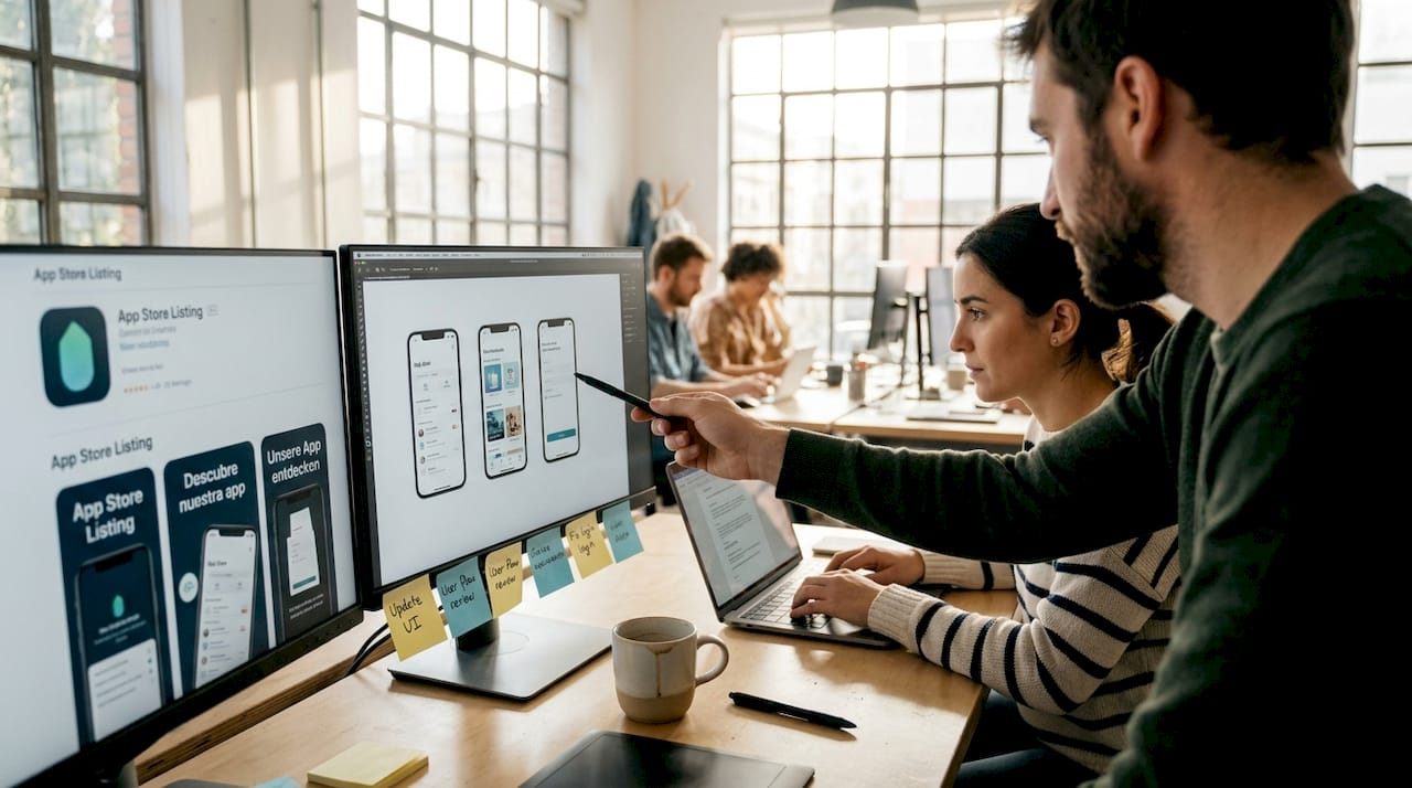
The order of your screenshots matters enormously. Your first screenshot should showcase your single most compelling feature or benefit, not a generic welcome screen. Users make decisions in seconds, and screenshot best practices confirm that leading with your strongest value proposition is the highest-impact change you can make.
Here is a practical process for building a high-converting screenshot set:
- Lead with your core benefit. Frame screenshot one around the problem your app solves.
- Use short, bold text overlays. Keep captions under six words. Make the benefit obvious at a glance.
- Show real UI. Authentic interface screenshots outperform stock imagery or illustrated mockups.
- Use device mockups. Placing your UI inside a clean 3D device frame adds professionalism and context.
- Maintain visual consistency. Use the same color palette, font, and tone across all screenshots.
“The apps that convert best treat their screenshot set like a mini ad campaign, not a feature list.”
Pro Tip: Tools like the AppScreenKit screenshot generator let you drop your UI into professional 3D device mockups and export all required sizes in one click. For indie developers without a design team, that kind of speed is a genuine competitive advantage.
Strategic localization: Unlock new markets
Once your screenshots are optimized, next-level app growth comes from targeting new audiences with strategic localization. Most indie developers skip this step entirely, which means the opportunity is wide open.
Localization is not just translating your app description. It means adapting your screenshots, text overlays, and metadata for specific regions and languages. The results are significant. Localization boosts CVR by 15 to 40% on average, and full UI localization in non-English markets can push that lift to 30 to 50%. Meanwhile, top apps localize for 75 to 96% of their target markets and use Custom Product Pages (CPPs) to achieve an additional 25 to 45% conversion lift.
For indie developers, you do not need to localize everywhere at once. Prioritize strategically:
- Japanese and Korean markets respond strongly to polished, detail-rich visuals.
- German and French markets expect localized text in screenshots, not just the app description.
- Spanish-speaking markets are large and often underserved by indie apps.
- Brazilian Portuguese is distinct from European Portuguese and worth treating separately.
The table below shows how localization depth affects conversion rates by region:
| Region | Basic localization (text only) | Full visual localization | Full UI localization |
|---|---|---|---|
| Japan | +15% CVR | +30% CVR | +45% CVR |
| Germany | +12% CVR | +25% CVR | +38% CVR |
| Brazil | +18% CVR | +32% CVR | +50% CVR |
| France | +10% CVR | +22% CVR | +35% CVR |
Even basic localization of your screenshot text overlays can unlock meaningful growth in markets where your app currently has zero presence.
Leverage free tools and AI for rapid iterations
Localization can feel daunting, but free tools and rapid iteration can make even complex visual changes manageable and consistently rewarding. The good news is that you do not need a big budget to test and improve your visuals continuously.
Free tools like Canva and Figma, combined with AI tools like ChatGPT for generating copy ideas, give indie developers a fast prototyping workflow at zero cost. The key is not to perfect your visuals once and move on. The key is to treat your app listing as a living asset that you improve every week.
Here is a practical iteration workflow for small teams:
- Week 1: Audit your current screenshots against the top three competitors in your category.
- Week 2: Redesign your first two screenshots using the benefit-first framework.
- Week 3: Run an A/B test using your app store’s built-in testing tools.
- Week 4: Track your top 10 keywords weekly and note any ranking shifts.
- Ongoing: Localize one new market per month, starting with the highest-traffic region.
Pro Tip: Long-tail keywords (three to five word phrases) are far less competitive than broad terms and often convert better because they attract users with specific intent. Pair keyword tracking with visual updates using the AppScreenKit visual iteration tools to see which changes drive the most measurable lift.
The compounding effect of consistent iteration beats a single big redesign every time. Small weekly improvements add up to significant ranking and conversion gains over a quarter.
Visual strategy comparison: Which moves boost your metrics fastest?
With individual strategies explored, let’s compare their impact side by side so you can prioritize your next move. Not every tactic delivers the same return for the same effort, and as an indie developer, your time is your most limited resource.
It is worth noting that 65 to 70% of downloads come from organic search, and average conversion rates sit at 28 to 33% on the App Store and 23 to 28% on Google Play. That means visual and ASO improvements directly affect the majority of your potential downloads.
| Strategy | Conversion impact | Effort level | Cost |
|---|---|---|---|
| Icon optimization | CTR +8 to 12% | Low | Free to low |
| Screenshot redesign | CVR +18 to 60% | Medium | Free to low |
| Basic localization | CVR +15 to 40% | Medium | Free to low |
| Full UI localization | CVR +30 to 50% | High | Low to medium |
| Iterative A/B testing | Compounding gains | Low (ongoing) | Free |
Based on this breakdown, here is how to sequence your efforts:
- Start with screenshots. Highest impact, medium effort, and directly testable.
- Fix your icon next. Low effort, measurable CTR gains, and a one-time investment.
- Add basic localization. Pick one high-value market and localize your screenshot text.
- Build an iteration habit. Weekly tracking and monthly updates compound over time.
The developers who grow fastest are not the ones who launch perfectly. They are the ones who improve consistently.
Bring your app visuals to life: Next steps with AppScreenKit
Now that you know which visual strategies matter most, here is how to take action with a tool built for indie dev agility. Creating professional screenshots used to mean hiring a designer or spending hours in Figma. That is no longer the case.
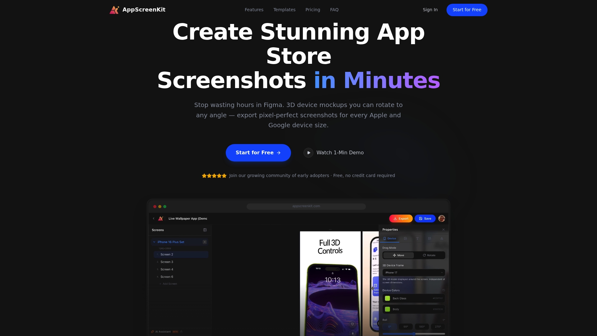
AppScreenKit is built specifically for indie developers and small teams who need polished, store-ready visuals without the overhead. You can upload your app UI, place it inside true 3D device mockups that rotate in real space, add branded text and gradient backgrounds, and export pixel-perfect screenshots for every required device size in a single click. No design skills needed. No manual resizing. No rejection headaches. The free starter plan lets you get started immediately, so you can implement everything covered in this article today, not next sprint.
Frequently asked questions
How much can app icons really affect downloads?
Optimized icons can boost click-through rates by 8 to 12%, which leads to improved search rankings and more organic downloads over time.
Are localized screenshots worth it for indie apps?
Yes. Localizing screenshots can boost conversion rates by 15 to 40%, making it especially valuable for non-English markets where competition from indie apps is lower.
What free tools should small teams use for app visuals?
Canva and Figma are strong starting points for visual design, and AI tools like ChatGPT help generate screenshot copy ideas quickly and at no cost.
Is screenshot optimization more effective than paid ads?
For indie developers, ASO and screenshot optimization typically deliver better long-term ROI than paid user acquisition, especially early on, because the gains compound with every iteration.
Leave a Reply