TL;DR:
- Strong visuals on Google Play significantly increase app conversion rates, with testing boosting performance.
- Adhere to Google’s technical specs for icons, feature graphics, screenshots, and videos to avoid rejections.
- Consistent, benefit-focused assets that tell a cohesive visual story outperform feature-centric designs.
Your app could be exceptional, but if your Google Play visuals are weak, most users will never find out. Average U.S. conversion rates on Google Play hover around 27%, and the gap between a high-converting listing and a forgettable one almost always comes down to visuals. This guide walks you through every asset you need: icons, feature graphics, screenshots, and promo videos. You’ll learn the exact specs, design principles, and testing methods that turn browsers into installs, without needing a dedicated design team or expensive software.
Table of Contents
- Google Play visual asset requirements and tools
- Step-by-step: Designing app icons and feature graphics
- Step-by-step: Creating high-impact screenshots and promo videos
- A/B testing and optimizing Google Play visuals for conversion
- Our hard-won lessons for high-performing Google Play visuals
- Level up your Google Play visuals with AppScreenKit
- Frequently asked questions
Key Takeaways
| Point | Details |
|---|---|
| Get asset specs right | Follow Google Play’s exact specifications for icons, feature graphics, screenshots, and videos to avoid common rejection reasons. |
| First impressions win installs | Focus on your icon and the first three screenshots, since most potential users decide within seconds. |
| Always A/B test visuals | Regular A/B testing of icons and screenshots can increase conversion rates by up to 20%. |
| Consistency builds trust | Keep colors, branding, and messaging consistent across all visual assets for stronger user trust and retention. |
| Avoid policy pitfalls | Never include rankings, badges, or misleading text—policy violations may lead to app rejection or delisting. |
Google Play visual asset requirements and tools
Before you open any design tool, you need to know exactly what Google expects. Every asset type has strict technical requirements, and submitting the wrong format or size will get your listing rejected or display incorrectly across devices.
Here’s a quick overview of the four core visual asset types:
| Asset | Size | Format | Notes |
|---|---|---|---|
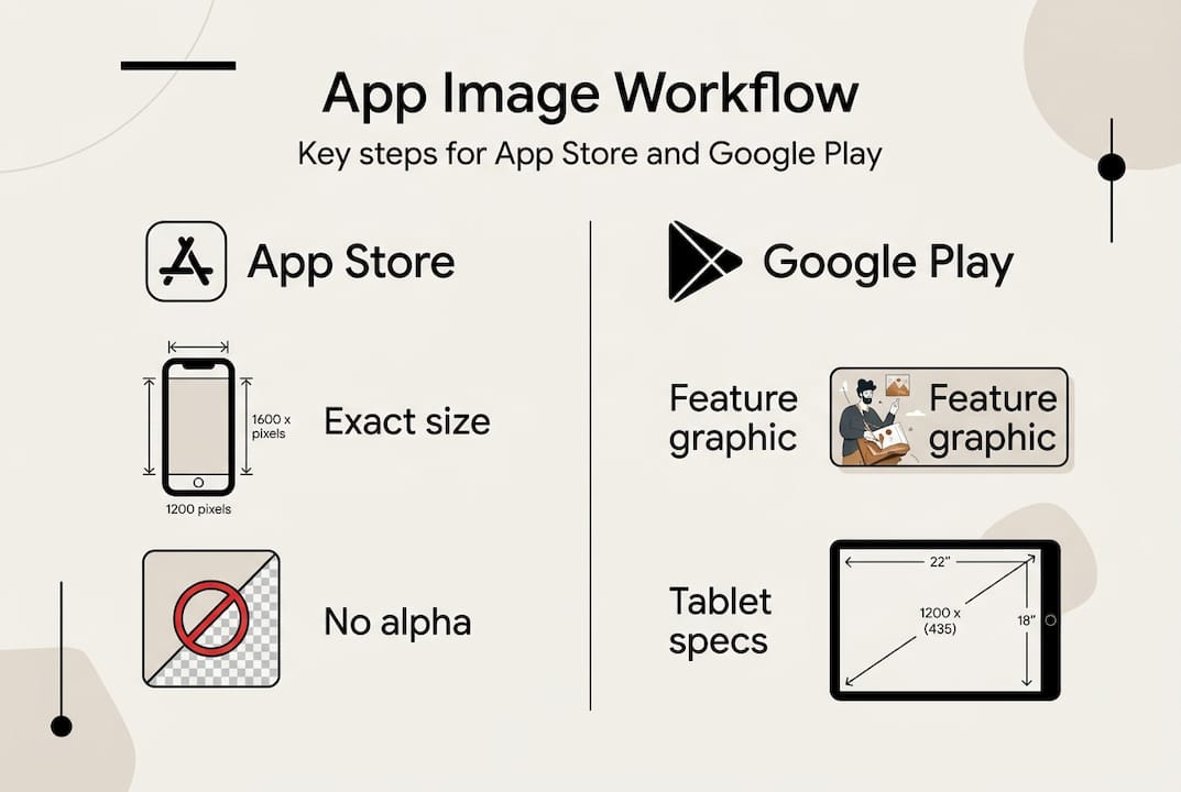
| App icon | 512x512px | 32-bit PNG | No rounded corners applied by you |
| Feature graphic | 1024x500px | JPG or PNG | Used in featured placements |
| Screenshots | Varies by device | JPG or PNG | Up to 8 per device type |
| Promo video | 30s to 2 min | YouTube link | Landscape or portrait |
According to Google’s icon specifications, app icons must be 512x512px PNG, feature graphics 1024x500px, and promo videos between 30 seconds and 2 minutes. Screenshots allow up to 8 per device type, giving you room to tell a full story.
For tools, small teams don’t need enterprise software. Here’s what works well:
- Figma for vector-based icon and graphic design
- AppScreenKit for fast, professional screenshot creation with 3D mockups
- Canva for quick feature graphic drafts
- Google Play Console for asset library management and organizing assets across experiments
The Play Console asset library is underused by most indie developers. It lets you store, reuse, and swap visuals across store listings, event listings, and A/B tests without re-uploading every time. If you’re serious about boosting Google Play downloads, building an organized asset library from day one saves hours later.
Pro Tip: Upload multiple icon and screenshot variants to your asset library before you launch. That way, when you’re ready to run experiments, you’re not scrambling to create new assets under pressure.
One more thing worth noting: assets are not one-size-fits-all across device types. Phone, tablet, Chromebook, and Android TV each have their own screenshot dimensions. Plan for this early so you’re not manually resizing everything at the last minute. Good store conversion optimization starts with having the right assets ready for every surface.
Step-by-step: Designing app icons and feature graphics
Your icon is the first thing a user sees in search results. Your feature graphic appears when your app is featured or displayed in certain Play Store layouts. Both need to work hard and fast.
Designing your app icon
- Start with a 512x512px canvas in your design tool.
- Use a simple, recognizable shape. Avoid text inside the icon if possible.
- Pick one or two brand colors. High contrast improves visibility at small sizes.
- Test your icon at 48px and 96px to simulate how it looks in search results.
- Export as a 32-bit PNG with alpha channel, under 1024KB.
Google’s icon design specifications are clear: icons must be square, avoid misleading elements, and should not include rankings, badges, or promotional text. Violating these rules triggers rejection, and it happens more often than developers expect.
Pro Tip: Keep your icon consistent with your in-app branding. Users who install your app after seeing the icon should feel visual continuity immediately. Inconsistency erodes trust fast.
Designing your feature graphic
The feature graphic is 1024x500px and often appears without your icon next to it, so it needs to stand alone. Feature graphics should centralize key visual elements and avoid white or dark gray backgrounds, which tend to disappear into the Play Store’s UI.
- Place your primary visual (product image, character, or device mockup) in the center third.
- Use vibrant, brand-aligned colors that create contrast.
- Keep text to a minimum. A tagline of five words or fewer is ideal.
- Avoid badges, star ratings, or pricing callouts. These violate policy.
- Export at full resolution with no compression artifacts.
“Your feature graphic is a billboard, not a brochure. One clear message, one strong visual, nothing else.”
A common mistake is treating the feature graphic like a screenshot with extra space. It’s not. Think of it as a brand impression, not a product demo. For a full listing optimization checklist that covers both of these assets, it helps to work through each element systematically.
If you’re building for multiple markets, consider using a design localization plugin to adapt text and imagery for different regions without starting from scratch. Localized visuals consistently outperform generic ones in non-English markets.
| Element | Icon priority | Feature graphic priority |
|---|---|---|
| Brand color | High | High |
| Text | Avoid | Minimal |
| Central focus | Shape/symbol | Product or character |
| Policy risk | Badges, rankings | Badges, pricing, vulgarity |
For visual marketing strategies that go beyond the basics, thinking about icon and feature graphic as a coordinated pair rather than separate assets is a mindset shift that pays off.
Step-by-step: Creating high-impact screenshots and promo videos
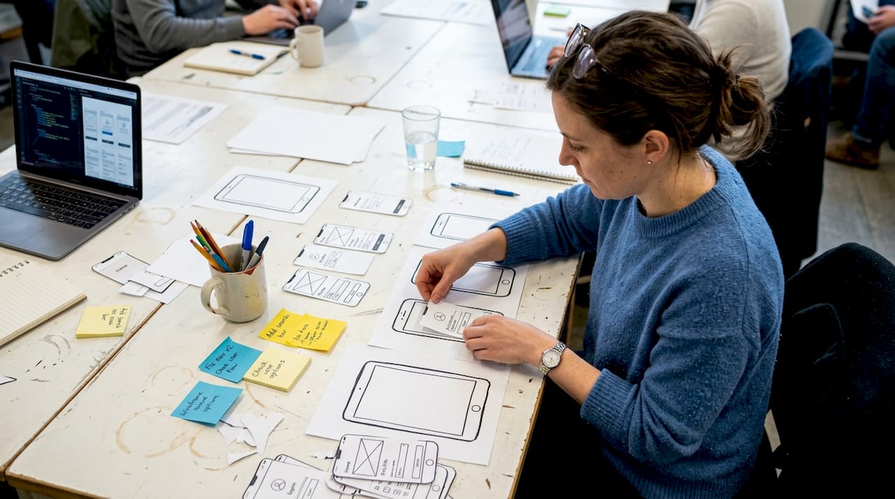
Screenshots and promo videos are where you actually sell the experience of using your app. Done right, they answer the user’s core question: “Will this app solve my problem?”
Screenshot strategy
The first 3 screenshots are critical because 90% of users don’t scroll past the third one. That means your most compelling value proposition needs to appear in slots one through three, not buried at the end.
Here’s how to sequence them:
- Screenshot 1: Lead with the single biggest benefit, not a feature list.
- Screenshot 2: Show the core UI in action with a real use case.
- Screenshot 3: Address a common objection or highlight a secondary benefit.
- Screenshots 4 to 8: Go deeper for users who are already interested.
Google’s screenshot guidelines require that screenshots highlight core features with minimal text, be localized where possible, and contain no rankings, badges, or inappropriate content. Keep overlay text short, readable, and in a font size that holds up on small screens.

For an efficient image launch workflow, plan your screenshot narrative before you start designing. Write out the story you want to tell across all 8 slots, then design to match it.
Pro Tip: Show outcomes, not just screens. “Save 2 hours a week” performs better than “View your schedule” as screenshot copy. Users buy results.
Promo video guidelines
Videos must be 30 seconds to 2 minutes and hosted on YouTube. Your hook needs to land in the first 5 seconds or you’ve lost the viewer. Use real app footage, not animated mockups, and add captions because most users watch without sound.
Avoid these common mistakes:
- Opening with a logo animation (wastes your 5-second hook window)
- Showing too many features without connecting them to user outcomes
- Forgetting captions for silent autoplay
- Using pricing or promotional claims that may become outdated
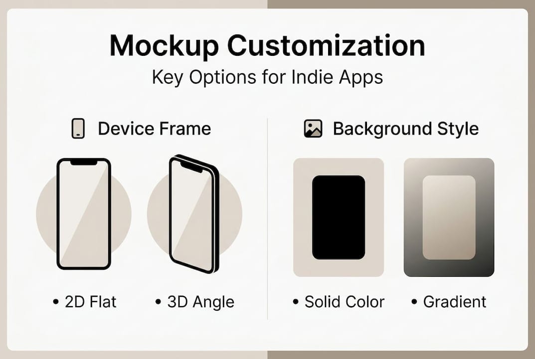
For more on promo video best practices, Google’s own documentation covers format requirements in detail. Pair that with strong mockup customization tips to make your in-video device frames look polished and professional.
A/B testing and optimizing Google Play visuals for conversion
Publishing your assets is not the finish line. It’s the starting line. The real gains come from systematic testing and iteration.
Setting up visual A/B tests in Play Console
- Navigate to “Store Presence” then “Store Listing Experiments” in Play Console.
- Choose the asset you want to test: icon, screenshots, or feature graphic.
- Set your traffic split (typically 50/50 for clean data).
- Define a hypothesis before you start. Example: “Outcome-focused screenshot copy will outperform feature-focused copy.”
- Run the test for at least 7 days to account for day-of-week variation.
A/B tests on icons and screenshots yield conversion lifts between 2% and 20%. That range is wide because the quality of your hypothesis matters as much as the test itself. Vague tests produce vague results.
“Test one change at a time for true wins. Changing your icon and screenshots simultaneously makes it impossible to know what moved the needle.”
| What to test | Why it matters | Expected lift range |
|---|---|---|
| Icon color or shape | First impression in search | 2 to 10% |
| Screenshot order | Narrative clarity | 5 to 15% |
| Outcome vs feature copy | User relevance | 5 to 20% |
| Feature graphic style | Featured placement CTR | 2 to 8% |
After a test concludes, don’t just look at install rate. Check retention at day 1 and day 7. A visual that drives installs but attracts the wrong users will hurt your overall metrics. The asset library management tool in Play Console makes it easy to swap in winning variants without rebuilding your listing.
Pro Tip: Keep a testing log. Document every experiment, hypothesis, result, and what you learned. Patterns emerge over time that you’d never catch by testing in isolation.
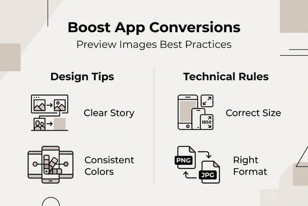
For deeper reading on what moves the needle, preview image conversion tips and visual download strategies are worth bookmarking as ongoing references.
Our hard-won lessons for high-performing Google Play visuals
Here’s something most guides won’t tell you: the biggest mistake developers make isn’t technical. It’s conceptual. They design visuals that showcase what their app does instead of what their app achieves for the user. Features are internal. Benefits are external. Users only care about the external.
Consistency across your icon, screenshots, feature graphic, and video is also more powerful than most developers realize. When all four assets feel like they belong to the same brand, trust builds instantly. When they look like they were made by four different people on four different days, doubt creeps in.
Policy compliance is not optional and not always obvious. Subtle violations like a faint star rating in a screenshot background or slightly misleading icon imagery can trigger rejection weeks after launch. Build a habit of reviewing the checklist for higher CVR before every update.
Here’s the contrarian take: early in your app’s lifecycle, your icon and screenshots drive far more impact than your promo video or feature graphic. Most users never see the feature graphic unless your app is featured. Invest your time where users actually look first.
Level up your Google Play visuals with AppScreenKit
If applying everything in this guide sounds like a lot of work, it doesn’t have to be. AppScreenKit is built specifically for developers and small teams who want professional-grade Play Store visuals without the design overhead.
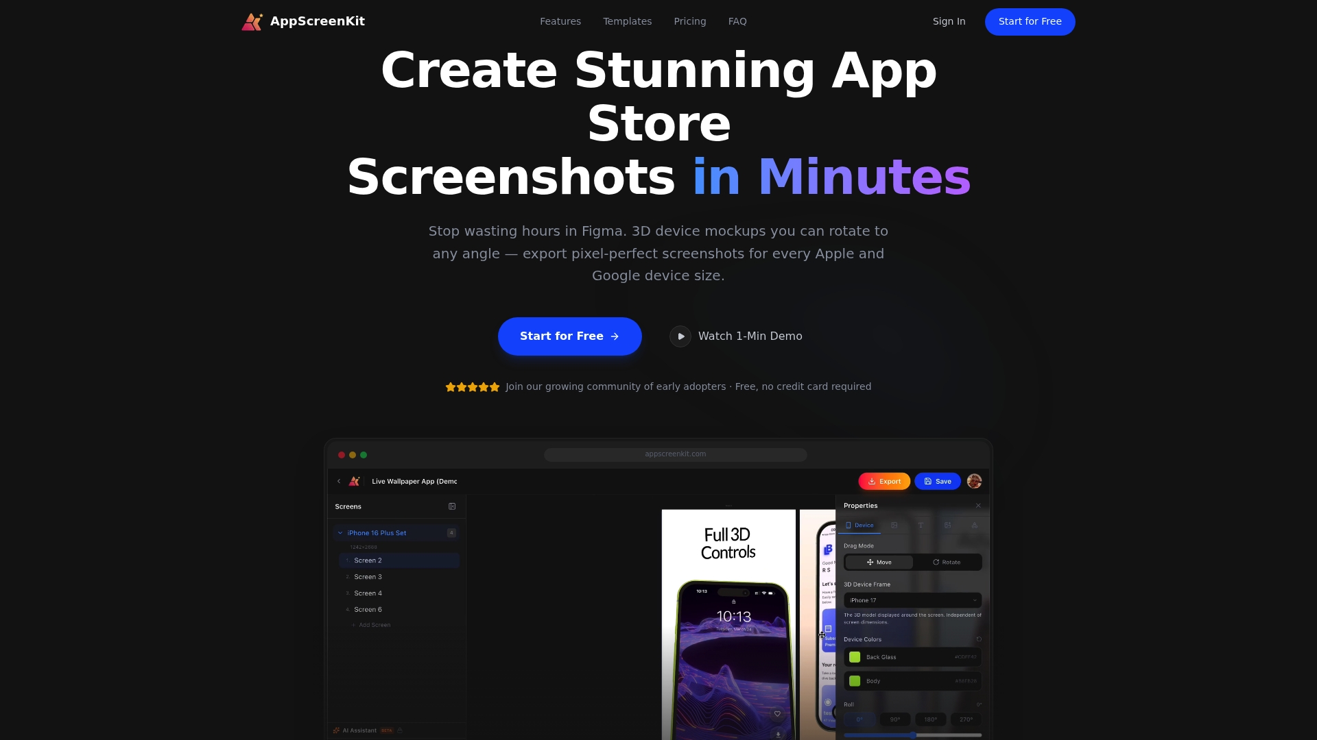
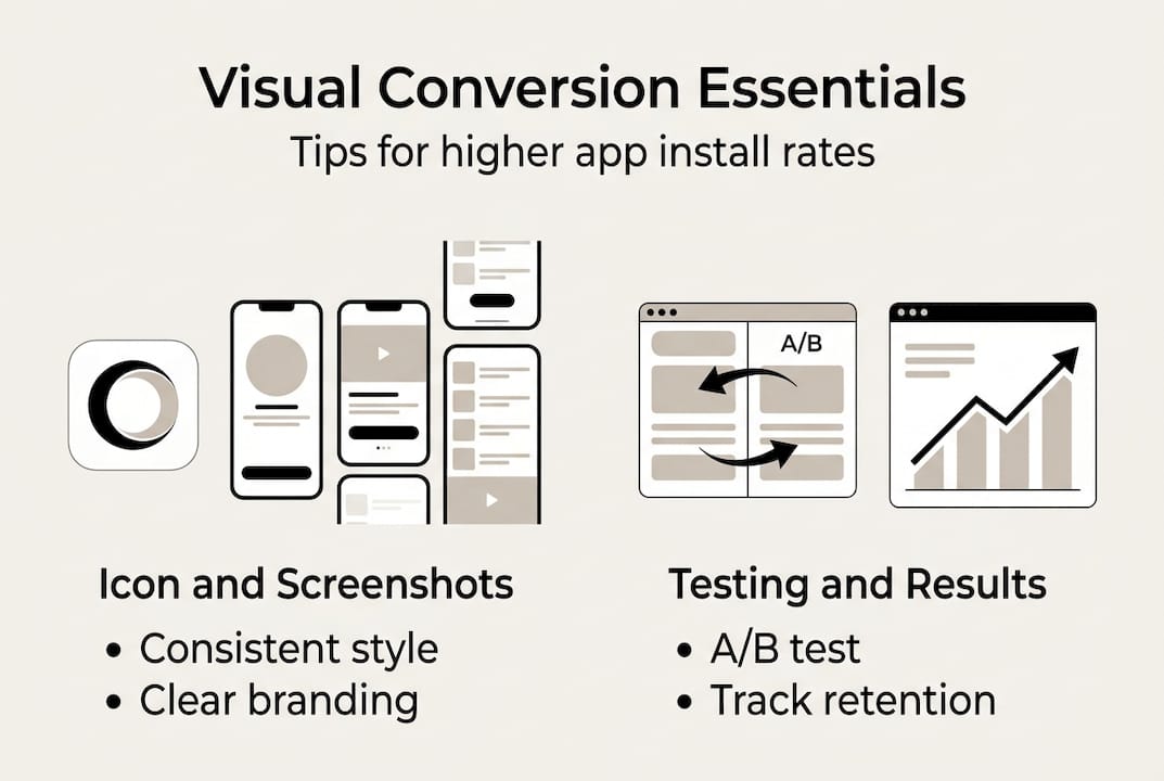
You can create pixel-perfect screenshots with 3D device mockups, add branded text and gradient backgrounds, and export every device size in one click. Start with the store listing checklist to audit what you already have, then use the preview image conversion guide to prioritize what to fix first. When you’re ready to go deeper, the smarter visuals guide covers advanced strategies for sustained download growth. AppScreenKit’s free starter plan lets you get started today with no design skills required.
Frequently asked questions
What are the technical requirements for Google Play app icons?
App icons must be 512x512px PNG, 32-bit with alpha channel, under 1024KB, and square without misleading elements or rounded corners applied by the developer.
How many screenshots should I use in my Google Play listing?
You can upload up to 8 per device type, but prioritize the first three since 90% of users never scroll past the third screenshot.
What makes a good feature graphic for Google Play?
A strong feature graphic uses vibrant colors, centers the main visual element, and keeps text minimal. Avoid badges and white or dark gray backgrounds that blend into the Play Store UI.
How should I design promo videos for Google Play?
Keep videos between 30 and 120 seconds, deliver your hook in the first 5 seconds, use landscape orientation, and always add captions for users watching without sound.
How can I optimize visuals for higher conversion rates?
Run A/B tests in Play Console targeting icons and screenshots, test one variable at a time, and use outcome-focused designs. Icon and screenshot tests typically yield conversion lifts between 2% and 20%.