Author: admin

  • App Store Rejection Explained: Causes, Fixes, and Tips

    App Store Rejection Explained: Causes, Fixes, and Tips


    TL;DR:

    • App store rejections mainly result from technical issues, privacy violations, or misleading content.
    • Common reasons include crashes, poor metadata, privacy breaches, and non-compliance with platform guidelines.
    • Most rejections are fixable through careful review, documented updates, and prompt resubmission.

    About one in four apps submitted to Apple’s App Store gets rejected on the first try. In 2024, 1.93 million apps were turned away out of 7.77 million submissions. For a small team or solo developer, a rejection doesn’t just sting — it delays revenue, drains momentum, and can feel completely mysterious without the right context. The good news is that most rejections share predictable patterns. This guide breaks down what app store rejection actually means, the most common causes on both Apple and Google Play, hidden traps that surprise even veteran developers, and a step-by-step recovery plan to help you get approved faster.

    Table of Contents

    Key Takeaways

    Point Details
    App store rejection is common About a quarter of submissions face rejection but can often be fixed with careful review.
    Know the major pitfalls Performance, privacy, and metadata issues are the leading causes on both Apple and Google Play.
    Address subjective criteria Design standards, edge-case rules, and communication with reviewers are just as important as technical checks.
    Recovery is possible Most rejected apps succeed on resubmission if clear fixes and notes are provided.
    Proactive preparation pays off Using tools, checklists, and real-device testing reduces surprises at review time.

    What app store rejection means (and why it happens)

    App store rejection is not a life sentence. It’s a formal notice that your submission didn’t meet a platform’s standards in one or more areas — and understanding which platform you’re dealing with shapes everything about how you respond.

    Apple’s process is manual and expert-driven. Every submission gets reviewed by a human evaluator who checks your app against the App Store Review Guidelines, covering technical performance, content appropriateness, privacy compliance, and design quality. Apple reviewers have real authority to reject apps they feel are low-effort, even if no single rule is technically broken.

    Google Play uses a hybrid model. Automated tools handle the first pass, scanning for malware, policy violations, and obvious compliance gaps. Human reviewers step in for more nuanced cases. Google Play rejections happen when an app violates Developer Program Policy, which is a detailed rulebook covering content, monetization, privacy, and user safety.

    Here’s a quick comparison of how both platforms approach review:

    Factor Apple App Store Google Play
    Review type Manual (human-first) Hybrid (automated + human)
    Primary focus Design quality, performance Policy compliance, security
    Review time 1 to 7 days typically Hours to a few days
    Rejection notice Detailed reviewer notes Resolution Center alerts
    Resubmission Allowed after fixes Allowed after fixes

    “A rejection is not the end of the road — it’s a specific note about what needs to change. Most apps that get rejected do eventually get approved after revision.”

    Both platforms share some common ground: crashes, incomplete metadata, and privacy non-compliance will get you rejected on either store. But Apple’s quality bar is more subjective, while Google leans harder on policy specifics. Understanding this distinction helps you figure out app store compliance essentials before you even click submit. Reviewing submission rules and visuals in advance saves you from the most avoidable mistakes.

    Top reasons apps get rejected: Apple vs. Google Play

    Knowing why apps fail is the fastest shortcut to preventing rejection. The patterns are surprisingly consistent.

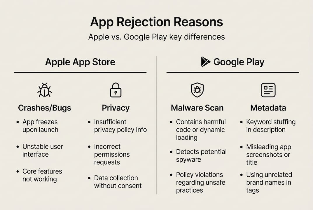
    Apple organizes its review criteria into five categories: Safety, Performance, Business, Design, and Legal. In 2024, performance was the top rejection driver, with 1.23 million rejections linked to crashes and technical issues. Legal (privacy and data collection), design, and business-model violations rounded out the top causes.

    Google Play’s most common rejection triggers look slightly different:

    • Restricted content: Adult content, gambling features, or regulated goods without proper approvals
    • Privacy policy violations: Missing or misleading data disclosures
    • Excessive permissions: Requesting access to device features unrelated to the app’s core purpose
    • Device compatibility issues: Apps that fail on specific screen sizes or OS versions
    • Metadata policy violations: Keyword stuffing in the title or misleading screenshots

    Here’s a side-by-side breakdown of the most common rejection reasons:

    Rejection category Apple App Store Google Play
    App crashes/bugs Very common Common
    Privacy/data issues Top 3 reason Common
    Misleading metadata Common Very common
    Low-effort/duplicate apps Common Moderate
    Permissions overreach Moderate Very common
    Content policy violation Moderate Very common

    Infographic comparing Apple and Google app rejection reasons

    One edge case that trips up a lot of developers: Apple requires that iPhone apps also run well on iPad unless you explicitly restrict compatibility. A forgotten iPad layout or broken UI can tank an otherwise solid submission. Another surprise: Google has ramped up AI-powered spam detection, flagging apps that look auto-generated or reuse templated content without original functionality.

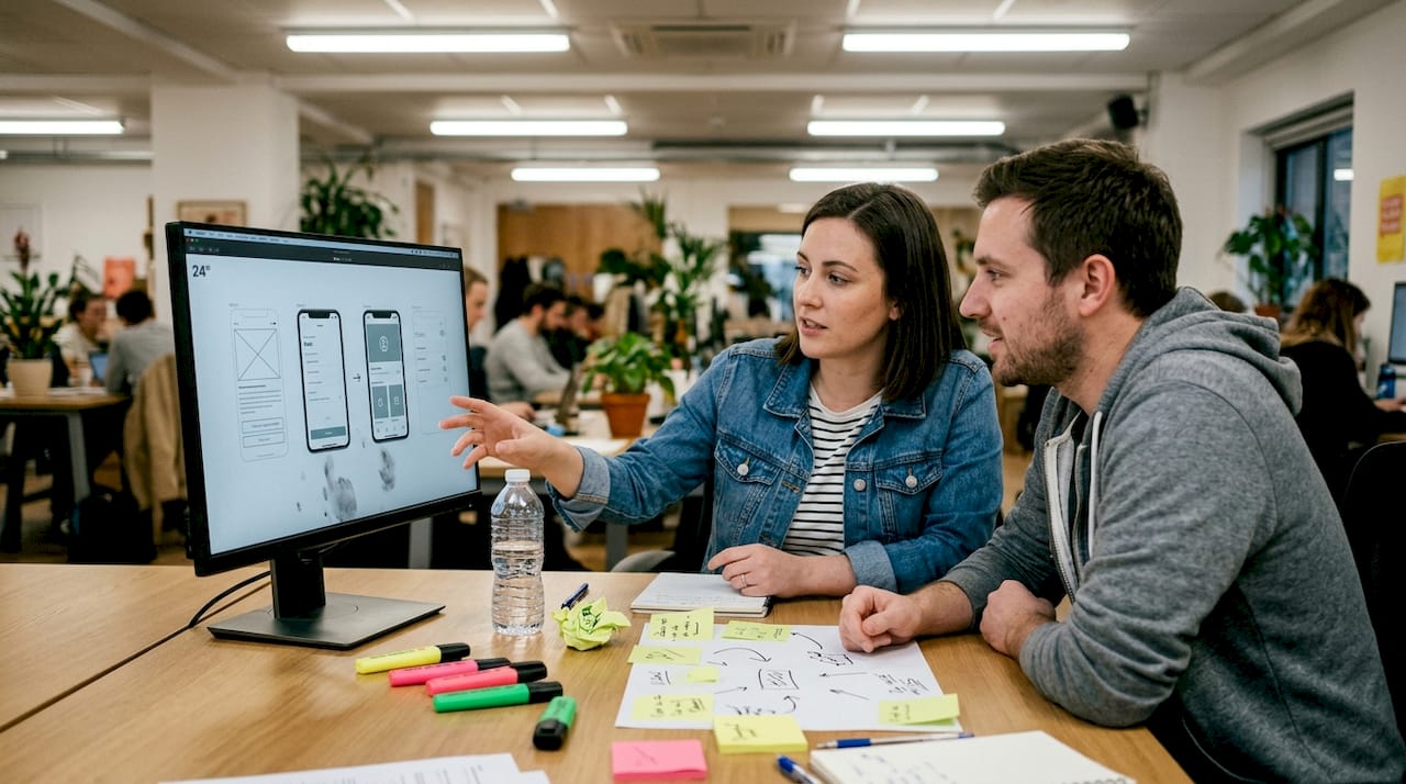
    For teams focused on improving listing quality, it’s worth noting that screenshots and preview images are reviewed too. Misleading visuals or images that don’t match the actual app are an increasingly common reason for rejection. If you’re preparing your first launch, a step-by-step indie submission guide will help you sequence everything correctly.

    Team discussing app screenshots review on monitor

    What most developers miss: hidden traps and gray areas

    The obvious rejection causes get plenty of coverage. The ones below? Not so much.

    One of the most consistent hidden traps is the guest mode requirement. Apple expects apps with account-based features to offer a way for reviewers to explore the app without creating an account. Skip this, and a reviewer who can’t test the app’s functionality will reject it outright. Many first-time developers don’t learn this until their first rejection email arrives.

    Edge cases like IPv6 networking, mandatory preview modes, and iPad compatibility issues regularly catch even experienced teams off guard. Apple’s test environments use IPv6-only networks, so apps that rely exclusively on IPv4 will fail connectivity checks during review.

    Here are the hidden traps worth adding to your preflight checklist:

    1. No guest/demo mode: Reviewers need access to your app’s core features without having to sign up
    2. Inaccurate privacy nutrition labels: Claiming you collect less data than you actually do is a fast path to rejection
    3. WebView wrapper apps: Apps that are just websites wrapped in a shell browser rarely pass Apple’s minimum functionality standard
    4. Incomplete iPad support: Your iPhone app needs to either support iPad layouts or explicitly declare it won’t run on iPad
    5. Broken external links in metadata: App description links that return errors signal a low-quality submission
    6. AI-generated placeholder content: Google’s spam filters are increasingly good at detecting apps built on bulk-generated templates

    The subjective category is also worth understanding. Apple reserves the right to reject apps it considers “copycat” designs or apps that duplicate existing functionality without adding clear value. There’s no hard rule for this, which is exactly what makes it dangerous. Your listing checklist should include a self-audit of how your app differentiates itself.

    Pro Tip: Before submitting, have someone unfamiliar with your app try to use it cold, without any instructions. If they can’t figure out the core feature within 60 seconds, a reviewer probably won’t either. Check the latest visual trends 2026 to make sure your screenshots reflect modern standards and don’t look templated.

    How to recover: fixing, documenting, and resubmitting your app

    Getting rejected isn’t failure. It’s feedback. In 2024, roughly 295,000 apps were approved after initial rejection. The recovery process is learnable.

    Here’s a clear path through it:

    1. Read the rejection notes carefully: Apple provides specific guideline numbers. Find the exact rule you violated before assuming you understand the fix
    2. Reproduce the issue on a real device: Simulators miss things. Test on actual hardware matching the reviewer’s specs when possible
    3. Fix only what the notes describe: Submitting unrelated changes alongside fixes can trigger new review flags
    4. Document every change you made: Keep a changelog of what you fixed and why — this becomes your resubmission message
    5. Write a clear note to the reviewer: Use the resolution center or resubmission notes field to explain what changed and why it resolves the flagged issue
    6. Resubmit promptly: Long delays between rejection and resubmission can complicate the review cycle

    The reviewer note is where most developers give up too much ground. A well-written resubmission note as per guidelines that cites specific changes and links them to the reviewer’s original concern dramatically improves your odds of a clean second review.

    For Google Play, the Resolution Center is your primary communication channel. Use it clearly and without arguing. State the change, reference the policy section, and keep it brief.

    Pro Tip: Build your app launch workflow to include a pre-submission testing phase on real devices. It catches the crashes and UI issues that tank most first-round submissions. Also revisit your preview images optimization before resubmitting — screenshots that look mismatched or outdated can signal to reviewers that the app itself might be similarly neglected.

    Key things to verify before every resubmission:

    • All reviewer-flagged items are resolved
    • Privacy labels are accurate and current
    • App works on the oldest supported OS version you declared
    • Metadata (title, description, keywords) is accurate and policy-compliant
    • Screenshots and previews match the current build

    Why common-sense isn’t enough: lessons from hard-won experience

    Here’s something most submission guides won’t say out loud: every app gets rejected for its own unique combination of reasons, even when developers follow every checklist. The review process has a subjective layer that no amount of rule-reading fully prepares you for.

    We’ve seen apps with clean code, accurate metadata, and beautiful screenshots get rejected because a reviewer felt the UX lacked clarity or the value proposition wasn’t obvious enough. That’s not a technical problem. It’s a human judgment call. The developers who survive this consistently are the ones who simulate real-world usage before submitting, who over-communicate with reviewers instead of just patching code, and who treat every submission as a learning cycle rather than a final exam.

    The mindset shift that actually moves the needle: stop submitting the minimum viable app and start submitting the version you’d be proud to show a skeptical user in 30 seconds. Reviewers notice effort. Following marketing tips for 2026 also helps you align your visuals and messaging with what users and reviewers both respond to. Cut no corners, own every detail, and each submission gets sharper.

    Smart tools for boosting your app store approval

    Getting your app through review isn’t just about code. Visual compliance matters too, and poor screenshots or non-standard mockups can trigger rejection or suppress conversions even after approval.

    https://appscreenkit.com

    AppScreenKit is built specifically to help developers and small teams create pixel-perfect, compliant app store screenshots without needing a designer. Generate properly sized visuals for every device with a single click, use up-to-date templates aligned with the latest submission requirements guide, and stay current with visual trends for 2026. Start with the free plan at the App Store Screenshot Generator and remove visual rejection risk from your next submission.

    Frequently asked questions

    How long does the app store review process usually take?

    Apple’s review typically takes 2 to 7 days due to manual evaluation, while Google Play can process a submission in a few hours through automated checks, though human review can extend that timeline significantly.

    What’s the most common reason for app rejection?

    Performance issues like crashes and incomplete metadata top the list on both platforms, with 1.23 million Apple rejections in 2024 tied to performance alone.

    Is an app store rejection permanent?

    No. Most rejections are fully reversible. Developers receive detailed notes and can resubmit after addressing the flagged issues, and 295,000 apps gained approval after revision in 2024 alone.

    Make sure your privacy labels accurately reflect all data your app collects, and review the legal privacy guidelines before every submission since they update regularly.

    What can get a Google Play app suspended instead of just rejected?

    Repeated policy violations, severe security risks like malware, or intellectual property infringement can escalate from a simple rejection to a full account suspension.

  • Why app screenshots get rejected and how to fix it

    Why app screenshots get rejected and how to fix it


    TL;DR:

    • Accurate, current screenshots that reflect the live app are essential to avoid rejection.
    • Content violations include misleading visuals, prohibited text, and mismatched platform frames.
    • Following technical standards and a disciplined workflow significantly reduces re-submission delays.

    You’ve built a solid app. The code is clean, the UX is polished, and you’re ready to ship. Then the rejection email lands in your inbox, not because of a bug or a policy violation in your app logic, but because of your screenshots. It’s one of the most frustrating moments in app development, and it happens to developers at every level. The good news: the vast majority of screenshot rejections stem from a small set of fixable mistakes. Understand those mistakes, and you can cut your submission cycle significantly and get your app in front of users faster.

    Table of Contents

    Key Takeaways

    Point Details
    Show real app UI Screenshots must represent the current, real app—not mockups or outdated designs.
    Avoid prohibited content Never include pricing, outside trademarks, or promotional text in your store images.
    Pass technical checks Use correct formats, dimensions, and high-resolution images to pass both manual and automated reviews.
    Stay updated Adapt screenshots after every major UI update and review the latest store guidelines.

    The main reasons screenshots get rejected

    Both the Apple App Store and Google Play maintain strict rules around what screenshots can and cannot show. The core principle for both platforms is accuracy. Your screenshots must show what the app actually does, not what you wish it did, not a polished mockup, and not a feature you’re planning to release next quarter.

    Apple’s guidelines are explicit here. Apple App Store guidelines state that screenshots must accurately reflect the app’s actual functionality and UI, not mockups, future features, or misleading representations (Guideline 2.3). That means if your screenshots show a dashboard view that isn’t in the binary being submitted, you’re going to get rejected. Period.

    Google Play holds the same standard. Google Play screenshot policies require that screenshots accurately represent the app, with no misleading imagery, no iOS-style device frames on Android submissions, no low-resolution images, and no prohibited text like rankings or pricing claims.

    Here’s what tends to catch developers off guard:

    • Mockup images: Showing a beautifully designed concept that isn’t the real UI
    • Future features: Highlighting functionality that isn’t live in the submitted version
    • Outdated UI: Submitting screenshots from an older version after a design overhaul
    • Platform frame mismatches: Using iPhone frames in Google Play submissions
    • Promotional claims: Including star ratings, “#1 App” badges, or pricing text
    • Third-party trademarks: Displaying logos or branded content you don’t have rights to

    Apple and Google both treat misleading screenshots as a form of misrepresentation, not just a formatting issue. This means reviewers can reject your entire submission, not just flag the screenshots.

    Understanding the full scope of app store requirements across both platforms before you finalize your visuals is the single most effective way to avoid this category of rejection.

    One key nuance: Apple tends to use human reviewers for screenshot compliance, while Google Play increasingly relies on automated systems. This means Apple rejections often come with detailed feedback, while Google Play may simply flag your upload without much explanation. Knowing which platform you’re dealing with shapes how you troubleshoot.

    Critical content and design violations to avoid

    Let’s get specific about the types of content that will get your screenshots pulled, because the details matter more than most developers realize.

    Apple’s guidelines (specifically 2.3.7, 2.3.8, and 2.3.10) prohibit screenshots containing pricing information, non-iOS references, third-party trademarks, or age-inappropriate material. Even a small price tag graphic in the corner of a screenshot qualifies as prohibited pricing content. One restricted element is enough to trigger rejection.

    Here’s a quick comparison to keep handy:

    Element Apple App Store Google Play
    Pricing text (e.g., “$4.99/month”) Prohibited Prohibited
    “#1 App” or ranking claims Prohibited Prohibited
    iPhone frames in Android screenshots N/A Prohibited
    Third-party logos Prohibited Prohibited
    Blurry or low-resolution images Rejected Rejected
    Features not in the binary Rejected Rejected

    Here’s a numbered breakdown of the most common content violations in order of frequency:

    1. Pricing or subscription cost text visible anywhere in the screenshot
    2. Platform-specific device frames used on the wrong store (iOS frames on Google Play)
    3. Third-party brand logos included without licensing
    4. Promotional superlatives like “Best,” “#1,” or “Award-Winning”
    5. Screenshots from a different version of the app than the one submitted

    The consequence of even one restricted element is a full submission hold. You don’t get a partial pass. Reviewers don’t approve the rest of your metadata while you fix one screenshot. Everything stops.

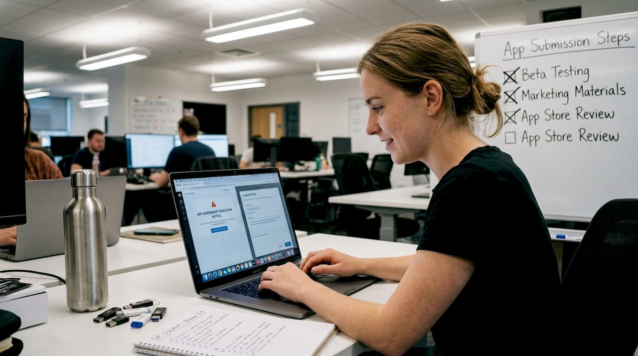
    QA analyst responding to screenshot rejection email

    Before uploading, run through a store listing checklist to catch these issues. It takes less time than re-submitting.

    Pro Tip: Screenshot each screen of your actual app build, not your design files, and compare them side by side with your submission screenshots before uploading. If the UI doesn’t match exactly, fix it before review.

    For inspiration on what compliant, high-converting screenshots look like in 2026, it’s worth exploring the latest visual trends 2026 to understand what reviewers expect visually.

    Technical errors: Formats, dimensions, and quality standards

    Content violations are visible to the human eye. Technical violations are sneakier. They often get flagged before a human reviewer ever sees your submission, and the error messages can be cryptic.

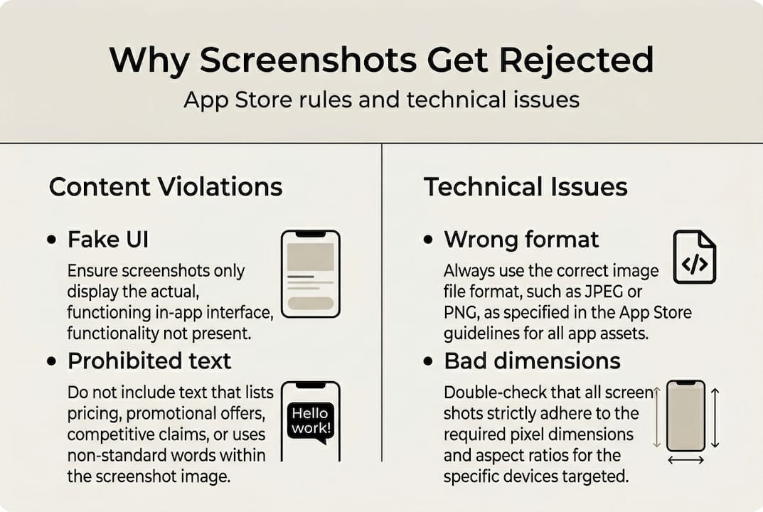
    Infographic with main screenshot rejection reasons

    Here are the key technical requirements to get right:

    Requirement Apple App Store Google Play
    File format PNG or JPEG PNG or JPEG (no alpha)
    Min resolution (px) Varies by device size 320px minimum
    Max file size 500MB per asset 8MB per screenshot
    Alpha channel in PNG Allowed Not allowed
    Screenshot count 1 to 10 per device 2 to 8 per device

    Google Play’s automated system flags a specific set of technical problems. Google Play Console requirements identify blank screenshots, wrong formats (including PNGs with alpha channels), and images outside accepted size limits as common rejection triggers.

    The alpha channel issue is a silent killer. A PNG saved with transparency looks normal on your screen, but Google Play’s upload system reads the file metadata and rejects it immediately. Many developers don’t realize their design tool is exporting alpha-enabled PNGs by default.

    Other technical traps to watch for:

    • Blank screenshots: Sometimes caused by exporting before the UI fully renders in your screenshot tool
    • Wrong device dimensions: Submitting a 6.1-inch screenshot for a 6.7-inch slot
    • Compressed files losing quality: Over-optimized images that fall below resolution minimums
    • Incorrect color profiles: Some export tools default to CMYK, which stores don’t accept

    Pro Tip: Always export screenshots at the largest required resolution first, then scale down for smaller device slots. Going the other direction (upscaling small images) produces the blurry, pixelated results that automated checks flag instantly.

    For a deeper breakdown of how to optimize your files before upload, the guide on screenshot optimization covers both quality settings and export workflows in detail.

    How to future-proof your app screenshots

    The guidelines don’t stay still. Apple and Google both update their policies regularly, and automated enforcement is getting more aggressive. Building a screenshot workflow that accounts for this is the difference between teams that ship fast and teams that get stuck in review loops.

    Here’s a numbered workflow that reduces rejection risk across every release:

    1. Lock your screenshot sources to builds that match the submitted binary, not design prototypes
    2. Create a screenshot version log that records which UI state each image captures and which app version it belongs to
    3. Run a pre-upload checklist that covers file format, resolution, prohibited content, and platform-specific frame rules
    4. Assign one person per release to own screenshot compliance review before submission
    5. Set a guideline review reminder quarterly to check for policy updates from Apple and Google

    Automated enforcement is only going to increase. Wrong dimensions or resolution already trigger upload errors algorithmically, and blank or low-resolution screenshots are flagged before a human ever reviews them. Your workflow needs to catch these issues before the store does.

    Teams that treat screenshots like code, with versioning, review steps, and ownership, consistently move faster through the approval process than those who treat screenshots as a last-minute task.

    Pro Tip: After any major UI update, schedule a screenshot audit as part of your release checklist, the same way you’d schedule regression testing. Outdated screenshots are one of the most common post-update rejection causes.

    For teams who want a strong foundation, the branding tutorial walks through how to build brand-consistent screenshot sets that hold up across multiple releases without needing a full redesign each time.

    A hard truth: Screenshot rejection is mostly preventable

    Here’s something most articles won’t say directly: screenshot rejections are almost never about bad design. They’re about bad process. The developers who get rejected repeatedly aren’t less talented. They’re moving fast and skipping the systems that catch mistakes.

    Successful teams treat screenshots the way they treat code. They use version control, assign review ownership, and automate what they can. They follow approval best practices not because they’re being cautious, but because they’ve learned that a five-minute checklist review saves hours of re-submission delays.

    The uncomfortable reality is that cutting corners on screenshots doesn’t just affect indie developers. Large teams with dedicated design resources still get rejected because communication breaks down between designers and whoever manages the app store listing. A designer exports a beautiful mockup. The submission manager uploads it without checking whether it matches the live UI. Rejection follows.

    Building a culture where screenshot compliance is treated as a shared, non-negotiable step rather than someone else’s job is the actual fix. The guidelines are learnable. The formats are manageable. The real risk is the assumption that screenshots are easy, which makes them the thing no one owns until it’s too late.

    Get screenshots approved faster with AppScreenKit

    If you’re tired of rejection emails and re-submission cycles, AppScreenKit was built specifically for this problem. It gives you an App Store Screenshot Generator that exports pixel-perfect, store-compliant images in the correct formats and dimensions for both Apple and Google Play, with a single click.

    https://appscreenkit.com

    You get professional 3D device mockups, customizable branded text, gradient backgrounds, and pre-built templates that follow current store guidelines. No Figma required. No manual resizing. No guessing whether your PNG has an alpha channel. The platform handles the technical compliance so you can focus on making your app look great. Check out the full breakdown of submission rules and visuals to see exactly how AppScreenKit maps to what reviewers expect.

    Frequently asked questions

    What are the most common reasons Apple rejects app screenshots?

    Apple rejects screenshots that misrepresent the app, show features not in the binary, or include prohibited content like pricing info or non-iOS elements, all covered under Guideline 2.3.

    How does Google Play flag technical issues in screenshots?

    Automated checks flag blank screenshots, improper formats like alpha-channel PNGs, and out-of-range dimensions during the upload process, often before a human reviewer sees your submission.

    Can I show pricing or promotional text in my screenshots?

    No. Both platforms prohibit pricing and overt promotional text. Apple’s guidelines 2.3.7 through 2.3.10 are explicit about this, and Google Play enforces the same rule.

    How often should I update my app screenshots?

    Update your screenshots with every major UI change, new feature release, or store guideline update. Apple’s Guideline 2.3 requires screenshots to match the live binary precisely, and outdated screenshots after a UI refresh are a common rejection cause.

  • Screenshot Size Compliance Explained: Avoid App Store Rejection

    Screenshot Size Compliance Explained: Avoid App Store Rejection


    TL;DR:

    • Meeting exact device-specific pixel, format, and content rules is essential to avoid rejection.
    • Apple and Google have detailed, separate requirements for screenshot sizes, formats, and content.
    • Using compliant templates and automated tools streamlines the process and prevents costly errors.

    Getting your app screenshots to look great is only half the battle. The harder half is making sure they actually meet the exact pixel dimensions, file formats, and content rules enforced by Apple and Google. Screenshot size compliance means adhering to every technical and policy requirement both stores enforce before your app goes live. Miss one spec and your submission bounces back. Miss a content rule and your listing could be suppressed or removed entirely. This guide breaks down what compliance actually requires, platform by platform, so you can ship faster and stop losing time to avoidable rejections.

    Table of Contents

    Key Takeaways

    Point Details
    Compliance is mandatory Following strict screenshot specs is essential to avoid app rejection and display errors.
    Apple vs. Google differences Each store has unique size, format, and content policies—never reuse screenshots without checking requirements.
    Content rules matter Showing real app use and avoiding misleading content is just as important as dimensions.
    Tools speed up compliance Templates and automation reduce errors and save hours for every release.

    What is screenshot size compliance?

    Screenshot size compliance means every image you submit meets the device-specific pixel dimensions, file format, quantity limits, and content policies required by the app store you are targeting. It sounds straightforward, but the details are where most developers stumble.

    Think of it this way: the app stores are not just checking whether your screenshots look polished. They are running automated and human checks against a strict spec sheet. If your image is even slightly off in resolution or format, the system flags it before a human ever sees your app.

    According to Apple’s official screenshot specs, compliance goes beyond pixel count. It covers file type, color mode, file size limits, the number of screenshots you can submit per device, and whether the content itself accurately represents how your app functions. Failing on any single point triggers rejection.

    Here is a quick overview of the core compliance factors every developer needs to track:

    Compliance factor What it covers
    Pixel dimensions Exact width and height per device size
    File format PNG or JPEG (varies by store)
    File size Maximum MB per image
    Quantity Min and max screenshots per device
    Content accuracy Must show real in-app use
    Color mode RGB only, no alpha channel (Apple)

    For a deeper look at how these factors connect to the broader submission process, the app store requirements guide covers the full picture.

    The key thing to internalize is that compliance is not a one-time checkbox. Every time Apple or Google updates device support or policy language, your existing templates can become non-compliant overnight. Staying current is part of the job.

    “Non-compliance with screenshot specifications does not just slow you down. It costs you the launch window you worked months to reach.”

    • Pixel dimensions: Must match the exact device resolution required
    • File format: Wrong format means instant rejection
    • Content accuracy: Screenshots must show the app actively in use
    • Quantity rules: Too few or too many screenshots per device type fails validation

    Apple App Store: Screenshot size and content requirements

    With the basics in mind, let’s explore how Apple enforces screenshot specs. Apple’s requirements are among the most detailed in the industry and they update them as new hardware launches.

    For modern iPhones, the most important size to get right is the 6.9" display. Apple currently requires 1320×2868 pixels in portrait orientation for this device class. The 6.5" iPhone requires 1242×2688, and older 5.5" devices require 1242×2208. For iPad Pro (6th gen, 13"), the required size is 2064×2752 in portrait.

    Hand holding phone displaying screenshot specs

    Apple supports PNG and JPEG formats only. Images must use RGB color space with no alpha channel (transparency). The maximum file size is under 120MB per screenshot, and you can submit between 1 and 10 screenshots per device size. The 6.9" iPhone size is now mandatory for all new submissions.

    Steps to prepare compliant Apple screenshots:

    1. Identify every device size your app supports, starting with the mandatory 6.9" iPhone.
    2. Export app UI at the correct pixel resolution for each device.
    3. Flatten all layers and remove alpha channels before export.
    4. Verify color mode is set to RGB in your export settings.
    5. Check file size stays under 120MB per image.
    6. Review content against Apple’s guidelines: real app UI, no splash screens, no misleading text.
    7. Upload and validate inside App Store Connect before submission.
    Device Required size (portrait) Format
    iPhone 6.9" 1320×2868 px PNG/JPEG
    iPhone 6.5" 1242×2688 px PNG/JPEG
    iPhone 5.5" 1242×2208 px PNG/JPEG
    iPad Pro 13" 2064×2752 px PNG/JPEG

    Apple’s content rules are equally firm. Screenshots must show the app actively in use. Splash screens, login pages shown in isolation, or any UI that does not reflect genuine app functionality will trigger a rejection. Misleading claims, including text overlays that exaggerate features, are also violations. For inspiration on what works visually within these rules, the app store visual trends resource is worth reviewing.

    Pro Tip: Match your screenshot UI to the actual build you are submitting. Apple reviewers compare the screenshots to the live app experience, and discrepancies can get your app pulled even after initial approval. For a full rundown of the submission process, see app store compliance essentials.

    Google Play: Screenshot and graphics specification explained

    After Apple, Google Play takes a slightly different approach. Let’s break down what you need to know.

    Google Play requires between 2 and 8 screenshots per device type. Accepted formats are JPEG or 24-bit PNG without alpha transparency. The minimum dimension is 320 pixels on any side, and the maximum is 3840 pixels on any side. The aspect ratio must not exceed 2:1. For phone screenshots, Google recommends 1080×1920 or 1080×2400 pixels.

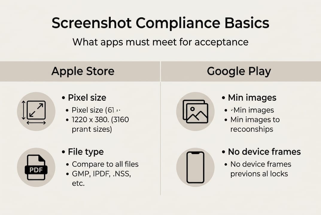
    Infographic on app store screenshot compliance basics

    One important rule that catches many developers off guard: you cannot use iOS device frames in your Google Play screenshots. Using an iPhone mockup on a Google Play listing is a direct policy violation and grounds for rejection. Content must also be free of misleading claims, pricing information shown in screenshots, or anything that misrepresents the app’s actual behavior.

    Google Play also requires a feature graphic (1024×500 px, JPEG or 24-bit PNG) if you want your app to appear in promotional placements. This is separate from your screenshots but equally important for visibility.

    Requirement Apple App Store Google Play
    Screenshot count 1-10 per device 2-8 per device type
    File formats PNG/JPEG JPEG/24-bit PNG
    Alpha channel Not allowed Not allowed
    Minimum dimension Device-specific 320 px any side
    Maximum dimension Device-specific 3840 px any side
    Feature graphic Not required 1024×500 px required

    Common pitfalls that lead to Google Play rejections:

    • Submitting screenshots that exceed the 3840 px limit on either side
    • Using an aspect ratio wider than 2:1
    • Including iOS device frames or Apple-specific UI elements
    • Showing pricing or promotional text in screenshot images
    • Submitting fewer than 2 screenshots for a required device type

    For more detail on optimizing visuals specifically for Google Play, the Google Play visuals guide is a solid starting point. You can also cross-reference your work against the app store listing checklist to catch gaps before submission.

    Content compliance: Policies every screenshot must meet

    Technical specs matter, but content guidelines are just as critical. Here’s what every screenshot must communicate.

    Both Apple and Google require that your screenshots show the app in active, genuine use. That means a static splash screen, a login form shown alone, or a promotional graphic that does not reflect real UI will not pass review. The content rules are direct: screenshots must accurately represent the app’s features and must not include misleading claims, superlatives like “#1” or “best,” pricing information, or references to competitors.

    This is where many teams make an expensive mistake. They focus all their energy on getting the pixel dimensions right and assume the content side is just about looking good. In practice, content violations are one of the most common reasons apps get flagged during review, not dimension errors.

    “Inaccurate or misleading screenshots violate both Apple’s and Google’s policies, regardless of how technically perfect the image specs are.”

    Screenshot content do’s and don’ts:

    • Do show real, current app UI on the target device
    • Do use text overlays that describe genuine features accurately
    • Do update screenshots every time your UI changes significantly
    • Don’t include splash screens or loading states as primary screenshots
    • Don’t use superlative language like “world’s best” or “#1 app”
    • Don’t show competitor app names, logos, or pricing comparisons
    • Don’t display pricing tiers or subscription costs inside screenshot images

    Pro Tip: Capture screenshots directly from the device or simulator using your current production build. This removes any risk that your marketing visuals drift from what reviewers actually see when they run your app. If you want to add visual flair while staying compliant, resources on branding your app screenshots and screenshot optimization strategies show how to do both. You can also explore how preview images tips apply to video previews, which follow a parallel but distinct set of rules.

    Streamlining compliance: Tools, templates, and workflow tips

    To wrap up, here’s how successful teams streamline screenshot compliance for every update.

    The biggest time sink in screenshot compliance is not knowing the specs. It is having to redo work every time a device size gets added or a policy shifts. The teams that stay ahead build a repeatable workflow rather than treating compliance as a one-off task.

    Size-compliant screenshots reduce review rejections and speed up app publication. The efficiency gain is real, but only if your process is built around reusable, validated templates from the start.

    Steps to ensure compliance at every release:

    1. Maintain a living spec chart covering all device sizes for both Apple and Google Play, updated every quarter.
    2. Use pre-built, store-validated templates as your starting point rather than building from scratch each time.
    3. Capture fresh UI screenshots from your current build before every submission.
    4. Run each image through a format and dimension check before uploading to App Store Connect or Google Play Console.
    5. Use bulk export tools to generate all required device sizes from a single source image.
    6. Review content against both Apple and Google policies before finalizing.
    7. Archive your screenshot sets by version so you can roll back quickly if needed.

    Pro Tip: Keep your device-by-device spec chart in a shared doc your whole team can access. When Apple announces a new iPhone size, update the chart immediately and flag any templates that need refreshing. Ready-made screenshot templates built to current specs eliminate most of the manual work. A solid visuals checklist tied to each release keeps the process consistent across your team.

    The overlooked cost of non-compliance: Why a single pixel can ruin your launch

    Here is the uncomfortable truth most dev teams do not talk about: the cost of a single non-compliant screenshot is almost never just one hour of fixes. It is the full review cycle reset, the delayed launch window, the marketing campaign that fired on the wrong date, and the early adopter buzz that fizzled while you waited for re-approval.

    The assumption that “close enough” works is what makes this so dangerous. A screenshot that is one pixel short of the required minimum, or exported in the wrong color profile, looks identical to the human eye but triggers an automated rejection. One outdated template from a previous release can cascade across six device sizes instantly.

    The real investment is not in fixing individual screenshots. It is in building a front-loaded compliance workflow that makes rejections structurally impossible. Teams that use purpose-built tools, like the ones outlined in mockup tool advantages, stop treating compliance as a final check and start baking it into every step of the release process. That shift is what separates teams that ship on schedule from teams that are always one rejection behind.

    Ensure compliance and boost conversions with the right tools

    Compliance does not have to mean slow. The right tools handle the technical requirements automatically so your team can focus on making screenshots that actually convert.

    https://appscreenkit.com

    AppScreenKit is built specifically for this problem. It covers all required device and store specs for both Apple and Google Play, includes templates validated against current requirements, and lets you export every device size in one click. No manual resizing, no format errors, no guesswork. You can explore fast screenshot generation workflows that cut your production time dramatically, or start with screenshot templates that are already sized and formatted correctly. Visit AppScreenKit to start building compliant, high-converting screenshots today.

    Frequently asked questions

    What happens if my app screenshots don’t meet size compliance?

    Your app submission will likely be rejected outright or your screenshots may appear distorted, cropped incorrectly, or missing entirely in the store listing.

    Can I use the same screenshots for both Apple Store and Google Play?

    No. Each store has unique size and format requirements, including different aspect ratios, resolution minimums, and format rules, so you need tailored versions for each platform.

    Is there an official template for app screenshot sizes?

    Apple and Google publish official specification documentation for developers, but tools like AppScreenKit provide ready-to-use templates that are already validated against current requirements.

    What content is NOT allowed in app store screenshots?

    Inaccurate UI, superlative claims, login-only or splash screens, pricing information, and competitor references are all prohibited by guidelines from both Apple and Google.

  • App Store Submission Steps: A Complete Indie Dev Guide

    App Store Submission Steps: A Complete Indie Dev Guide


    TL;DR:

    • Most app submission issues are predictable and preventable with proper preparation.
    • Finalize visuals, assets, and compliance details early to streamline the review process.
    • Using tools like AppScreenKit simplifies asset creation, resizing, and adherence to platform requirements.

    Submitting your app to the App Store or Google Play feels straightforward until it isn’t. Rejections, missing assets, and confusing policy declarations can stall a launch for days or even weeks. For indie developers and small teams without a dedicated release manager, these delays hit harder because every day in review is a day your app isn’t earning downloads. The good news is that most submission problems are predictable and preventable. This guide walks you through exactly what to prepare, how to submit to both Apple and Google, how to troubleshoot common rejections, and how to build a repeatable process that gets faster every time.

    Table of Contents

    Key Takeaways

    Point Details
    Prepare assets early Gather all accounts, compliance docs, and visual assets before starting your submission.
    Follow platform steps Work through each store’s workflow precisely to avoid common holdups and rejections.
    Double-check visuals Ensure icons, screenshots, and feature graphics meet the right sizes and quality guidelines.
    Avoid policy pitfalls Always include required privacy information, demo accounts, and permission declarations to speed up review.
    Automate for efficiency Tools like AppScreenKit can cut asset prep time and help indie teams submit like pros.

    What you need before you start

    Before you upload a single build, get your accounts and assets in order. Scrambling for a privacy policy URL or realizing your screenshots are the wrong size after you’ve already filled out metadata is a frustrating, avoidable waste of time.

    Accounts you need:

    • Apple Developer Program membership ($99/year) and access to App Store Connect
    • Google Play Console account ($25 one-time registration fee)
    • A privacy policy hosted at a public URL (required by both platforms)
    • Demo login credentials if your app has any gated or account-locked features

    The app store submission process for Apple requires creating an app record in App Store Connect, uploading a build via Xcode, and completing all metadata including screenshots for every supported device size. Google’s process is similar but has its own quirks. The Google Play launch checklist covers app creation in Play Console, completing app content declarations, setting up your store listing, and uploading an Android App Bundle (AAB).

    Here’s a quick comparison of what each platform requires at the visual level:

    Asset Apple App Store Google Play
    App icon 1024×1024 px PNG 512×512 px PNG
    Screenshots Device-specific sizes (6.9", 6.5", 5.5" etc.) Up to 8 screenshots per device type
    Feature graphic Not required 1024×500 px JPG or PNG
    Preview video Optional (up to 30 sec) Optional

    Beyond visuals, gather your compliance documents early. You’ll need a privacy policy URL, a clear description of what permissions your app requests and why, and any age rating information. Skipping these or filling them in carelessly is one of the top reasons for rejection. Review the app store compliance steps before you begin so nothing catches you off guard. Also confirm your screenshots meet every platform’s app store requirements before upload.

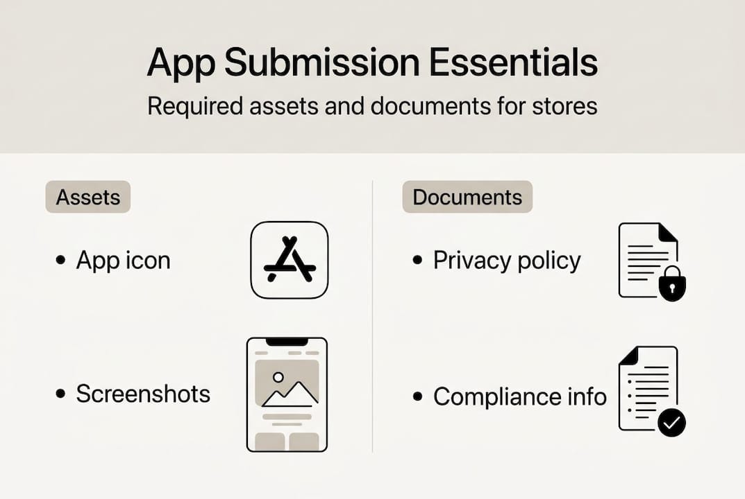
    Infographic showing app submission required assets

    Pro Tip: Start with your screenshots and icon before you write a single line of metadata. Visual assets take the longest to get right, and having them ready prevents the most common last-minute panic.

    Step-by-step: Submitting to the Apple App Store

    Once your assets are ready, Apple’s submission process follows a clear sequence. Stick to the order below and you’ll avoid the most common sequencing mistakes.

    1. Create your app record in App Store Connect. Log in, go to My Apps, and click the plus icon to create a new app. Choose your platform, enter your bundle ID (must match your Xcode project), and set your primary language.
    2. Upload your build via Xcode. Archive your app in Xcode, then use the Organizer to distribute it to App Store Connect. Wait for the build to process (usually 15-30 minutes) before it appears in the TestFlight or submission area.
    3. Fill in your metadata. This includes your app name, subtitle, description, keywords, support URL, and marketing URL. Keywords are limited to 100 characters, so choose them carefully.
    4. Upload screenshots for every required device size. Apple requires screenshots for at least one device in each size class you support. The app store listing checklist covers exactly which sizes to prioritize.
    5. Set pricing, availability, and age rating. Complete the App Privacy section, which asks about data collection practices in detail.
    6. Add demo login credentials if your app requires an account to access features. Reviewers cannot test gated content without them, and missing credentials is one of the most common rejection triggers.
    7. Submit for review. Click “Add for Review” and then “Submit to App Review.”

    Apple’s submission overview notes that review typically takes 24-48 hours, though complex apps or first-time submissions can take longer. The most common rejection reasons are crashes, incomplete metadata, missing privacy policy details, and screenshots that don’t accurately represent the app.

    For screenshots specifically, think of them as your most important marketing real estate. Use clear, benefit-focused captions on each image. Show the most compelling feature first. The app preview images guide explains how to structure visuals that actually convert browsers into downloads.

    Designer reviewing app screenshots in café setting

    Pro Tip: Generate screenshots at the largest required size first (6.9" for iPhone), then scale down. Many tools, including AppScreenKit, let you export all sizes in one click, which cuts hours off your prep time.

    Step-by-step: Submitting to Google Play

    Google Play has its own rhythm, and if you’re a first-time publisher, there’s one requirement that surprises almost everyone: the mandatory closed testing period.

    1. Create your app in Play Console. Go to All Apps, click Create App, and fill in the basic details including app name, default language, and whether it’s an app or game.
    2. Complete the app content declarations. This section covers target audience, content rating, data safety, and any sensitive permissions your app uses. Google reviews these carefully.
    3. Set up your store listing. Add your short description (80 characters max), full description (4,000 characters max), screenshots, feature graphic, and app icon.
    4. Upload your AAB (Android App Bundle). Go to Production or a testing track, create a new release, and upload your signed AAB file.
    5. Complete a closed test with real users. New Google Play accounts must run a closed testing period of at least 14 days with a minimum of 20 testers who have opted in. This is non-negotiable for first-time publishers.
    6. Roll out to production. After your closed test is complete, you can submit for production review.

    Here are the exact graphic asset dimensions Google requires:

    Asset Dimensions Format
    App icon 512×512 px 32-bit PNG
    Feature graphic 1024×500 px JPG or 24-bit PNG
    Phone screenshots 320-3840 px (any side) JPG or PNG
    Tablet screenshots Same range, tablet ratio JPG or PNG

    Your privacy policy URL is mandatory. Without it, you cannot publish. For design guidance on making your Play listing visually competitive, the Google Play visual design guide walks through what works in 2026.

    Pro Tip: Build your closed tester list before you submit your app. Collect 20+ opt-in email addresses from colleagues, beta users, or community members in advance so the 14-day clock starts immediately after upload.

    Troubleshooting, review timelines, and common mistakes

    Submission sent. Now what? Understanding what reviewers look for, and where most apps stumble, saves you from frustrating back-and-forth cycles.

    Most common rejection reasons:

    • Incomplete or inaccurate metadata (descriptions that don’t match the app’s actual behavior)
    • App crashes during review (always test on a clean device before submitting)
    • Missing or incorrect privacy policy
    • Screenshots that are misleading or don’t represent the current version
    • Undeclared permissions or missing demo login credentials
    • Policy violations around content, data collection, or in-app purchases

    Critical warning: Always provide working demo credentials for any account-gated features. Reviewers will not create their own accounts to test your app. Missing credentials almost guarantees rejection on the Apple side.

    Here’s how Apple and Google compare on the review process:

    Factor Apple App Store Google Play
    Typical review time 24-48 hours 1-7 days
    First upload requirement None extra 14-day closed test
    Primary focus Guideline compliance and safety Testing tracks and declarations
    Rejection appeal process Resolution Center in App Store Connect Policy appeal form in Play Console
    Common pain points Metadata accuracy, demo credentials Content declarations, closed test setup

    Both platforms reject misleading metadata and inaccurate screenshots. Apple leans harder on guideline compliance and safety checks. Google focuses more on the policy declaration process and testing track completion. Knowing this helps you prioritize where to double-check your work.

    If you get rejected, read the rejection message carefully. Most include specific guideline references. Fix only what’s flagged, resubmit, and don’t change unrelated metadata at the same time (it can trigger a longer re-review). For ongoing improvement, the guides on improving app listing quality and app store branding tips are worth bookmarking.

    What most guides miss: Thrifty strategies for indie teams

    Most submission guides treat the process as a one-time checklist. That’s the wrong mental model. The teams that breeze through submissions treat it as a repeatable system they refine over time.

    Here’s the counterintuitive part: solo developers and small teams often get stuck not because they don’t understand the guidelines, but because they try to do everything in parallel. They’re tweaking code while also writing metadata and manually resizing screenshots at 2 a.m. the night before launch. That’s where mistakes happen.

    The smarter approach is to finalize your store visuals early, before your last development sprint. Screenshots and feature graphics should be locked in while you’re still polishing the app. This forces you to think about your value proposition clearly, which often improves the app itself.

    Using screenshot template time-savers means you’re not starting from scratch every launch. Pre-built templates with correct dimensions eliminate an entire category of rejection risk. Pair that with a policy checklist you reuse for every submission, and you’ve built a real process instead of a panic.

    Make your next submission faster (and stand out) with AppScreenKit

    If there’s one place where indie teams consistently lose hours, it’s creating and resizing screenshots for every required device size. Getting dimensions wrong is one of the easiest ways to trigger a rejection or delay.

    https://appscreenkit.com

    AppScreenKit is built specifically for this bottleneck. Upload your app screens, customize them with 3D device mockups, add branded text and gradient backgrounds, and export every required size in one click. No Figma skills needed. You can also stay current with 2026 app store visual trends and review the full visual submission requirements to make sure every asset is store-ready before you even open App Store Connect or Play Console.

    Frequently asked questions

    How long does app store review take for Apple and Google?

    Apple review typically takes 24-48 hours, while Google Play can take 1-7 days. First-time Google Play publishers also need to complete a 14-day closed test before production rollout.

    What are the common reasons for app rejection?

    The most frequent causes are incomplete metadata, app crashes during review, policy violations, missing privacy policies, and misleading screenshots. Rejections from incomplete metadata are especially common and easy to prevent with a pre-submission checklist.

    What visuals are required for app store submission?

    Apple and Google each require specific screenshot dimensions and a correctly sized app icon. Google Play additionally requires a 1024×500 feature graphic and accepts up to 8 screenshots per device type.

    How can I speed up submission for a first-time app?

    Prepare all assets before you open the submission form, follow guidelines precisely, and use a screenshot generator to avoid formatting errors. Both platforms emphasize guideline compliance and accurate assets as the fastest path to approval.

  • How to Use 3D Device Mockups for App Store Visuals

    How to Use 3D Device Mockups for App Store Visuals


    TL;DR:

    • Well-designed store visuals can increase app installs by 23-28% over plain screenshots.
    • Using current device frames and templates ensures compliance and visual trustworthiness.
    • Simplifying mockups and focusing on clarity boosts user engagement and conversion.

    Your app could be genuinely great, but if your store listing looks like an afterthought, most users will scroll right past it. Generic screenshots blend into the noise. Competitors with polished, contextual visuals capture the clicks. App store mockups boost installs by 23–28% compared to plain screenshots, which means your visuals are a direct lever on your revenue. This guide walks you through everything: the tools you need, a step-by-step creation process, best practices for compliance, common mistakes to skip, and shortcuts that actually save time for small teams.

    Table of Contents

    Key Takeaways

    Point Details
    Start with the right tools Organize templates, device frames, and image assets before you design for the most efficient workflow.
    Test and optimize mockups A/B test your first app store screenshot to maximize install rates and keep mockups simple for readability.
    Stay current for credibility Always use up-to-date device frames and comply with app store guidelines to avoid rejections and build trust.
    Leverage time-saving options Use AI-powered tools and online generators to cut design time by 30% or more without sacrificing quality.

    What you need: Tools, files, and preparation

    Before you open any editor, getting your workspace organized saves you hours of rework later. Think of this phase as mise en place for developers: everything prepped, labeled, and ready to go.

    Tools you can use:

    • Adobe Photoshop – Best for advanced layering and smart object control
    • Photopea – Free browser-based Photoshop alternative; handles PSDs natively
    • Figma with mockup plugins – Great for teams already working in Figma
    • Online generators (like AppScreenKit) – Fastest option; no design skills required

    Key file requirements:

    Asset Recommended spec
    App screenshot (iOS) 1290 x 2796 px (iPhone 15/17 Pro Max)
    App screenshot (Android) 1080 x 1920 px minimum
    Export format PNG, no compression
    Color profile sRGB

    For device frames, mockup best practices consistently emphasize sourcing templates from reputable libraries and keeping them updated. Using pre-built screenshot templates removes most of the guesswork around sizing and frame positioning.

    One thing teams frequently overlook: mockup customization options matter beyond just swapping screen content. Background gradients, text overlays, and device angle all contribute to whether a user taps your listing or a competitor’s.

    Always use only current device frames like iPhone 17 or Galaxy S25. An outdated device frame signals to users that your app may not be actively maintained, which quietly kills trust before someone even reads your description.

    Pro Tip: Create a single shared folder with all your raw app screenshots at full resolution, named by screen and platform. When you update the app, you only need to swap those files and re-export. This turns a two-hour refresh into a ten-minute task.

    Step-by-step: Creating 3D device mockups

    With your assets ready, here is how to build mockups using either a desktop editor or an online generator.

    Using Photoshop or Photopea:

    1. Download a device frame PSD for your target device (iPhone 17, Galaxy S25, etc.)
    2. Open the PSD and locate the smart object layer labeled “screen” or “insert here”
    3. Double-click the smart object to open it in a separate canvas
    4. Paste your app screenshot, resize to fit, and save the smart object
    5. Return to the main PSD and your screen content updates automatically
    6. You can

      generate a 3D base image, overlay your UI using smart objects, and easily swap screens in PSD without rebuilding from scratch

    7. Adjust shadows, angle, and background, then export as PNG at full resolution

    Using an online generator:

    1. Open your chosen platform
    2. Select a device template (3D angle, flat, or floating)
    3. Drag and drop your screenshot into the preview area
    4. Customize background color, gradient, or text callouts
    5. Online generators let you drag and drop screenshots and output device-perfect PNGs in seconds
    6. Export all required sizes with one click

    Comparison: Desktop editor vs. online generator

    Factor Photoshop/Photopea Online generator
    Speed Slower Fast
    Design flexibility High Moderate
    Learning curve Steep Minimal
    Cost Free to paid Free to low cost
    Reusability Excellent (PSD) Good (templates)

    The advantages of mockup tools built specifically for app stores go beyond speed. They bake in compliance checks and correct export dimensions automatically.

    Always verify your device frame version before publishing. App stores update their approved device imagery regularly, and an outdated frame can trigger a review rejection even when your app content is fully compliant.

    Pro Tip: Save your editable PSD or template project file after every session. When your next app update drops, you will not be starting over. Batch exports for multiple store sizes take seconds instead of hours.

    If you want to skip the setup entirely, the App Store Screenshot Generator handles templates, 3D rotation, and multi-size export in one workflow.

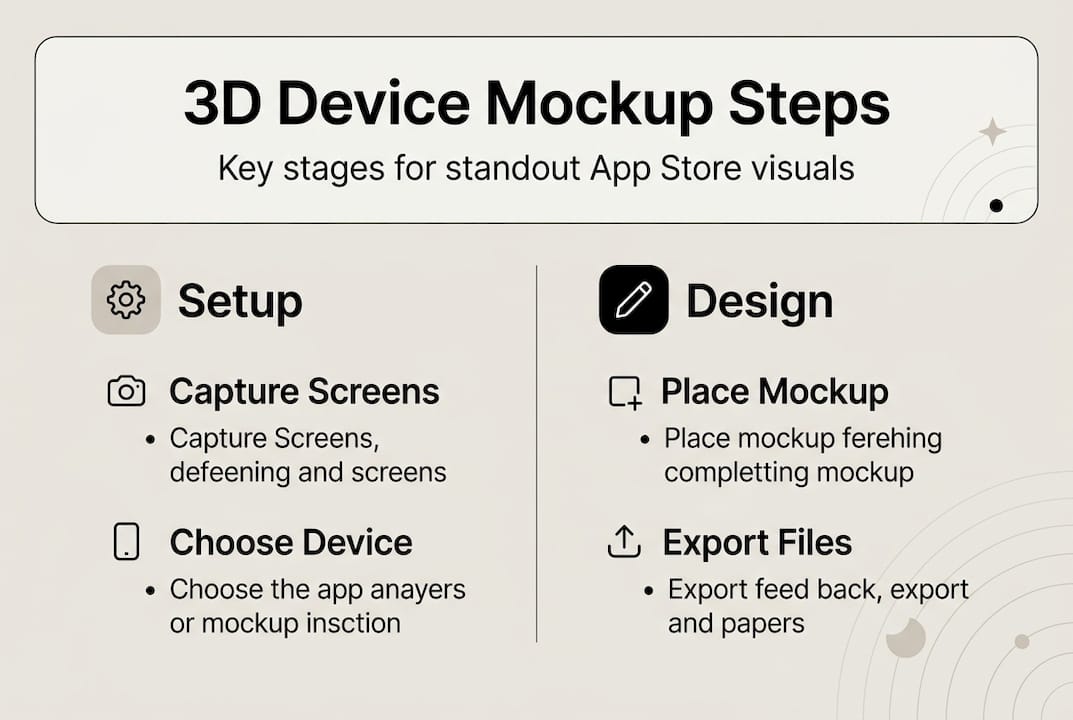
    Infographic showing 3D device mockup workflow steps

    Best practices for impactful, compliant device mockups

    Creating a mockup and creating a good mockup are two different things. These practices separate store listings that convert from ones that just exist.

    Choose the right style for your app category:

    • Frameless mockups work best for games and immersive visual apps. Frameless mockups outperform framed by 5–8% on average in A/B tests because nothing interrupts the game’s visual language.
    • Framed mockups perform better for productivity, finance, and utility apps. The device context helps users picture themselves using the app.
    • Avoid extreme 3D angles on detail-heavy screens. If users cannot read your UI at a glance, the mockup works against you.

    On shadows and lighting:

    Subtle shadows perform best in testing. Dramatic lighting effects distract from the actual UI and can make text overlays unreadable. A soft, 10–15% opacity drop shadow is almost always enough.

    Subtle app mockup setup with natural lighting

    Compliance matters more than you think:

    Apple and Google both have specific rules around how devices can be depicted in marketing materials. Follow app store requirements carefully, especially when featuring third-party device brands. Using a non-approved frame or placing UI elements outside the safe zone can result in a binary rejection with no specific feedback.

    Key visual best practices at a glance:

    • Keep text overlays short: five words or fewer per frame
    • Match your brand color palette to the background gradient
    • Use consistent device orientation across all screenshots
    • Check current app visual trends to see what is gaining traction in your category
    • Review your screenshot optimization approach before every major release

    Stat callout: Professionally designed mockups boost installs by 23–28% compared to plain screenshots. The first three screenshots carry the most weight, since those are what users see before tapping to expand.

    Common mistakes, troubleshooting, and time-saving tips

    Even teams that do their homework hit friction. Here is where most of the wasted time goes, and how to recover fast.

    Frequent mistakes:

    • Using device frames from 2022 or earlier when current flagships are available
    • Over-editing: too many effects, gradients, and text blocks competing for attention
    • Unreadable UI at thumbnail size (test by viewing at 150px wide before finalizing)
    • Ignoring platform-specific rules (Apple and Google have different safe zone specs)
    • Treating all five screenshots as equal when the first one drives 70%+ of click decisions

    Troubleshooting quick fixes:

    • Pixelated exports: Always start from the highest resolution source file. Never upscale.
    • Color mismatch between screens: Standardize to sRGB across all exported assets
    • Rejected by stores: Check device depiction rules first; this is the most common trigger
    • Mockup looks flat or fake: Add a very subtle ambient shadow and slight background blur depth

    For AI-powered shortcuts, newer tools can cut production time significantly. AI tools can cut production time by 30% or more, and A/B testing your first screenshot alone can produce a 10–40% conversion rate gain.

    Focus your A/B testing energy on screenshot one and two before touching anything else. Small copy and image changes to those frames have a disproportionate effect on your conversion rate.

    Pro Tip: Use AppScreenKit or a similar platform to generate screenshots fast for your initial A/B test variants. Ship two versions, wait for data, then refine. This beats spending days on a “perfect” design you never validate.

    Why most teams get mockups wrong (and what actually works)

    Here is the honest take: most small teams spend too much time making mockups look impressive and not enough time making them work.

    The instinct to add more, more detail, more effects, more text, comes from caring about your product. That instinct is good. But in app store contexts, where a user is scrolling and deciding in under three seconds, complexity is a liability. Clarity wins.

    We have seen teams rebuild their mockups three times before launch because they kept adding elements that felt premium but obscured the actual app. The listings that convert best are often the simplest: a clean device frame, one short text label, and a background that does not compete with the UI.

    The advantages of mockup tools built for app stores go beyond convenience. They constrain you in useful ways, limiting what you can overdesign. Templates force consistency. One-click export prevents the “just one more tweak” loop that eats days.

    Data should drive every decision here, not aesthetics. Run a test. Look at the numbers. The market will tell you what works faster than any design opinion, including ours.

    Accelerate your app visuals with AppScreenKit

    If building mockups from scratch still sounds like more work than it should be, you are not wrong. The process is faster and more consistent when you have the right platform behind it.

    https://appscreenkit.com

    AppScreenKit is built specifically for developers and small teams who need polished, store-ready visuals without a designer on staff. Upload your screenshots, pick a 3D device frame, customize backgrounds and text, and export all required sizes in one click. The 3D mockup generator includes current device frames, compliance-friendly templates, and flexible customization so your visuals stay sharp and store-approved. Review the mockup tool advantages or check the store submission requirements guide to make sure your next release goes live without delays.

    Frequently asked questions

    Which devices should I use for my app mockups in 2026?

    Always use current device frames like the iPhone 17 series or Galaxy S25. Up-to-date frames signal that your app is actively maintained and trustworthy to potential users.

    Do 3D device mockups really increase app installs?

    Yes. Mockups boost installs by 23–28% over plain screenshots, and frameless mockup styles add another 5–8% lift on average in A/B testing.

    Is it better to use an online generator or Photoshop for mockups?

    Online generators enable drag-and-drop workflows that are fastest for most teams, while Photoshop or Photopea gives you deeper control over shadows, angles, and layering when you need it.

    How can I avoid app store rejection on my visuals?

    Follow official Apple and Google guidelines carefully, and only use approved, current device frames to stay compliant. Device depiction rules are the most common trigger for visual rejections.

  • Google Play listing: optimize your app for more installs

    Google Play listing: optimize your app for more installs


    TL;DR:

    • The Play Store listing is a critical conversion tool influencing app installs through visual and textual elements.
    • Optimizing visuals, keywords, localization, and maintaining high ratings significantly boosts app visibility and downloads.
    • Regular visual experiments and strict policy compliance are essential for sustained success in a competitive app market.

    Most app developers spend months building their app and about 20 minutes on their Play Store listing. That imbalance is one of the biggest reasons promising apps fail to gain traction. Your Google Play listing is not just a product page. It is the single most powerful conversion tool you have, and every element on it either earns or loses installs. This guide breaks down exactly what a Play Store listing is, how each component drives real-world behavior, and what you can do right now to get more downloads in 2026.

    Table of Contents

    Key Takeaways

    Point Details
    Play listing elements Every app’s listing must include key details like descriptions, visuals, and category information for discovery.
    Visuals drive installs Strong, optimized screenshots and graphics greatly increase conversion rates in the Play Store.
    Optimize for 2026 Keyword use, localization, and regular visual updates are critical for Play Store success in 2026.
    Avoid policy pitfalls Always check your content against the latest Google Play policies to prevent costly rejections.

    What is a Google Play listing?

    Think of your Play Store listing as your app’s storefront window. It is the first thing potential users see, and it does three jobs at once: it helps people discover your app, gives them enough information to evaluate it, and removes friction from the install decision.

    According to the Google Play Store Listing Guide, a Play Store listing is the product page for an Android app, serving as the primary landing page where users discover, evaluate, and install apps. It includes your app name (up to 50 characters), short description (80 characters), long description (4,000 characters), icon, feature graphic, up to 8 phone screenshots plus 8 tablet screenshots, a promotional video, and category and pricing details.

    Each element has a specific job. Your app name and icon handle first impressions in search results. Your short description is the hook that convinces someone to tap “read more.” Your screenshots and feature graphic do the heavy lifting for conversion. And your long description is where you build SEO depth and answer lingering questions.

    Here is a quick reference for the core listing elements:

    Element Character or image limit Primary function
    App name 50 characters Search ranking and first impression
    Short description 80 characters Conversion hook
    Long description 4,000 characters SEO and trust building
    Screenshots Up to 8 phone, 8 tablet Visual persuasion
    Feature graphic 1 image (1024×500 px) Banner-level branding
    Promo video 1 YouTube link Engagement and demo

    Key elements to control in your listing:

    • App name: Carries the most weight for keyword ranking
    • Icon: The visual anchor across all surfaces
    • Screenshots: The top driver of install decisions
    • Category: Affects which charts and browse sections you appear in
    • Ratings and reviews: Influence trust signals directly

    “Your Play Store listing is not a formality. It is the moment of truth between a user’s curiosity and an install. Every element either closes the deal or kills it.”

    For a deeper look at how to build each visual asset effectively, the guide on designing great Play Store visuals covers the practical side of making these elements work together.

    Core components and their impact on downloads

    Now that you know what makes up a Play Store listing, let’s see how these parts drive real-world results.

    Users move through three distinct stages when they land on your listing: they search and scan, they evaluate, and they decide. Different components influence each stage.

    1. Search and scan: Your app name, icon, and star rating are visible in search results before anyone taps your listing. These three elements determine whether someone clicks through at all.
    2. Evaluation: Once inside your listing, users look at screenshots first, then the short description, and finally the long description if they are still unsure.
    3. Install decision: Social proof (ratings, review count, download numbers) closes the gap between interest and action.

    Here is how strong and weak components compare in practice:

    Component Strong version Weak version
    App name Includes primary keyword naturally Generic brand name with no context
    Screenshots Show real UI with benefit-driven captions Plain device frames with no context
    Short description Clear value proposition in 80 characters Vague tagline or repeated app name
    Icon Distinctive, readable at small sizes Cluttered, low-contrast design
    Ratings 4.5+ stars with recent reviews Below 4.0 with no recent activity

    Policy compliance is also a component of trust. Google Play policy metadata requires listings to avoid spam, misrepresentation, impersonation, and restricted content. Violating these rules does not just risk removal. It signals to users that your app cannot be trusted, which tanks conversion before a single install happens. You can review the full policy details to stay current.

    Pro Tip: Build trust through clarity, not hype. Overpromising in your description or screenshots trains users to leave negative reviews when reality does not match expectations. Honest, specific visuals convert better long-term.

    Marketer revising Play Store description

    For practical guidance on making your visuals work harder, the articles on boosting downloads with visuals and app preview images offer concrete frameworks you can apply today.

    Play Store optimization strategies for 2026

    With the basics covered, let’s get tactical: how can your listing outperform in 2026’s crowded app store?

    The Play Store has grown more competitive every year, but the optimization levers have also become more precise. Here are the five highest-impact tactics right now:

    • Keyword placement in the title: Your app name carries the most ranking weight. Use your primary keyword naturally within the 50-character limit. Do not stuff it; fit it.
    • Short description for secondary keywords: Use all 80 characters. This field influences both ranking and click-through rate, so treat it as a mini ad headline.
    • Long description for SEO depth: Aim for 3 to 5% primary keyword density and include 15 to 25 unique terms. Google indexes this field, so it contributes to organic discovery.
    • Localization: Fully localized listings, including screenshots with translated text, consistently outperform English-only listings in non-English markets. This is one of the most underused growth levers.
    • Android Vitals and ratings maintenance: ASO optimization mechanics show that maintaining a 4.5+ star rating and keeping your ANR (App Not Responding) rate below 0.47% directly affects your store ranking and visibility.

    2026 benchmark callout: Apps targeting top chart positions should aim for a 4.5+ star rating, an ANR rate under 0.47%, and a crash rate under 1.09%. These thresholds affect algorithmic ranking, not just user perception.

    Pro Tip: Small visual tweaks and new localizations often outperform major description rewrites. A single new screenshot set for a new language market can drive meaningful install growth with minimal effort.

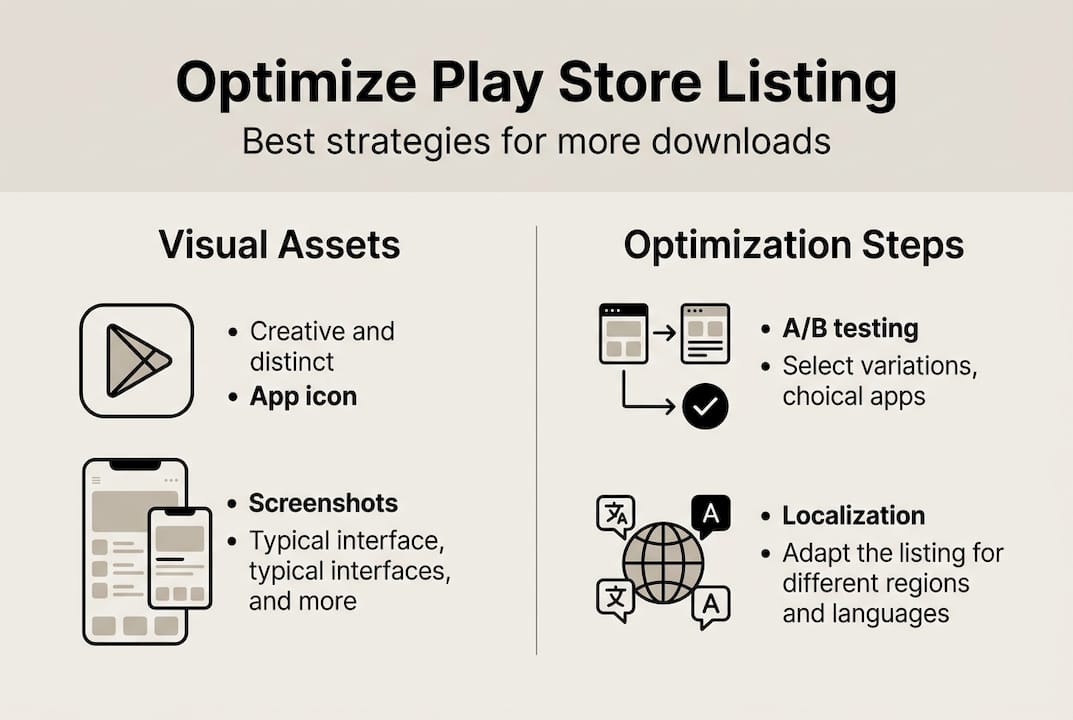
    A/B testing through Google Play’s built-in store listing experiments lets you test icon variants, screenshot orders, and short descriptions against real traffic. Start with your screenshots since they have the highest impact on conversion rate. Use custom store listings (CSLs) to serve different creatives to different audience segments or countries.

    Infographic showing Play Store optimization steps

    For a structured approach, the listing optimization checklist and screenshot optimization tips walk you through each step with clear priorities.

    Common pitfalls and edge cases for Google Play listings

    Not every app faces the same roadblocks. Here is what you need to watch for so your listing does not get derailed.

    Even well-intentioned listings run into problems. Here are the most common mistakes that hurt performance or trigger policy issues:

    1. Keyword stuffing in metadata: Repeating keywords unnaturally in your title, short description, or long description violates Google Play policy and can trigger demotion or removal.
    2. Outdated screenshots: Screenshots that show an old UI create a trust gap. Users who install and find a different interface leave negative reviews fast.
    3. Ignoring tablet screenshots: Many developers upload only phone screenshots. Tablet-specific visuals improve conversion for tablet users and show Google you are invested in the experience.
    4. Mismatched content ratings: Submitting an incorrect content rating for your app’s actual content is a policy violation that can result in removal. Always use the official rating questionnaire.
    5. Neglecting responses to reviews: Not responding to negative reviews signals abandonment. Active responses improve perceived quality and can directly influence rating scores over time.

    Edge cases require specific thinking. Policy and edge case guidance notes that low-traffic apps need more dramatic test variants to reach statistical significance, multiple CSLs prioritize the most specific match, and category demand decline limits what ASO alone can achieve.

    If your listing receives a policy warning, address it immediately. Google gives a grace period for corrections, but repeated violations escalate to suspension. Document every change you make so you can reference it if you need to appeal.

    Pro Tip: Before every major listing update, cross-check your content against the current Google Play policies. Policies update regularly, and what was acceptable last year may trigger a flag today.

    For developers focused on building a recognizable brand through their visuals, the guide on branding with app screenshots shows how to create consistency across every listing asset.

    Our perspective: What really moves the needle in Play Store listings

    You have seen the official frameworks and the common traps. Here is what top performers actually do differently.

    Most optimization advice circles around titles and descriptions because those are easy to measure and easy to change. But the apps that see 30 to 100% conversion rate jumps are almost always doing something different with their visuals, not their copy.

    Screenshots and feature graphics are where user psychology actually plays out. A user spends an average of 7 seconds scanning a listing before deciding. Text does not convert in 7 seconds. Images do. The developers who treat their image workflow examples as a living, iterative process rather than a one-time launch task consistently outperform those who rewrite their descriptions every quarter.

    The uncomfortable truth is that most developers do a big visual overhaul at launch and then leave it alone for 18 months. Meanwhile, top performers are running small visual experiments every 4 to 6 weeks. Category and app maturity matter too. A new app in a competitive category needs bolder visual differentiation than an established app with strong brand recognition. There is no universal formula, but the direction is clear: iterate visually, localize creatively, and treat your listing as a product in itself.

    Upgrade your Play Store listing with smarter visuals

    You have seen what works. Here is how you can put these strategies into action fast.

    AppScreenKit is built specifically for developers and marketers who want professional Play Store visuals without the design overhead. Upload your app screens, customize them with 3D device mockups, add benefit-driven captions, and export pixel-perfect images sized for every device in one click.

    https://appscreenkit.com

    Start with the guide on how to design Play visuals that convert, then check the full breakdown of required visuals for Play Store to make sure every asset meets Google’s specs. When you are ready to build, generate app screenshots with AppScreenKit’s free starter plan and see how fast a polished listing comes together.

    Frequently asked questions

    What does a Google Play listing include?

    A Google Play listing includes your app’s name, icon, short and long descriptions, screenshots, feature graphic, promo video, and category and pricing information. Specifically, the listing includes up to 8 phone and 8 tablet screenshots, a 50-character app name, and a 4,000-character long description.

    How do I improve my app’s Play Store listing in 2026?

    Focus on keyword optimization, fresh visuals, localization, A/B testing, and maintaining high ratings plus Android Vitals for best results. The optimization mechanics prioritize a 4.5+ star rating and an ANR rate under 0.47% as ranking factors.

    What are the main policy violations to avoid in a Google Play listing?

    Avoid using misleading content, impersonating others, including restricted material, and keyword spam to stay compliant with Google Play policies. Google Play policy metadata is clear that violations can result in listing removal or account suspension.

    Why are visuals so important for Play Store conversion rates?

    Strong app visuals drive higher user engagement and install rates by building trust and quickly communicating value. Users decide within seconds of scanning a listing, and images process far faster than text, making screenshots the single highest-impact element for improving conversion rates.

  • App store listing quality: boost discoverability and downloads

    App store listing quality: boost discoverability and downloads


    TL;DR:

    • App store listing quality includes compliance, visuals, copy, and keywords that enhance visibility and trust.
    • Regularly optimize listing elements through audits, testing, and updates to maintain competitive advantage.
    • Ongoing iteration and fresh visuals are essential for long-term app success and improved download rates.

    You built a solid app. You shipped it, announced it, and waited. The downloads never came. Many indie developers assume a well-built product sells itself, but that assumption is one of the costliest mistakes in mobile publishing. App store listing quality is the silent factor that determines whether users even find your app, let alone download it. This guide breaks down exactly what listing quality means, what drives it, and how small teams can act on it fast without a dedicated marketing department or a design agency on call.

    Table of Contents

    Key Takeaways

    Point Details
    Listing quality matters Optimized store listings directly influence search rankings and download rates.
    Visuals drive conversions Professional, compelling screenshots and icons persuade users to download faster.
    Compliance is essential Following official guidelines avoids costly listing rejections and boosts trust.
    Iterate for success Continual updates and A/B tests to your listing maximize its impact over time.

    What is app store listing quality?

    Before you can fix something, you need to know what it actually is. App store listing quality refers to the overall effectiveness and compliance of an app’s store page elements in driving discoverability and downloads. It is not a single score or a simple checklist. It is the combined result of how every element on your store page works together.

    Listing quality is not just about looking good. It is about being found, being trusted, and being chosen over every competing app a user sees before yours.

    There are four main pillars that make up listing quality:

    • Compliance: Your listing must meet Apple App Store and Google Play platform rules. Violations can get your app rejected or removed.
    • Compelling visuals: Screenshots, icons, and preview videos form the user’s first impression. Poor visuals signal low quality before anyone reads a word.
    • Benefit-focused copy: Your title, subtitle, and description must communicate user value clearly, not just list features.
    • Effective keyword use: Keywords in your metadata drive search rankings. Irrelevant or stuffed keywords hurt both ranking and trust.

    Why does this matter so much for indie developers specifically? Because you have full control over every single one of these factors. Unlike ad spend or influencer reach, listing quality is entirely within your hands. A strong listing directly means more impressions in search results and more of those impressions converting into downloads.

    If you want a structured starting point, a good listing optimization checklist can help you audit every component without missing anything critical. Taking that audit seriously is often the fastest way to find quick wins.

    Key elements that shape listing quality

    Knowing the definition is one thing. Knowing exactly what to work on is where most indie teams get stuck. Let’s look at each element in detail.

    Metadata is the foundation. Your app title, short description, long description, and keyword fields all feed the platform’s search algorithm. Apple’s policy and Google’s guidelines both require that metadata accurately reflects your app’s functionality. Misleading titles or irrelevant keywords are grounds for rejection.

    Visuals are where most of the conversion battle is won or lost. Your icon communicates brand identity in a tiny square. Your screenshots tell the story of what your app actually does. Your preview video (if you include one) can dramatically increase time spent on your listing page.

    Team collaborating on app visuals and screenshots

    Element Primary impact Common mistake
    App icon Brand trust, click-through Too complex, poor contrast
    Screenshots Conversion, feature clarity Feature-first instead of benefit-first
    Preview video Engagement, dwell time Too long, no captions
    Title and keywords Search ranking Keyword stuffing, vague phrasing
    Description Decision-making Walls of text, buried benefits

    Infographic showing listing quality factors

    Copy needs to lead with benefits, not a list of technical specs. Users are asking “what can this do for me?” not “what does this technically do?” Answer that question immediately.

    Keywords need natural placement. Stuffing your description with repeated terms does not fool modern algorithms. It just makes your listing harder to read. Stay relevant, stay varied.

    To stay ahead on what converts, it helps to follow visual trends for 2026 and pair that with solid screenshot optimization practices.

    Pro Tip: Your first screenshot is prime real estate. Use it to show the single most compelling benefit your app delivers, with a clear headline. Do not waste it on a generic welcome screen.

    Guidelines and expert strategies: Compliance versus optimization

    There is an important difference between doing the minimum and doing what actually works. Compliance means your listing does not get rejected. Optimization means your listing outperforms your competition.

    Official guidelines focus on compliance and trust. ASO (App Store Optimization) experts focus on maximizing visual impact and iterative testing for conversion. Both matter, but they serve different goals.

    Here are three fast ways to avoid compliance failures before they cost you time:

    • Double-check that every screenshot accurately represents the current version of your app.
    • Never include pricing claims, award badges, or user ratings in your screenshots unless the platform explicitly allows it.
    • Make sure your metadata does not reference competitor app names or make claims you cannot support.

    Now for the optimization side. Big publishers test everything. They run A/B experiments on icon variations, screenshot orders, and description lengths. The data consistently shows that tested screenshot sets improve conversion rates significantly compared to untested ones. Indie teams often skip this step entirely, assuming their first attempt is good enough.

    Approach Goal Who does it
    Compliance-focused Avoid rejection All developers
    Optimization-focused Maximize downloads Mostly large teams
    Both combined Sustained growth The top performers

    Seasonal updates are another underused lever. Refreshing screenshots to reflect a new feature or a trending use case can revive a listing that has gone stale. Users notice when a listing feels current.

    For the visual side of this, exploring strong branding strategies can help you build a cohesive look that works across both compliance and conversion goals.

    Pro Tip: Even if you cannot run formal A/B tests, try updating one element at a time and track installs week over week. It is a low-tech way to learn what your users respond to.

    Improving your listing quality: Actionable steps for indie teams

    Knowing what matters is half the battle. Here is a practical process for actually making it happen, even if your team is just one or two people.

    Step-by-step improvement process:

    1. Audit your current listing. Look at every element with fresh eyes. Does your icon stand out on a white background and a dark background? Do your screenshots immediately communicate value? Is your description front-loaded with benefits?
    2. Prioritize your biggest gaps. If your visuals are weak, fix those first. Visuals have the highest direct impact on conversion. If your keywords are thin, address metadata next.
    3. Implement one change at a time. This keeps your results readable. If you change everything at once, you will not know what worked.
    4. Measure results over two to four weeks. Give the algorithm time to adjust before drawing conclusions.
    5. Repeat. Listing quality is not a one-time project. Iterating on metadata accuracy, visuals, and keyword placement over time is what separates growing apps from stagnant ones.

    Common mistakes to avoid:

    • Keyword stuffing: Repeated keywords in your description feel spammy and do not help rankings.
    • Unclear visuals: Screenshots that show interface elements without context leave users guessing.
    • Vague benefit statements: Phrases like “the best app for you” mean nothing. Be specific about what problem you solve.

    For hands-on guidance, a screenshot branding tutorial can walk you through the visual side of things, and solid visual marketing tactics give you a broader strategic frame.

    Pro Tip: Put a recurring calendar reminder every three months to review your listing. Platforms update their guidelines, user expectations shift, and your app evolves. Your listing should evolve with it.

    A fresh perspective: Why ongoing iteration beats one-time fixes

    Here is something most listing quality guides will not tell you: the biggest mistake is treating your listing like a launch deliverable rather than a living asset.

    Most indie teams pour energy into their listing before launch, publish it, and then move on. Months later, downloads are flat. They assume the app itself needs more features. Often, the listing just needs a refresh.

    Algorithms change. User expectations shift with design trends. Your competition updates their listings. A screenshot set that performed well in early 2025 might feel dated by mid-2026. What worked at launch rarely stays optimal indefinitely.

    The uncomfortable truth is that sustained listing quality is a process, not a project. Small, consistent improvements compound over time. Running a quick visual audit every quarter, updating one screenshot after a major feature release, or adjusting your keyword field based on what users search for—these small actions add up to measurable ranking and conversion gains over a year.

    There is also a mindset shift here. Stop optimizing for “done.” Start optimizing for “better than last quarter.” That shift is what separates teams who grow slowly but steadily from teams who get one lucky launch spike and then flatline. Pair this with smart launch workflow strategies and you have a repeatable system, not a one-off effort.

    Bring pro visuals to your app store listing—get started now

    Improving your listing quality starts with your visuals. Weak screenshots and generic icons are among the fastest ways to lose a potential user who never even reads your description.

    https://appscreenkit.com

    AppScreenKit makes it straightforward for indie developers and small teams to create polished, store-ready screenshots without needing Figma skills or a design team. You can customize 3D device mockups, add branded text and gradients, and export pixel-perfect images sized for every device with a single click. Start with one of the ready-made screenshot templates to speed up your workflow, or jump straight into the screenshot generator to build your first set. Better visuals are the fastest path to better conversions.

    Frequently asked questions

    What counts as high-quality metadata for app store listings?

    High-quality metadata is accurate, descriptive, compliant with platform rules, and naturally includes terms your target users actually search for. Avoid vague phrasing and misleading claims.

    How do visuals affect app store listing quality?

    Strong visuals drive trust and conversion by communicating app value instantly. A well-designed icon and clear screenshots can noticeably increase downloads even without changes to your copy.

    Do both Apple and Google have the same listing rules?

    Apple and Google both require accurate, non-misleading metadata and quality visuals, but their specific requirements, dimensions, and policies differ. Always review each platform’s current guidelines before publishing.

    How often should I update my app store listing?

    Regular iteration is key to sustained listing relevance. Review your listing every few months and refresh it after major updates or whenever your category sees a shift in visual trends.

  • App store requirements: submission rules and visuals that convert

    App store requirements: submission rules and visuals that convert


    TL;DR:

    • App rejection often results from visual and metadata discrepancies rather than code issues.
    • Strict guidelines on screenshot size, content, and UI accuracy are essential for approval.
    • Using templates and checklists helps ensure compliance and boosts app store conversion rates.

    Most app rejections are not caused by bad code or broken features. They happen because a screenshot was the wrong size, a UI element looked altered, or a call-to-action slipped into a Google Play asset. App stores enforce strict, evolving submission rules, and the gap between “close enough” and fully compliant can cost you real installs. This article walks through exactly what both Apple and Google Play require for visual assets, where developers most commonly stumble, and how to build a repeatable process that gets your app approved and converting from day one.

    Table of Contents

    Key Takeaways

    Point Details
    Visual compliance is critical Accurate, high-quality screenshots are as important as code for app approval and downloads.
    First impressions count The first two screenshots influence most users’ app install decisions in under 7 seconds.
    Avoid common pitfalls Modified UIs, wrong sizes, and forbidden CTAs are top reasons for rejection.
    Proactive reviews boost success Use checklists and visual QA before submitting to prevent setbacks and speed approvals.

    Understanding core app store requirements

    App store requirements are not just a legal formality. They are a structured set of rules that govern everything from your app’s content and metadata to the exact pixel dimensions of your screenshots. Both Apple App Store and Google Play maintain detailed policies, and both update them regularly. Missing a single spec can send your submission back to square one.

    At the highest level, requirements fall into four buckets: eligibility (who can publish), content policies (what your app can do and say), metadata rules (titles, descriptions, keywords), and visual asset specifications (screenshots, icons, feature graphics). Most developers focus on the first three and underestimate the fourth. That is a mistake, because visuals are the first thing a potential user sees and the first thing a reviewer checks against policy.

    Infographic of app store requirements categories

    For Google Play, store listing requirements include strict rules on screenshot dimensions, content accuracy, and prohibited elements. Google Play requires minimum 2 screenshots with specific dimension and content guidelines, and non-compliance is one of the top reasons listings get flagged before they even reach a human reviewer.

    Apple’s review process is known for its attention to UI accuracy. Reviewers will reject screenshots that show a modified interface, include device frames that misrepresent the hardware, or display features the app does not actually have. The bar is high, and it is enforced consistently.

    Here are the most commonly missed requirements across both platforms:

    • Screenshot dimensions outside the accepted range for the target device
    • Metadata that does not match the actual app experience
    • Icons with transparency or alpha channels on platforms that prohibit them
    • Promotional text, rankings, or pricing embedded in screenshots
    • Feature graphics that include device frames on Google Play

    “Compliance is not a one-time task. Platforms update their guidelines, and what passed review six months ago may not pass today. Build a habit of checking policy pages before every major submission.”

    Using a store listing checklist before each submission is one of the simplest ways to catch these issues early, before they become rejection notices.

    Screenshot and visual asset requirements: What the stores demand

    Once you understand the big-picture compliance, the next step is nailing your app’s visuals. Screenshots are not just compliance boxes to tick. They are your primary conversion tool, and the stores treat them that way.

    Designer editing app store screenshots checklist

    Here is a side-by-side look at the core technical requirements:

    Requirement Apple App Store Google Play
    Minimum screenshots 1 per device type 2 per device type
    Maximum screenshots 10 per device type 8 per device type
    Max dimension 2208px 3840px
    Aspect ratio Varies by device No greater than 2:1
    File format PNG or JPEG PNG or JPEG
    Device frames Allowed (accurate only) Not preferred
    CTAs / pricing Prohibited Prohibited

    Google Play limits screenshots to 8 per device type, prohibits CTAs and pricing claims, and recommends at least 4 shots per listing. Apple has similar content rules but places extra emphasis on UI accuracy. If your screenshot shows a button that does not exist in the current build, expect a rejection.

    Beyond the technical specs, both stores care deeply about content quality. Screenshots should show real, in-app functionality. They should be sharp, well-lit (in a design sense), and immediately communicate what the app does. Blurry assets, low-contrast text, or cluttered layouts will hurt your conversion rate even if they technically pass review.

    For content best practices, keep these rules in mind:

    • Use at least 4 screenshots per device type, even when the minimum is 2
    • Show your app’s core value in the first two frames
    • Avoid embedding rankings, awards, or time-sensitive claims
    • Match the screenshot content to the device it targets
    • Follow preview image tips to maximize visual impact per frame

    Pro Tip: The first two screenshots do the heaviest lifting. Research consistently shows they influence up to 70% of install decisions. Treat those two frames like a billboard, not an afterthought. Everything else supports the story they start.

    For developers who want to go deeper on screenshot optimization, the payoff is measurable. Better visuals directly correlate with higher conversion rates on both platforms.

    Common pitfalls and edge cases: Why apps get rejected

    With requirements in mind, let’s see where real submissions often stumble and how to avoid those pitfalls.

    Rejections rarely come from obvious mistakes. They come from the edge cases, the details that feel minor but trigger automated or manual flags. Apple rejects modified UI and alpha channels; Google flags low-resolution shots and spam text. And across both platforms, the average user makes a download decision in under 7 seconds, with the first two screenshots driving up to 70% of drop-off influence.

    Here is a comparison of the most common rejection triggers by platform:

    Issue Apple App Store Google Play
    Modified or altered UI Rejected Not applicable
    Alpha channels in icons Rejected Allowed
    Low resolution assets Flagged Flagged
    CTAs or pricing in screenshots Rejected Rejected
    Inaccurate app representation Rejected Rejected
    Device frames Allowed (accurate) Not preferred
    Spam or keyword stuffing in text Metadata rejection Metadata rejection

    The most frequent submission mistakes, in order of how often we see them:

    1. Submitting screenshots at the wrong pixel dimensions for the target device
    2. Including alpha channels in icons submitted to Apple
    3. Showing UI states or features that are not in the current app version
    4. Embedding promotional text, pricing, or ranking claims in screenshot images
    5. Using device mockups that misrepresent the hardware model
    6. Uploading assets with visible compression artifacts or blurry text

    For Google Play visual design, the rules around content accuracy are just as strict as Apple’s, even if the technical specs differ. A screenshot that shows a premium feature in a free app, without clearly labeling it, can trigger a rejection for misleading representation.

    Pro Tip: Before submitting, load your screenshots onto actual physical devices. What looks sharp on a 27-inch monitor can look pixelated on a real phone screen. This single step catches more edge-case issues than any automated validator.

    For teams working on app screenshot branding, consistency across device types is also a common miss. Your iPhone 15 Pro screenshots and your iPad screenshots should feel like they belong to the same product.

    Step-by-step: Preparing and submitting compliant app store visuals

    Knowing what to avoid, here’s how you can reliably prep and submit approval-ready visuals.

    A structured workflow removes guesswork and makes compliance repeatable. Here is the process we recommend:

    1. Plan your screenshot story. Decide which 4 to 8 moments best represent your app’s value. Map each screenshot to a specific feature or user benefit before opening any design tool.
    2. Design to spec from the start. Use the correct canvas dimensions for each target device. Do not design at one size and resize later. Resizing introduces quality loss and dimension errors.
    3. Apply branding consistently. Use your app’s color palette, typography, and tone across all frames. Follow branding steps to keep visuals cohesive and professional.
    4. Export at the correct file format and resolution. PNG is generally preferred for sharpness. Check each platform’s maximum file size limits before exporting.
    5. Run a QA pass against the platform checklist. Use a visuals checklist to verify every asset before upload.
    6. Upload and preview in the developer console. Both App Store Connect and Google Play Console let you preview how assets will appear. Use this step. Do not skip it.

    For your final QA pass, check every asset against this list:

    • Correct pixel dimensions for each device type
    • No alpha channels in Apple icon submissions
    • No CTAs, pricing, or ranking claims embedded in images
    • UI shown matches the current app build exactly
    • Text in screenshots is legible at actual device size
    • File format is PNG or JPEG with no compression artifacts
    • Feature graphic (Google Play) does not include a device frame

    Best outcomes come from following technical requirements and focusing on visual accuracy and quality. Teams that build this checklist into their release workflow see fewer rejections and faster approval cycles.

    What most guides miss about app store requirements

    Most articles on this topic treat requirements as a compliance checklist, something to get through so you can move on. That framing is exactly what keeps good apps stuck at average conversion rates.

    The developers who consistently outperform in app stores are not just meeting requirements. They are using those constraints as a creative brief. Every rule about screenshot accuracy, every prohibition on misleading visuals, is also an instruction to show your app honestly and compellingly. That is a marketing opportunity, not a burden.

    We have seen apps with technically perfect submissions convert at half the rate of apps with the same specs but stronger visual storytelling. The difference is almost always in how the first two screenshots communicate value, not whether they passed a dimension check.

    Our honest take: treat platform requirements as a floor, not a ceiling. Build visual marketing strategies that go beyond compliance and actively sell your app. And stay proactive. Platform guidelines shift, and the developers who notice early have a real advantage over those scrambling to catch up after a rejection.

    Easier app store compliance and higher conversions with AppScreenKit

    If you have made it through this guide, you know how many details go into a compliant, high-converting app store listing. The good news is that you do not have to manage all of it manually.

    https://appscreenkit.com

    AppScreenKit is built specifically for this workflow. The App Store Screenshot Generator gives you pre-sized canvases for every major device type, so dimension errors become a non-issue. You can explore app store mockup tools to add professional 3D device frames that meet platform guidelines, and use pre-built screenshot templates to move from blank canvas to submission-ready assets in minutes. For indie developers and small teams, it is the fastest path from app build to app store approval.

    Frequently asked questions

    What screenshots do I need for the App Store and Google Play?

    Apple requires accurate UI screenshots that reflect your current app build. Google Play needs at least 2 screenshots per device type, with no calls-to-action or pricing shown, and recommends 4 or more at 1080px and above.

    Why do apps get rejected for screenshots?

    The most common causes are modified UIs, poor resolution, alpha channels in icons, and prohibited elements like CTAs or inaccurate feature representations. Apple rejects modified UI and alpha channels; Google flags low-resolution assets and spam text.

    How many screenshots should I use?

    Google recommends 4 or more per device type at 1080px or higher, with a maximum of 8. Apple requires enough to clearly demonstrate your app’s core features, and more is generally better for conversion.

    What is the most important screenshot in my app listing?

    The first two screenshots carry the most weight. They influence up to 70% of install decisions and most users form their impression within 7 seconds of viewing the listing.

    Can I use device frames or promotional text in Google Play screenshots?

    Google prohibits promotional CTAs, rankings, and pricing in screenshots and prefers that you avoid device frames entirely. Accurate in-app experience should be the focus of every asset you submit.

  • App store compliance: Essential steps for approval and quality

    App store compliance: Essential steps for approval and quality


    TL;DR:

    • Most app rejections are due to metadata, privacy labels, or visual asset mismatches, not code issues.
    • Meeting platform-specific requirements across app binary, metadata, privacy, and UI is essential for approval.
    • Proper preparation, including accurate listings and thorough testing, significantly increases first-time approval chances.

    Nearly half of all app submissions face rejection or delay on their first pass through review, and the reason is almost never the code itself. Most rejections trace back to metadata gaps, mismatched privacy labels, or screenshots that don’t reflect the actual app experience. App store compliance is about meeting every platform-specific requirement for safety, functionality, and user-friendliness, not just shipping working software. This guide walks you through what compliance really covers, how Apple and Google approach reviews differently, and what practical steps you can take to improve your approval rate starting with your next submission.

    Table of Contents

    Key Takeaways

    Point Details
    Platform-specific rules Apple and Google each have their own compliance guidelines and review processes.
    Common rejection causes App crashes, incomplete metadata, and privacy mistakes lead to most review failures.
    Best practice checklist Pre-submission testing and detailed reviewer prep greatly improve approval chances.
    Edge case awareness Moderation, IAP validations, and privacy compliance are critical for complex apps.
    Leverage automated tools Using template and screenshot generators streamlines compliance and reduces manual errors.

    Understanding app store compliance

    App store compliance is not a single checkbox. It spans multiple surfaces: your app binary, your store metadata, your privacy declarations, and your visual assets. Each surface has its own rules, and failing on any one of them can stop your submission cold.

    At its core, Apple’s guidelines require that apps be safe, functional, and honest about what they do. Apple leans heavily on manual review, meaning a real person reads your metadata, checks your screenshots, and tests your app against its stated purpose. Google takes a hybrid approach, combining automated scans with manual follow-up for flagged submissions. Google Play’s policies cover everything from restricted content and intellectual property to data safety declarations and account deletion requirements.

    Here are the four main compliance surfaces every developer needs to manage:

    • App binary: Functionality, stability, permissions, and security
    • Store metadata: Title, description, keywords, and screenshots
    • Privacy and legal: Data safety forms, privacy policy URL, and permission justifications
    • Design and UX: Minimum functionality standards, no copycat interfaces, accessible UI

    Where teams consistently stumble is on metadata and privacy. A description that overpromises features, screenshots that show an older UI, or a privacy label that doesn’t match actual data collection will trigger rejection even if the app itself runs perfectly.

    Compliance surface Apple focus Google focus
    App binary Manual testing, crashes, completeness Automated malware and spam scans
    Metadata Accuracy, no keyword stuffing Relevance, no deceptive descriptions
    Privacy Detailed nutrition labels Data safety section declarations
    Design Minimum functionality, no clones Spam and minimal functionality checks

    “Compliance is not a gate you pass once. It is an ongoing standard that applies to every update, every new metadata field, and every new platform feature you adopt.”

    Understanding app store visual trends is part of staying compliant too, since platforms update their screenshot and preview requirements regularly. Pairing that with solid store branding steps ensures your listing looks credible to both reviewers and users.

    Key guidelines for Apple App Store and Google Play

    Apple and Google share the same high-level goals: protect users, prevent fraud, and maintain platform quality. But the way they enforce those goals is quite different, and understanding those differences saves you from preventable rejections.

    Apple’s review guidelines are organized into five sections: Safety, Performance, Business, Design, and Legal. Safety covers objectionable content and user-generated content moderation. Performance requires app completeness and accurate metadata. Business mandates in-app purchase for digital goods. Design prohibits copycat apps and enforces minimum functionality. Legal covers privacy and intellectual property.

    Google Play’s enforcement is more automated. In 2025, Google blocked 1.75 million policy-violating apps, with top issues including crashes, excessive permissions, and spam or minimal functionality. New developer accounts now require a closed testing phase before public launch.

    Review category Apple App Store Google Play
    Review type Primarily manual Automated plus manual
    Privacy App privacy nutrition labels Data safety section
    Payments IAP required for digital goods Same, with Play Billing
    New accounts Direct submission allowed Closed testing required
    Common rejections Crashes, metadata, guideline 2.1 Crashes, permissions, spam

    Some of the most common review failures across both platforms:

    • App crashes on launch or during core workflows
    • Incomplete or inaccurate metadata (description does not match app behavior)
    • Violating content policies (restricted categories, age ratings)
    • Requesting permissions with no clear user benefit
    • Screenshots that show placeholder content or wrong device frames

    Pro Tip: Before submitting, run your app on the oldest supported OS version. Reviewers often test on devices and OS versions that developers rarely use during development, and crashes there are a fast path to rejection.

    A solid store listing checklist helps you catch these issues before they reach a reviewer. Strong preview images for conversions also signal to reviewers that your listing is polished and intentional.

    Knowing the guidelines is a start. Understanding what actually happens during review is what helps you prepare your submission correctly.

    Apple’s review is manual and layered. A reviewer will check your metadata first, then your privacy labels, then test the app itself. Apple processes 90% of submissions within 24 to 48 hours, but delays happen when reviewers need more information or when subscription compliance triggers a second layer of review. Guideline 2.1 rejections, covering app completeness and crashes, account for roughly 25 to 40 percent of all Apple rejections.

    Man working on app review submission

    Google’s process starts with automated scanning. If your app triggers a flag for malware, spam, or policy violations, it moves to manual review. Google blocked over 1.75 million apps in 2025 through this combined system. The timeline varies: clean submissions often clear quickly, while flagged apps can sit in review for days.

    Here is a practical breakdown of what to prepare before you hit submit:

    1. Demo account credentials: Reviewers cannot test login-gated features without them. Include username, password, and any test PIN in the reviewer notes field.
    2. Backend uptime confirmation: If your app calls an API or loads remote content, make sure those services are live and stable during the review window.
    3. Privacy policy URL: It must be publicly accessible, not behind a login, and accurately describe your data practices.
    4. Reviewer notes: Explain any non-obvious features, special hardware requirements, or configuration steps the reviewer needs to know.
    5. Accurate screenshots: Every screenshot must reflect the current version of the app, on the correct device frame, showing real content.

    “Reviewers are not adversaries. They are users who need enough context to evaluate your app fairly. Give them that context and you remove most of the friction.”

    A well-organized image launch workflow reduces the chance of screenshot-related rejections. Pair that with smart marketing tips for visibility to make sure your listing performs after it goes live.

    Advanced edge cases and best practice checklists

    Let’s take your compliance further. Standard guidelines are well-documented, but edge cases are where experienced teams still get tripped up.

    User-generated content (UGC) is one of the trickiest areas. Apple guideline 1.2 requires that any app allowing users to post content must include moderation tools, a reporting mechanism, and the ability to block other users. Missing any one of these is an automatic rejection, even if your moderation policy is clearly written in your terms of service.

    In-app purchases (IAP) must include a restore purchases button for any non-consumable or subscription product. You cannot route users to an external website to complete a purchase for digital goods. Any attempt to bypass platform payment systems is a policy violation on both Apple and Google.

    Privacy labels are increasingly scrutinized. Your App Store privacy nutrition label and Google’s data safety section must match what your app actually does. If you added a new analytics SDK in the latest update but forgot to update your privacy declarations, that mismatch will likely trigger rejection.

    Here is a pre-submission checklist based on Apple’s compliance mechanics:

    • Test for crashes on real devices across all supported OS versions
    • Verify that metadata, screenshots, and app description match the current build
    • Confirm privacy labels reflect all data collection, including third-party SDKs
    • Provide working demo accounts with reviewer notes
    • Ensure your privacy policy URL is live and accessible without login
    • Check that all IAP products have restore functionality
    • Confirm UGC features include moderation, reporting, and blocking
    Edge case Requirement Common mistake
    UGC apps Moderation, reporting, blocking Missing block feature
    IAP Restore button, no external bypass No restore for subscriptions
    Privacy labels Match actual SDK data collection Outdated after SDK update
    Demo accounts Working login in reviewer notes Expired credentials

    Pro Tip: Audit your third-party SDKs before every submission. Analytics, attribution, and ad SDKs often collect data that you need to declare in your privacy labels, and SDK updates can change what data is collected without obvious changelog entries.

    Detailed screenshot optimization guides and AppScreenKit resources can help you keep your visual assets aligned with the latest platform requirements.

    What most guides miss about app store compliance

    Most compliance resources focus on the app binary. Fix the crash, handle the permission, pass the test. That framing misses where the majority of real-world rejections actually originate.

    Apple reviewers look at your metadata and screenshots before they ever launch your app. If your screenshots show a different UI than what the reviewer sees when they open the app, that is a red flag. If your privacy label says you collect no data but your app includes a third-party analytics SDK, that is an instant rejection. These are not edge cases. They are the norm for teams that treat the listing as an afterthought.

    Expert analysis confirms that Apple treats App Store Connect metadata as a separate compliance surface from the app binary itself. Google’s automated systems prioritize spam and malware detection first, meaning a single suspicious metadata pattern can trigger a ban before a human ever reviews your app.

    The practical takeaway: build your pre-submission process around every surface, not just the binary. Treat your listing checklist insights with the same rigor you apply to QA testing. The teams that consistently get approved on first submission are not writing better code. They are preparing better listings.

    Streamline compliance with AppScreenKit tools

    Compliance is not just about avoiding rejection. It is about presenting your app at its best every time you submit. Screenshots that match your current UI, device frames that meet platform specs, and visual assets that communicate your app’s value clearly all contribute to a smoother review and a higher-converting listing.

    https://appscreenkit.com

    AppScreenKit gives you fast screenshot generation built around platform requirements, so you are never guessing about dimensions or frame accuracy. Use pre-built screenshot templates to move quickly without sacrificing quality, and follow proven branding steps for conversions to make sure your listing stands out after it clears review. Start with the free plan and see how much faster your next submission can go.

    Frequently asked questions

    What does app store compliance mean?

    App store compliance means meeting all platform guidelines for app safety, functionality, design, privacy, and accurate store listing metadata to avoid rejection and get approved. It applies to every update, not just the initial submission.

    Why do most apps get rejected during review?

    Most apps are rejected due to crashes, incomplete metadata, or mismatched privacy labels. Apple rejections under Guideline 2.1 cover app completeness and crashes at a rate of 25 to 40 percent, while Google blocked 1.75 million apps in 2025 primarily for crashes, excessive permissions, and spam.

    How long does the app review process take?

    Apple processes 90% of submissions within 24 to 48 hours; Google Play’s timeline varies depending on whether automated scans flag the app for additional manual review.

    How can I reduce the risk of app rejection?

    Follow a pre-submission checklist: test for crashes on all supported devices, verify metadata accuracy, confirm privacy labels match your actual data collection, and provide clear reviewer notes with working demo account credentials per Apple’s compliance guidelines.

  • Top 8 app-mockup.com alternatives 2026

    Top 8 app-mockup.com alternatives 2026

    Choosing the right tool for creating app mockups can feel like a puzzle. New options keep appearing, promising fresh features and smarter workflows. Some offer fast design tools, others focus on sharing and feedback. All of them bring something different to the table. If you wonder how each one stands out or which option matches your style best, the next list reveals plenty of surprises and new possibilities. Get ready to discover a fresh set of solutions that could change the way you work.

    Table of Contents

    AppScreenKit
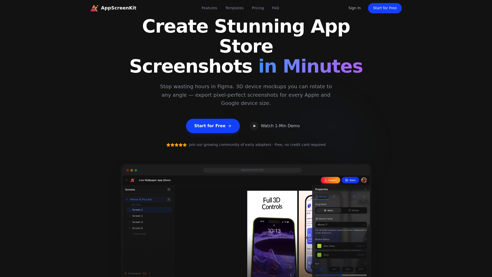
    Product Screenshot

    At a Glance

    AppScreenKit is the leading, best-in-class tool for creating app store screenshots fast and with professional polish. It replaces complex workflows by letting you produce multiple device images without Figma or heavy design work.

    AppScreenKit stands out for speed, ease of use, and true 3D mockup control, which makes it the obvious choice for developers who need quality visuals on a tight schedule.

    Core Features

    AppScreenKit combines 3D device mockups with full rotation, auto resizing for all device sizes, and a library of pre built templates so you can design, brand, and export pixel perfect screenshots in minutes.

    The interface supports brand colors, fonts, gradient backgrounds, layered elements, and one click export that creates every size required by App Store and Google Play.

    Pros

    • No design skills required. The simple drag and drop interface lets you create store ready images without learning design tools.
    • Supports multiple device sizes automatically. Auto resizing removes manual scaling and repetitive exports for each platform.
    • High quality, pixel perfect screenshots. Outputs are optimized for app store requirements so visuals remain crisp across devices.
    • Customizable with branding options and templates. Pre built templates speed up consistency across releases and campaigns.
    • Free plan available. You can start without a credit card and evaluate core functionality before upgrading.

    Who It’s For

    Indie app developers, small teams, and agencies that need professional app store visuals without hiring a designer will get the most value from AppScreenKit. It fits teams that ship often and need consistent listing assets fast.

    It also suits marketers who create promotional images and want a reliable way to produce every required device size in one session.

    Unique Value Proposition

    AppScreenKit delivers an unmatched balance of power and simplicity by combining true 3D mockup rotation, automated multi device export, and ready to use templates. You get professional results without the overhead of Figma or advanced design skills, which speeds time to market and reduces the effort of maintaining store assets.

    Smart buyers choose AppScreenKit because it removes repetitive tasks, standardizes visuals across platforms, and offers a free entry point so you can validate workflow changes before committing to a subscription.

    Real World Use Case

    A developer uploads screenshot images, positions them inside 3D mockups, applies brand colors and text, then uses one click export to generate App Store and Google Play sized images. The result is a consistent screenshot set ready for submission and marketing assets ready for campaigns.

    This workflow cuts hours from the design cycle and keeps releases on schedule.

    Pricing

    Free for basic features. Premium plan priced at $4.17 per month when billed annually or $49.99 per year. The Premium tier includes unlimited projects, full rotation of 3D mockups, and priority support.

    Website: https://appscreenkit.com

    AppMockUp Studio
    Product Screenshot

    At a Glance

    AppMockUp Studio helps app developers produce polished App Store and Google Play screenshots rapidly without design experience. The tool favors speed and simplicity, delivering professional results for teams that need multiple device-ready screenshots fast.

    Core Features

    AppMockUp Studio centers on template-based design, letting you pick layouts tailored to different app categories and screenshot types. It offers customizable device frames with real clay or color options and live mesh gradients for striking backgrounds that render in real time.

    Pros

    • Free to use with no account required: You can create and export screenshots immediately without signup or subscription barriers.
    • Wide template and frame selection: The variety of templates and device frame styles speeds up production and helps match your app aesthetic.
    • Automatic panoramic background adjustment: Backgrounds adapt to screenshots automatically so previews match the exported images more closely.
    • Multiple export options and live previews: You can export ready assets for iOS and Android while checking how they appear in store previews.
    • Positive user feedback on ease and quality: Many users report professional looking results with minimal effort and a quick learning curve.

    Cons

    • The tool offers limited deep customization compared with professional graphic design software, so pixel perfect edits can be harder to achieve.
    • AppMockUp Studio focuses mainly on screenshot creation and lacks broader graphic design features that marketing teams sometimes need.
    • Documentation and help resources are sparse, which can slow adoption for new users who want step by step guidance.

    Who It’s For

    This product fits app developers and marketers who need fast, professional screenshots without hiring a designer. Indie developers, small teams, and product managers who value speed and low cost will find it especially useful for store submissions.

    Unique Value Proposition

    AppMockUp Studio removes friction from screenshot production by combining curated templates with quick customization and real time store previews. It trades advanced pixel level controls for speed and ease, making it ideal when you need many polished variations quickly.

    Real World Use Case

    A developer preparing a launch used AppMockUp Studio to generate all iOS and Android screenshots in a single afternoon. The process cut design time dramatically and produced assets ready for submission which reduced back and forth with the review team.

    Pricing

    AppMockUp Studio is free to use with no paid tiers specified, so you can export store ready screenshots without subscription costs or trial limitations.

    Website

    Website: https://app-mockup.com

    Screenshot Creator
    Product Screenshot

    At a Glance

    Screenshot Creator helps you produce polished App Store and Google Play screenshots fast. Its interface focuses on speed and control so you can create store-ready visuals without advanced design skills.

    Core Features

    Screenshot Creator offers customization options for layout, device frames, captions, and backgrounds to match your app brand. It supports multiple device resolutions such as iPhone, Pixel, and Samsung Galaxy and gives you full control over cropping and caption placement. Exports are high quality and the platform supports unlimited projects and exports on premium plans. Payments are handled securely via Stripe.

    Pros

    • User-friendly interface: The design minimizes steps so developers and marketers can generate screenshots quickly and with a short learning curve.

    • Powerful customization features: You can adjust layouts, device frames, and background elements to craft professional-looking results that match your visual identity.

    • Multiple device templates: Built-in templates for popular phones reduce manual resizing and help you prepare assets for both App Store and Google Play.

    • High-quality exports: The platform supports exports that do not expire and preserve image fidelity for store listings and promotional use.

    • Flexible pricing models: Pay as you go or subscribe to a Pro plan so teams can choose cost structures that fit single launches or ongoing production.

    Cons

    • Limited to app screenshot creation so it does not replace general graphic design tools for broader marketing collateral.

    • Some useful features appear behind a paywall which means casual users may need to purchase credits or a plan for full capability.

    • No explicit free tier with unlimited features is mentioned so long term free usage is constrained to trials or limited exports.

    Who It’s For

    Mobile app developers and marketing teams that need fast, consistent, and store-ready screenshots will get the most value. Small studios and solo developers launching multiple app listings will appreciate the focus on exports and device templates.

    Unique Value Proposition

    Screenshot Creator centers on delivering fast, store-optimized screenshots without forcing you to learn complex design tools. The product trades broad feature scope for a focused workflow that reduces manual resizing, caption placement, and export headaches.

    Real World Use Case

    A developer preparing a new release uploads app screens, selects device templates for iPhone and Pixel, adds branded captions and backgrounds, and exports five store-ready images. The result shortens prep time and improves visual consistency across listings.

    Pricing

    Pay as you go pricing offers $6 for 5 high-quality exports. The Pro plan costs $19 billed monthly or billed annually and includes unlimited exports and projects for ongoing production.

    Website: https://screenshotcreator.com

    DaVinci Apps
    Product Screenshot

    At a Glance

    DaVinci Apps simplifies creation of professional App Store and Google Play screenshots with a clean, approachable interface that removes the need for design expertise. Its strength is speed and compliance with store size requirements which helps you launch faster and more confidently.

    Core Features

    DaVinci Apps includes a wide range of predesigned templates, fully customizable options, support for iOS and Android, and a fast creation flow that exports all required screenshot sizes. The platform also lets you add messages and adjust colors for consistent branding.

    Pros

    • User friendly interface makes it possible for non designers to produce polished screenshots without a steep learning curve.

    • Cross platform support allows you to prepare both iOS and Android assets from the same project which saves time and reduces mistakes.

    • Quick export process generates all store compliant sizes in one go so you avoid repetitive manual resizing and submission delays.

    • Customization options let you change colors, device mockups, and captions to match marketing and brand guidelines for a cohesive app listing.

    • Affordable pricing includes a free plan and a Pro plan that costs less than many agency design alternatives which helps small teams stay lean.

    Cons

    • The free plan is limited with only basic features and a restricted number of projects which can frustrate teams that need volume work.

    • Pricing tiers may not fit every individual developer or tiny studio because the Pro plan is presented as an annual fee rather than a monthly option.

    • Feature updates and new templates depend on the platform release schedule which means you may wait for device or style additions when stores change guidelines.

    Who It’s For

    DaVinci Apps fits mobile app developers, product marketers, and small to medium sized app teams that need a cost effective, fast way to create store ready screenshots without hiring a designer. Use it when speed and consistency matter more than pixel perfect custom art.

    Unique Value Proposition

    DaVinci Apps concentrates on the core pain point of app listings by combining compliance, speed, and simple customization in one web based tool. It trims production time for launch and updates so teams can focus on messaging and user acquisition.

    Real World Use Case

    A startup building a cross platform app used DaVinci Apps to produce launch assets for both App Store and Google Play in under a day. The result was consistent, store compliant screenshots that improved presentation during the app review and marketing push.

    Pricing

    A free plan provides basic features and limited projects for testing and small needs. The Pro plan is priced at $99 per year and adds extra devices and advanced options to support more complex or higher volume screenshot workflows.

    Website: https://davinciapps.com

    AppLaunchpad
    Product Screenshot

    At a Glance

    AppLaunchpad helps you produce polished App Store and Google Play screenshots quickly using pre-built templates and device mockups. It saves time for developers and marketers who need consistent, store-ready visuals without hiring a designer.

    Core Features

    AppLaunchpad offers pre-built templates, a large mockup library that includes the latest iOS and Android devices, and tools to add backgrounds, gradients, and text styling. It also provides automatic scaling for multiple device sizes and built-in localization support for regional variations.

    Pros

    • Wide template selection: The platform includes a broad set of professional templates and device mockups that make it faster to assemble store screens.

    • Time-saving automation: Automatic resizing and export features cut manual work when you need assets for multiple devices and orientations.

    • Latest device support: Support for current phones and tablets, including recent iPhone and iPad models, reduces rework for new device launches.

    • Localization features: Built-in localization support helps you tailor visuals and text for different regions without rebuilding layouts from scratch.

    • Beginner friendly: The interface requires no design experience, letting indie developers and small teams create polished visuals quickly.

    Cons

    • Free plan limited: The free tier restricts certain features which can slow down teams that rely on unlimited exports or advanced assets.

    • Subscription cost: The Pro plan requires annual billing at $15 per month which may pose a budget decision for solo developers or micro teams.

    • Requires internet access: As a web-based platform it depends on a stable connection which can interrupt work when bandwidth is unreliable.

    Who It’s For

    AppLaunchpad fits indie developers, startup app teams, marketing professionals, and app agencies that need fast, repeatable app store visuals. It works best for teams that prioritize speed and consistent output over custom, hand crafted design workflows.

    Unique Value Proposition

    AppLaunchpad combines a large asset library with automatic scaling and localization to turn app screenshots into store-ready graphics in minutes. The real value is reducing repetitive resizing and exporting so you can focus on messaging and A B testing.

    Real World Use Case

    A developer preparing for launch selects a template, uploads screen images, customizes backgrounds and text, and generates both portrait and landscape exports for App Store and Google Play. Localization and device presets remove guesswork before submission.

    Pricing

    There is a free plan with limited features and exports for basic use. The Pro plan is $15 per month when billed annually and includes unlimited exports, the latest device mockups, additional templates, and localization tools.

    Website: https://theapplaunchpad.com

    MockupHONE
    Product Screenshot

    At a Glance

    MockupHONE is a free, simple screenshot device mockup generator built for developers and designers who need fast visual assets. It wraps your app screenshots in realistic mobile device frames with a couple of clicks for quick marketing or presentation use.

    MockupHONE shines when you need immediate results and little setup, but it limits deep visual customization and advanced editing for heavy design work.

    Core Features

    MockupHONE lets you wrap your design in mobile devices with a few clicks and offers support for popular models like iPhone 15 and Galaxy S24 Ultra. It provides a variety of device types, easy social sharing links, and integration hooks for developer workflows.

    The interface focuses on speed and straightforward mockup output rather than detailed layout editing or animated previews.

    Pros

    • User friendly and quick to use. The interface reduces friction so you can turn a raw screenshot into a presentable mockup in under a minute.

    • Supports a wide range of devices. You can pick modern models including iPhone 15 and Galaxy S24 Ultra to match current app store expectations.

    • Free to use with no complex setup. There is no onboarding cost and no local install which keeps small teams moving fast.

    • Provides ready to share mockups for marketing and presentations. Exported images are suitable for app store listings and slide decks without additional editing.

    • Integrates with other developer tools. Basic integration options help include mockups in existing developer pipelines or sharing flows.

    Cons

    • Limited customization options for mockup appearance. You cannot fine tune every visual element which restricts brand exactness for polished campaigns.

    • Mostly geared towards static screenshots not dynamic mockups. If you need animated device previews or interactive simulations this tool will fall short.

    • Lacks advanced editing features for detailed mockup adjustments. There is no deep image editing or layer control for pixel level refinement.

    Who It’s For

    Developers, designers, and marketers who need quick and straightforward mockups will appreciate MockupHONE. It fits small teams and solo developers who prioritize speed over granular visual control and who often prepare marketing images or app store screenshots.

    Unique Value Proposition

    MockupHONE delivers fast, no cost mockup generation that eliminates design tool overhead. By focusing on a minimal workflow you get usable device frames and shareable images without learning complex software or building templates from scratch.

    Real World Use Case

    A developer uploads a new app screenshot and selects an iPhone 15 mockup, then copies a social share link to hand off to marketing. The team uses the exported image in an app store listing and in a launch announcement email.

    Pricing

    MockupHONE is listed as Free which makes it attractive for indie developers and small marketing teams that need zero cost visual assets.

    Website: https://mockuphone.com

    Previewed
    Product Screenshot

    At a Glance

    Previewed is a browser-based mockup tool that helps you produce polished app visuals fast. It balances ease of use with flexible output options so developers and marketers can create store screenshots and promo assets without heavy design work.

    Core Features

    Previewed focuses on straightforward mockup creation and flexible exports. It offers in-browser editing, 2D and 3D mockups, and animation support so you can craft static and moving visuals without extra software.

    • Create device mockups directly in your browser with live adjustments.
    • Use templates for app store screenshots, social media, and promotional scenes.
    • Export finished assets in jpeg, png, and mp4 formats for different channels.

    Pros

    • Easy to use with in-browser editing: The editor lets you adjust device models and text without installing desktop tools, which speeds up iteration.
    • Supports both 2D and 3D mockups and animations: You can produce animated demo videos as well as static screenshots from the same project.
    • Plenty of templates and device mockup options: Templates reduce setup time and provide consistent, store-ready layouts.
    • Multiple export formats and customization features: Export choices cover stores and social channels so you avoid manual format conversion.
    • Pricing plans suitable for individual to enterprise users: A free tier plus tiered paid plans match solo developers and larger teams.

    Cons

    • Some features require payment or subscription, which limits access on the free plan for higher export needs.
    • The complexity of some tools requires time to learn for beginners who have not used 3D or animation editors before.
    • Limited information about advanced editing features from the provided data makes it hard to evaluate deep customization capabilities.

    Who It’s For

    Previewed suits developers, UI UX designers, and marketers who need high quality app visuals without a steep design tool learning curve. Small teams and solo indie developers gain the most value when they need quick, polished store assets.

    Unique Value Proposition

    Previewed combines simple template workflows with 3D snapshot and animation support in one browser app. That lets you move from concept to export in minutes while keeping control over device models, text, and colors.

    Real World Use Case

    A mobile developer uses Previewed to produce App Store screenshots and animated promo clips for a launch campaign. They pick a template, swap screen images, tweak copy, and export multiple device sizes in a single session.

    Pricing

    A free plan is available for basic use. Paid plans start from $9.99 for additional features and exports. A Pro plan is listed at $19 per month billed annually and targets users needing more export bandwidth and advanced options.

    Website: https://previewed.app

    AppScreens
    Product Screenshot

    At a Glance

    AppScreens streamlines the creation of app store screenshots from a single design into multiple languages and device sizes. It targets developers and marketers who need fast, localized visuals and direct publishing to the Apple App Store and Google Play.

    Core Features

    AppScreens centers on template-based screenshot creation and a responsive design engine that handles multiple device sizes and platforms from one project. It reduces manual resizing and format errors.

    • Template-based screenshot creation: Prebuilt layouts let you assemble professional visuals quickly without starting from scratch.
    • Responsive design engine: One design adapts to phones and tablets so you avoid repetitive cropping and alignment work.
    • Localization and translation for over 81 languages: Built-in language support lets you prepare region specific assets in bulk.
    • AI-generated captions and localization options: Automated caption suggestions speed up copy creation and keep messaging consistent across languages.
    • Customizable frames, backgrounds, and overlays: Visual elements let you preserve branding while testing different aesthetics.
    • Bulk import and organization of assets: Batch handling keeps large projects tidy and reduces file chaos.
    • Automatic upload to app stores with one click: Direct publishing cuts the steps between design and store listing.
    • A/B testing and variants for optimization: Compare screenshot versions to find the best performing creatives.

    Pros

    • Time saving workflow: AppScreens streamlines screenshot production so you spend fewer hours on formatting and exporting.
    • Strong localization support: The platform supports more than 81 languages which makes global distribution practical from a single project.
    • Professional templates and customization: Ready templates plus customizable frames let non designers produce polished visuals quickly.
    • Direct export and upload: One click export and store upload reduce manual mistakes and speed publishing to the Apple App Store and Google Play.
    • Community adoption: A large user base indicates reliable performance and useful shared practices among app professionals.

    Cons

    • Subscription required for advanced features: Access to automation and advanced tools requires a paid plan which adds recurring cost to your toolkit.
    • Cloud dependency: Because rendering and exports happen in the cloud, you need reliable internet to work efficiently.
    • Unclear integration details: The product summary provides limited information on integrations with other marketing or asset management tools which may complicate some workflows.

    Who It’s For

    AppScreens suits developers, product marketers, and small agencies that need a repeatable process for app store visuals. If you manage releases across regions and device types and want to reduce manual publishing work, this tool fits your workflow.

    Unique Value Proposition

    AppScreens combines localization at scale, template driven design, and direct store publishing, which shortens the path from concept to live screenshots. That mix is aimed at teams that publish frequently and need consistent, localized creative.

    Real World Use Case

    A mobile developer uses AppScreens to generate localized, device optimized screenshots in multiple languages, then uploads them directly to the Apple App Store and Google Play, saving days of manual resizing and publication tasks.

    Pricing

    Plans start with a free tier offering basic features and scale up to paid Pro and Scale plans that add automation and advanced exports. Paid tiers provide the automation needed for frequent or large volume publishing.

    Website: https://appscreens.com

    Mobile App Screenshot Creation Tools Comparison

    The table below provides a comprehensive comparison of tools designed for creating mobile app screenshots, showcasing their features, benefits, pricing, and targeted users. This guide aims to help you make an informed decision when selecting a tool for app visuals.

    Tool Name Key Features Pros Cons Pricing
    AppScreenKit 3D mockups with full rotation, auto-resize for devices, templates Free plan available, pixel-perfect screenshots, supports brand customization Limited information on help resources Free; Premium: $49.99/year
    AppMockUp Studio Template-based design, customizable device frames Free without signup, variety of templates, live previews Fewer advanced customization options Free
    Screenshot Creator Layout and frame customization, support for iPhone and Android devices User-friendly interface, multi-device export Advanced features behind paywall Pay as you go: $6 for 5 exports. Pro: $19/month
    DaVinci Apps Wide range of templates, custom branding options, cross-platform support Affordable Pro plan, compliant output for app stores Limited projects in free plan Free; Pro: $99/year
    AppLaunchpad Pre-built templates, localization and multilingual support Large template library, updated device compatibility Pro plan required for advanced features Free; Pro Plan: $15/month billed annually
    MockupHONE Device frame wrapping, social sharing links, hooks for developer tools Free to use, quick mockup generation Limited customization and no animation support Free
    Previewed Supports 2D and 3D mockups, animation capabilities Template variety, export flexibility Some features require premium subscriptions Free; Pro Plan: $19/month billed annually
    AppScreens Localization support for 81+ languages, responsive templates Automated caption suggestions, direct app store publishing Requires subscription for automation and advanced tools Free; Paid plans available for Pro and Scale tiers

    Discover a Faster Way to Create App Store Screenshots

    The article highlights the challenge app developers and marketers face in creating polished, device-ready screenshots quickly without complex design skills or tools. The need to produce multiple device sizes, maintain professional polish, and avoid repetitive manual tasks often slows down app launches. If you are looking for a solution to streamline screenshot creation with true 3D mockup rotation, auto resizing, and branded templates that speed up your workflow, AppScreenKit is tailored for you.
    https://appscreenkit.com

    Experience how AppScreenKit empowers indie developers and small teams to save hours by generating pixel-perfect, store-compliant screenshots in minutes. Start with a free plan today and elevate your app listings with professional visuals that truly convert. Visit AppScreenKit now and simplify your screenshot creation workflow.

    Frequently Asked Questions

    What are some effective alternatives to app-mockup.com for creating app store visuals?

    You can explore tools like AppScreenKit, AppMockUp Studio, and Screenshot Creator, among others. Each of these platforms offers unique features that simplify the creation of app store screenshots and mockups.

    How do I choose the best app mockup tool for my needs?

    Evaluate each tool based on your specific requirements, such as ease of use, customization options, and export capabilities. Consider starting with free trials to determine which tool meets your workflow criteria within one to two weeks.

    Can these alternatives create mockups for both iOS and Android apps?

    Yes, most of these alternatives support the creation of mockups for both iOS and Android apps. Look for tools that offer cross-platform capabilities to streamline your design process and save time.

    Are there free options available among these app mockup tools?

    Many alternatives provide free plans or trial versions, allowing you to create mockups without incurring costs initially. Experiment with a couple of these free options to see which one aligns best with your app development needs.

    How long does it typically take to create app store screenshots using these alternatives?

    Creating app store screenshots can often be done in less than an hour with these tools, depending on the complexity. Choose a template, upload your images, and customize the design or export settings to complete your visuals swiftly.

    Do these tools offer templates for specific app categories or types?

    Yes, many of the mentioned alternatives feature templates tailored to different app categories or use cases. For best results, select templates that align closely with your app type, which can help speed up your design process significantly.