TL;DR:
- Optimized app store screenshots can boost conversion rates by 25 to 40 percent.
- Focusing on device relevance, clarity, localization, and testing yields the highest results.
- Using tools like AppScreenKit speeds up creation, testing, and updating of mockups efficiently.
Your app store listing has roughly three seconds to convince a stranger to tap “Get.” Most indie teams pour months into the product itself, then rush the screenshots in an afternoon. That gap is expensive. Optimized screenshots can increase conversion rates by 25 to 40%, which means the difference between a launch that gains traction and one that quietly flatlines. This article gives you a tested, step-by-step framework for building 3D mockups that actually move the needle, from defining your goals all the way to running your first A/B test.
Table of Contents
- Define your purpose: what do you want your mockups to achieve?
- Choose the right device models and composition
- Frame or frameless? Find the format that fits your app
- Perfect the details: scaling, shadows, platform accuracy, and localization
- Test, optimize, repeat: how to A/B test your mockups for max impact
- Why most indie teams overcomplicate mockups (and what actually moves the needle)
- Make 3D mockup creation faster and more effective with AppScreenKit
- Frequently asked questions
Key Takeaways
| Point | Details |
|---|---|
| Latest device models | Using up-to-date flagship devices in your mockups signals quality and freshness to users. |
| Frame style choice | Select framed or frameless layouts based on your app’s category to maximize conversions. |
| Pixel-perfect details | Accurate scaling, correct status bars, and subtle shadows ensure a professional look. |
| Localization boosts installs | Localizing screenshots for key markets can raise conversion rates by as much as 80 percent. |
| AB testing wins | Consistently testing one variable at a time leads to noticeable improvements in app store results. |
Define your purpose: what do you want your mockups to achieve?
Before you open any design tool, write down what success looks like. This sounds obvious, but most indie teams skip it and end up with visuals that look polished yet communicate nothing specific. A mockup built to maximize first-time downloads looks very different from one designed to re-engage lapsed users or win over a localized market.
Ask yourself these three questions before touching a single pixel:
- Are you optimizing for first-time installs? If so, your mockup needs to answer “what does this app do?” within the first glance.
- Are you targeting a specific geography? Localized captions and culturally relevant UI screenshots outperform generic English-only visuals in most non-English markets.
- Are you trying to improve browse-to-install conversion for a specific feature? Highlight that feature explicitly in the first two screenshots.
Conversion rate and engagement are the two metrics worth tracking when you evaluate whether your mockup strategy is working. Impressions and views tell you about discoverability. Conversion rate tells you whether your visuals are doing their job.
Pro Tip: Pick one or two primary goals and lock them in before you start designing. Every creative decision, angle, caption, color, and device choice should serve those goals. Teams that try to accomplish five things at once end up accomplishing none of them.
Choose the right device models and composition
Device choice is a trust signal. When a user sees your app running on a current flagship phone, their brain registers that the app is actively maintained and relevant. When they see an iPhone X or a Galaxy S8, they unconsciously wonder if the app is abandoned.
Using the latest device models, such as the iPhone 17 series or Galaxy S26, signals that your app is current and worth downloading. This is a low-effort, high-impact change that many indie teams overlook entirely because they created their mockup assets two years ago and never updated them.
Here is how to approach composition:
- Front-facing, flat angle works best for most apps. It keeps the UI readable and lets the content speak for itself.
- Angled or perspective mockups can work well when you want to show depth, like a 3D game environment or a layered dashboard, but use them sparingly.
- Multi-device compositions showing a phone and tablet side by side are effective for productivity apps with iPad support.
Apple is strict about device depiction in marketing materials, so always comply with their guidelines to avoid rejection. This means no distorted device images, no unofficial device renders that misrepresent hardware dimensions, and no UI elements that suggest system-level functionality your app does not actually have.
When you are using 3D mockups for app stores, the ability to rotate a device in true 3D space gives you flexibility to find the exact angle that shows your UI at its best without sacrificing readability.
Pro Tip: Download official device image kits directly from Apple or Google when you need guaranteed compliance and sharpness. Unofficial renders often have subtle distortions that look fine at small sizes but become obvious at the large dimensions required by app stores.
Frame or frameless? Find the format that fits your app
This is one of the most debated choices in app store optimization, and the answer genuinely depends on your category. Frameless screenshots outperform framed by 5 to 8% on average, but that average hides a lot of variation. Productivity apps and B2B tools often benefit from frames, while games and high-impact consumer apps tend to do better without them.
Here is a quick decision guide:
| App type | Recommended format | Reason |
|---|---|---|
| Mobile games | Frameless | Full-bleed visuals maximize impact |
| Productivity / B2B | Framed | Device context adds credibility |
| Fitness and health | Either, test both | Depends on visual style |
| Finance and banking | Framed | Trust signals matter more than drama |
| Photo and video editing | Frameless | Showcases output quality directly |
| Social and messaging | Frameless | Emphasizes content over chrome |
The practical takeaway is that frameless works when your UI is visually compelling on its own. Framed works when the device context helps the user understand what they are looking at or adds a layer of professional credibility.
Avoid the trap of common screenshot mistakes like choosing a format because it looks cool rather than because it serves your conversion goal. The format is a vehicle for the message, not the message itself.
A/B testing frame choices is one of the highest-leverage experiments you can run. The cost is low (you already have the screenshots), and the potential conversion impact is measurable within two weeks.
Perfect the details: scaling, shadows, platform accuracy, and localization
This is where amateur mockups and professional ones diverge. The broad strokes are easy. The details are what build trust at a subconscious level.
Here is a numbered checklist for detail polish:
- Scale correctly. Every platform has exact pixel dimensions for screenshots. Pixel-perfect scaling means no gaps between the device edge and the screenshot boundary, no stretching, and no blurry edges from upscaling.
- Match the status bar. Your mockup’s status bar should show a clean, accurate time (10:09 is a common convention), full signal bars, and full battery. A depleted battery or a cluttered notification bar looks sloppy.
- Apply shadows carefully. A drop shadow at 10 to 15% opacity adds depth and separates the device from the background without obscuring the UI. Go heavier than that and it starts to look like a stock photo from 2015.
- Keep angles readable. Front-facing mockups are safest for maintaining UI readability. If you use an angled view, make sure the text in your UI is still legible at the sizes the store displays.
- Localize your captions and on-screen text. This is the single highest-ROI detail most indie teams skip entirely.
On that last point: localized screenshots boost conversions by 30 to 80% in non-English markets. That is not a minor improvement. If you are targeting Japan, Germany, Brazil, or South Korea, a translated caption on your screenshot is worth more than any visual tweak you could make.
Here is a quick reference for localization priorities:
| Market | Language | Conversion lift potential |
|---|---|---|
| Japan | Japanese | Very high |
| Germany | German | High |
| Brazil | Portuguese | High |
| South Korea | Korean | Very high |
| France | French | Moderate to high |
Customizing your app mockups to include localized text layers for each target market is easier than it sounds when you have a system. The key is to build your base screenshot with text on a separate layer so you can swap captions without rebuilding the entire composition.
Pro Tip: As soon as your base screenshots are finalized, set up localization layers for each target market immediately. Waiting until “after launch” almost never happens. Build it into your pre-launch workflow and treat it as non-negotiable for any market where you expect meaningful downloads.
Understanding screenshot optimization basics helps you see why each of these details compounds. One polished detail might add 2%. All of them together can add 20%.
Test, optimize, repeat: how to A/B test your mockups for max impact
Polished visuals are the starting point. Tested visuals are the competitive advantage. The difference between a team that guesses and a team that knows is a structured A/B testing protocol.
Apple Product Page Optimization makes it straightforward to test one variable at a time, such as frame versus frameless, and get statistically meaningful results without needing a massive user base. Google Play offers similar functionality through store listing experiments.
Here is a step-by-step A/B test protocol for mockups:
- Identify one variable to test. This could be frame versus frameless, a different device angle, a caption change, or a background color swap. One variable only. Testing two things at once makes it impossible to know what caused the result.
- Set up your variant in the platform’s testing tool. For iOS, use Product Page Optimization. For Android, use Google Play Store Listing Experiments.
- Define your success metric before you launch. Conversion rate from impression to install is the most direct measure. Do not change your metric mid-test.
- Run the test for at least 7 to 14 days. Shorter tests are vulnerable to day-of-week effects and random variance. Weekends behave differently from weekdays for most app categories.
- Read the results and implement the winner. Then immediately set up the next test. Optimization is a cycle, not a one-time event.
Stat callout: Improved mockups yield a 25 to 40% conversion lift. For an app getting 10,000 impressions per month, that is the difference between 1,000 and 1,400 installs from the same traffic.
The advantages of mockup tools become especially clear during A/B testing cycles. When you can generate a variant in minutes rather than hours, you run more tests, learn faster, and compound your gains over time.
Why most indie teams overcomplicate mockups (and what actually moves the needle)
Here is an uncomfortable truth we have seen play out repeatedly: indie teams spend 80% of their mockup time on things that account for maybe 10% of the conversion impact. They agonize over gradient shades, debate whether a shadow should be 12% or 14% opacity, and produce six versions of the same screenshot with slightly different device angles. Meanwhile, they are running an outdated device model, their captions are in English only, and they have never run a single A/B test.
The highest-impact levers are not glamorous. They are: using the current device model, showing a clean and readable UI, writing a caption that communicates a specific benefit, and localizing for your top non-English markets. That combination, done well, will outperform any amount of cosmetic refinement.
The second mistake is launching once and treating the screenshots as permanent. Your listing is a living asset. Every major feature update is an opportunity to refresh your visuals and run a new test. Teams that treat their first screenshot set as final are leaving compounding gains on the table.
The discipline that actually drives results is simple: make one change, test it, measure it, implement the winner, and repeat. Following visual marketing strategies that are grounded in evidence rather than aesthetics is what separates teams that grow consistently from teams that wonder why their great app is not getting downloads.
We are not saying design does not matter. It absolutely does. But design in service of a clear message, tested against real user behavior, is what converts. Design for its own sake is just expensive decoration.
Make 3D mockup creation faster and more effective with AppScreenKit
Applying every tip in this article manually, across multiple device sizes, multiple markets, and multiple test variants, is a significant time investment. That is exactly the problem AppScreenKit was built to solve.
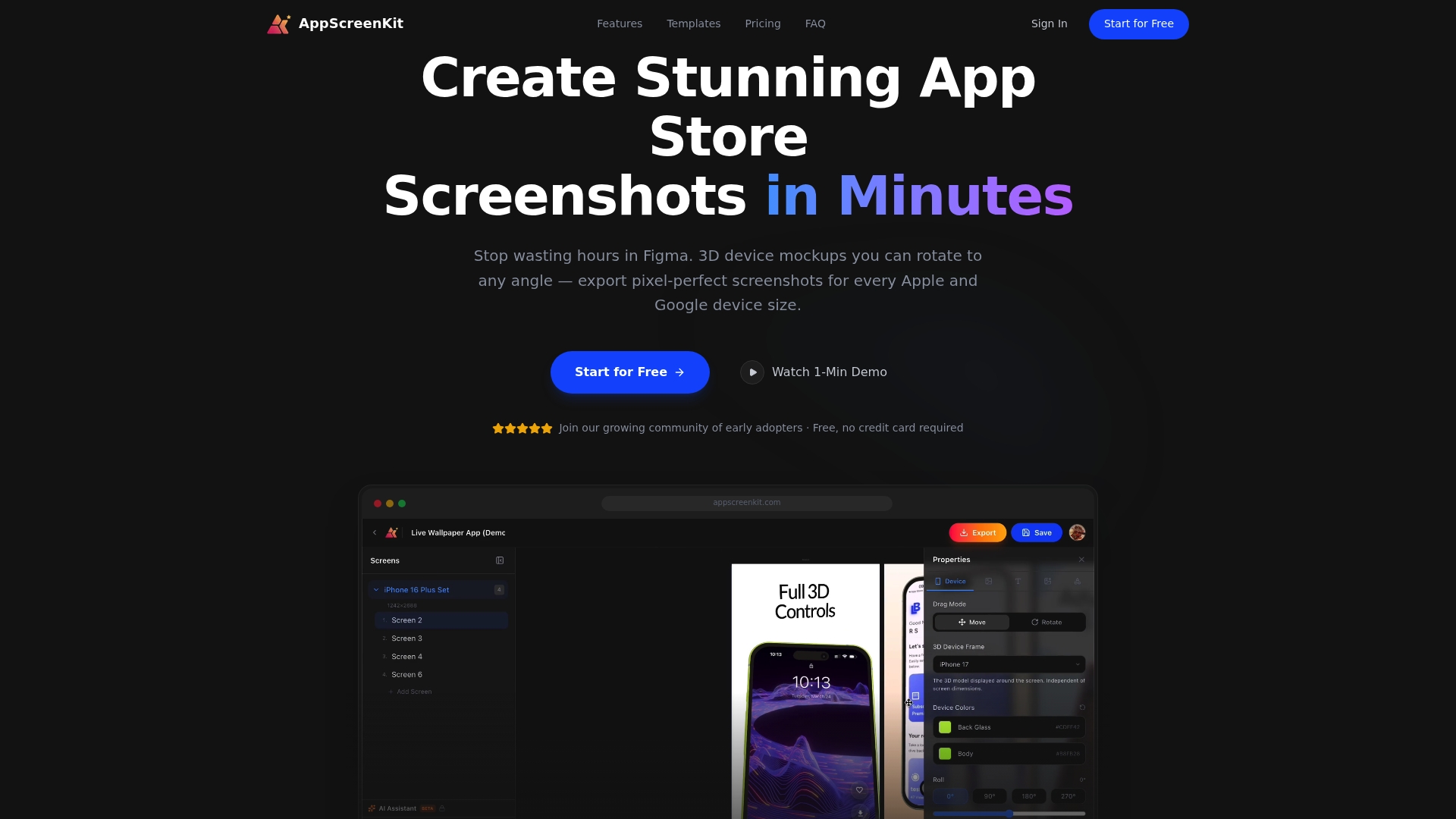
With AppScreenKit, you can upload your app screens, drop them into professional 3D device mockups that rotate in true 3D space, add localized captions and gradient backgrounds, and export pixel-perfect screenshots for every required device size in a single click. The platform includes pre-built screenshot templates optimized for both the App Store and Google Play, so you are not starting from scratch on every iteration. When you are ready to run an A/B test, spinning up a variant takes minutes rather than hours. Explore the full range of 3D mockup features and start with the free plan to see how much faster your next launch can move.
Frequently asked questions
How do I pick the best device for my app screenshot mockups in 2026?
Use the latest flagship models for each platform, like the iPhone 17 or Galaxy S26, to make your app look relevant and actively maintained to potential users.
Are framed or frameless mockups better for conversions?
Frameless screenshots convert better for games by 5 to 8% on average, while productivity and utility apps often perform best with framed mockups that add device context.
What are the biggest mistakes indie teams make with 3D app mockups?
The most common errors are using outdated device models, skipping pixel-perfect scaling, and not localizing screenshots for target markets, which can cost 30 to 80% in conversion lift.
How much can optimized 3D mockups really impact my downloads?
Optimized screenshots can lift app store conversion rates by 25% to 40%, which translates directly into more installs from the same amount of store traffic.
What is the most important step when A/B testing app mockups?
Test one variable at a time and run each experiment for at least 7 to 14 days to get results that are statistically reliable and actionable.
Leave a Reply