
TL;DR:
- Well-designed store visuals can increase app installs by 23-28% over plain screenshots.
- Using current device frames and templates ensures compliance and visual trustworthiness.
- Simplifying mockups and focusing on clarity boosts user engagement and conversion.
Your app could be genuinely great, but if your store listing looks like an afterthought, most users will scroll right past it. Generic screenshots blend into the noise. Competitors with polished, contextual visuals capture the clicks. App store mockups boost installs by 23–28% compared to plain screenshots, which means your visuals are a direct lever on your revenue. This guide walks you through everything: the tools you need, a step-by-step creation process, best practices for compliance, common mistakes to skip, and shortcuts that actually save time for small teams.
Table of Contents
- What you need: Tools, files, and preparation
- Step-by-step: Creating 3D device mockups
- Best practices for impactful, compliant device mockups
- Common mistakes, troubleshooting, and time-saving tips
- Why most teams get mockups wrong (and what actually works)
- Accelerate your app visuals with AppScreenKit
- Frequently asked questions
Key Takeaways
| Point | Details |
|---|---|
| Start with the right tools | Organize templates, device frames, and image assets before you design for the most efficient workflow. |
| Test and optimize mockups | A/B test your first app store screenshot to maximize install rates and keep mockups simple for readability. |
| Stay current for credibility | Always use up-to-date device frames and comply with app store guidelines to avoid rejections and build trust. |
| Leverage time-saving options | Use AI-powered tools and online generators to cut design time by 30% or more without sacrificing quality. |
What you need: Tools, files, and preparation
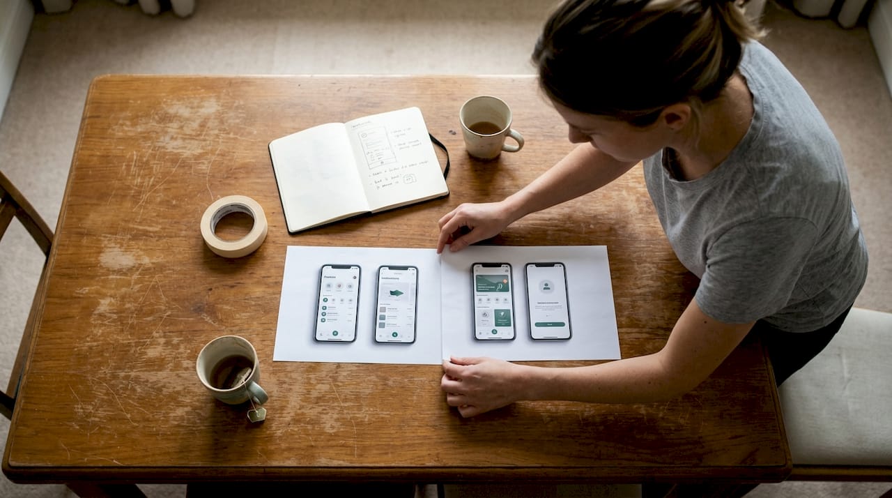
Before you open any editor, getting your workspace organized saves you hours of rework later. Think of this phase as mise en place for developers: everything prepped, labeled, and ready to go.
Tools you can use:
- Adobe Photoshop – Best for advanced layering and smart object control
- Photopea – Free browser-based Photoshop alternative; handles PSDs natively
- Figma with mockup plugins – Great for teams already working in Figma
- Online generators (like AppScreenKit) – Fastest option; no design skills required
Key file requirements:
| Asset | Recommended spec |
|---|---|
| App screenshot (iOS) | 1290 x 2796 px (iPhone 15/17 Pro Max) |
| App screenshot (Android) | 1080 x 1920 px minimum |
| Export format | PNG, no compression |
| Color profile | sRGB |
For device frames, mockup best practices consistently emphasize sourcing templates from reputable libraries and keeping them updated. Using pre-built screenshot templates removes most of the guesswork around sizing and frame positioning.
One thing teams frequently overlook: mockup customization options matter beyond just swapping screen content. Background gradients, text overlays, and device angle all contribute to whether a user taps your listing or a competitor’s.
Always use only current device frames like iPhone 17 or Galaxy S25. An outdated device frame signals to users that your app may not be actively maintained, which quietly kills trust before someone even reads your description.
Pro Tip: Create a single shared folder with all your raw app screenshots at full resolution, named by screen and platform. When you update the app, you only need to swap those files and re-export. This turns a two-hour refresh into a ten-minute task.
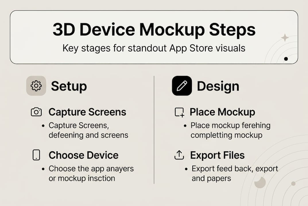
Step-by-step: Creating 3D device mockups
With your assets ready, here is how to build mockups using either a desktop editor or an online generator.
Using Photoshop or Photopea:
- Download a device frame PSD for your target device (iPhone 17, Galaxy S25, etc.)
- Open the PSD and locate the smart object layer labeled “screen” or “insert here”
- Double-click the smart object to open it in a separate canvas
- Paste your app screenshot, resize to fit, and save the smart object
- Return to the main PSD and your screen content updates automatically
- You can
generate a 3D base image, overlay your UI using smart objects, and easily swap screens in PSD without rebuilding from scratch
- Adjust shadows, angle, and background, then export as PNG at full resolution
Using an online generator:
- Open your chosen platform
- Select a device template (3D angle, flat, or floating)
- Drag and drop your screenshot into the preview area
- Customize background color, gradient, or text callouts
- Online generators let you drag and drop screenshots and output device-perfect PNGs in seconds
- Export all required sizes with one click
Comparison: Desktop editor vs. online generator
| Factor | Photoshop/Photopea | Online generator |
|---|---|---|
| Speed | Slower | Fast |
| Design flexibility | High | Moderate |
| Learning curve | Steep | Minimal |
| Cost | Free to paid | Free to low cost |
| Reusability | Excellent (PSD) | Good (templates) |
The advantages of mockup tools built specifically for app stores go beyond speed. They bake in compliance checks and correct export dimensions automatically.
Always verify your device frame version before publishing. App stores update their approved device imagery regularly, and an outdated frame can trigger a review rejection even when your app content is fully compliant.
Pro Tip: Save your editable PSD or template project file after every session. When your next app update drops, you will not be starting over. Batch exports for multiple store sizes take seconds instead of hours.
If you want to skip the setup entirely, the App Store Screenshot Generator handles templates, 3D rotation, and multi-size export in one workflow.
Best practices for impactful, compliant device mockups
Creating a mockup and creating a good mockup are two different things. These practices separate store listings that convert from ones that just exist.
Choose the right style for your app category:
- Frameless mockups work best for games and immersive visual apps. Frameless mockups outperform framed by 5–8% on average in A/B tests because nothing interrupts the game’s visual language.
- Framed mockups perform better for productivity, finance, and utility apps. The device context helps users picture themselves using the app.
- Avoid extreme 3D angles on detail-heavy screens. If users cannot read your UI at a glance, the mockup works against you.
On shadows and lighting:
Subtle shadows perform best in testing. Dramatic lighting effects distract from the actual UI and can make text overlays unreadable. A soft, 10–15% opacity drop shadow is almost always enough.
Compliance matters more than you think:
Apple and Google both have specific rules around how devices can be depicted in marketing materials. Follow app store requirements carefully, especially when featuring third-party device brands. Using a non-approved frame or placing UI elements outside the safe zone can result in a binary rejection with no specific feedback.
Key visual best practices at a glance:
- Keep text overlays short: five words or fewer per frame
- Match your brand color palette to the background gradient
- Use consistent device orientation across all screenshots
- Check current app visual trends to see what is gaining traction in your category
- Review your screenshot optimization approach before every major release
Stat callout: Professionally designed mockups boost installs by 23–28% compared to plain screenshots. The first three screenshots carry the most weight, since those are what users see before tapping to expand.
Common mistakes, troubleshooting, and time-saving tips
Even teams that do their homework hit friction. Here is where most of the wasted time goes, and how to recover fast.
Frequent mistakes:
- Using device frames from 2022 or earlier when current flagships are available
- Over-editing: too many effects, gradients, and text blocks competing for attention
- Unreadable UI at thumbnail size (test by viewing at 150px wide before finalizing)
- Ignoring platform-specific rules (Apple and Google have different safe zone specs)
- Treating all five screenshots as equal when the first one drives 70%+ of click decisions
Troubleshooting quick fixes:
- Pixelated exports: Always start from the highest resolution source file. Never upscale.
- Color mismatch between screens: Standardize to sRGB across all exported assets
- Rejected by stores: Check device depiction rules first; this is the most common trigger
- Mockup looks flat or fake: Add a very subtle ambient shadow and slight background blur depth
For AI-powered shortcuts, newer tools can cut production time significantly. AI tools can cut production time by 30% or more, and A/B testing your first screenshot alone can produce a 10–40% conversion rate gain.
Focus your A/B testing energy on screenshot one and two before touching anything else. Small copy and image changes to those frames have a disproportionate effect on your conversion rate.
Pro Tip: Use AppScreenKit or a similar platform to generate screenshots fast for your initial A/B test variants. Ship two versions, wait for data, then refine. This beats spending days on a “perfect” design you never validate.
Why most teams get mockups wrong (and what actually works)
Here is the honest take: most small teams spend too much time making mockups look impressive and not enough time making them work.
The instinct to add more, more detail, more effects, more text, comes from caring about your product. That instinct is good. But in app store contexts, where a user is scrolling and deciding in under three seconds, complexity is a liability. Clarity wins.
We have seen teams rebuild their mockups three times before launch because they kept adding elements that felt premium but obscured the actual app. The listings that convert best are often the simplest: a clean device frame, one short text label, and a background that does not compete with the UI.
The advantages of mockup tools built for app stores go beyond convenience. They constrain you in useful ways, limiting what you can overdesign. Templates force consistency. One-click export prevents the “just one more tweak” loop that eats days.
Data should drive every decision here, not aesthetics. Run a test. Look at the numbers. The market will tell you what works faster than any design opinion, including ours.
Accelerate your app visuals with AppScreenKit
If building mockups from scratch still sounds like more work than it should be, you are not wrong. The process is faster and more consistent when you have the right platform behind it.
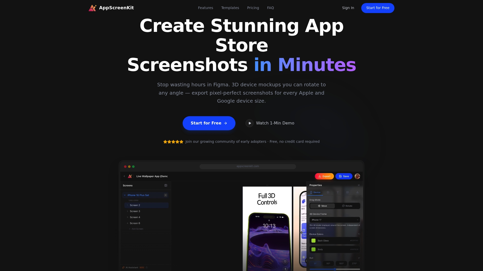
AppScreenKit is built specifically for developers and small teams who need polished, store-ready visuals without a designer on staff. Upload your screenshots, pick a 3D device frame, customize backgrounds and text, and export all required sizes in one click. The 3D mockup generator includes current device frames, compliance-friendly templates, and flexible customization so your visuals stay sharp and store-approved. Review the mockup tool advantages or check the store submission requirements guide to make sure your next release goes live without delays.
Frequently asked questions
Which devices should I use for my app mockups in 2026?
Always use current device frames like the iPhone 17 series or Galaxy S25. Up-to-date frames signal that your app is actively maintained and trustworthy to potential users.
Do 3D device mockups really increase app installs?
Yes. Mockups boost installs by 23–28% over plain screenshots, and frameless mockup styles add another 5–8% lift on average in A/B testing.
Is it better to use an online generator or Photoshop for mockups?
Online generators enable drag-and-drop workflows that are fastest for most teams, while Photoshop or Photopea gives you deeper control over shadows, angles, and layering when you need it.
How can I avoid app store rejection on my visuals?
Follow official Apple and Google guidelines carefully, and only use approved, current device frames to stay compliant. Device depiction rules are the most common trigger for visual rejections.
Leave a Reply