
TL;DR:
- App rejection often results from visual and metadata discrepancies rather than code issues.
- Strict guidelines on screenshot size, content, and UI accuracy are essential for approval.
- Using templates and checklists helps ensure compliance and boosts app store conversion rates.
Most app rejections are not caused by bad code or broken features. They happen because a screenshot was the wrong size, a UI element looked altered, or a call-to-action slipped into a Google Play asset. App stores enforce strict, evolving submission rules, and the gap between “close enough” and fully compliant can cost you real installs. This article walks through exactly what both Apple and Google Play require for visual assets, where developers most commonly stumble, and how to build a repeatable process that gets your app approved and converting from day one.
Table of Contents
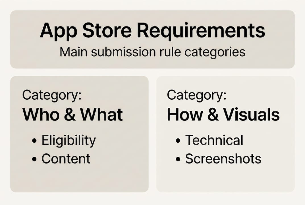
- Understanding core app store requirements
- Screenshot and visual asset requirements: What the stores demand
- Common pitfalls and edge cases: Why apps get rejected
- Step-by-step: Preparing and submitting compliant app store visuals
- What most guides miss about app store requirements
- Easier app store compliance and higher conversions with AppScreenKit
- Frequently asked questions
Key Takeaways
| Point | Details |
|---|---|
| Visual compliance is critical | Accurate, high-quality screenshots are as important as code for app approval and downloads. |
| First impressions count | The first two screenshots influence most users’ app install decisions in under 7 seconds. |
| Avoid common pitfalls | Modified UIs, wrong sizes, and forbidden CTAs are top reasons for rejection. |
| Proactive reviews boost success | Use checklists and visual QA before submitting to prevent setbacks and speed approvals. |
Understanding core app store requirements
App store requirements are not just a legal formality. They are a structured set of rules that govern everything from your app’s content and metadata to the exact pixel dimensions of your screenshots. Both Apple App Store and Google Play maintain detailed policies, and both update them regularly. Missing a single spec can send your submission back to square one.
At the highest level, requirements fall into four buckets: eligibility (who can publish), content policies (what your app can do and say), metadata rules (titles, descriptions, keywords), and visual asset specifications (screenshots, icons, feature graphics). Most developers focus on the first three and underestimate the fourth. That is a mistake, because visuals are the first thing a potential user sees and the first thing a reviewer checks against policy.
For Google Play, store listing requirements include strict rules on screenshot dimensions, content accuracy, and prohibited elements. Google Play requires minimum 2 screenshots with specific dimension and content guidelines, and non-compliance is one of the top reasons listings get flagged before they even reach a human reviewer.
Apple’s review process is known for its attention to UI accuracy. Reviewers will reject screenshots that show a modified interface, include device frames that misrepresent the hardware, or display features the app does not actually have. The bar is high, and it is enforced consistently.
Here are the most commonly missed requirements across both platforms:
- Screenshot dimensions outside the accepted range for the target device
- Metadata that does not match the actual app experience
- Icons with transparency or alpha channels on platforms that prohibit them
- Promotional text, rankings, or pricing embedded in screenshots
- Feature graphics that include device frames on Google Play
“Compliance is not a one-time task. Platforms update their guidelines, and what passed review six months ago may not pass today. Build a habit of checking policy pages before every major submission.”
Using a store listing checklist before each submission is one of the simplest ways to catch these issues early, before they become rejection notices.
Screenshot and visual asset requirements: What the stores demand
Once you understand the big-picture compliance, the next step is nailing your app’s visuals. Screenshots are not just compliance boxes to tick. They are your primary conversion tool, and the stores treat them that way.

Here is a side-by-side look at the core technical requirements:
| Requirement | Apple App Store | Google Play |
|---|---|---|
| Minimum screenshots | 1 per device type | 2 per device type |
| Maximum screenshots | 10 per device type | 8 per device type |
| Max dimension | 2208px | 3840px |
| Aspect ratio | Varies by device | No greater than 2:1 |
| File format | PNG or JPEG | PNG or JPEG |
| Device frames | Allowed (accurate only) | Not preferred |
| CTAs / pricing | Prohibited | Prohibited |
Google Play limits screenshots to 8 per device type, prohibits CTAs and pricing claims, and recommends at least 4 shots per listing. Apple has similar content rules but places extra emphasis on UI accuracy. If your screenshot shows a button that does not exist in the current build, expect a rejection.
Beyond the technical specs, both stores care deeply about content quality. Screenshots should show real, in-app functionality. They should be sharp, well-lit (in a design sense), and immediately communicate what the app does. Blurry assets, low-contrast text, or cluttered layouts will hurt your conversion rate even if they technically pass review.
For content best practices, keep these rules in mind:
- Use at least 4 screenshots per device type, even when the minimum is 2
- Show your app’s core value in the first two frames
- Avoid embedding rankings, awards, or time-sensitive claims
- Match the screenshot content to the device it targets
- Follow preview image tips to maximize visual impact per frame
Pro Tip: The first two screenshots do the heaviest lifting. Research consistently shows they influence up to 70% of install decisions. Treat those two frames like a billboard, not an afterthought. Everything else supports the story they start.
For developers who want to go deeper on screenshot optimization, the payoff is measurable. Better visuals directly correlate with higher conversion rates on both platforms.
Common pitfalls and edge cases: Why apps get rejected
With requirements in mind, let’s see where real submissions often stumble and how to avoid those pitfalls.
Rejections rarely come from obvious mistakes. They come from the edge cases, the details that feel minor but trigger automated or manual flags. Apple rejects modified UI and alpha channels; Google flags low-resolution shots and spam text. And across both platforms, the average user makes a download decision in under 7 seconds, with the first two screenshots driving up to 70% of drop-off influence.
Here is a comparison of the most common rejection triggers by platform:
| Issue | Apple App Store | Google Play |
|---|---|---|
| Modified or altered UI | Rejected | Not applicable |
| Alpha channels in icons | Rejected | Allowed |
| Low resolution assets | Flagged | Flagged |
| CTAs or pricing in screenshots | Rejected | Rejected |
| Inaccurate app representation | Rejected | Rejected |
| Device frames | Allowed (accurate) | Not preferred |
| Spam or keyword stuffing in text | Metadata rejection | Metadata rejection |
The most frequent submission mistakes, in order of how often we see them:
- Submitting screenshots at the wrong pixel dimensions for the target device
- Including alpha channels in icons submitted to Apple
- Showing UI states or features that are not in the current app version
- Embedding promotional text, pricing, or ranking claims in screenshot images
- Using device mockups that misrepresent the hardware model
- Uploading assets with visible compression artifacts or blurry text
For Google Play visual design, the rules around content accuracy are just as strict as Apple’s, even if the technical specs differ. A screenshot that shows a premium feature in a free app, without clearly labeling it, can trigger a rejection for misleading representation.
Pro Tip: Before submitting, load your screenshots onto actual physical devices. What looks sharp on a 27-inch monitor can look pixelated on a real phone screen. This single step catches more edge-case issues than any automated validator.
For teams working on app screenshot branding, consistency across device types is also a common miss. Your iPhone 15 Pro screenshots and your iPad screenshots should feel like they belong to the same product.
Step-by-step: Preparing and submitting compliant app store visuals
Knowing what to avoid, here’s how you can reliably prep and submit approval-ready visuals.
A structured workflow removes guesswork and makes compliance repeatable. Here is the process we recommend:
- Plan your screenshot story. Decide which 4 to 8 moments best represent your app’s value. Map each screenshot to a specific feature or user benefit before opening any design tool.
- Design to spec from the start. Use the correct canvas dimensions for each target device. Do not design at one size and resize later. Resizing introduces quality loss and dimension errors.
- Apply branding consistently. Use your app’s color palette, typography, and tone across all frames. Follow branding steps to keep visuals cohesive and professional.
- Export at the correct file format and resolution. PNG is generally preferred for sharpness. Check each platform’s maximum file size limits before exporting.
- Run a QA pass against the platform checklist. Use a visuals checklist to verify every asset before upload.
- Upload and preview in the developer console. Both App Store Connect and Google Play Console let you preview how assets will appear. Use this step. Do not skip it.
For your final QA pass, check every asset against this list:
- Correct pixel dimensions for each device type
- No alpha channels in Apple icon submissions
- No CTAs, pricing, or ranking claims embedded in images
- UI shown matches the current app build exactly
- Text in screenshots is legible at actual device size
- File format is PNG or JPEG with no compression artifacts
- Feature graphic (Google Play) does not include a device frame
Best outcomes come from following technical requirements and focusing on visual accuracy and quality. Teams that build this checklist into their release workflow see fewer rejections and faster approval cycles.
What most guides miss about app store requirements
Most articles on this topic treat requirements as a compliance checklist, something to get through so you can move on. That framing is exactly what keeps good apps stuck at average conversion rates.
The developers who consistently outperform in app stores are not just meeting requirements. They are using those constraints as a creative brief. Every rule about screenshot accuracy, every prohibition on misleading visuals, is also an instruction to show your app honestly and compellingly. That is a marketing opportunity, not a burden.
We have seen apps with technically perfect submissions convert at half the rate of apps with the same specs but stronger visual storytelling. The difference is almost always in how the first two screenshots communicate value, not whether they passed a dimension check.
Our honest take: treat platform requirements as a floor, not a ceiling. Build visual marketing strategies that go beyond compliance and actively sell your app. And stay proactive. Platform guidelines shift, and the developers who notice early have a real advantage over those scrambling to catch up after a rejection.
Easier app store compliance and higher conversions with AppScreenKit
If you have made it through this guide, you know how many details go into a compliant, high-converting app store listing. The good news is that you do not have to manage all of it manually.
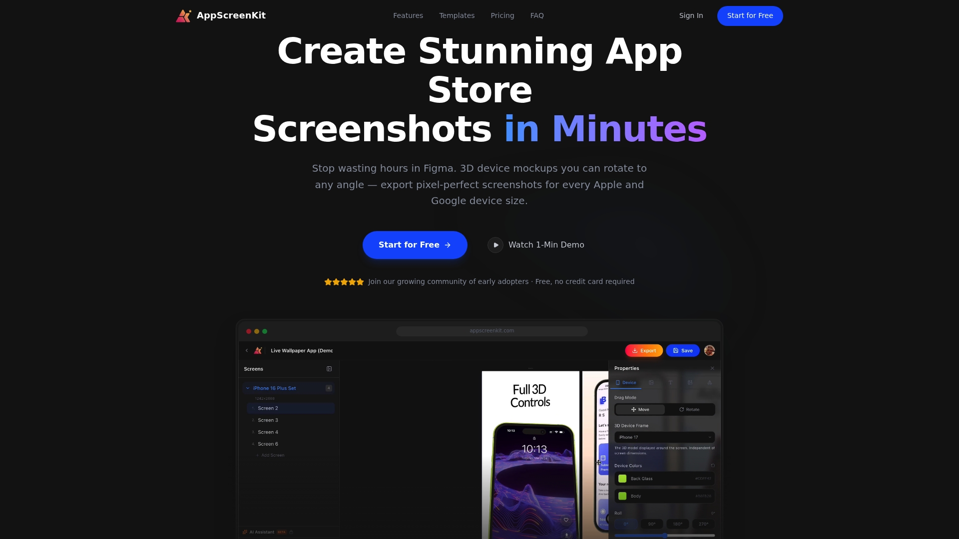
AppScreenKit is built specifically for this workflow. The App Store Screenshot Generator gives you pre-sized canvases for every major device type, so dimension errors become a non-issue. You can explore app store mockup tools to add professional 3D device frames that meet platform guidelines, and use pre-built screenshot templates to move from blank canvas to submission-ready assets in minutes. For indie developers and small teams, it is the fastest path from app build to app store approval.
Frequently asked questions
What screenshots do I need for the App Store and Google Play?
Apple requires accurate UI screenshots that reflect your current app build. Google Play needs at least 2 screenshots per device type, with no calls-to-action or pricing shown, and recommends 4 or more at 1080px and above.
Why do apps get rejected for screenshots?
The most common causes are modified UIs, poor resolution, alpha channels in icons, and prohibited elements like CTAs or inaccurate feature representations. Apple rejects modified UI and alpha channels; Google flags low-resolution assets and spam text.
How many screenshots should I use?
Google recommends 4 or more per device type at 1080px or higher, with a maximum of 8. Apple requires enough to clearly demonstrate your app’s core features, and more is generally better for conversion.
What is the most important screenshot in my app listing?
The first two screenshots carry the most weight. They influence up to 70% of install decisions and most users form their impression within 7 seconds of viewing the listing.
Can I use device frames or promotional text in Google Play screenshots?
Google prohibits promotional CTAs, rankings, and pricing in screenshots and prefers that you avoid device frames entirely. Accurate in-app experience should be the focus of every asset you submit.
Leave a Reply