TL;DR:
- Branded screenshots utilize design, branding, and marketing elements to enhance app store appeal.
- Optimized, branded visuals can increase conversion rates by 20 to 40 percent.
- Strategic choices in framing, platform specifics, and unique branding distinguish successful listings.
Most developers pour months into building a great app, then upload a few plain screen captures and wonder why downloads stall. Your app store listing is a storefront, and screenshots are the window display. Potential users spend roughly three seconds scanning visuals before deciding to install or scroll past. Optimized screenshots boost CVR by 20 to 40%, yet the majority of listings still rely on raw UI captures with zero branding. This guide breaks down what branded screenshots actually are, how to build them step by step, and why getting this right is one of the highest-leverage moves you can make for your app’s growth.
Table of Contents
- What is a branded app screenshot?
- Step-by-step process to create branded app screenshots
- How branded screenshots drive user conversions
- Critical choices: Framed vs. frameless, iOS vs. Google Play, and best practices
- Why most apps fail with screenshots (and how to break through)
- Ready to create branded screenshots that convert?
- Frequently asked questions
Key Takeaways
| Point | Details |
|---|---|
| Branded screenshot basics | Branded app screenshots combine your brand’s visual identity with strategic marketing overlays for greater impact than standard UI captures. |
| Conversion-driven design | Tests show optimized visuals can lift app store conversions by 20-40% and affect nearly every download decision. |
| Step-by-step creation | Capture, enhance, overlay brand elements, and export compliant images using specialized tools for best results. |
| Best practices matter | Customization for platform, device, and message—like going frameless or using benefit-led copy—makes a measurable difference. |
| Stand out in the app store | Thoughtful branding, storytelling, and strategic visual order outperform imitation and generic templates every time. |
What is a branded app screenshot?
A plain screenshot is simply what you get when you press the capture button on a device. It shows the interface, nothing more. A branded app screenshot is something entirely different. It is a professionally designed image that layers your visual identity, your colors, your fonts, your logo, and persuasive marketing copy on top of the actual app UI. The goal is not just to show what the app looks like; it is to communicate why someone should care.
As Kajabi’s documentation puts it, a branded screenshot incorporates colors, fonts, logos, and marketing visuals well beyond standard UI captures. That distinction matters enormously. Think of it this way: a plain screenshot is a product photo with no background, no styling, and no context. A branded screenshot is a product photo styled for a magazine ad.
Here is a breakdown of the core differences:
| Element | Standard screenshot | Branded screenshot |
|---|---|---|
| Background | App UI only | Custom gradient or brand color |
| Text overlay | None | Benefit-driven headline |
| Device frame | None or basic | Styled 3D mockup |
| Logo | Not present | Prominent brand mark |
| Font | System default | Brand-specific typeface |
| Visual style | Functional | Polished, marketing-ready |
The key elements that make a screenshot truly branded include:
- Consistent color palette that reflects your brand identity
- Benefit-driven text that answers “what does this do for me?”
- Device mockups that frame the UI in a professional context
- Logo placement for immediate brand recognition
- Typography that matches your overall visual system
“Your screenshots are not just documentation of your app’s UI. They are your most powerful marketing asset on the app store page.”
For a hands-on walkthrough of putting these pieces together, the branded screenshot tutorial at AppScreenKit walks you through the process with real examples. Understanding these components is the foundation, but the real question is how you actually produce them efficiently.
Step-by-step process to create branded app screenshots
Building branded screenshots does not require a design degree. It requires a clear process. Here is how to do it without getting lost in the details.
-
Capture raw UI screenshots inside your app. Use a physical device or emulator to grab clean, high-resolution screen captures. Make sure the UI shows your best feature, not a loading screen or an empty state.
-
Choose a purpose-built design tool. General design software like Photoshop can work, but specialized tools are faster and safer. Specialized tools let you add device frames, backgrounds, and text overlays while ensuring compliance with store specs out of the box. Options include AppLaunchpad, AppMockUp, and AppScreenKit.
-
Apply your brand colors and gradients. Set the background to your primary brand color or a gradient that feels on-brand. Avoid generic blues and grays that blend into every other listing in the category.
-
Add benefit-oriented text headlines. Write short, punchy captions that lead with the user benefit. “Track every habit in seconds” beats “Habit tracking feature” every time. Keep it under eight words per overlay.
-
Frame the UI in a device mockup. A polished 3D device frame adds professionalism and context. Rotate the mockup for visual interest, especially for the first screenshot. Browse screenshot template options to find layouts that suit your app category.
-
Export to exact store specifications. iOS requires 6.9-inch and 6.5-inch sizes at minimum. Google Play has its own pixel requirements. Getting this wrong triggers rejections and delays. Review preview images best practices to avoid common sizing mistakes before you submit.
-
Build localization-ready versions from the start. Design your layout so text overlays sit in separate layers. Swapping headline copy for German, Spanish, or Japanese becomes a five-minute task instead of a full redesign.
Pro Tip: Set up your brand color codes, fonts, and logo as reusable assets in your design tool before you start. This single habit cuts production time by more than half when you need to update screenshots after a major feature release.
How branded screenshots drive user conversions
Great-looking screenshots are not just about aesthetics. They directly move the needle on installs. The data is clear: screenshots can boost conversions by 20 to 40%, and most users make their install decision based on visuals alone, often without reading a single word of the description.

Here is a snapshot of what the research tells us:
| Metric | Impact |
|---|---|
| CVR lift from optimized screenshots | 20 to 40% |
| Users who decide based on visuals | Over 60% |
| First screenshot view rate | Approximately 80% |
| Screenshots typically viewed before deciding | 2 to 3 |
The reason visuals outperform text so heavily comes down to how the brain processes information. Images register in milliseconds. A headline in a description takes conscious effort to read. When someone is scrolling through search results, a striking screenshot stops the scroll. A bland one does not.
Beyond raw aesthetics, specific optimizations make a measurable difference:
- Benefit-led messaging converts better than feature lists because it answers “what is in it for me?”
- Screenshot order matters because the first image carries roughly 80% of all impressions
- Localized visuals outperform English-only versions in non-English-speaking markets by a significant margin
- Consistent visual theme across all screenshots builds trust and perceived app quality
For a deeper look at applying these principles, see how branding drives conversions with specific case examples. You can also review screenshot optimization results to see how iterative testing compounds these gains over time.
Critical choices: Framed vs. frameless, iOS vs. Google Play, and best practices
Once you understand why branded screenshots work, the next layer is making the right strategic calls for your specific context. Not every app benefits from the same visual approach.
Framed vs. frameless: Device frames add context and reinforce the “real app on a real phone” feeling. But data shows frameless screenshots outperform framed by 5 to 8% in many categories, particularly productivity and utility apps, where clean presentation of the UI itself sells the product. Framed screenshots work better for games and lifestyle apps where the device context adds emotional resonance.
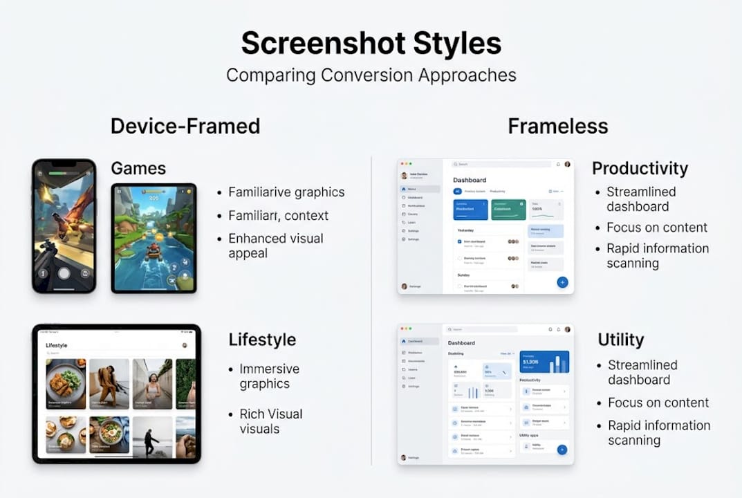
| Approach | Best for | Conversion tendency |
|---|---|---|
| Device-framed | Games, lifestyle apps | Strong contextual appeal |
| Frameless | Productivity, utilities | Higher direct CVR on average |
| 3D rotated mockup | Any premium app | High perceived quality |
iOS vs. Google Play: Apple’s App Store audience tends to respond to emotional, brand-forward visuals. Google Play users lean toward clarity and scenario-driven imagery that shows the app solving a specific problem. Your copy and visual style should reflect that difference. Reviewing app store requirements for each platform before you export saves painful resubmission cycles.
Common pitfalls to avoid:
- Overloading screenshots with too much text or too many UI elements
- Using stock photos that feel disconnected from the actual app experience
- Ignoring platform-specific size and content guidelines, which leads to rejection
- Treating all five screenshot slots the same, when each should build on the last
- Forgetting to update screenshots after major UI changes
Pro Tip: Test your first three screenshots ruthlessly. Users swipe through only two or three before deciding. If your opening trio does not communicate clear value and visual appeal, nothing else matters. Track the visual trends shaping engagement in 2026 to ensure your style feels current.
Why most apps fail with screenshots (and how to break through)
Here is something nobody says out loud: most app screenshots look identical because developers benchmark against competitors and copy what they see. The result is a category full of listings that blur together. Copying the market leader’s visual style does not give you their results. It just makes you one of many apps that look like a cheaper version of something else.
The apps that genuinely break through with screenshots are not the ones with the biggest design budgets. They are the ones that took time to understand their specific audience and built visuals around what that audience actually cares about. An indie meditation app that shows a person breathing calmly with warm amber tones will outperform a generic blue-and-white grid layout, not because it is technically better, but because it feels intentional.
Template visuals are a fine starting point, but they become a ceiling if you never move past them. Explore real branding examples to see how outlier apps built unique visual identities that drove outsized installs. The difference is almost never technique. It is conviction about who the app is for and what feeling it should create.
Ready to create branded screenshots that convert?
Everything covered in this guide points to one practical conclusion: your screenshots need to work as hard as your app does. The strategy is clear, and now you need the right tools to execute it without spending weeks in Figma or hiring a design team.
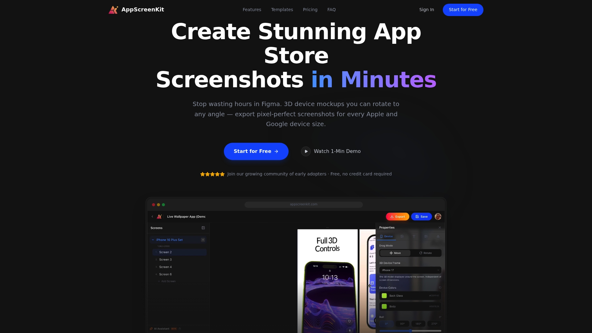
AppScreenKit is built exactly for this. The App Store Screenshot Generator gives you 3D device mockups, gradient backgrounds, branded text overlays, and one-click multi-size export, all in a browser, no design experience needed. Dig into the mockup tools guide to see how the workflow compares to traditional methods, and check the submission rule guide to make sure every file you export is store-ready on the first attempt.
Frequently asked questions
What distinguishes a branded app screenshot from a regular one?
A branded screenshot incorporates your logo, color palette, custom fonts, and benefit-driven marketing overlays, while a standard screenshot is just a raw capture of the app’s UI with nothing added.
How much can optimized screenshots boost my app downloads?
Conversion rates increase by 20 to 40% with well-designed branded screenshots, and since the first screenshot alone gets roughly 80% of all views, optimizing it has an outsized impact on installs.
Are framed or frameless screenshots better?
Frameless screenshots outperform framed ones by 5 to 8% on average, but the best choice depends on your app category and the specific platform you are targeting.
What tools help create branded app screenshots fast?
Popular tools include AppLaunchpad, AppMockUp, and AppScreenKit, each offering device frames, background editors, and export options designed to meet store requirements without manual resizing.
Leave a Reply