TL;DR:
- Visual branding of screenshots significantly increases app downloads and user trust.
- Consistent colors, fonts, and device mockups create professional, recognizable listings that convert.
- Indie developers have a competitive edge by iterating quickly and optimizing visual assets effectively.
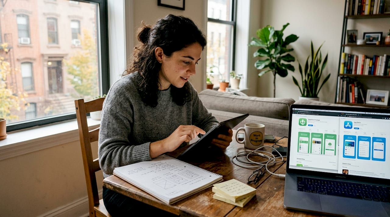
Most users spend about five seconds scanning your app store listing before they decide to download or keep scrolling. Those seconds are almost entirely visual. Your screenshots are not just product images — they are your pitch, your brand, and your first handshake with a potential user. 60-70% of users make that call based on the first three screenshots alone, without ever scrolling further. This tutorial walks you through exactly how to brand your app screenshots for maximum impact, from setup to export, with actionable steps built for indie developers and small teams.
Table of Contents
- Understand the impact: why screenshot branding matters
- Get ready: essential tools and requirements
- Step-by-step guide: create branded app screenshots
- Check your work: common mistakes and how to verify results
- Why strong screenshot branding is your indie edge
- Level up your screenshots with AppScreenKit
- Frequently asked questions
Key Takeaways
| Point | Details |
|---|---|
| First impressions matter | Over half of users decide on your app within the first few screenshots. |
| Tool selection is crucial | Using templates and the right branding tools speeds up your workflow and boosts quality. |
| Consistent branding drives trust | Alignment with your app’s colors and voice increases user confidence and download rates. |
| Test for real impact | Verifying your screenshots with users or A/B tests ensures your branding actually works. |
Understand the impact: why screenshot branding matters
Your app could be brilliant. The onboarding could be flawless. But if your screenshots look generic, rushed, or inconsistent, users will never find out. Screenshot branding is the process of making your app’s visuals feel intentional, recognizable, and trustworthy at a glance.
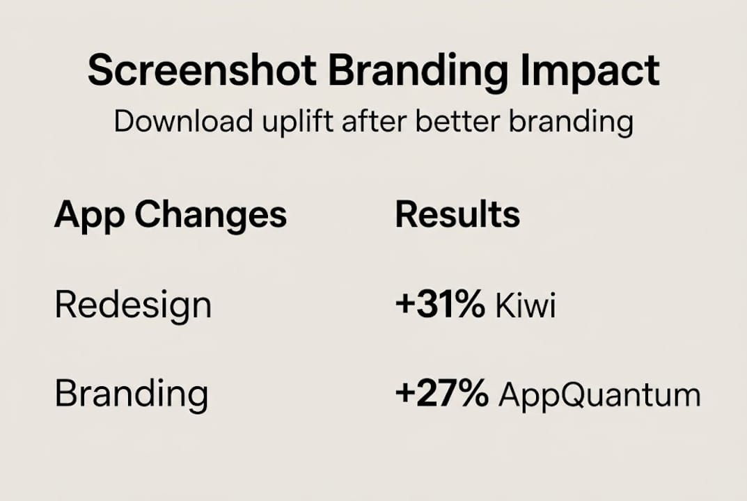
The numbers back this up hard. Kiwi.com gained +31% downloads after optimizing their screenshots, and AppQuantum saw a +21.5% lift under similar conditions. These are not outliers — they are what happens when visual presentation is treated as a core growth lever, not an afterthought.
Here is a quick overview of what screenshot optimization can realistically deliver:
| App / Team | Change Made | Download Uplift |
|---|---|---|
| Kiwi.com | Screenshot redesign with branding | +31% |
| AppQuantum | Visual hierarchy improvements | +21.5% |
| Typical indie app | Consistent color and messaging | +10-20% |
The indirect benefits matter just as much as the direct ones. Strong screenshot branding builds recognition across search results, increases trust before a user even taps your listing, and signals professionalism that carries over into review sentiment. Users who feel confident before downloading are more likely to engage and less likely to churn early.
Understanding screenshot optimization basics is the foundation. Once you see how small visual decisions compound into real conversion differences, the process stops feeling like design work and starts feeling like growth work. Pairing that with smart visual marketing strategies gives you a repeatable framework rather than a one-time fix.
Key indirect benefits of strong screenshot branding include:
- Stronger brand recall across multiple app store placements
- Higher trust signals before a user reads a single review
- Better ASO performance because visuals influence click-through rates
- Reduced refund and churn risk from users who know what they are getting
The first 3 screenshots carry the most weight. Everything else in your listing is secondary to what users see in that initial frame.
Get ready: essential tools and requirements
Before you open any tool, you need the right assets and a clear picture of what each store actually requires. Skipping this step is the fastest way to waste hours on screenshots that get rejected or underperform.
Here is how the main tool categories compare:
| Tool type | Skill required | Speed | Cost | Best for |
|---|---|---|---|---|
| Figma / Sketch (DIY) | High | Slow | Low to mid | Teams with designers |
| Template-based platforms | Low | Fast | Low | Indie devs, small teams |
| Hiring a designer | None | Varies | High | One-time launches |
Template-based platforms like AppScreenKit are built specifically for speed without sacrificing quality. You do not need to know Figma. You do not need to hire anyone. You pick a layout, drop in your UI, and customize.
Before you start any branding work, gather these essentials:
- Your app UI screenshots exported at the highest resolution your device supports
- Brand color codes in HEX or RGB format
- Your app icon and any logo variations
- Approved font files or confirmed web-safe alternatives
- App Store and Google Play size specs for every device you support
- Competitor screenshots for benchmarking visual tone
Using pre-built screenshot templates cuts your setup time dramatically. A good template already handles layout balance, safe zones, and text hierarchy — you just bring your content.
For background color, dark backgrounds often outperform light ones in terms of visual drama, and color psychology plays a real role. Blue signals trust, orange signals energy, and green signals growth. These are not opinions — they are patterns that show up consistently in high-converting app listings.
Pro Tip: Prepare two versions of your background — one light, one dark — before you finalize anything. Run both through a quick gut-check with a few teammates or beta users. The winner is almost always obvious within seconds, and that feedback costs you nothing.
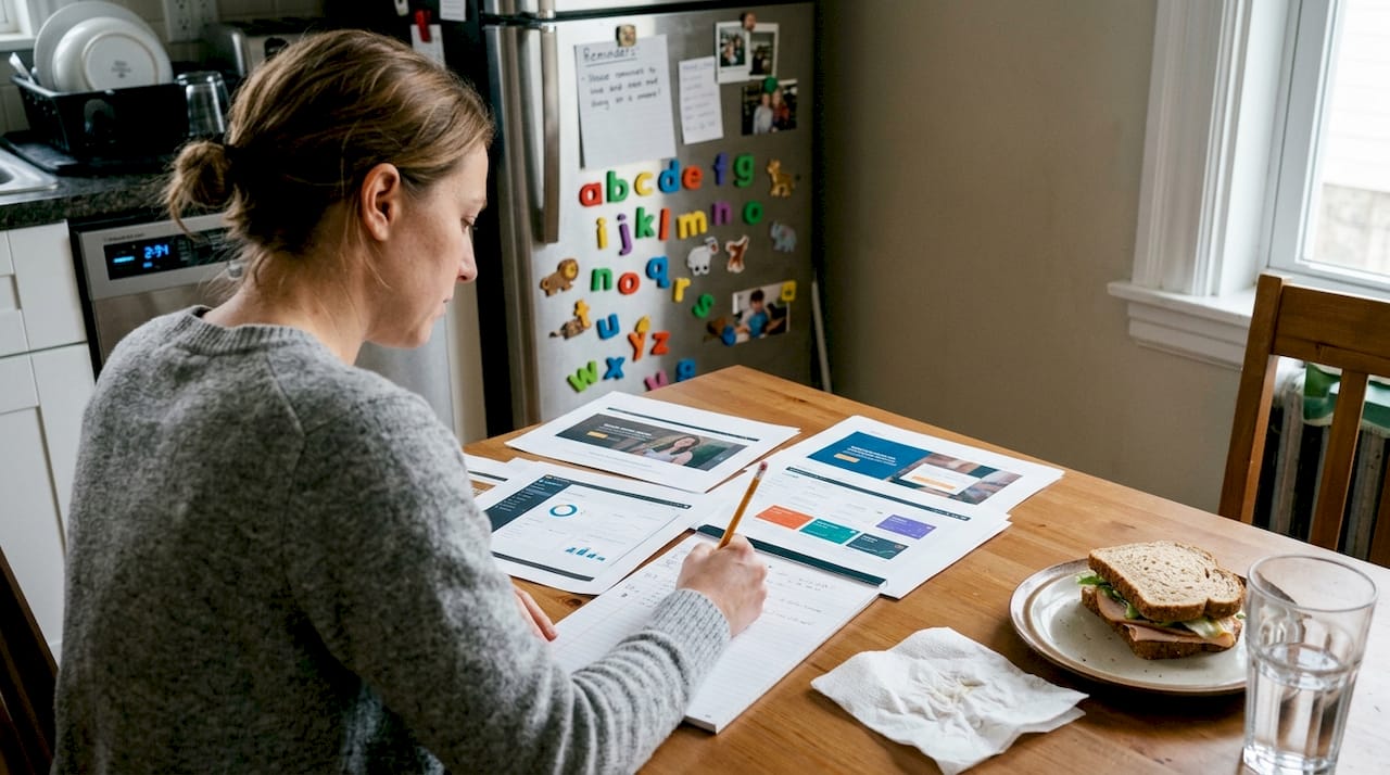
Step-by-step guide: create branded app screenshots
With your assets ready, here is the actual workflow to produce screenshots that convert.
-
Choose your layout template. Start with a proven structure. A strong first screenshot typically leads with a bold headline, a device mockup showing your best UI feature, and a clean background. Do not reinvent the wheel on layout.
-
Set your brand colors and fonts. Apply your HEX codes to backgrounds, text, and accent elements. Consistency here is non-negotiable. If your app uses Inter Bold at 24px for headlines, your screenshots should too.
-
Place your UI screenshots into device mockups. Use 3D device mockups where possible — they add depth and professionalism that flat screenshots cannot match. Rotate the mockup slightly to create visual interest without obscuring the UI.
-
Write tight, benefit-driven captions. Each screenshot gets one job. Screenshot one: hook. Screenshot two: core feature. Screenshot three: social proof or key differentiator. Keep captions under 8 words where possible.
-
Apply branding steps for higher conversions by checking that every image shares the same visual language: same font, same color palette, same tone. Inconsistency kills trust fast.
-
Review against 2026 visual trends. Gradient backgrounds, bold typography, and minimal UI clutter are dominating high-converting listings right now.
-
Export at full resolution for every required device size. Do not manually resize — use a tool that generates all sizes in one click.
“Users decide in 5-7 seconds — make each image count.”
The first 3 screenshots carry the entire first impression. Spend 60% of your effort there.
Pro Tip: Before finalizing captions, read them out loud. If you stumble or need to re-read, the copy is too complex. Your screenshot text should land instantly, like a billboard at highway speed.
Check your work: common mistakes and how to verify results
Producing screenshots is only half the job. Verifying that they actually work is where most indie developers stop short, and where real gains get left behind.
The most common branding mistakes to watch for:
- Cluttered layouts with too many UI elements competing for attention
- Inconsistent color usage across the screenshot set
- Text that is too small to read at thumbnail size in search results
- Generic device mockups that do not match your app’s visual identity
- Captions that describe features instead of communicating benefits
- Ignoring the first three and spending too much energy on screenshots four through ten
Once your screenshots are ready, run them through these quick checks:
The squint test. Squint your eyes until the screenshot blurs. Can you still read the headline? Can you still identify the device and the core visual? If not, your contrast or text size needs work.
The branding consistency check. Line up all your screenshots side by side. Do they look like they belong to the same app? Same font, same colors, same tone. If one looks different, fix it before publishing.
The first-three impact review. Show only your first three screenshots to someone unfamiliar with your app. Ask them: what does this app do, and would you try it? Their answer tells you everything.
For ongoing optimization, A/B testing is your best tool. Use a soft launch in a secondary market to test two screenshot sets before your main release. App preview image tips can help you understand which visual formats perform best in testing environments.
Remember: 60-70% of users never scroll past the first three screenshots. Your audit should weight those images accordingly.
Why strong screenshot branding is your indie edge
Here is the assumption that needs to be challenged: that polished, trustworthy app visuals are only achievable by large studios with dedicated design teams. That is simply not true anymore, and clinging to that belief is costing indie developers real downloads.
The truth is that small teams have a structural advantage in screenshot branding. You can iterate in hours, not weeks. You can test a new visual direction without a committee sign-off. You can respond to what is working in your category faster than any large organization can.
Big studios often have more visual consistency problems, not fewer, because more people touch the assets. An indie developer who owns the brand vision end-to-end can produce more coherent, compelling screenshots than a team of ten with conflicting opinions.
Brand is trust at a glance — especially when you have just seconds.
The developers who win on practical visual marketing are not the ones with the biggest budgets. They are the ones who treat every screenshot as a deliberate decision and iterate quickly when something is not converting. That is a mindset advantage, and it is available to every indie developer reading this right now.
Level up your screenshots with AppScreenKit
Everything covered in this tutorial — brand consistency, device mockups, fast iteration, multi-size exports — is exactly what AppScreenKit is built to handle. You do not need a designer or a complex workflow to produce screenshots that look like they came from a top-tier studio.
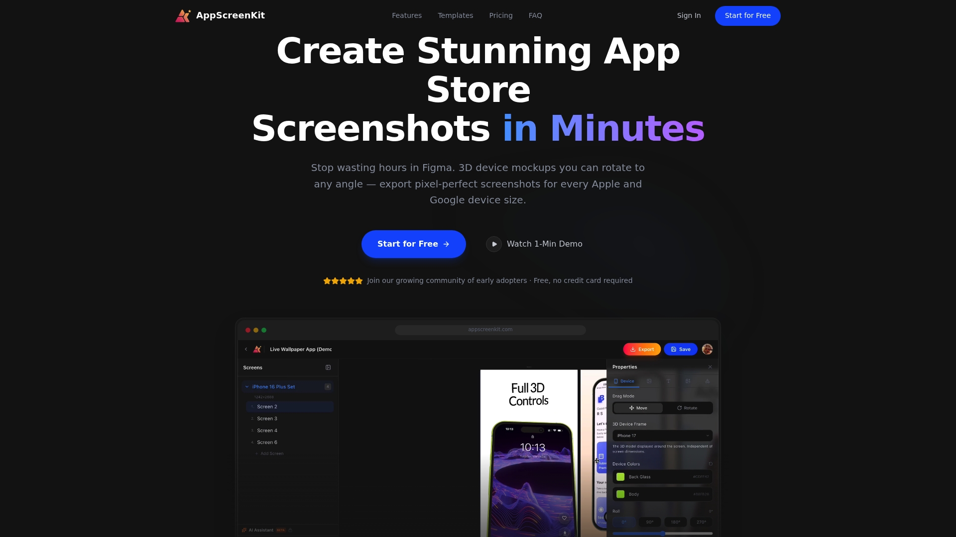
AppScreenKit gives you professional 3D device mockups, gradient backgrounds, pre-built templates, and single-click exports for every required device size. It is the fastest way to go from raw UI screenshots to a fully branded, store-ready set. Start with screenshot optimization fundamentals, then put them into practice immediately with the Screenshot Generator. Your next iteration is one session away.
Frequently asked questions
What size and resolution are required for app store screenshots in 2026?
Both the App Store and Google Play require multiple device sizes and high-resolution exports. Always check the current platform guidelines directly, as specs update regularly with new device releases.
How many screenshots should I include for best conversion?
You can submit up to ten, but your real focus should be the first three. 60-70% of users decide based on those alone, so make them your strongest work.
Should I use light or dark backgrounds for screenshots?
Test both, but dark backgrounds often outperform light ones for visual drama and contrast. Color psychology also matters — blue builds trust, which works well for productivity and finance apps.
How quickly can screenshot changes impact download rates?
Results can show up fast. Case studies report +31% downloads for some apps within the first few weeks of updating their screenshot branding.
Leave a Reply