TL;DR:
- Localizing app screenshots culturally and linguistically significantly boosts download rates, sometimes by up to 80%.
- Using realistic, populated data and avoiding empty or ghost features builds trust and improves conversions.
- Consistent, well-framed, and visually coherent screenshots that tell a story increase swipe engagement and app installs.
Your app screenshots are doing more work than you think. Before a single user reads your description or checks your ratings, those visuals already decided whether someone taps “Get” or scrolls past. Small missteps like a blank screen, a mismatched color palette, or English-only text in a Japanese market can quietly kill your conversion rate. This guide breaks down the four most damaging screenshot mistakes indie developers make, explains exactly why each one costs you downloads, and gives you concrete fixes you can apply today.
Table of Contents
- Mistake #1: Ignoring localization for global markets
- Mistake #2: Showcasing ghost features or empty states
- Mistake #3: Poor framing, color, and mockup decisions
- Mistake #4: Inconsistent visual narrative and lack of continuity
- The hidden traps even pros fall into: our contrarian take
- Supercharge your screenshots the easy way
- Frequently asked questions
Key Takeaways
| Point | Details |
|---|---|
| Localize screenshots | Adapting screenshots for each target market can increase downloads by up to 80%. |
| Show real app data | Screenshots featuring authentic, in-app content reduce rejection risk and build user trust. |
| Use proven visuals | Prioritize gradient backgrounds, proper framing, and color choices favored by top apps. |
| Tell a visual story | Present screenshots in a narrative sequence to boost swipe engagement and installs. |
| Test and optimize | Regularly review screenshots for empty states, design missteps, and changing trends. |
Mistake #1: Ignoring localization for global markets
Most indie developers build their screenshots once in English, upload them everywhere, and move on. It feels efficient. In reality, it’s one of the most expensive decisions you’ll make for your app’s growth.
Localization for screenshots goes well beyond swapping out text. It means adapting cultural references, adjusting imagery to reflect local norms, updating legal symbols or date formats, and sometimes reconsidering your entire visual hierarchy. A payment app screenshot showing a dollar sign might confuse users in markets where another currency dominates. A humor-driven visual that lands in the US might feel tone-deaf in a more formal market.
The stakes are measurable. Not localizing screenshots can cost you a 30 to 80% increase in downloads. That’s not a rounding error. For an app getting 1,000 installs a month, that gap could mean the difference between sustainable growth and obscurity.
Here’s what localization actually requires for screenshots:
- Translate all on-screen text including captions, headlines, and UI labels
- Replace culture-specific imagery like local landmarks, faces, or symbols
- Adjust reading direction for right-to-left languages like Arabic or Hebrew
- Check legal requirements for symbols, age ratings, or compliance text by region
- Test visuals with native speakers before publishing, even informally
The biggest pitfall? Assuming your English screenshots are “neutral enough.” They’re not. App store algorithms also favor localized listings, meaning localized screenshots can improve your visibility in search results, not just your conversion rate. Check out this screenshot branding guide for specific ways to keep your brand consistent across localized variants.
Pro Tip: Build your screenshots in a template system from the start. Tools that support multi-language layers let you swap text and imagery without rebuilding the design from scratch, cutting localization time by half or more.
Mistake #2: Showcasing ghost features or empty states
Localization increases your reach, but now let’s tackle what’s actually shown inside those screenshots.
A “ghost feature” is any UI element that isn’t live in your current app version. This includes unreleased filters, placeholder dashboards, or metrics that look impressive but aren’t real. Empty states are the flip side: screenshots showing blank feeds, zero activity, or sparse UI that makes your app look unfinished.
Both are dangerous. Ghost features or exaggerated claims risk store rejection, and even when they slip through review, real users notice fast. A one-star review saying “nothing like the screenshots” is hard to recover from.

What counts as realistic, populated data? Think messages between actual-sounding users, stats that feel plausible (not “$1M saved in 3 days”), profiles with real photos and names, and charts with believable trends. Your screenshots should look like someone genuinely uses your app daily.
Here are the trust-busting patterns to eliminate immediately:
- Blank or near-empty screens that make the app look unused
- Unrealistically perfect numbers like “10,000 tasks completed today”
- Features that don’t exist yet in the current app build
- Unbranded placeholder text like “Lorem ipsum” visible in the UI
- Inconsistent UI versions mixing old and new design elements
“Real, populated data builds trust. Fake screens break it before the user even downloads your app.”
Another often skipped consideration: dark mode. 80% of users prefer dark mode screenshots, yet many developers only submit light mode variants. Including both shows polish and speaks to user preference. Review common screenshot rejection reasons to make sure your screens pass review, and study device mockup best practices to frame your real content professionally.
Pro Tip: Before submitting, load your screenshots on a real physical device and walk through them like a skeptical user. Empty states and data gaps become obvious when you’re not staring at your own design tool.
Mistake #3: Poor framing, color, and mockup decisions
Eliminating ghost features is key, but presentation details like color, composition, and framing can make or break conversions.
The choice between framed (showing a device mockup around your UI) and frameless (showing your UI edge to edge) actually varies by app category. Games and creative apps often perform better frameless because the full-bleed visuals feel immersive. Productivity and utility apps often benefit from a framed mockup because it gives users spatial context for how the app feels on an actual device.
| App category | Framed | Frameless |
|---|---|---|
| Games | Moderate | Strong |
| Productivity | Strong | Moderate |
| Social / Lifestyle | Moderate | Strong |
| Finance / Health | Strong | Weak |
Color and background choices matter just as much. Gradient backgrounds are used by 67% of top apps, and it’s not a coincidence. Gradients create visual depth without the risk of a flat background that blends into the app store’s white interface. They also allow your device mockup and text to stay legible across both light and dark browsing environments.
On caption placement, top-cap text (headline above the device) is preferred by roughly 60% of top-performing apps versus 40% using bottom-cap. Top-cap draws the eye before the user processes the visual, creating a context frame that makes the screenshot easier to interpret quickly.
What to avoid:
- Clashing colors that compete with your UI instead of supporting it
- Cramming too many elements into one screenshot without breathing room
- Inconsistent spacing across screenshots in the same series
- Low contrast text on backgrounds that make captions unreadable at a glance
Browse screenshot templates for quality as a starting reference point, and cross-check your choices against current visual trends to keep your listing competitive without overcomplicating your design.
Mistake #4: Inconsistent visual narrative and lack of continuity
Once your basic look is solid, it’s time to make sure your screenshots tell a compelling, swipe-worthy story.
Most developers think of screenshots as individual images. High-converting listings treat them as frames in a short film. Each screenshot should build on the last, moving the user from “what is this?” to “I need this” by the time they reach the final frame.
Panoramic continuity encourages users to swipe through all screenshots, which directly increases install intent. When the background bleeds across two screenshots or the device mockup shifts naturally from one frame to the next, users feel pulled forward instead of stopping to reorient.
| Narrative condition | Avg. swipe-through rate | Impact on installs |
|---|---|---|
| Strong continuity | 68% | +34% vs. baseline |
| Weak or no continuity | 31% | Baseline |
Here’s how to build a proper visual story:
- Screenshot 1: The hook. Lead with your app’s single biggest benefit. Not a feature list. One clear, bold value statement.
- Screenshot 2: The proof. Show the core feature working with real, populated data.
- Screenshot 3 and 4: The depth. Reveal supporting features that reinforce the main benefit.
- Screenshot 5: The action. Close with a social proof element, a rating, or a clear lifestyle shot that makes the app feel desirable.
Every caption should speak to one benefit, not describe the screen. “Track every expense instantly” beats “Expense tracking screen” every time. Explore app preview image techniques to extend this narrative into video previews, and review screenshot optimization basics to make sure each frame is technically optimized as well.
The hidden traps even pros fall into: our contrarian take
After working with developers across hundreds of app launches, we’ve noticed a pattern that doesn’t get enough attention: over-designed screenshots often underperform simple ones.
The instinct to add more, whether it’s layered gradients, animated UI elements baked into stills, complex typographic treatments, is understandable. You’re competing against polished listings from well-funded teams. But heavy design can actually obscure the app’s core value. When a user spends three seconds trying to figure out what your screenshot is showing, you’ve already lost them.
Following visual trends is useful, but trends only work when they support clarity. Some of the highest-converting screenshots we’ve seen are nearly plain: a clean device frame, one focused UI view, and a single benefit written in plain language. No texture. No complexity.
The uncomfortable truth is that most screenshot failures aren’t caused by bad design skills. They’re caused by designing for other designers instead of for users. Your audience doesn’t care about kerning. They care about whether your app solves their problem. Always test visual changes in context, and check screenshot size compliance tips so that polished designs don’t get rejected on a technicality. Different audiences respond to different signals, and only real testing tells you which signals work.
Supercharge your screenshots the easy way
Fixing these mistakes doesn’t have to mean starting from zero or learning a new design tool.
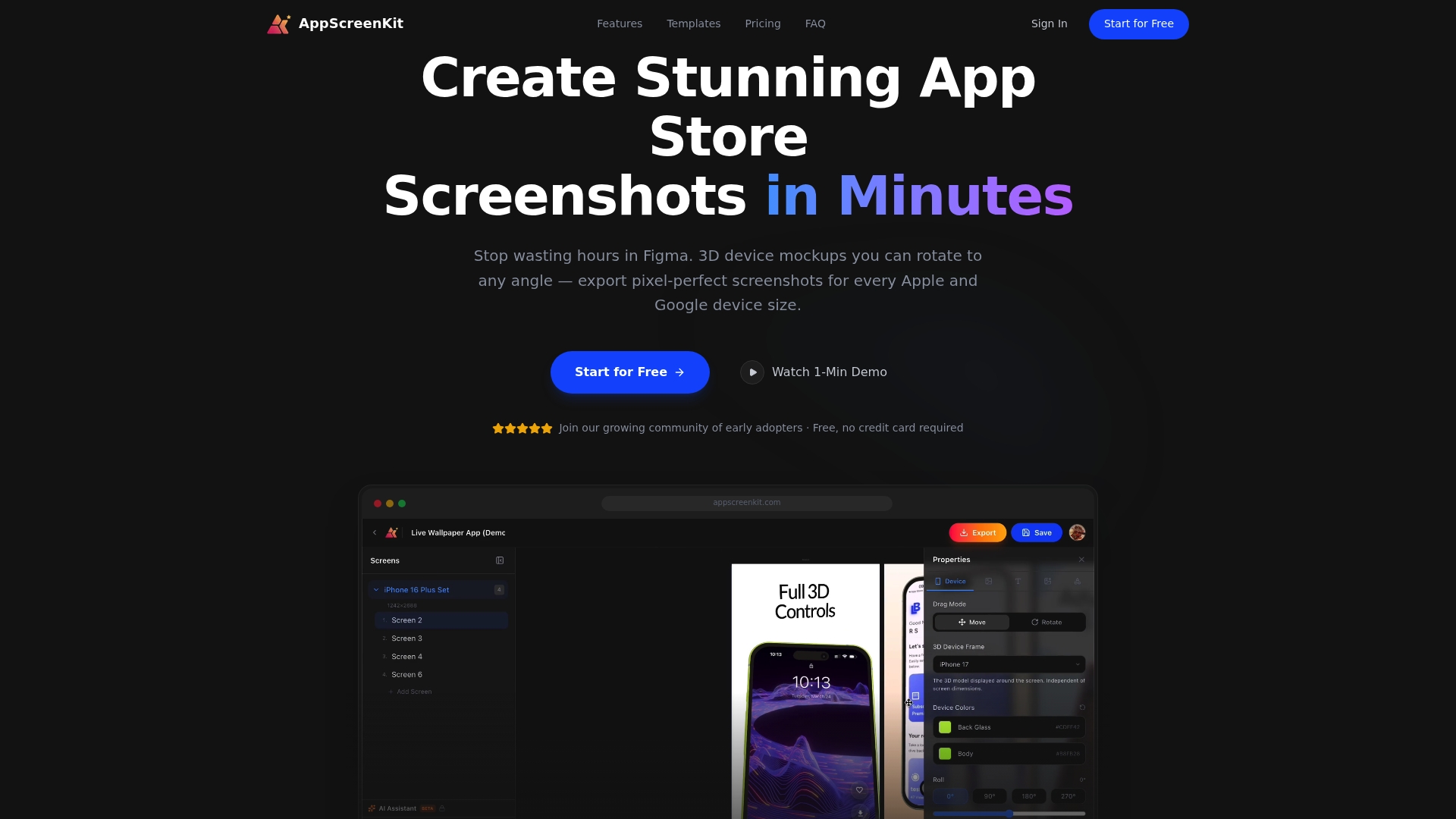
AppScreenKit is built specifically for indie developers and small teams who need professional-grade screenshots without the overhead. Use fast screenshot generation to export multiple device sizes in one click, apply pre-built screenshot templates that follow current best practices, and maintain consistent branding your screenshots across every localized variant. The platform handles 3D device mockups, gradient backgrounds, and size compliance automatically so you can focus on what matters: getting your app in front of users who will actually download it.
Frequently asked questions
Why do localized screenshots increase downloads so much?
Localized screenshots match what users in each market expect to see, building immediate trust. Up to 80% more downloads are possible when screenshots reflect the local language and cultural context of the target audience.
Is using dark mode screenshots now a necessity?
Yes. With 80% of users preferring dark mode, submitting only light mode screenshots means missing a significant portion of your potential audience from the start.
What are the biggest causes of app screenshot rejection?
Showing unreleased features, using exaggerated or unverifiable claims, and submitting incorrect screen dimensions are the most common triggers. Ghost features and exaggerated claims are flagged quickly during review.
How many screenshots should I use in my app store listing?
Use every available slot. Panoramic continuity across a full set of screenshots keeps users swiping and dramatically increases the chance of an install.
Leave a Reply