TL;DR:
- Effective screenshot optimization involves deliberate design, sequencing, and testing to boost app conversions.
- Both Apple and Google algorithms favor high-quality, localized, and strategically ordered visuals that communicate value quickly.
- Regularly updating and testing screenshots can significantly increase install rates and overall app store success.
Over 60% of users decide to install an app based on the first few screenshots they see, yet most developers treat those screenshots as an afterthought. They upload raw UI captures, slap on a device frame, and move on. Screenshot optimization changes that entirely. It is the strategic process of designing, sequencing, and testing your app store visuals to maximize installs and engagement. This guide breaks down exactly how it works, what the algorithms reward, and what practical steps you can take today to turn passive browsers into active downloaders.
Table of Contents
- Defining screenshot optimization for app store success
- How App Store and Play Store algorithms use screenshots
- The anatomy of a high-converting app screenshot
- Effective testing and iteration: From theory to practice
- A real-world perspective: Why screenshot optimization is a game changer (and what most miss)
- Apply screenshot optimization: Save time, boost results with AppScreenKit
- Frequently asked questions
Key Takeaways
| Point | Details |
|---|---|
| Screenshots drive installs | Optimized app store screenshots greatly improve user engagement and conversion rates. |
| Platform algorithms matter | Apple and Google treat screenshots differently—tailor your approach to each app store. |
| Localization = higher CVR | Localized screenshots can boost conversion rates by 15-40% in most test cases. |
| Test smarter, not just more | Prioritize your first screenshot and use testing tools for sustainable growth. |
Defining screenshot optimization for app store success
Let’s be direct: uploading screenshots and optimizing screenshots are two very different things. Basic screenshot uploading means you grab a few UI frames, export them, and call it done. Screenshot optimization, on the other hand, is a deliberate, user-focused process. As AppScreenKit explains, screenshot optimization involves much more than uploading images—it is about tailoring visuals to maximize conversions.
“Screenshots are your first handshake with new users.”
The core goals of optimization are simple but powerful: grab attention within the first two seconds, communicate your app’s key value clearly, and lift your CVR (conversion rate, meaning the percentage of store visitors who actually install). Every design decision, from background color to caption placement, feeds into those three goals.
Here is a quick comparison of what separates standard screenshots from optimized ones:
| Feature | Standard screenshots | Optimized screenshots |
|---|---|---|
| Design intent | UI documentation | Conversion-focused storytelling |
| Testing | None | A/B tested variants |
| Localization | One version for all | Region-specific adaptations |
| Sequence | Random or default | Strategically ordered |
| Text | Minimal or absent | Benefit-driven captions |
| Device frames | Generic or missing | Branded, contextual mockups |
Why does this matter so much? Here are the core reasons optimized screenshots move the needle:
- Visibility: App stores reward listings with higher engagement, so better screenshots create a positive feedback loop.
- Credibility: Polished visuals signal a quality product before users even read a single review.
- Installs: More compelling first impressions directly translate to more taps on the “Get” or “Install” button.
- Monetization: More installs mean more users in your funnel, which amplifies every revenue stream you have.
For teams looking to move fast without sacrificing quality, fast screenshot generation workflows make the whole process scalable. Pairing that with a solid app store listing checklist ensures nothing gets missed. And if you want to go beyond static images, app preview images tips can push your listing even further.
Apple’s own Product Page Optimization (PPO) tool exists precisely because screenshots are that important. The platform would not invest in a dedicated testing feature if screenshots were just decoration.
How App Store and Play Store algorithms use screenshots
Apple and Google both care deeply about screenshots, but they use them in different ways. Understanding those differences gives you a real competitive edge.
Apple’s App Store uses OCR (optical character recognition, which means it reads text inside your images) to index the words in your screenshots. That means the captions you write are not just for users—they are partially readable by the algorithm. Google Play focuses more on visual impression and uses its built-in A/B testing data to surface listings that demonstrate strong engagement signals.
| Factor | Apple App Store | Google Play |
|---|---|---|
| Text indexing | OCR-based keyword reading | Not confirmed |
| A/B testing | Product Page Optimization (PPO) | Store Listing Experiments |
| Localization impact |
15-40% CVR uplift |
Similar uplift reported |
| Image limit | Up to 10 screenshots | Up to 8 screenshots |
| Display on search | First 1-3 shown in results | First 2-3 shown in results |
Here is how the journey from upload to install actually plays out on both platforms:
- User searches for a relevant keyword in the store.
- Your listing appears in results, showing your first one to three screenshots.
- User scans visually in under two seconds, deciding whether to tap.
- User taps your listing and sees the full screenshot gallery.
- User reads captions and evaluates the app’s value proposition.
- User installs or bounces based on what the screenshots communicated.
Every step in that sequence is a chance to win or lose the install. The 2026 visual trends show that gradient backgrounds, bold typography, and 3D device mockups are outperforming flat, minimal designs in most categories this year.
Pro Tip: Use high-contrast text in your screenshot captions and localize them for your top markets. Avoid stuffing keywords unnaturally into captions—Apple’s OCR reads context, not just density. A clean, readable caption with one strong keyword beats a cluttered one every time. Pair this with a well-planned app image launch workflow to stay consistent across updates.
The anatomy of a high-converting app screenshot
Not all screenshots are created equal. The difference between a screenshot that converts and one that just fills a slot usually comes down to five specific elements.
Here are the top five ingredients of a high-converting screenshot:
- A benefit-driven caption: Lead with what the user gets, not what the feature is. “Track every habit in seconds” beats “Habit tracking dashboard.”
- A strong background: Gradient or solid color backgrounds that complement your brand make the device pop and guide the eye.
- A contextual device mockup: Showing your UI inside a recognizable, well-rendered device frame adds instant credibility.
- A clear visual hierarchy: The user’s eye should move from caption to device to supporting detail in one smooth flow.
- Strategic sequencing: Your first screenshot is your hook. The second builds interest. The third closes the case.
What should you actively avoid? Raw UI dumps, empty states, and login screens are the fastest way to lose a potential user. Low-contrast text on busy backgrounds is equally damaging. And irrelevant UI screens—showing a settings page when your core value is a dashboard—confuse users instead of converting them.
A real-world example: one productivity app team changed their first screenshot’s background from white to a deep navy gradient and rewrote the caption from “Dashboard view” to “See everything at a glance.” Installs from search increased by 22% in three weeks. The app itself did not change at all.
Pro Tip: Test your screenshot designs in grayscale before publishing. If the layout still reads clearly without color, your visual hierarchy is solid. If it looks confusing in grayscale, color is doing too much heavy lifting and users on certain displays may miss your message entirely.
Using pre-built templates removes the guesswork from layout and hierarchy. Combined with smart visual marketing strategies, you can build a screenshot set that looks intentional and professional without starting from scratch.
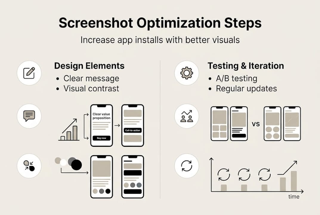
Effective testing and iteration: From theory to practice
Building great screenshots is only half the job. Testing them is where the real gains happen.
Both Apple and Google give you native tools to run tests. Apple PPO allows testing up to 3 variants, and you should always prioritize the first screenshot, background choices, and device frames in those tests. Google’s Store Listing Experiments work similarly, letting you measure which variant drives more installs over a set traffic split.
Here is a structured approach to running a screenshot test that actually produces useful data:
- Isolate one variable. Change only the first screenshot caption, or only the background color. Never change multiple elements at once or you will not know what caused the result.
- Set a minimum traffic threshold. Run the test until each variant has received at least 1,000 impressions for statistical confidence.
- Measure CVR, not just installs. A spike in installs from a paid campaign can distort raw numbers. Conversion rate tells the real story.
- Document everything. Keep a log of what you tested, when, and what the result was. Patterns emerge over time.
- Implement the winner and start the next test. Optimization is a cycle, not a one-time event.
“Test the sequence, not just the visuals.”
A common real-world result: Variant A used a white background with the device centered. Variant B used a dark gradient with the device slightly offset and a bold caption. Variant B drove 18% more installs over a two-week test window. The only difference was background and caption placement.
Avoid keyword stuffing, changing multiple variables at once, and over-testing low-traffic screens. These are the three mistakes that waste the most time and produce the least insight.
Pro Tip: Update your screenshots 2-4 times per year, especially after major app updates or when a competitor refreshes their listing. Static screenshots age quickly, and the store algorithms reward active, well-maintained listings. Use an image launch workflow to make updates fast and repeatable.
A real-world perspective: Why screenshot optimization is a game changer (and what most miss)
Here is the uncomfortable truth most developers do not want to hear: your app’s quality does not matter if your screenshots do not communicate it. Users cannot try your app before installing it. Screenshots are the entire product experience at that moment.
Most teams focus their energy on features, performance, and ratings. Screenshots get whatever time is left. That is exactly backwards. A minor tweak to caption wording or background contrast can move installs more than a full feature release. We have seen it happen repeatedly.
The apps that consistently top their categories are not always the best-built ones. They are the ones that never stop optimizing their store presence. They treat screenshots as a living asset, not a static deliverable.
‘The only screenshots that don’t convert are the ones you never optimized.’
If you are serious about growth, start with a structured checklist for visuals and build from there. Small, consistent improvements compound into significant install lifts over time.
Apply screenshot optimization: Save time, boost results with AppScreenKit
Putting these principles into practice does not have to mean hours in Figma or a design background you do not have.
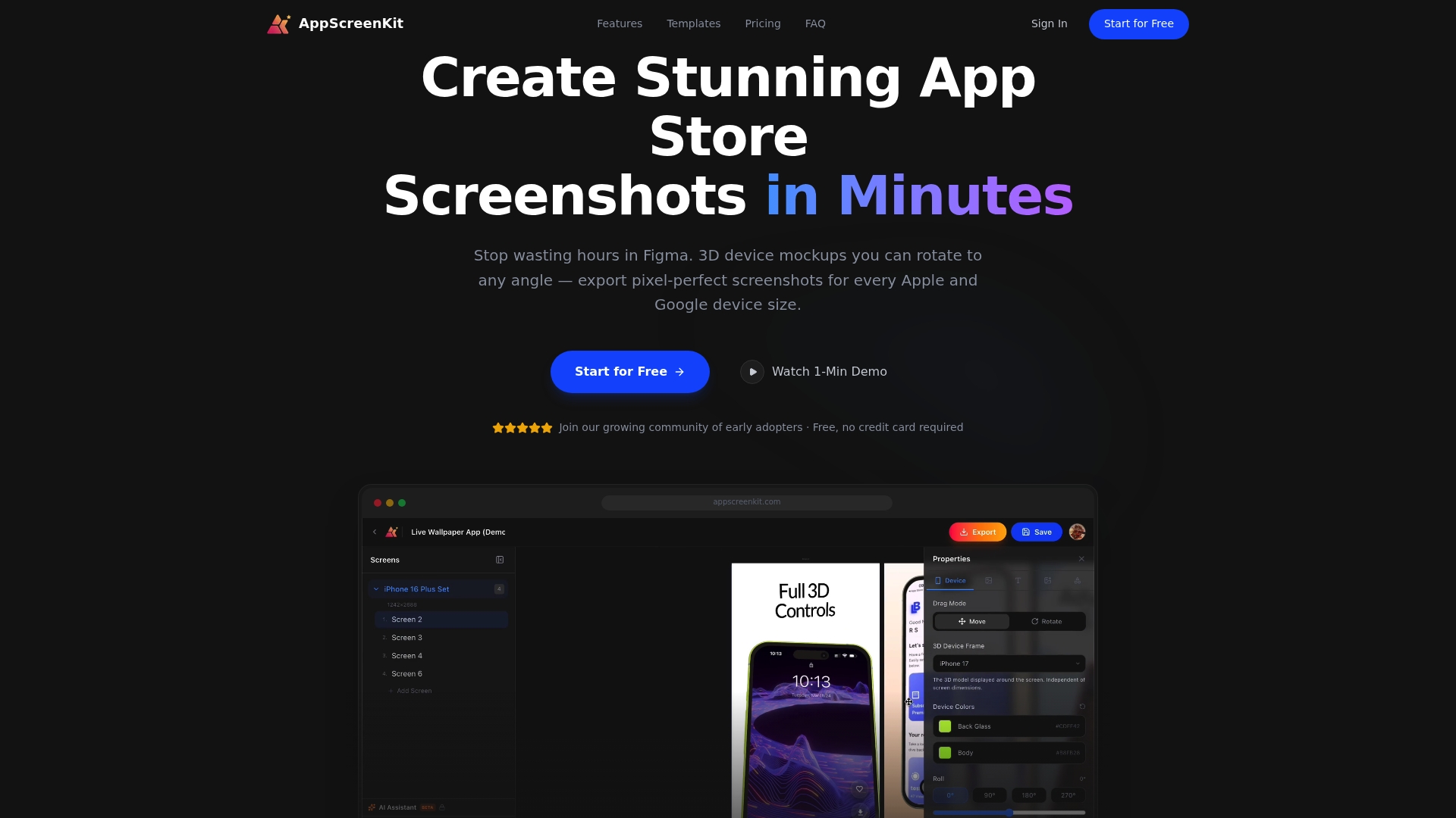
AppScreenKit is built specifically for developers and small teams who need professional, conversion-ready screenshots without the complexity. You can upload your app images, apply 3D device mockups, add branded captions and gradient backgrounds, and export pixel-perfect files for every required device size in minutes. The platform’s pre-built templates handle layout and hierarchy automatically, so you can focus on the message rather than the mechanics. Use the visuals checklist to audit your current listing, then apply preview image tips to level up every asset before your next update.
Frequently asked questions
What is the first step in optimizing app screenshots?
Identify your app’s single most compelling value and feature it in the first screenshot with a benefit-driven caption and high-contrast text. Everything else in your gallery supports that opening statement.
How often should I update my app store screenshots?
Update your screenshots 2-4 times per year, particularly after major app releases or when competitors refresh their listings. Stale screenshots signal an inactive product to both users and the algorithm.
Can optimizing screenshots increase my app’s conversion rate?
Absolutely. Localized, high-contrast images can increase conversion rates by 15-40%, making screenshot optimization one of the highest-ROI activities in app marketing.
Is it better to test multiple screenshots or focus on just one?
Focus your tests on the first screenshot first, since it appears in search results and drives the majority of install decisions before a user even taps your listing.
Leave a Reply