
TL;DR:
- App store visuals are vital for first impressions and conversions within three seconds.
- Consistent branding, understanding platform requirements, and user-centric design improve download rates.
- Regular testing and updating visuals ensure optimal performance and sustained app store success.
Your app could be genuinely great, but if your store listing looks like it was thrown together in an afternoon, most users will scroll right past it. App store visuals are the first thing potential users judge, and that judgment happens in under three seconds. A polished, consistent brand presence signals quality, builds trust, and directly drives downloads. This guide walks you through every practical step: from understanding platform requirements and gathering the right assets, to crafting visuals that convert and building a workflow to keep them sharp as your app evolves.
Table of Contents
- Understand app store requirements and audience
- Gather essential branding assets
- Craft compelling store visuals step-by-step
- Test, optimize, and deploy your app store visuals
- Why most indie apps undervalue visual branding (and how to stand out)
- Supercharge your app store branding with AppScreenKit
- Frequently asked questions
Key Takeaways
| Point | Details |
|---|---|
| Know the requirements | Learn the visual and policy differences between the App Store and Google Play before designing your assets. |
| Prepare strong assets | Create all necessary icons, graphics, and screenshots in high quality and organized formats. |
| Focus on conversion | Each visual should tell a story and guide users quickly toward hitting download. |
| Continuously improve | Test, iterate, and update your branding assets based on performance data and user feedback. |
Understand app store requirements and audience
Before you design a single pixel, you need to know the rules of each platform and who you’re designing for. Skipping this step is the fastest way to waste hours on visuals that get rejected or simply don’t resonate.
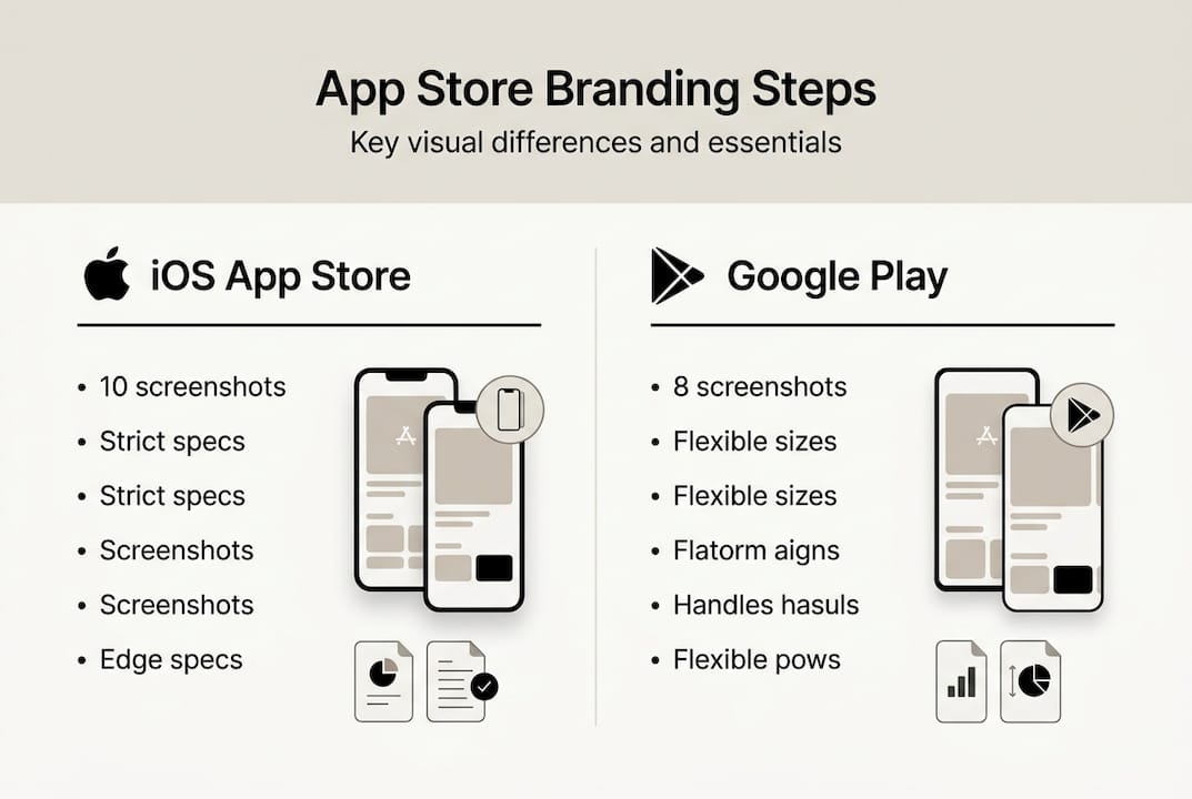
The App Store (iOS) and Google Play have meaningfully different requirements. iOS enforces stricter technical specs and a tighter content policy. Screenshots must reflect the actual app experience, and Apple reviews them carefully. Google Play is more flexible overall, but it places heavy emphasis on the feature graphic, a 1024×500 pixel banner that appears at the top of your listing and acts as your primary visual hook. Both platforms penalize thin content like generic gradients with no real substance.
| Element | iOS App Store | Google Play |
|---|---|---|
| Screenshots | Up to 10, device-specific sizes | Up to 8, flexible aspect ratios |
| Feature graphic | Not required | Required, 1024×500 px |
| App icon | 1024×1024 px (no alpha) | 512×512 px |
| Video preview | Optional, 15-30 seconds | Optional, YouTube link |
| Content policy | Strict, must reflect real UI | More flexible, broader creative range |
Understanding your audience is just as important as knowing the specs. Look at the top five competing apps in your category. What visual language do they use? What do their screenshots emphasize? This tells you what users already expect, and where there’s room to stand out.
Key audience research steps:
- Check competitor listings for visual patterns, color choices, and messaging tone
- Read user reviews of competing apps to find unmet expectations you can address visually
- Define your core user persona, including age range, technical comfort, and primary use case
- Match your visual style to your persona’s expectations, not just your personal taste
Pro Tip: Use the store listing checklist to audit your current visuals against both platform requirements before you start redesigning anything. It saves time and prevents surprises.
For a deeper look at how Google Play visual requirements affect conversion, the differences between platforms go beyond dimensions and touch on how users browse and decide.
Gather essential branding assets
With a clear picture of requirements and your audience, the next step is assembling everything you need before you start designing. Trying to create visuals without a complete asset set leads to inconsistent results and wasted revision cycles.
Here’s what you need to prepare:
- App icon: High-resolution source file at 1024×1024 px for iOS and 512×512 px for Google Play. Use a vector format so it scales cleanly.
- Screenshots: Raw captures from your app at the highest resolution available. Capture key flows, not just the home screen.
- Feature graphic: Required for Google Play at 1024×500 pixels, this banner is your listing’s billboard. Treat it seriously.
- Color palette: Define 2 to 3 primary brand colors with exact hex codes. Consistency across all visuals builds recognition.
- Typography: Pick one or two fonts that match your app’s personality. Use them exclusively across all store assets.
- Taglines and copy: Write short, punchy phrases (under 10 words) that describe each key feature or benefit shown in screenshots.
| Asset | iOS requirement | Google Play requirement |
|---|---|---|
| App icon | 1024×1024 px, no transparency | 512×512 px, PNG |
| Screenshots | Up to 10 per device size | Up to 8, JPEG or PNG |
| Feature graphic | Not used | 1024×500 px, required |
| Short description | Not applicable | 80 characters max |
One thing many indie developers underestimate is the power of device mockups. Placing your screenshots inside a realistic phone frame immediately elevates the perceived quality of your listing. It signals that a real product exists behind the image. For guidance on making the most of this, the preview image best practices resource covers what works and what to avoid.

Organize all your assets into a single folder structure before you start. Label everything clearly. This sounds basic, but when you’re updating visuals for a new app version six months from now, a clean asset library saves hours.
Craft compelling store visuals step-by-step
With assets ready, it’s time to build visuals that actually convert. This is where most indie developers either shine or fall flat. The difference is usually not talent. It’s process.
- Start with a wireframe layout for each screenshot. Decide where the device mockup sits, where the caption goes, and what background treatment you’ll use. Sketch it out before touching any design tool.
- Tell a feature story across your screenshots. Each image should highlight one specific benefit, not try to show everything at once. Think of your screenshots as a short slide deck that walks users through your app’s value.
- Apply your brand colors and typography consistently across all images. Use your primary color for emphasis, your secondary color for backgrounds or accents, and keep font sizes large enough to read on a small phone screen.
- Add device mockups to ground the screenshots in reality. A flat screenshot floating on a gradient looks amateurish. A screenshot inside a polished 3D phone frame looks like a finished product.
- Write short, benefit-focused captions. Avoid feature names that mean nothing to new users. Instead of “Advanced sync engine,” write “Your data, always up to date.”
- Polish and export at the correct dimensions for each device size. Double-check that no important content is cut off at the edges.
“The best app store visuals don’t just show what an app looks like. They show what it feels like to use it.”
Avoid thin content like generic gradients as backgrounds with no real visual substance. Google Play flags this, and users notice it too. Your background should support the story your screenshot is telling, not fill empty space.
Pro Tip: Explore app visual marketing strategies to see how top-performing apps structure their screenshot sequences for maximum impact.
For teams looking to customize device frames and layouts quickly, app mockup customization offers practical techniques that work even without a dedicated designer on the team.
Test, optimize, and deploy your app store visuals
Effective visuals require ongoing care. Publishing your first set of screenshots is not the finish line. It’s the starting point for continuous improvement.
Before you go live, gather real feedback. Share your visuals with five to ten people who match your target persona. Ask them what they think the app does after looking at the screenshots for ten seconds. If their answers don’t match your intent, something needs to change.
Once live, use testing tools to measure performance:
- Apple’s product page optimization lets you test up to three alternate screenshot sets against your default and measures which drives more downloads
- Google Play’s store listing experiments offer similar A/B testing functionality with statistical significance tracking
- Third-party tools like Splitmetrics or Storemaven let you run tests before publishing, using paid traffic to simulate store behavior
- Monitor your conversion rate (the percentage of store page visitors who install) as your primary success metric
| Optimization action | Expected impact | Effort level |
|---|---|---|
| A/B test screenshot order | Medium to high | Low |
| Rewrite captions | Medium | Low |
| Update feature graphic | High | Medium |
| Add localized visuals | High | High |
| Refresh visuals for major update | High | Medium |
Build a repeatable deployment workflow so that every new app version ships with updated visuals. This means keeping your source files organized, using templates so you’re not starting from scratch each time, and scheduling a visual review as part of your release checklist. The app image launch workflow covers how to structure this process so it doesn’t slow down your release cycle.
Iterate based on data, not assumptions. If a screenshot set underperforms, change one variable at a time so you know what actually moved the needle.
Why most indie apps undervalue visual branding (and how to stand out)
Here’s something worth saying plainly: most indie developers treat store visuals as the last thing they do before launch, not as part of the product itself. That’s a mistake that costs real downloads.
Visuals are not decoration. They are a primary conversion lever. A user who lands on your store page has already shown intent. Your visuals either close that conversion or lose it. No amount of post-launch marketing recovers the installs you lose to a weak first impression.
Small teams that integrate branding into their development cycle, rather than bolting it on at the end, consistently see faster traction. They ship with confidence because the listing is ready when the app is ready.
The most impactful visuals are also the most user-centric. They don’t show off the developer’s taste. They show the user what their life looks like with the app in it. That shift in perspective, from “here’s what we built” to “here’s what you get,” is what separates listings that convert from those that don’t.
Use the optimize visuals checklist to audit your current listing through this lens. You may be surprised how quickly a few targeted changes move your numbers.
Supercharge your app store branding with AppScreenKit
You now have a clear, step-by-step path from raw assets to a polished, conversion-ready store listing. The next step is putting it into practice without spending days in Figma or paying a designer for every update.
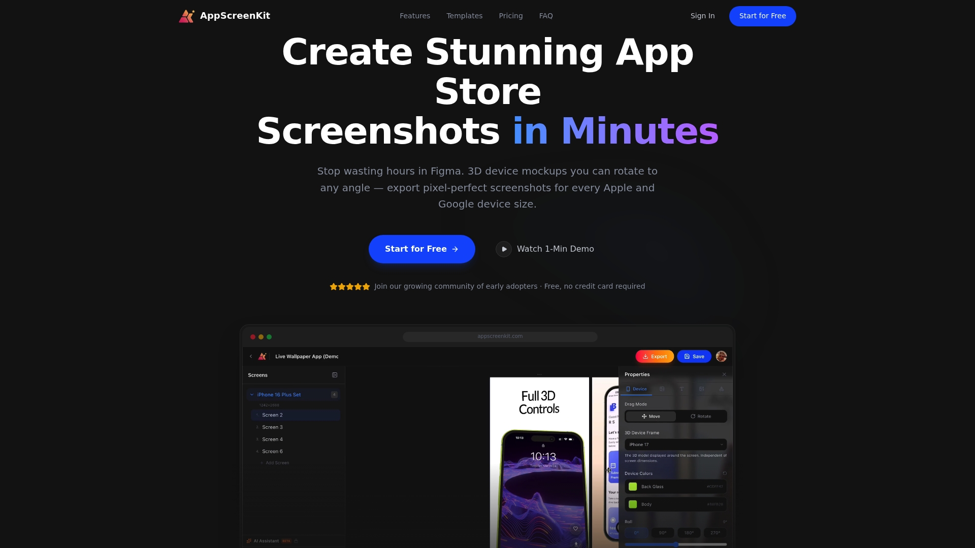
AppScreenKit is built specifically for indie developers and small teams who need professional results fast. You can upload your app screenshots, customize them with 3D device mockups, add branded text and backgrounds, and export pixel-perfect images for every device size in minutes. Use the screenshot generator to go from raw captures to store-ready visuals in a single session. For more guidance, the optimize app listing resource and preview image tips will help you refine every detail before you publish.
Frequently asked questions
What are the minimum branding assets needed for app store listings?
At minimum, you need an app icon, high-resolution screenshots, a 1024×500 feature graphic for Google Play, and a concise on-brand description. iOS does not require a feature graphic but expects device-specific screenshots.
How do iOS and Google Play branding requirements differ?
iOS enforces stricter technical and content guidelines, while Google Play is more flexible and places strong emphasis on the feature graphic banner as the primary visual element of your listing.
What is a common mistake in app store branding?
Using thin content like gradients with no real visual substance is one of the most common mistakes. It signals low effort and reduces the likelihood that a browsing user will install.
How can I efficiently update my store visuals for new app versions?
Keep your source files in a labeled template system so you can swap out screenshots and update captions without rebuilding layouts from scratch each time. Tie visual updates directly to your release checklist.
Can I test which visuals perform best before publishing?
Yes. Both Apple and Google offer built-in testing tools, and third-party platforms let you run experiments using simulated store traffic before your changes go live.
Leave a Reply