
TL;DR:
- App store visuals in 2026 must meet precise platform specifications and reflect real UI to avoid rejection.
- Visual trends emphasize clarity, authenticity, and AI-friendly design, such as high-contrast text and minimal layouts.
- AI-powered A/B testing can increase conversion rates by 20%, focusing on concept-level experiments and continuous optimization.
App store visuals have quietly become as important to algorithms as they are to human eyes. AI A/B testing lifts conversions by 20%, and that number is reshaping how developers and marketers approach screenshot design. The old assumption that a few polished images would do the job no longer holds. In 2026, your visuals need to satisfy machine indexing logic, pass strict platform guidelines, and still convince a real person to tap “Download” in under three seconds. This article walks you through the exact technical requirements, the design trends driving installs, the testing frameworks that compound results, and the edge case strategies that protect your listing from rejection.
Table of Contents
- App store screenshot requirements and device-specific standards
- Emerging visual trends for screenshots, icons, and banners
- AI-driven experiment frameworks and A/B testing best practices
- Edge cases: Avoiding rejection, localization, and hybrid strategies
- A fresh take: Clarity, imperfection, and trust in visual design
- Next steps: Streamlining your visual optimization workflow
- Frequently asked questions
Key Takeaways
| Point | Details |
|---|---|
| Visual clarity drives conversion | Screenshots must use high contrast and clear text hierarchy for both AI and human audiences. |
| AI-powered A/B testing lifts results | Automated experimentation can increase conversion rates by up to 20% when rigorously executed. |
| Compliant screenshots prevent rejection | Following exact size and format standards is critical to avoid costly app store rejections. |
| Localization expands global reach | Localized visuals and captions can drive up to 30% more conversions in international markets. |
| Authenticity builds trust | Balanced design—blending polish and real-world imperfection—creates user trust and engagement. |
App store screenshot requirements and device-specific standards
With platform requirements changing yearly, let’s look at what 2026 demands for compliant and high-performing app store screenshots.
Getting the specs wrong is the fastest way to waste a launch window. Both Apple and Google have precise rules, and neither platform gives you much grace when you miss them.
iOS requirements in 2026:
- Screenshots must use 1290x2796px for the 6.7-inch iPhone (the primary display size Apple uses for review)
- Up to 10 screenshots allowed per device type
- File formats: PNG or JPEG only, sRGB color space
- Screenshots must reflect the actual UI, not concept art or misleading feature representations
Google Play requirements in 2026:
- Flexible sizing: minimum 320px, maximum 3840px, with a 16:9 to 9:16 aspect ratio
- Between 2 and 8 screenshots required
- Maximum file size of 8MB per image
- No transparency allowed in screenshots
| Specification | iOS App Store | Google Play |
|---|---|---|
| Primary resolution | 1290x2796px | 320px to 3840px |
| Max screenshots | 10 | 8 |
| Formats accepted | PNG, JPEG | PNG, JPEG |
| Transparency | Not specified | Not allowed |
| Aspect ratio | Device-specific | 16:9 to 9:16 |
| Max file size | Varies | 8MB |
The most common rejection triggers are not exotic edge cases. Wrong dimensions, using device mockups instead of real UI captures, and visuals that imply features the app does not actually have are the top three offenders. Apple’s review team flags misleading UI regularly, and Google’s automated systems catch size violations before a human ever sees your submission.
Using screenshot generator tools that automatically export to the correct dimensions for each device type removes most of this risk. Manual resizing across six or seven device sizes is where errors creep in.
Pro Tip: Always preview your screenshots inside device simulators before submitting. What looks sharp on your design canvas can appear blurry or cropped on an actual device screen, and catching that before submission saves you a rejection cycle.
One more thing worth noting: both platforms update their guidelines at least once a year. Set a calendar reminder to review the official documentation every quarter, not just before a major release.
Emerging visual trends for screenshots, icons, and banners
Now that you understand the requirements, focus on what’s actually trending visually in 2026 and why these trends matter for conversion and discovery.
The biggest shift in 2026 is that your screenshots are now metadata. AI indexing systems inside both the App Store and Google Play read visual signals, including text contrast, layout clarity, and branding consistency, to determine relevance and quality scores. Busy, cluttered screenshots do not just lose human attention. They confuse the algorithm.
“2026 visuals now matter as much to algorithms as humans.”
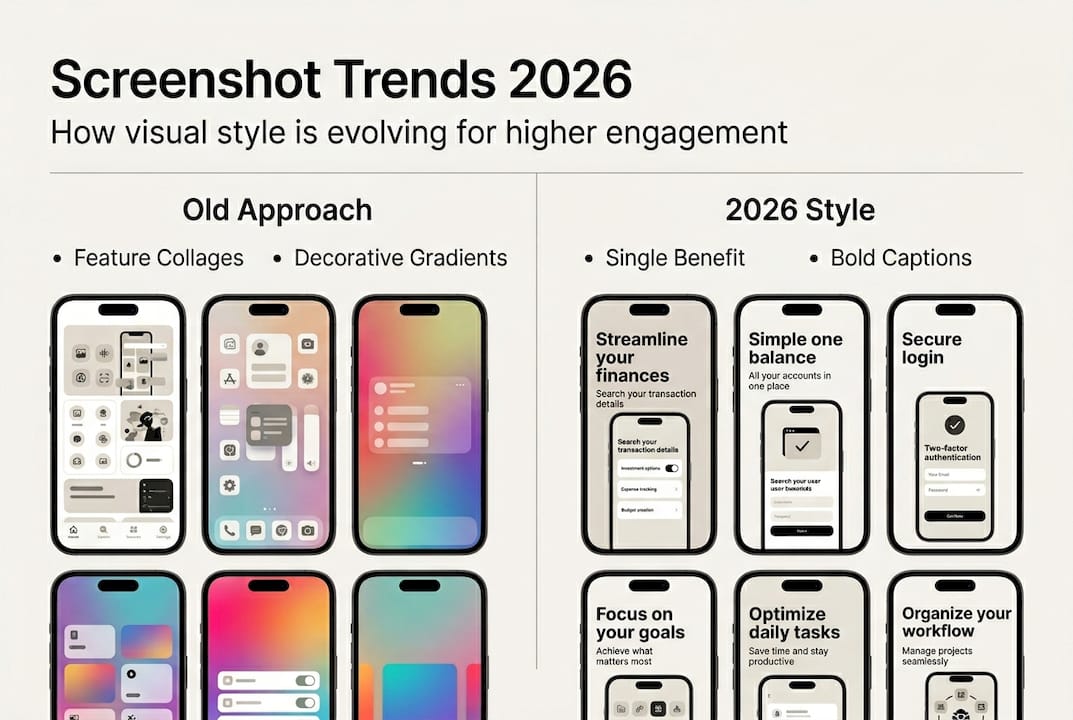
Visual trends in 2026 emphasize clarity for AI indexing, with high-contrast captions, clean text hierarchy, and intent-driven screenshot sequences taking priority over decorative complexity. The goal is to communicate a single benefit per screen, fast.
What’s trending right now:
- Liquid Glass and glassmorphism effects: iOS 26 Liquid Glass adjusts blur and colors dynamically, giving interfaces a layered, premium feel. Screenshots that reflect this aesthetic signal modernity and quality to users already familiar with the system design language.
- Minimalist, feature-centric layouts: One caption, one visual, one clear action. Less decoration, more signal.
- High-contrast text overlays: Short captions in bold, legible fonts that OCR systems can read and that users can process at a glance.
- Consistent brand color systems: Using the same palette across icon, screenshots, and banner creates a cohesive listing that AI systems recognize as trustworthy.
| Old approach | 2026 approach |
|---|---|
| Feature-heavy collages | Single benefit per screen |
| Decorative gradients | Purposeful brand color systems |
| Generic device frames | Contextual lifestyle or UI shots |
| Long caption text | 3 to 5 word high-contrast callouts |
| Inconsistent branding | Unified visual identity across all assets |
Applying visual clarity techniques to your existing screenshots is often faster than a full redesign. Start with caption contrast and layout simplification before touching color or typography.
The intent-driven approach is worth calling out separately. Each screenshot should answer a specific user question: What does this app do? How does it feel to use? Why should I trust it? Sequence your screens to answer those questions in order, and your conversion rate will reflect it.

AI-driven experiment frameworks and A/B testing best practices
With visual trends identified, the next step is optimizing for actual results. Let’s examine how AI-driven testing frameworks transform this process.
AI-driven tools and A/B testing are essential mechanics for optimizing app store visuals in 2026. But most teams run tests incorrectly. They tweak button colors or swap one caption word, then wait two weeks for inconclusive data. That is not testing. That is guessing with extra steps.
Effective experiment frameworks follow a clear sequence:
- Test hero concepts first. Your first screenshot drives the majority of impression-to-tap decisions. Test completely different value propositions before testing design details.
- Then test feature ordering. Once your hero concept is validated, experiment with which features appear in screenshots two through five.
- Finally, test social proof placement. Reviews, ratings, and user counts can appear as caption overlays. Test where they land in the sequence.
- Measure compounded CVR. Track conversion rate and revenue per impression together, not just installs. A screenshot that drives more downloads of low-retention users is not a win.
- Keep a continuous testing backlog. Informed by competitor analysis, seasonal events, and platform design updates.
Both Apple’s Product Page Optimization and Google’s Store Listing Experiments give you native tools to run these tests without third-party platforms. Use them. A/B tests need 1,000 or more visitors per variant to reach statistical significance, so underpowered tests are a common and costly mistake.
Statistic to keep in mind: AI-powered testing can lift conversion rates by 20% when applied at the concept level rather than the micro-detail level.
Pro Tip: Keep a running backlog of test ideas organized by hypothesis strength. Prioritize tests where the potential lift is large, like a completely different hero message, over low-impact tweaks like caption font weight.
AI-driven screenshot testing platforms can now generate variant concepts automatically, reducing the time between idea and live experiment from days to hours.
Edge cases: Avoiding rejection, localization, and hybrid strategies
Once experiments are running, it’s crucial to avoid pitfalls and unlock new market segments. Here’s how to handle the edge cases and advanced strategies.
Rejection is expensive. Not just in time, but in the momentum lost between a planned launch date and the actual go-live. Most visual rejections are preventable.
Common rejection triggers to eliminate:
- Incorrect screenshot dimensions for the submitted device type
- Using device mockups that obscure the actual UI
- Showing features, pricing, or subscription terms that differ from the live app
- Cluttered visuals or misleading UI representations that imply functionality the app does not have
- Screenshots that fail OCR readability checks due to low contrast or decorative fonts
Dark mode is another edge case that catches teams off guard. If your app supports dark mode, test your screenshots in both light and dark contexts. A caption that reads clearly on a white background may disappear entirely on a dark one.
Localization is where the biggest untapped gains live. Localization can lift conversions by 20 to 30% in non-English markets. That is not a marginal improvement. It is a growth channel that most indie developers and small teams skip entirely because it feels operationally complex.
The practical approach is to start with your top three non-English markets by download volume, translate captions only, and test localized versus English screenshots using Google’s Store Listing Experiments. The data will tell you whether a full visual localization is worth the investment.
Hybrid paid-organic strategies are also gaining traction. Running paid user acquisition campaigns with the same visual language as your organic listing creates a consistent experience from ad to store page. Users who click a paid ad and land on a listing that looks completely different experience a trust gap. Consistent visuals across both channels close that gap and improve both paid and organic performance simultaneously.
For teams building on SaaS app development strategies, aligning your visual identity early in the product cycle makes localization and paid-organic consistency far easier to execute at scale.
Applying visual optimization best practices across all these edge cases does not require a large team. It requires a clear checklist and the right tools.
A fresh take: Clarity, imperfection, and trust in visual design
Having covered edge cases, let’s step back for a deeper look at what really drives trust and results in app store visuals, beyond optimization trends.
Here is something the optimization playbooks rarely say out loud: hyper-polished screenshots can actually reduce trust in certain markets and categories. When every visual looks like it was generated by an AI and refined by a committee, users start to sense it. The result is a kind of visual uncanny valley where everything looks perfect and nothing feels real.
Testing concept-level changes over micro-tweaks is the technical answer to this problem. But the underlying insight is more human. Users are not just evaluating features. They are deciding whether they trust the team behind the app.
Some designers in 2026 are deliberately leaning into imperfection, using retro aesthetics, hand-drawn elements, and unpolished textures to signal authenticity. This is not a rejection of quality. It is a recognition that authenticity and polish serve different emotional functions.
“The right blend of polish and authenticity builds lasting user trust.”
The practical takeaway is to test both directions. Run a polished, AI-optimized variant against a more human, authentic one. The winner will tell you something specific about your audience that no trend report can. Balancing polish and authenticity is not a design philosophy question. It is an experiment waiting to happen.
AI tools need human oversight precisely because they optimize for measurable signals, not for the harder-to-quantify feeling of trust. Keep a human in the loop when reviewing test results and interpreting what the data actually means for your specific users.
Next steps: Streamlining your visual optimization workflow
Ready to put these lessons into practice? Here’s your shortcut to adopting these trends and optimizing your workflow.
Putting all of this into action is where most teams stall. The gap between knowing what to do and having the tools to do it fast is real.
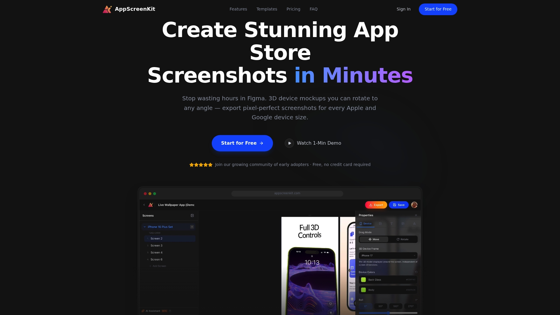
AppScreenKit is built specifically to close that gap. The automated screenshot generator handles dimension compliance across all device sizes in one click, so you are never manually resizing for six different screen formats. The platform’s 3D device mockups, gradient backgrounds, and branded text tools let you apply the latest visual trends without needing Figma or a dedicated designer. For teams ready to run experiments, AI-powered screenshot design tools help you generate concept-level variants fast, so your testing backlog stays full and your listing keeps improving. Start with the free plan, build your first compliant screenshot set, and keep testing.
Frequently asked questions
What are the most important screenshot dimensions for iOS apps in 2026?
1290×2796 pixels is the standard for 6.7-inch iPhones, and apps should provide up to 10 screenshots per device type to maximize listing real estate.
How can AI-driven A/B testing improve app store visual conversion rates?
AI-driven A/B tests can lift conversion rates by 20%, especially when tests focus on concept-level changes and are run with adequate sample sizes of 1,000 or more visitors per variant.
What visual trends are AI-indexing algorithms prioritizing in 2026?
AI prioritizes clear text hierarchy, high-contrast visuals, and consistent branding across all listing assets, making these the most important factors for both discovery and conversion.
How does localization impact app store screenshot effectiveness?
Localization can boost conversion by 20 to 30% in non-English markets, so always adapt both captions and visuals to match the language and cultural context of your target region.
What is the best sequence for app store screenshots to optimize both human and AI engagement?
Prioritize the first 1 to 3 screenshots as billboard-style value propositions, then sequence hero image, feature highlights, and social proof with high-contrast captions throughout.
Leave a Reply