TL;DR:
- Correct screenshot aspect ratios are essential to avoid rejection and ensure visual consistency.
- Apple requires precise pixel dimensions per device class, while Google Play allows flexible ratio ranges.
- Viewing aspect ratio as a creative tool enhances app listing appeal and increases conversion rates.
Getting your app rejected because of a screenshot shape feels absurd until it happens to you. A single mismatched dimension, one wrong ratio on a single device class, and your carefully crafted app listing gets flagged before anyone even sees your UI. The challenge runs deeper than avoiding rejection: the wrong aspect ratio can make your screenshots look cropped, amateurish, or visually inconsistent across store search results, killing conversion before users even tap your listing. This guide gives you the exact frameworks, comparisons, and optimization strategies to get screenshot aspect ratios right every time, across every major platform.
Table of Contents
- Understanding screenshot aspect ratio: The core concepts
- App Store vs Google Play: Screenshot aspect ratio requirements
- Selecting the right aspect ratio for your app screenshots
- Common aspect ratio mistakes and how to avoid them
- Testing and optimizing your screenshots for maximum impact
- Why most teams overlook aspect ratio—and what actually matters most
- Take your screenshot visuals further with AppScreenKit
- Frequently asked questions
Key Takeaways
| Point | Details |
|---|---|
| Aspect ratio definition | Aspect ratio is the width and height proportion of a screenshot and directly shapes how your app is presented. |
| App store rules differ | Apple and Google Play have distinct screenshot aspect ratio and sizing requirements you must follow to avoid rejection. |
| Optimize for conversion | Choosing the right aspect ratio boosts clarity, highlights features, and drives higher conversion in app store listings. |
| Avoid common mistakes | Mixing up resolution with ratio or ignoring store guidelines can lead to compliance problems and lost downloads. |
| Test for best results | Treat aspect ratio as a testable design variable for maximizing App Store Optimization (ASO) impact. |
Understanding screenshot aspect ratio: The core concepts
Now that you see why minor mistakes can cause problems, let’s nail down the basics so you can avoid common traps.
An aspect ratio describes the proportional relationship between a screenshot’s width and height. For example, 9:16 means the image is 9 units wide for every 16 units tall, which is the classic portrait phone format. Flip it to 16:9 and you get standard landscape, ideal for tablets or apps like video players and games.
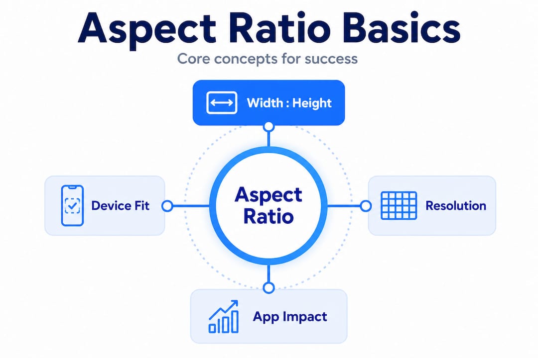
Here’s the key distinction most teams miss: aspect ratio and resolution are not the same thing. A 1080×1920 image and a 1440×2560 image are both 9:16, but they have very different pixel counts. Resolution affects sharpness and file size; aspect ratio determines shape and layout. Uploading a high-resolution image with the wrong ratio still gets your submission flagged or your screenshot visually distorted.
In a practical app store context, aspect ratio directly controls:
- How much vertical space your screenshot occupies in search results
- Whether text overlays and UI elements sit inside safe zones or get clipped
- The cropping behavior when app stores generate thumbnails for search previews
- How coherently your screenshots look as a sequential visual story across a listing
“Screenshot aspect ratio isn’t just a technical checkbox—it’s the foundation of your entire visual layout. Getting it wrong upstream means rebuilding everything downstream.”
One helpful way to think about it: aspect ratio is the frame; resolution fills that frame with pixels. You need both correct, but ratio errors are usually what trigger automatic rejections or ugly rendering. Our size compliance guide walks through the specific pixel dimensions tied to each ratio so you can cross-reference quickly.
Common ratios you will encounter include 9:16 (portrait phone), 16:9 (landscape phone or tablet), 3:4 (certain iPad displays), and 2:3 (older iPhone models). Knowing which applies to which device class is where most of the real complexity lives.
App Store vs Google Play: Screenshot aspect ratio requirements
With the fundamentals in place, let’s see exactly how Apple and Google’s requirements differ and how that impacts your workflow.
Apple and Google take fundamentally different approaches to screenshot dimensions, and understanding this gap saves you hours of rework.
For Apple, the rules are strict and device-specific. Apple requires exact pixel dimensions per device class, which means the aspect ratio is effectively locked rather than chosen by you. For an iPhone 16 Pro Max, for instance, you need images at 1320×2868 pixels. There is no flexibility around that dimension. You either match it exactly or the upload fails. This means your “aspect ratio strategy” for iOS is really about knowing which dimensions map to which device class and building to those specs from the start.
For Google Play, the approach is more flexible around aspect ratio boundaries. Rather than locking exact pixel dimensions per device, Google constrains screenshots to acceptable ratio ranges, most commonly 9:16 for portrait and 16:9 for landscape phone screenshots. This gives you more creative latitude in resolution, but it also introduces a trap: teams sometimes assume “flexible” means “anything goes,” and then submit screenshots with unusual ratios that get cropped or rejected during review.
| Platform | Dimension approach | Common portrait ratio | Common landscape ratio | Flexibility |
|---|---|---|---|---|
| Apple App Store | Exact pixel dimensions per device | Fixed by device class | Fixed by device class | Very low |
| Google Play | Ratio-bounded ranges | 9:16 (recommended) | 16:9 (recommended) | Moderate |
| Apple iPad | Exact pixel dimensions | 3:4 or 4:3 | Varies by model | Very low |
| Google Play tablet | Ratio-bounded | 3:4 or 16:10 | Varies | Moderate |
Key implications for your workflow:
- Apple submissions require you to pre-define device classes and build separate assets for each, with no ratio overlap across classes
- Google Play lets you sometimes share assets across phone sizes, but you must verify ratio compliance before assuming portability
- Both platforms preview your screenshots differently in search versus detail pages, so always check both contexts
Check the full submission rules for screenshots to avoid overlooked edge cases, and if you are building specifically for Android, the deep-dive on visuals for Google Play covers Android-specific nuances in detail.
Pro Tip: Always build your master screenshot compositions at the largest required resolution first. Then scale down for smaller device classes. This prevents quality loss and keeps ratios consistent across your entire asset set.
Selecting the right aspect ratio for your app screenshots
Knowing the store rules is only part of the battle. Next, let’s cover how to choose ratios that make your app stand out and boost conversion.
Choosing an aspect ratio is not purely a compliance decision. It is also a design and marketing choice that affects how much of your UI you can show, how prominent your text callouts appear, and how visually compelling your listing looks against competitors.

A practical and proven cross-platform approach is to build tall portrait compositions in a 9:16-style ratio for phone screenshots and create separate landscape assets only when your app genuinely benefits from them. This covers the widest device range efficiently and produces the most prominent visual footprint in store search results, where portrait screenshots take up more vertical real estate.
When should you lean toward landscape? Consider it seriously when:
- Your app is a video player, streaming service, or game with a horizontal-first UI
- Your tablet or iPad screenshots show off features that only make sense in wide format
- Your onboarding flow is designed around horizontal gestures or layouts
For most productivity apps, social apps, utilities, and tools, portrait is the stronger default. It mirrors how users hold their phones and matches the natural scroll direction of store listings.
| App category | Recommended primary ratio | Reasoning |
|---|---|---|
| Productivity and tools | 9:16 portrait | Matches natural phone use and scroll direction |
| Mobile games | 16:9 landscape | Gameplay is typically horizontal-first |
| Video and streaming | 16:9 landscape | UI and content naturally horizontal |
| Social and lifestyle | 9:16 portrait | Content-forward, mirrors social feed behavior |
| Tablets and iPad apps | 3:4 or 4:3 | Matches device native display ratio |
Smart teams also use ratio and orientation as screenshot optimization strategies variables during A/B testing. The first screenshot in your sequence carries the most weight for conversion. Testing whether a portrait or landscape lead image performs better in your category can drive meaningful installs lift without changing anything else about your listing.
You can also pair your ratio choices with app preview image strategies to create a cohesive listing experience that guides users from thumbnail to install.
Pro Tip: Your first screenshot gets up to 70% of the visual attention in search results. Treat its ratio and composition as a standalone advertisement, not just one frame in a series.
Common aspect ratio mistakes and how to avoid them
Even with the best intentions, there are traps many developers and marketers fall into. Here’s what to watch for.
The most common errors we see in screenshot submissions come from a handful of repeated patterns:
- Confusing pixel dimensions with aspect ratio. A developer uploads a 1080×1920 image for a device class that expects 1290×2796. Both are portrait, but the dimensions and ratios are different. The result: an automatic rejection or a stretched, blurry screenshot.
- Using one master image for all devices. It seems efficient, but Apple’s pixel-exact requirements per device class mean a single image will fail for at least some device types. You genuinely need separate assets per class for iOS.
- Not previewing screenshots in real store context. Screenshots look different in search versus the product page. What appears balanced at full resolution can look cluttered or text-heavy when rendered as a small thumbnail in search results. Always preview both views before submitting.
- Assuming Google Play flexibility means any ratio works. Google’s ratio bounds still have hard limits, and screenshots outside those bounds will be cropped in store previews or rejected outright. Staying within the 9:16 or 16:9 boundaries protects you from unexpected display errors.
- Rotating existing screenshots without re-checking ratios. Rotating a 9:16 portrait image produces a 16:9 landscape image. But rotating a non-standard portrait produces a non-standard landscape. Teams often rotate images assuming the output ratio is automatically acceptable.
“The most expensive screenshot mistake is not the one that causes rejection. It is the one that passes review but looks wrong in the store. That mistake quietly kills conversion for weeks before anyone catches it.”
To avoid these issues systematically, build a pre-submission checklist that includes explicit ratio verification for every device class, a store preview check across both search and product page views, and a final side-by-side comparison against a competitor listing in the same category. Our screenshot rejection fixes resource covers the most common failure modes with specific solutions for each.
Pro Tip: Keep a simple spreadsheet listing every device class you target, its required pixel dimensions, and its effective aspect ratio. Cross-reference every asset against this sheet before upload. It takes five minutes and prevents costly resubmissions.
Testing and optimizing your screenshots for maximum impact
With pitfalls in mind, let’s end with how to turn aspect ratio into a growth lever using data, iteration, and modern ASO tools.
App store optimization (ASO) is increasingly data-driven, and your screenshot format is one of the variables worth testing systematically. Treating orientation and aspect ratio as design variables in your experimentation framework gives you an additional conversion lever that most teams ignore entirely because they treat screenshots as a one-time production task.
Here is a practical framework for running aspect ratio-informed screenshot tests:
- Define your variable clearly. Are you testing portrait versus landscape orientation? The number of visible screenshots in search? The composition density inside a given ratio? Isolate one variable at a time.
- Use built-in store experimentation. Google Play’s Store Listing Experiments and Apple’s Product Page Optimization both allow screenshot testing with traffic splitting. These are free, native tools many teams leave unused.
- Track the right metrics. Conversion rate from search impression to product page visit, and from product page visit to install, are your primary signals. Screenshot changes can move both independently.
- Run tests long enough. Statistical significance usually requires at least 1,000 impressions per variant, ideally more. Cutting tests short produces misleading results that lead to bad decisions.
- Document everything. Record which ratio, which layout, and which copy combination was tested, what the result was, and when. This institutional knowledge pays compounding dividends over time.
Use your listing optimization checklist alongside testing cycles to make sure you are not leaving other conversion levers untouched. And stay current with visual trends 2026 to understand whether your ratio and layout choices are aligned with what is performing across the category right now.
Pro Tip: After any significant A/B test, write a one-paragraph summary of what you learned and why you think it happened. Over time, these notes become a private competitive advantage that no competitor can copy.
Why most teams overlook aspect ratio—and what actually matters most
Here is something we have observed consistently: the teams who obsess over technical spec compliance often produce the most forgettable screenshots. They nail the pixel dimensions, they match every device class requirement exactly, and then they fill those perfectly-sized frames with screenshots that communicate nothing compelling. Their listings are compliant and invisible.
The deeper insight is that aspect ratio is not just a technical specification. It is a design and marketing decision that shapes every creative choice that follows. A portrait 9:16 frame invites a very different layout story than a landscape 16:9 frame. The ratio determines how much UI you can show, how large your text callouts can be before they feel crowded, and how your screenshots relate to each other as a sequence.
Teams that treat aspect ratio as a creative variable, not just a compliance checkbox, find opportunities that their competitors are not even looking for. Testing an unconventional layout within a compliant ratio. Using the vertical height of a portrait frame to build a story that unfolds from screenshot one to screenshot five. Choosing a composition that gives your icon-level thumbnail a distinctive silhouette in search results. These are the moves that separate listings with 2% conversion rates from those with 6% or higher.
The screenshot branding insights we have compiled show that the most successful indie developers and small teams approach screenshots the way a good art director approaches print advertising: every inch of the frame is intentional, every element earns its place, and the ratio itself is a design constraint that drives creativity rather than limiting it.
Most teams are still missing this because they separate the technical work (getting dimensions right) from the creative work (making it compelling). The teams winning in crowded categories do both at the same time, inside the same workflow.
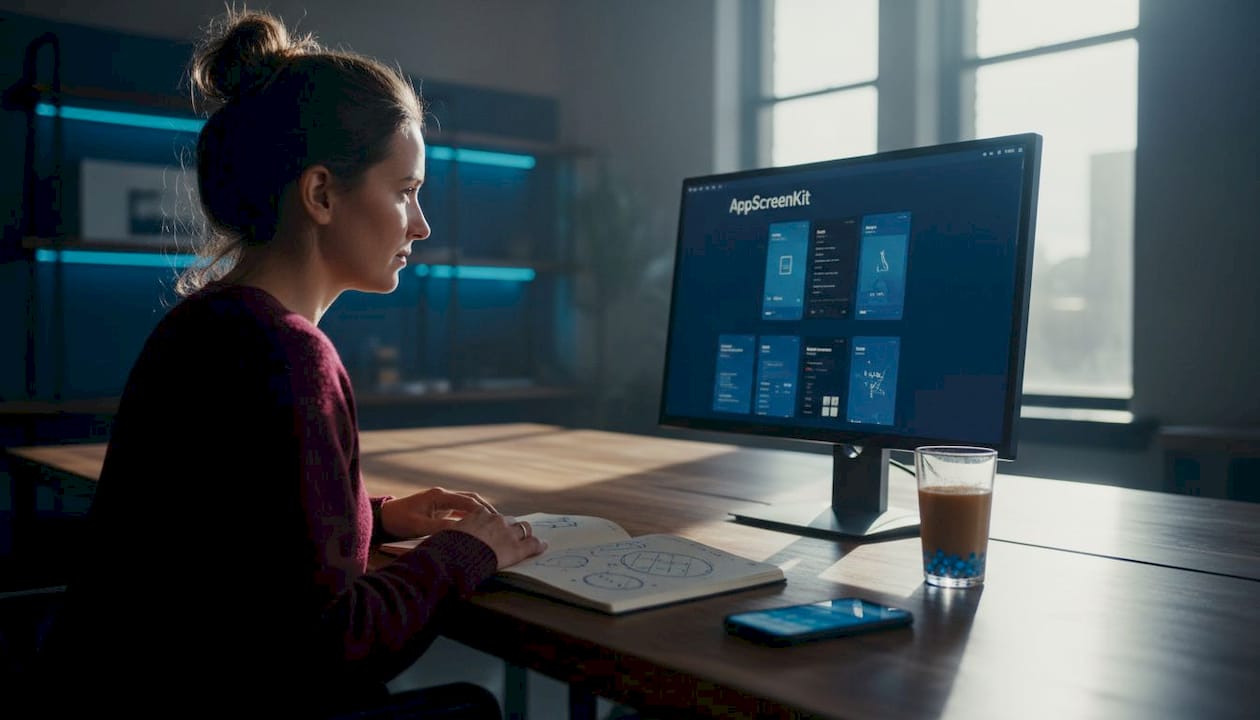
Take your screenshot visuals further with AppScreenKit
Ready to transform your app store presence? Getting aspect ratios right is only the starting point. AppScreenKit gives you pre-built templates sized exactly for every iOS device class and Google Play requirement, so you never have to manually calculate dimensions again.
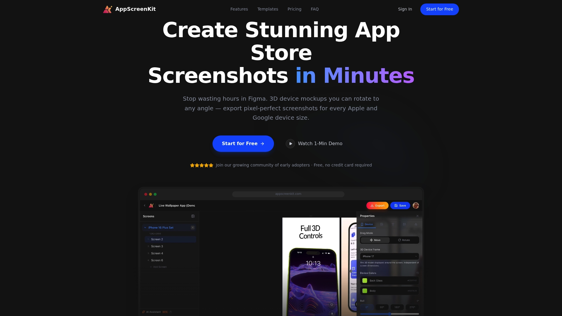
Upload your app UI, drop it into a 3D device mockup, add your branded text and gradient background, and export pixel-perfect screenshots for every platform in one click. Our platform handles the ratio and dimension compliance automatically, so you can focus entirely on making your visuals compelling. Combine that with our screenshot optimization resources and the latest 2026 visual trends to build a listing that converts. Start free today and see how fast compliant, professional screenshots can be.
Frequently asked questions
What does screenshot aspect ratio mean in mobile app stores?
Screenshot aspect ratio is the proportional relationship between an image’s width and height, such as 9:16 (portrait) or 16:9 (landscape), which determines how your screenshot is shaped and displayed in store listings.
Does Apple let you choose any aspect ratio for screenshots?
No. Apple requires exact pixel dimensions per device class, which locks the effective aspect ratio rather than giving you a free choice, so you must match dimensions precisely to avoid rejection.
What aspect ratios are accepted on Google Play?
Google Play constrains phone screenshots to portrait or landscape ranges, most commonly 9:16 for portrait and 16:9 for landscape, within defined minimum and maximum dimension boundaries rather than exact device-specific pixel matching.
Should I use the same aspect ratio for all screenshots?
It is best to match the recommended ratio for each store and device type. A 9:16-style portrait ratio works across most phone scenarios, with separate landscape assets created only when your app’s core experience genuinely requires horizontal format.
How can incorrect aspect ratio impact my app store listing?
Incorrect aspect ratios can cause screenshots to be rejected outright or displayed with cropping and proportion issues in store previews, making your listing look unprofessional and significantly reducing the likelihood that users will download your app.
Leave a Reply