
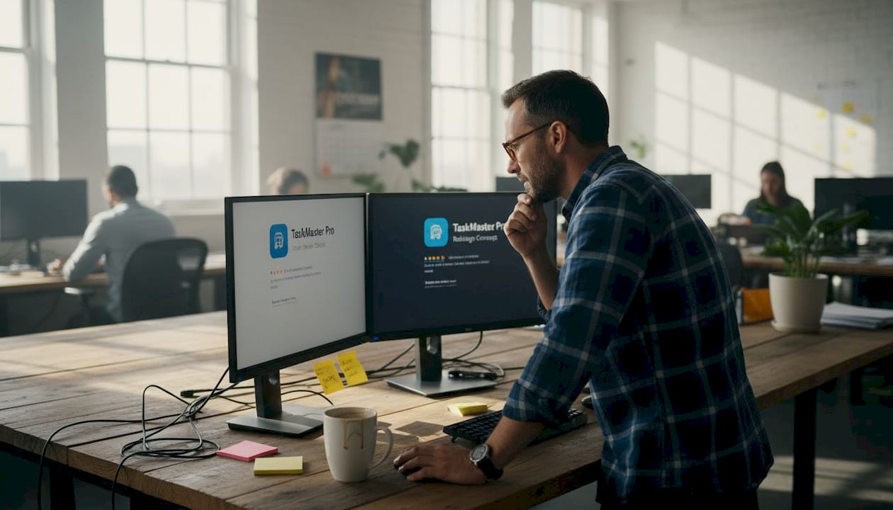
Getting your app noticed in a store with millions of listings is genuinely hard. Most indie developers ship a solid product, write a decent description, and then wonder why downloads stay flat. The truth is, your listing IS your first impression, and users decide in seconds whether to tap “Get” or scroll past. Optimized visuals and precise metadata can be the difference between a 3% and a 15% conversion rate. This checklist walks you through every major element, backed by real benchmarks, so you can stop guessing and start improving.
Table of Contents
- Essential metadata requirements for app store listings
- Optimize screenshots and video previews for conversion
- Run A/B tests and measure performance improvements
- Localize your listing for top markets
- Our take: What most developers miss when optimizing app store listings
- Streamline your app store listing with AppScreenKit
- Frequently asked questions
Key Takeaways
| Point | Details |
|---|---|
| Accurate metadata matters | Proper metadata boosts discoverability and conversion rates, so follow character limits and avoid duplicates. |
| Visuals influence CVR | Optimized screenshots and videos, especially the first in sequence, can raise conversion rates by up to 42%. |
| Localize for global reach | Localizing metadata and visuals can increase downloads by 15-40% in target markets. |
| Test and iterate | Regular A/B testing delivers actionable data for improving your app store listing performance. |
| Maintain with audits | Ongoing reviews and updates are essential to stay competitive and maximize listing effectiveness. |
Essential metadata requirements for app store listings
Metadata is the skeleton of your listing. Get it wrong, and no amount of beautiful screenshots will save you. The App Store guidelines are clear: your title is capped at 30 characters on iOS, your subtitle at 30 characters, and your keyword field at 100 characters with no duplicate terms allowed. Your description needs to explain what the app does, highlight its core benefits, and end with a clear call to action.
Here is what a well-optimized metadata checklist looks like:
- Title: Include your primary keyword naturally. Keep it under 30 characters. Avoid stuffing multiple terms.
- Subtitle: Use this space to reinforce a secondary benefit or feature. Do not repeat words from the title.
- Keyword field: Pack in unique, relevant terms. No commas with spaces, no duplicates, no terms already in your title.
- Description: Lead with your strongest benefit in the first two lines (visible before the “more” tap). Add a CTA near the end.
- App category: Choose the most accurate primary category. A wrong category tanks discoverability.
A common mistake is treating the keyword field like a sentence. It is not. Think of it as a comma-separated list of terms your target users actually search for. Tools like AppFollow or Sensor Tower can surface high-volume, low-competition keywords worth targeting.
Pro Tip: Localize your metadata for your top three markets from day one. Following localization best practices can dramatically improve discoverability in non-English-speaking markets, where competition is often lower and user intent is high.
For example, a productivity app targeting Japan should have a Japanese title and keyword field, not just a translated description. Small details like this separate listings that perform from those that stagnate. If you are already using an app screenshot generator to handle visuals, pair that workflow with localized metadata for compounding results.
Optimize screenshots and video previews for conversion
Once metadata is set, next comes maximizing impact with visuals. Your screenshots are not just decorations. They are your most powerful conversion tool, and most users never read your description at all.
The first screenshot carries the most weight. It is visible in search results before a user even taps your listing. If it does not immediately communicate value, you lose them. Use a bold caption, a clean background, and show the app in actual use. Never lead with a login screen or a splash screen.
Video previews are worth the extra effort. A well-made preview can increase CVR by 15-25% compared to screenshots alone. Keep it under 30 seconds, show real functionality in the first three seconds, and avoid lengthy intro animations.
Here is a quick checklist for screenshot and video optimization:
- Show the app in use, not UI chrome or empty states
- Add short, benefit-focused captions to every screenshot
- Use consistent brand colors and font styles across all frames
- Avoid cluttered layouts. One key message per screenshot
- For video, start with your strongest feature, not a logo animation
Pro Tip: Do not assume portrait orientation is always better. Some categories, especially games, perform significantly better with landscape screenshots. Check what top-ranked competitors in your category are using before you finalize orientation.
When thinking about using multimedia assets effectively, the goal is to create a visual narrative. Screenshot one sets the hook, screenshots two and three build on it, and the final frame reinforces trust with social proof or a rating callout. Each frame should feel like a logical next step, not a random feature dump.
> A/B testing your first screenshot caption and background alone can move conversion rates by double digits. It is the single highest-leverage visual change you can make.
Run A/B tests and measure performance improvements
Visual optimization goes hand-in-hand with ongoing testing and improvement. Guessing which screenshot works best is a losing strategy. Testing tells you.
Both major platforms offer native testing tools. Apple’s Product Page Optimization (PPO) lets you test up to three variants of your screenshots, app preview video, and icon. Google’s Store Listing Experiments covers descriptions too, giving you more variables to work with. According to optimization best practices, you need at least 1,000 impressions per variant and should run tests for 7 to 90 days to get statistically reliable results.
Here is how to run a structured A/B test:
- Identify the single element you want to test (first screenshot, icon, or caption copy)
- Create two or three variants with one clear difference between them
- Set up the test in App Store Connect or Google Play Console
- Let it run until you hit 1,000 impressions per variant
- Declare a winner only when the confidence level is above 90%
- Implement the winner, then start the next test
| Test element | Typical CVR impact | Test duration |
|---|---|---|
| First screenshot | High (up to 20%) | 14-30 days |
| App icon | Medium (5-15%) | 14-30 days |
| Video preview | High (15-25%) | 21-45 days |
| Description copy | Low to medium (3-10%) | 30-60 days |
| Screenshot order | Medium (5-12%) | 14-21 days |
One thing developers often overlook: test one element at a time. Testing multiple changes simultaneously makes it impossible to know what actually drove the result. Patience here pays off. Reviewing the Apple App Review Guidelines before launching tests also helps you avoid asset rejections that waste your testing window.
Using A/B testing tools that let you quickly generate new screenshot variants makes this cycle much faster. The less time you spend on asset production, the more cycles you can run.
Localize your listing for top markets
Optimizing visuals has maximum impact when tailored for different user segments and markets. A screenshot with English captions shown to a user in Brazil or South Korea is a missed opportunity, plain and simple.
Localizing metadata and screenshots for top markets can yield a 15-40% CVR boost depending on the market and category. That is not a marginal gain. That is the kind of lift that changes your app’s revenue trajectory.
Priority markets to consider for localization:
- Japan: High spending per user, strong preference for native-language listings
- Germany: Privacy-conscious users who respond well to clear, benefit-focused copy
- Brazil: Large and fast-growing market with low English proficiency
- South Korea: Competitive but high-value, especially for games and productivity apps
- France: Strong App Store presence with users who heavily favor French-language content
The process does not have to be expensive. Start with metadata localization, which is text-only and fast to produce. Then layer in localized screenshots for your top two or three markets. Use native speakers for translation, not just machine translation. Subtle phrasing errors can undermine trust.
Pro Tip: Localize your screenshots visually too, not just the captions. If your app shows a calendar with American date formats, swap it for the local format. Small details like this signal to users that the app was built for them, not just translated.
“Apps that localize both metadata and screenshots consistently outperform English-only listings in non-English-speaking markets, often by a significant margin.”
Common pitfalls include using the same screenshot layout for every market (text length varies dramatically by language) and ignoring right-to-left languages like Arabic or Hebrew. Review keys to localization before starting your workflow to avoid these traps.
| Market | Avg. CVR without localization | Avg. CVR with localization |
|---|---|---|
| Japan | 4-6% | 7-10% |
| Germany | 5-7% | 8-12% |
| Brazil | 3-5% | 6-9% |
| France | 5-8% | 9-13% |
Our take: What most developers miss when optimizing app store listings
Here is the uncomfortable truth: most indie developers treat listing optimization as a one-time task. They set it up at launch, maybe update screenshots when a major feature ships, and then leave it alone for a year. That is exactly why their conversion rates stagnate.
The conversion rate benchmarks tell a revealing story. Navigation apps average 115% CVR (meaning nearly every visitor installs), while games sit at 3-5%. A 12% CVR is genuinely strong for many categories. But these numbers shift constantly based on seasonality, competitor activity, and platform algorithm changes.
What separates top-performing listings is not just better screenshots. It is a habit of regular audits. Quarterly reviews of your keyword rankings, monthly checks on competitor visuals, and seasonal screenshot updates for holidays or back-to-school periods compound over time. The developers who treat their listing as a living product, not a static page, consistently outperform those who do not.
We also see developers over-index on data and under-invest in creativity. A test might tell you that caption A beats caption B, but it cannot tell you that an entirely different creative direction would beat both by 40%. Follow the data, but do not let it kill your instincts. Explore app store listing best practices regularly to stay current.
Streamline your app store listing with AppScreenKit
If you’d like to put these checklist items into practice with less effort, here is a simple next step.
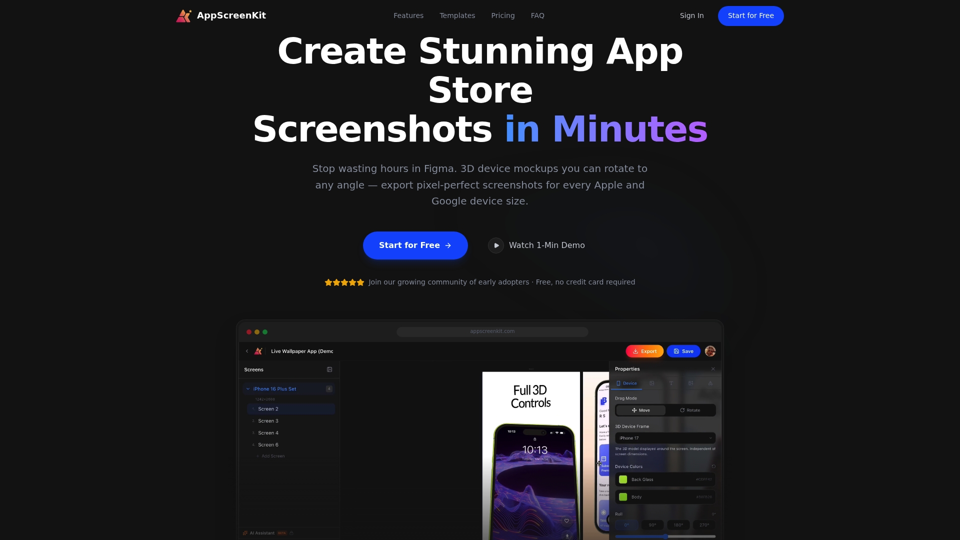
AppScreenKit is built specifically for indie developers and small teams who need professional, conversion-ready screenshots without a design background or expensive tools. You can upload your app images, drop them into 3D device mockups, add captions and gradient backgrounds, and export pixel-perfect assets for every required device size in minutes. The platform supports fast iteration, so running multiple A/B test variants does not become a production bottleneck. Whether you are creating localized screenshot sets for Japan and Germany or testing a new first-frame concept, AppScreenKit makes the asset side fast and painless. Start for free and create your first set today.
Frequently asked questions
How often should app store visuals be updated?
Update screenshots and visuals at least 2-4 times per year, with games benefiting from updates up to eight times annually to stay competitive and reflect seasonal trends.
What is the ideal sample size for A/B testing app store assets?
Aim for at least 1,000 impressions per variant and run each test for 7 to 90 days to ensure your results are statistically reliable before declaring a winner.
How much can localization improve app store conversion rates?
Localizing both metadata and screenshots for key markets can boost CVR by 15-40%, making it one of the highest-return optimization activities available to indie developers.
What should the first screenshot convey in an app store listing?
The first screenshot should instantly show the app’s core value using a clear caption and an engaging background, giving users an immediate reason to keep looking.
Leave a Reply